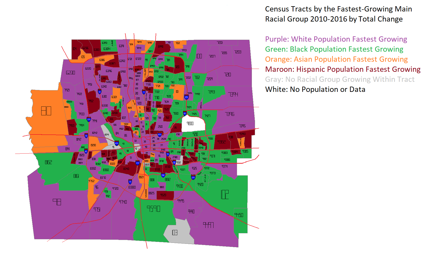
The US Census recently released updated estimates for 2016 for smaller-area designations like tracts and blocks. Looking at them, I wanted to see where racial groups were growing the fastest at that level. The first map is based on the % change from 2010 to 2016. What’s interesting about this map is that it is such a hodgepodge. No single part of the county is dominated by growth in any specific racial group. However, a few things can be generally determined. For example, almost all of the tracts where the White population is growing the fastest are within I-270, and the majority of those within the eastern half of the Columbus in what have long been dominated by Black majority populations. These areas include parts of Linden, the Near South and Near East sides. That said, the White population was growing the fastest in just 30 census tracts by % change. This compared to 53 for the Black population, 83 for the Asian population and 107 for the Hispanic population.
The next map takes a slightly different approach, measuring the TOTAL change in population, rather than by %. Again, a hodgepodge, but much less so than before. Instead of being the fastest-growing in just 30 tracts, the White population rockets up to 108 tracts. This shows that, while Asian and Hispanic populations have respectable % growth, this is largely based on comparatively small population bases. Still, non-White populations are clearly making inroads throughout Franklin County.
German Village dates back to the early 19th Century, when it was sometimes called called Germantown. Unsurprisingly, by the middle of the 20th Century, the neighborhood had declined significantly, yet still retained the vast majority of its historic buildings. The city of Columbus had it in mind to bulldoze a large part of the neighborhood in the 1950s for public housing, but activists organized against those plans. Instead, in what was one of the first major success stories of Columbus preservation, German Village was saved. The entire area was eventually added onto the National Register of Historic Places in 1975, and today it is still the largest historic district on the registry anywhere in the United States. Here are just a few before and after photos around the neighborhood.
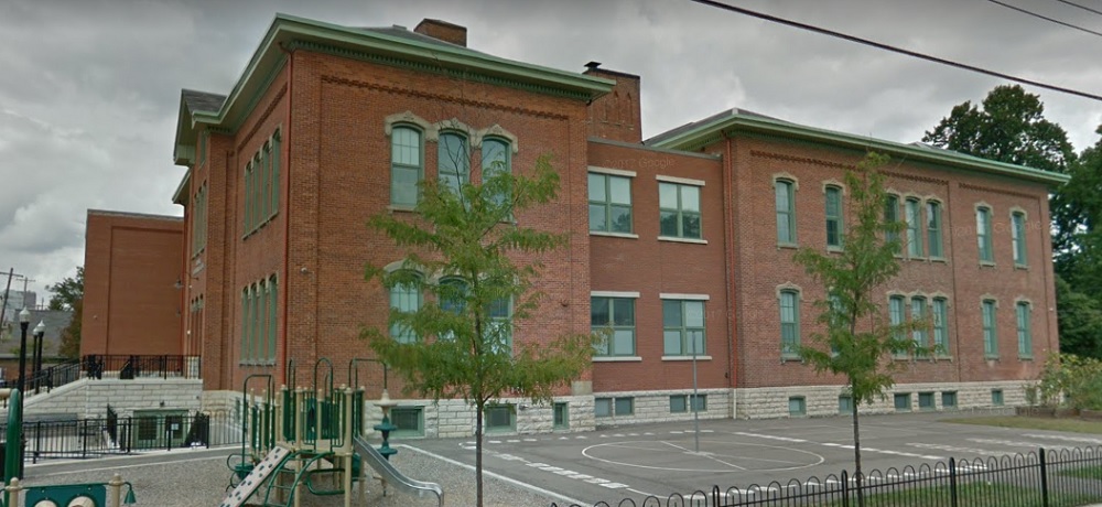
Before: Stewart Avenue Elementary School, looking northeast, in 1920. After: 2017 The school was constructed in 1873 and remains in use today, one of the oldest continuous schools remaining in the city.
Before: City Park Avenue at Lansing Street, looking south, in 1898. After: 2016
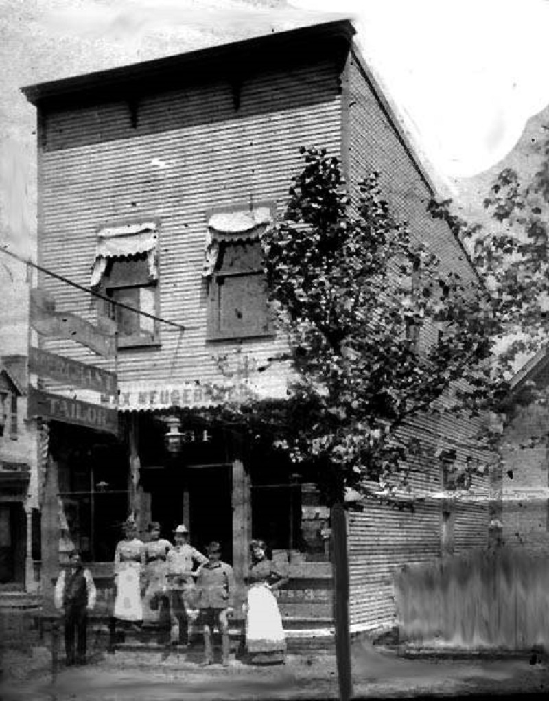
Before: The Max Neugebauer Tailor Shop at 764 Mohawk Street in 1897. After: 2016 Neugebauer arrived in Columbus in 1887, but it’s unclear when he opened this business.
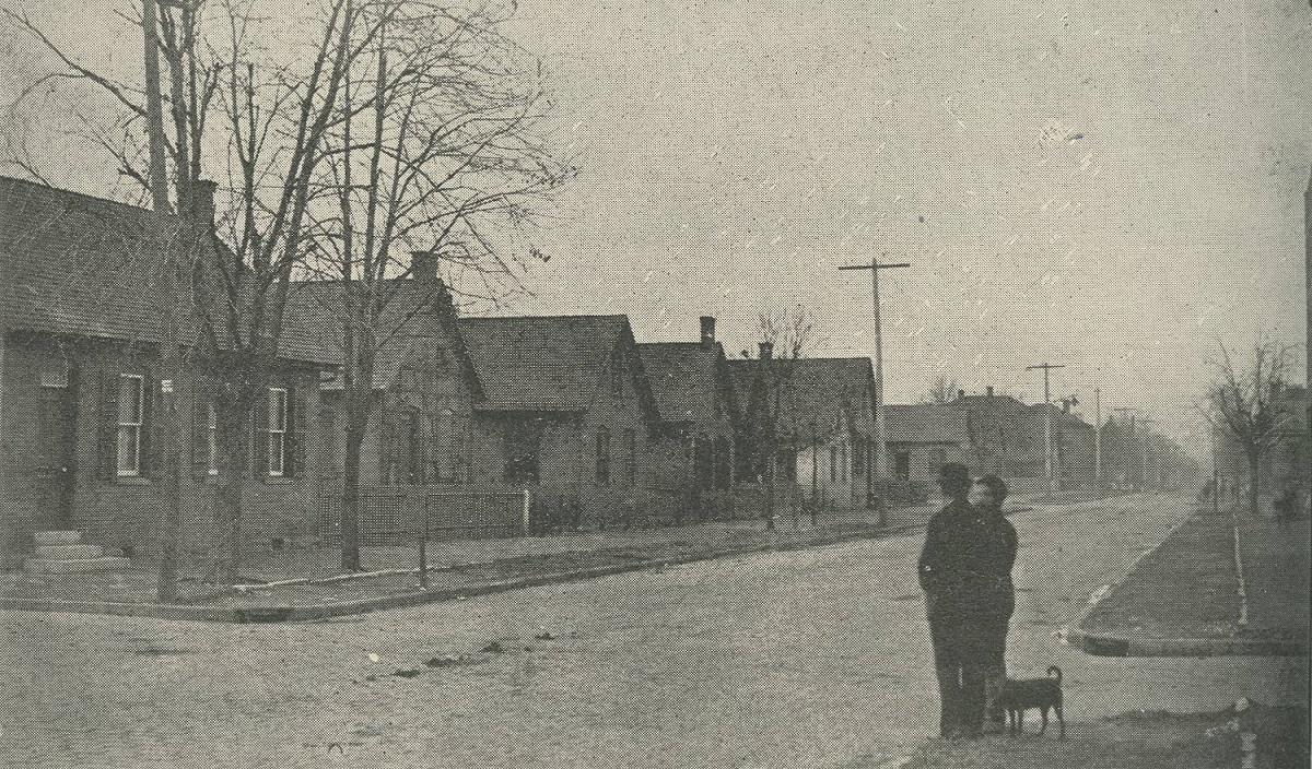
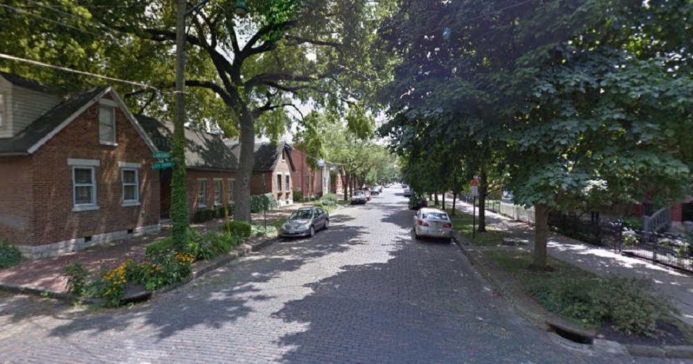
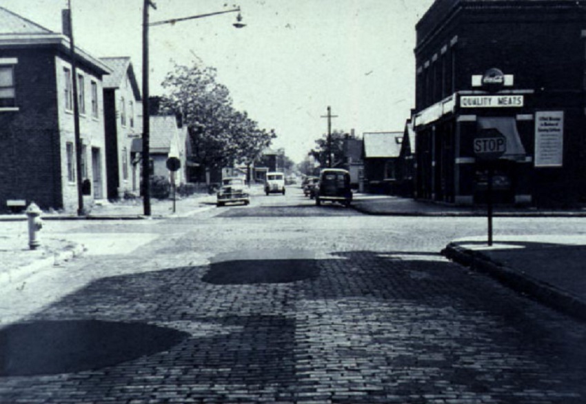
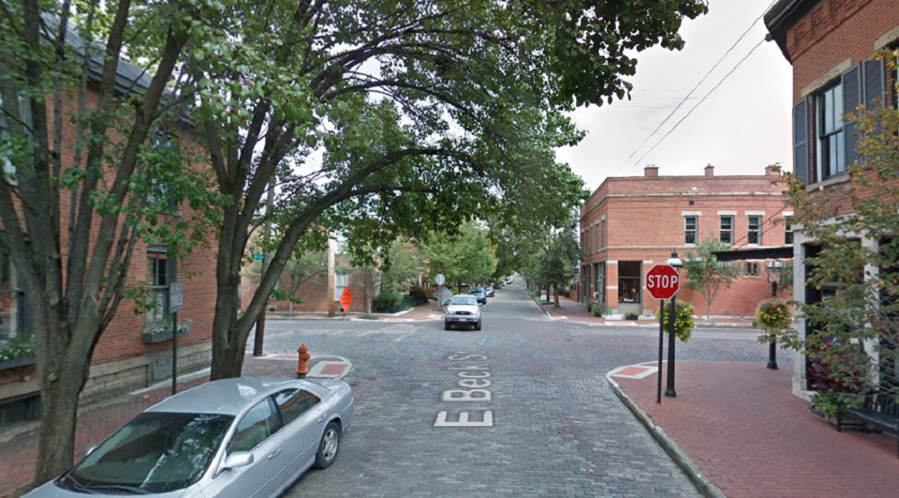
Before: Beck Street and Mohawk, looking east, in 1950. After: 2017 German Village was considered a “slum” by 1950, so the before photo would’ve been around the time of the neighborhood’s low point.
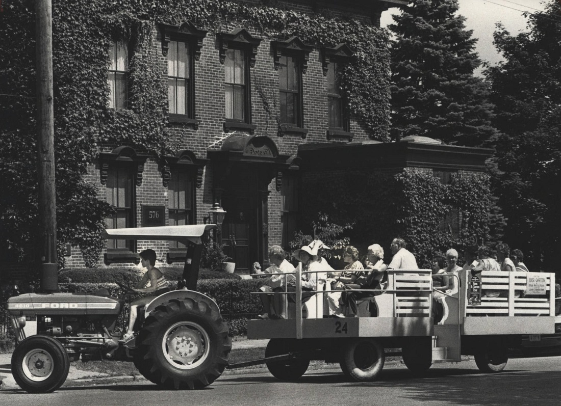
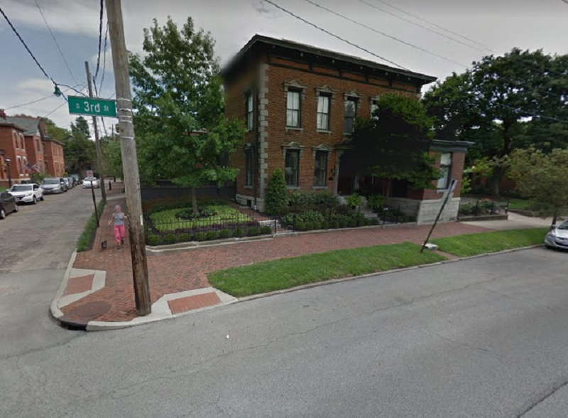
Before: Third Street and Beck, looking east, in 1981. After: 2016 The photo shows a German Village “Haus and Garten Tour” through the neighborhood.
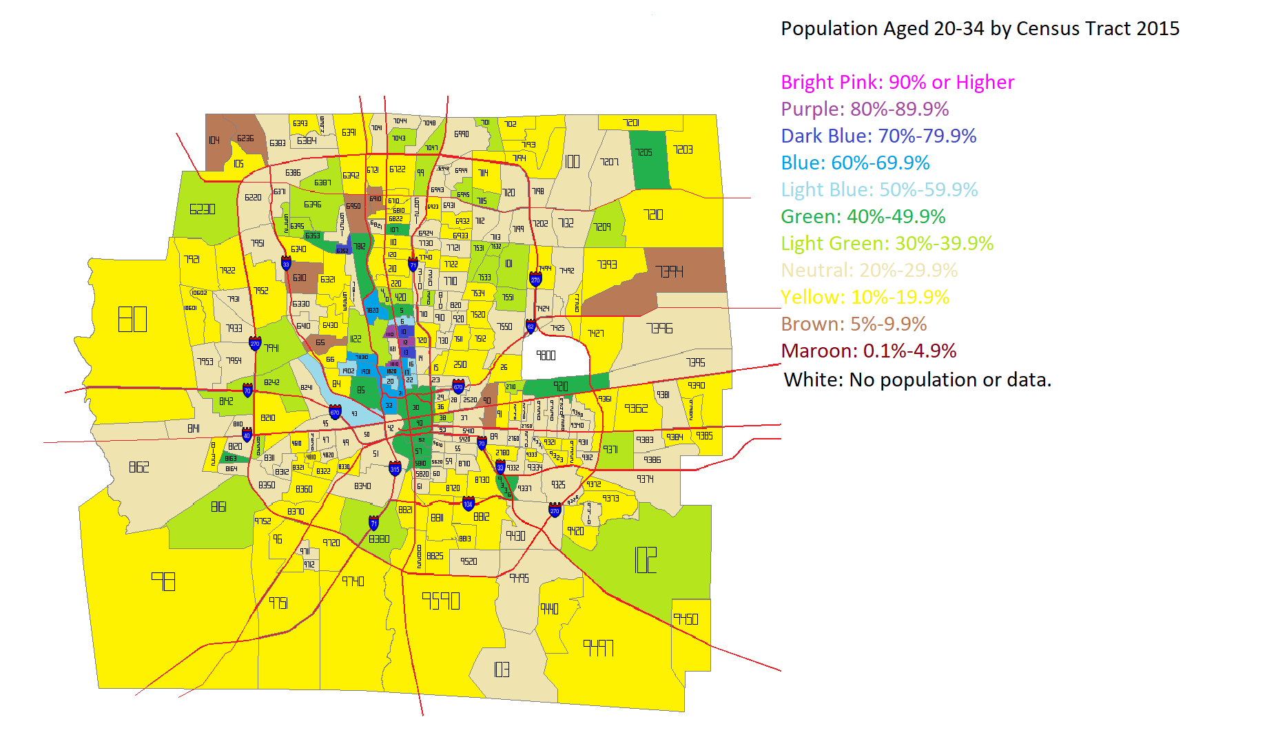
I’ve seen several articles across the internet lately questioning the idea that Millennials and young adults prefer density and urban areas. I decided to see how this played out in Franklin County overall. I first looked at the total population aged 20-34 in the year 2000 and the year 2015 by Census Tract. Here were the maps for those years.
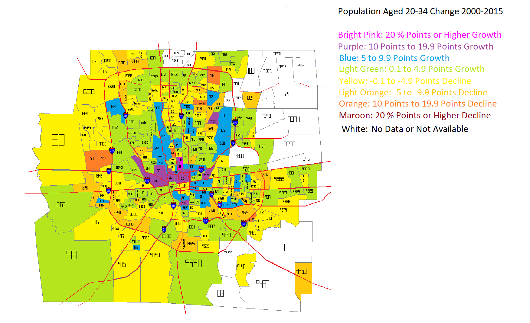
After looking at the numbers for both years, I came up with this map for how that age group had changed in the 2000-2015 period.
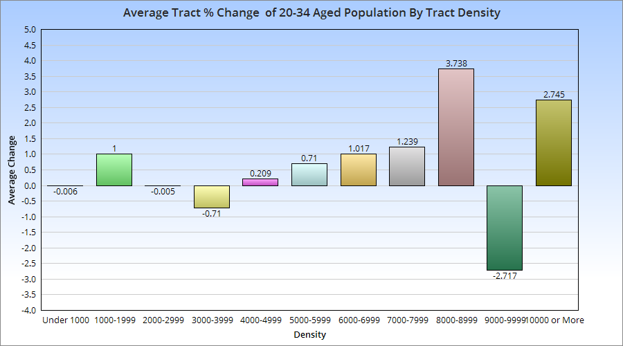
Unfortunately, some tracts, particularly in the eastern suburban areas, did not exist in 2000, and so I was not able to figure out the change for them during the period. The rest of the map, however, shows that the strongest growth in this age group was not only inside 270, but closest to Downtown and central corridors along Broad and High Streets. These maps don’t tell us about the relationship between those changes and the population density of the census tracts. So I went further and broke the tracts into increments of density to see where the strongest growth was occurring.
With a few exceptions, there appears to be a correlation between average 20-34 aged population growth and the density of the census tracts it occurs in. This suggests that this age group, at least in Franklin County, prefers areas with moderate to high density, which typically translates to urban living.
I saw this postthe other day about changing neighborhood demographics in certain cities, particularly when it comes to racial segregation and gentrification. Surprisingly, of all the maps and posts I’ve done on demographics, I hadn’t thought to do one that showed Franklin County gentrification trends. Well, now I have.
A bit of an explanation is needed for the color coding: -For those categories marked “Steady”, the demographic listed has been the majority throughout the period, with little to no change of other demographics. -For those mixed categories of one decline and one rise, it means that the majority demographic has declined at least 5 percentage points, while a secondary demographic has risen at least 5 percentage points. -For the category of recent or steady integration, there are at least 2 demographics at 10% or more of the total population, as well as a 3rd demographic reaching at least 5% of the population.
A few things that stand out to me: The eastern half of the county is in much greater flux than the western half, and integration is respectable county-wide. These neighborhoods of demographic equilibrium are largely the result of increasing Hispanic and Asian populations, particularly on the Northeast and West Sides, as well as the Whitehall area. In the center core, almost all of the High Street corridor has remained Steady White, suggesting that other demographics have, so far, been unable to tap into the building boom along and adjacent to this corridor. One other thing I notice is that there are FAR more tracts with a growing black population than there are with a growing White population, suggesting that perhaps the idea of Whites moving into neighborhoods and displacing residents is not quite as big of an issue as some might believe.
Here are the integrated tracts by year, based the above criteria, and their racial breakdown.
Breakdown of # of Tracts by % of Hispanic Population 1990 95% or Higher: 0 90%-94.9%: 0 80%-89.9%: 0 70%-79.9%: 0 60%-69.9%: 0 50%-59.9%: 0 Total Majority Hispanic Tracts: 0 40%-49.9%: 0 30%-39.9%: 0 20%-29.9%: 0 10%-19.9%: 0 0.1%-9.9%: 278 0%: 5 2015 95% or Higher: 0 90%-94.9%: 0 80%-89.9%: 0 70%-79.9%: 0 60%-69.9%: 0 50%-59.9%: 0 Total Majority Hispanic Tracts: 0 40%-49.9%: 0 30%-39.9%: 1 20%-29.9%: 7 10%-19.9%: 33 0.1%-9.9%: 241 0%: 9
Integrated Tracts By Year 1990: 2 2015: 98
Most Integrated Tract by Year 1990 1122: White: 76.6% Black: 9.6% Asian: 11.2% Hispanic: 2.5% 2015 7721: White: 33.9% Black: 31.2% Asian: 26.8% Hispanic: 10.1%
All in all, the data shows that the county is much less racially stratified/segregated now than it was in 1990, and that it doesn’t appear that gentrification is really affecting many areas in terms of forcing out one racial group for another.
A little more than 4 years ago, I posted numbers on the recovery of Ohio downtowns, and what that might mean for the future. That post has proven to be one of the site’s most popular. I figured it was time to take a look at their continuing changes.
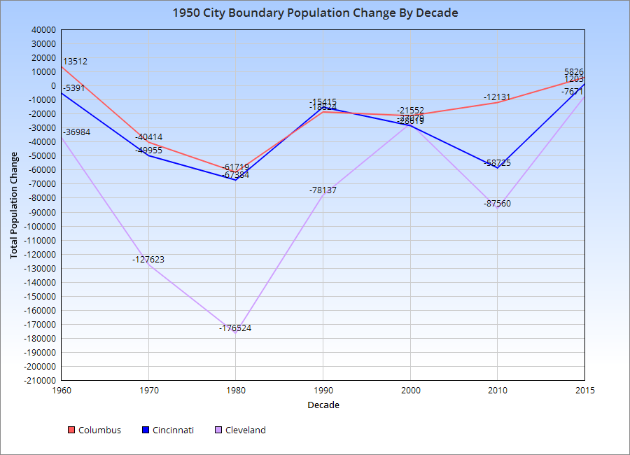
You can see by the chart for the 1950 Boundary population, the urban core of each city, that all 3-Cs suffered population losses post-1950. However, the rate of losses gradually declined, and 2 of the cities, Columbus and Cincinnati, appear to be growing in this boundary since at least 2010. Cleveland continues to lose.
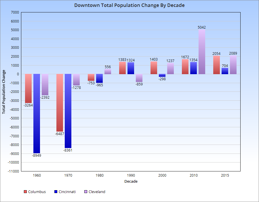
This is shown further by the chart below.
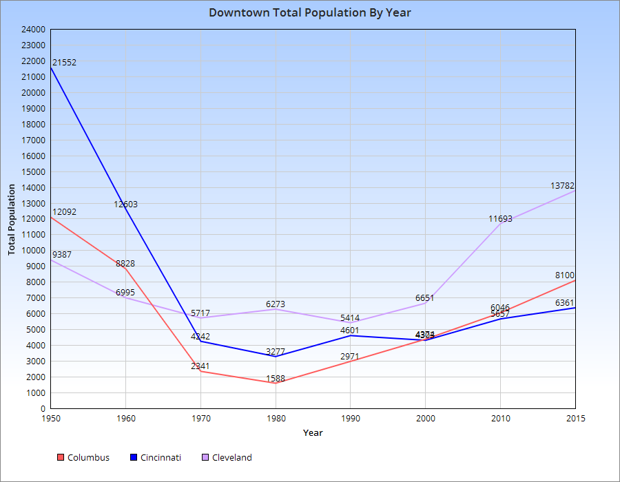
As far as the actual Downtowns of each, here are the population trends.
For the most part, population declines in the 3-Cs peaked around 1980, give or take a decade. Since then, all of them have seen increases, with Cleveland seeing the most rapid increase and Cincinnati the least. Columbus has seen steady, but increasingly rapid growth with each subsequent decade since 1980.