The US Census has released 2024 county and metro population estimates. The estimates generally show a further continuation of the post-pandemic recovery in the numbers. In fact, older estimates have also been revised upwards. Let’s break down the numbers.
Metro County
2020 Census
2023 Population
2024 Population
Delaware
214,123
232,732
237,966
Fairfield
158,920
165,630
167,762
Franklin
1,323,819
1,338,903
1,356,303
Hocking
28,056
27,567
27,429
Licking
178,517
183,540
184,898
Madison
43,848
44,668
45,531
Morrow
34,944
35,583
35,927
Perry
35,412
35,577
35,682
Pickaway
58,551
61,064
62,158
Union
62,790
69,765
71,721
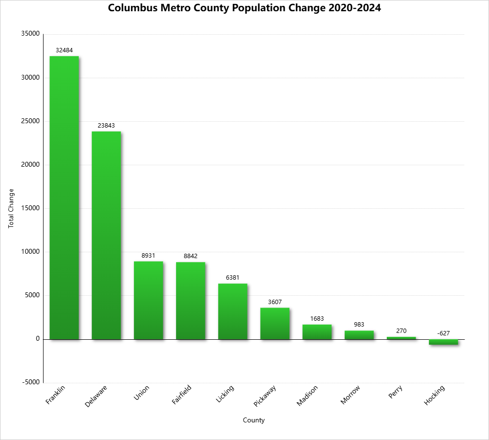
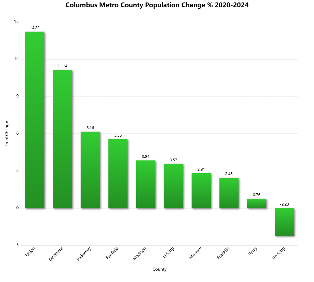
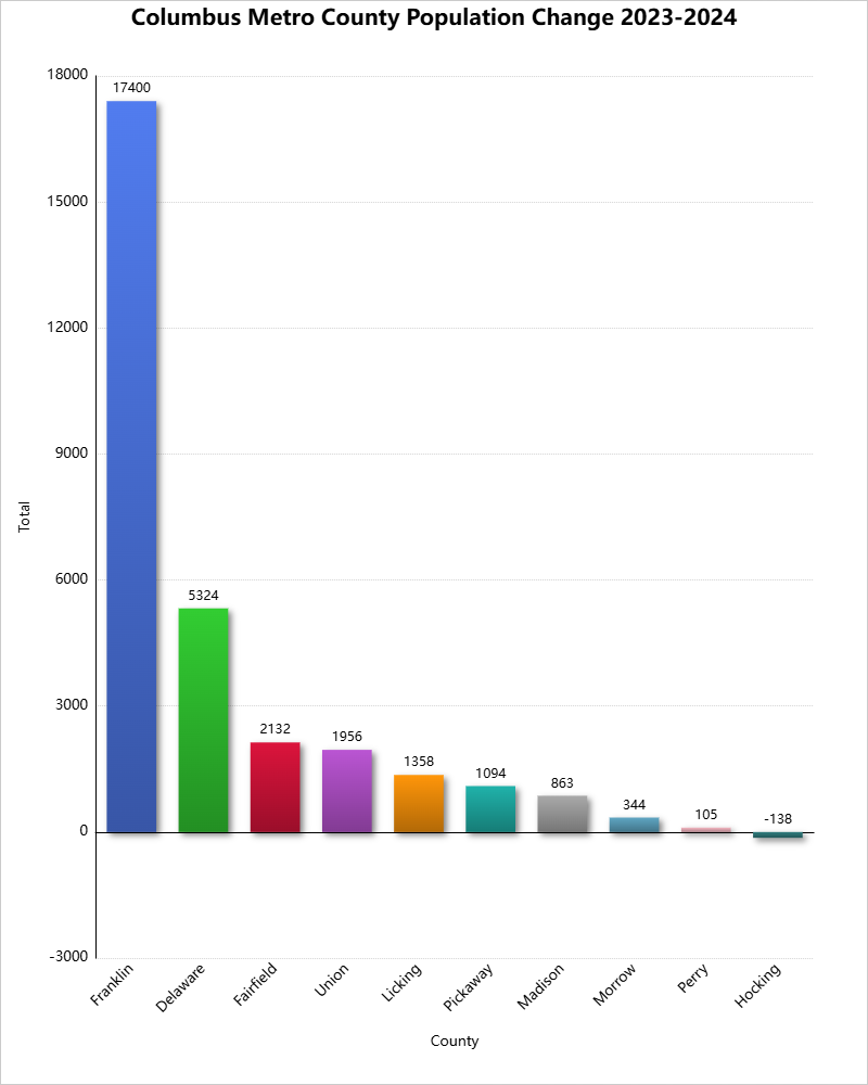
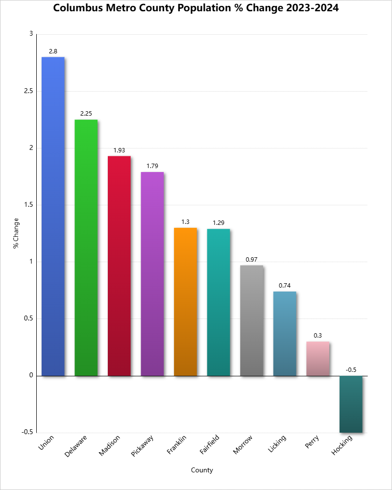
As you can see, all counties but Hocking grew in both the 2020-2024 and 2023-2024 periods. Most of the estimates were improvements over the 2023 version, as mentioned. For example, Franklin County’s estimates population in 2023 was 1,326,063, but the 2024 version for 2023 was revised to 1,338,903, indicating growth was significantly stronger than originally estimated.
Franklin County continued its very long run of being the top county in the metro for total growth.
I saw this postthe other day about changing neighborhood demographics in certain cities, particularly when it comes to racial segregation and gentrification. Surprisingly, of all the maps and posts I’ve done on demographics, I hadn’t thought to do one that showed Franklin County gentrification trends. Well, now I have.
A bit of an explanation is needed for the color coding: -For those categories marked “Steady”, the demographic listed has been the majority throughout the period, with little to no change of other demographics. -For those mixed categories of one decline and one rise, it means that the majority demographic has declined at least 5 percentage points, while a secondary demographic has risen at least 5 percentage points. -For the category of recent or steady integration, there are at least 2 demographics at 10% or more of the total population, as well as a 3rd demographic reaching at least 5% of the population.
A few things that stand out to me: The eastern half of the county is in much greater flux than the western half, and integration is respectable county-wide. These neighborhoods of demographic equilibrium are largely the result of increasing Hispanic and Asian populations, particularly on the Northeast and West Sides, as well as the Whitehall area. In the center core, almost all of the High Street corridor has remained Steady White, suggesting that other demographics have, so far, been unable to tap into the building boom along and adjacent to this corridor. One other thing I notice is that there are FAR more tracts with a growing black population than there are with a growing White population, suggesting that perhaps the idea of Whites moving into neighborhoods and displacing residents is not quite as big of an issue as some might believe.
Here are the integrated tracts by year, based the above criteria, and their racial breakdown.
Breakdown of # of Tracts by % of Hispanic Population 1990 95% or Higher: 0 90%-94.9%: 0 80%-89.9%: 0 70%-79.9%: 0 60%-69.9%: 0 50%-59.9%: 0 Total Majority Hispanic Tracts: 0 40%-49.9%: 0 30%-39.9%: 0 20%-29.9%: 0 10%-19.9%: 0 0.1%-9.9%: 278 0%: 5 2015 95% or Higher: 0 90%-94.9%: 0 80%-89.9%: 0 70%-79.9%: 0 60%-69.9%: 0 50%-59.9%: 0 Total Majority Hispanic Tracts: 0 40%-49.9%: 0 30%-39.9%: 1 20%-29.9%: 7 10%-19.9%: 33 0.1%-9.9%: 241 0%: 9
Integrated Tracts By Year 1990: 2 2015: 98
Most Integrated Tract by Year 1990 1122: White: 76.6% Black: 9.6% Asian: 11.2% Hispanic: 2.5% 2015 7721: White: 33.9% Black: 31.2% Asian: 26.8% Hispanic: 10.1%
All in all, the data shows that the county is much less racially stratified/segregated now than it was in 1990, and that it doesn’t appear that gentrification is really affecting many areas in terms of forcing out one racial group for another.
The US Census recently released demographic information for census tracts for 2015. Here are some quick maps for Franklin County for median household income.
First, median household income for both 2010 and 2015.
And the % change between 2010-2015.
As can be seen, a lot of the greatest improvements over the 5-year period were around Downtown, the Near East Side, North High, South High and around some of the higher-income suburbs like Upper Arlington and the New Albany area.
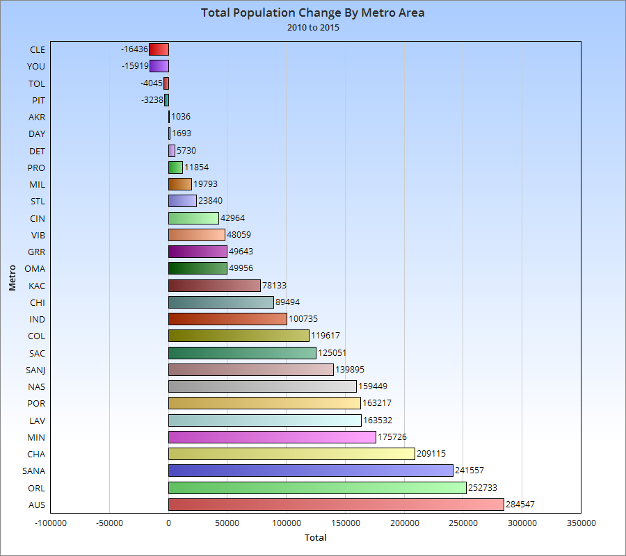
As promised, here are the 2015 metro area population estimates for Columbus and its regional and national peers.
2015 Metro Population Estimates Chicago, IL: 9,551,031 Detroit, MI: 4,302,043 Minneapolis, MN: 3,524,583 St. Louis, MO: 2,811,588 Charlotte, NC: 2,426,363 Portland, OR: 2,389,228 Orlando, FL: 2,387,138 San Antonio, TX: 2,384,075 Pittsburgh, PA: 2,353,045 Sacramento, CA: 2,274,194 Cincinnati: 2,157,719 Las Vegas, NV: 2,114,801 Kansas City, MO: 2,087,471 Cleveland: 2,060,810 Columbus: 2,021,632 Austin, TX: 2,000,860 Indianapolis: 1,988,817 San Jose, CA: 1,976,836 Nashville, TN: 1,830,345 Virginia Beach, VA: 1,724,876 Providence, RI: 1,613,070 Milwaukee, WI: 1,575,747 Grand Rapids, MI: 1,038,583 Omaha, NE: 915,312 Dayton: 800,909 Akron: 704,243 Toledo: 605,956 Youngstown: 549,885
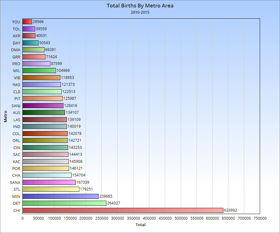
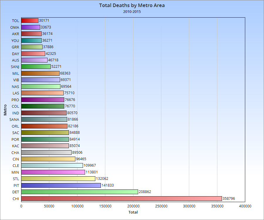
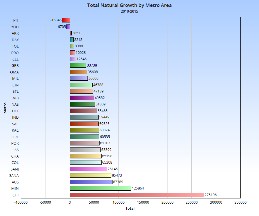
Components of Metro Area Population Change As you can see, while Columbus has a middle of the road birth rate for its peers, its relatively low death rate means that it manages to be near the top of the its peer group in natural growth.
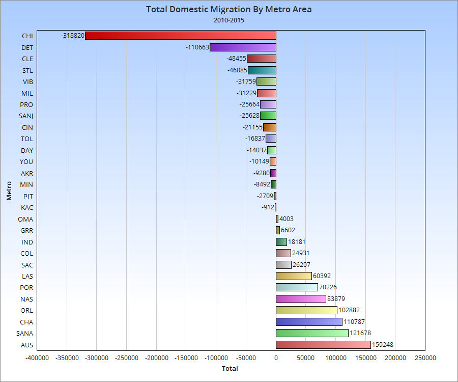
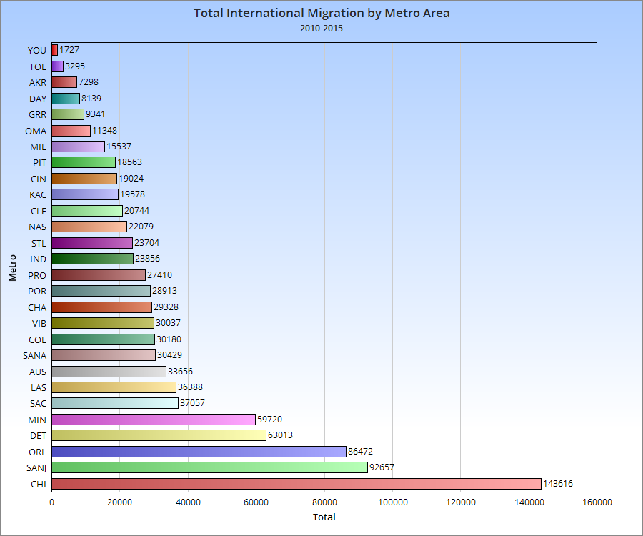
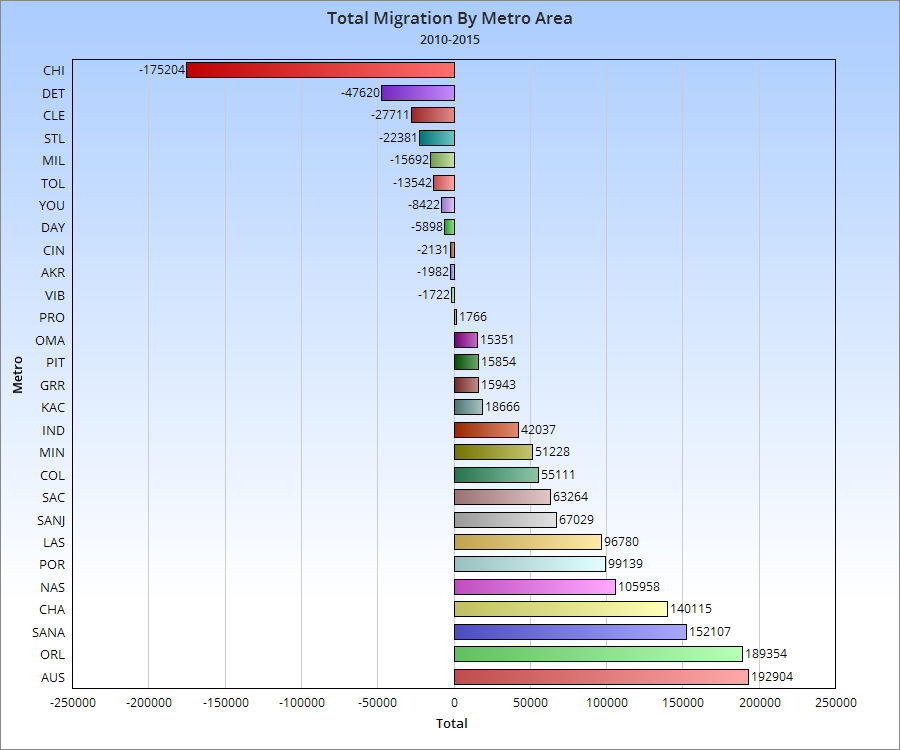
It seems that while international migration is competitive with peers in the Columbus metro, domestic migration would need to improve to truly be at the upper peer level. At the very least, it is positive.
Over the last few decades, much attention has been given to the fact that domestic migration by state has heavily favored the “Sun Belt”, states made up of the Southeast west to the West Coast. While Northern states weren’t all losing people, the region as a whole sent far more people to the Sun Belt than they retained. This helped fuel the respective Southern boom, and media story after media story over the years have made sweeping predictions of this growing powerhouse region, often centered around the idea that the boom had no foreseeable end. The irony with these predictions is that they ignored history. For more than 2 centuries, the North was where people moved. Its states and cities saw massive influxes of population. As recently as the decade of the 1950s, Ohio grew by nearly 2 million alone. Economic conditions in decline, job losses, particularly in the manufacturing industry, increases in the cost of living and other factors ended the boom and helped to bring about the rise of the South, so to speak. Since at least the 1960s, the story has been about the Sun Belt/West.
The Censusdoes state migration estimates every year, and there are some interesting things going on in the data that may indicate that the boom in the South is faltering while the North’s fortunes are not looking as grim as they once did.
First, what are the regions? South: Alabama, Arkansas, Florida, Georgia, Kentucky, Louisiana, Mississippi, North Carolina, Oklahoma, South Carolina, Tennessee, Texas, Virginia and West Virginia. North: Connecticut, Delaware, Washington D.C., Illinois, Indiana, Iowa, Kansas, Maine, Maryland, Massachusetts, Michigan, Minnesota, Missouri, Nebraska, New Hampshire, New Jersey, New York, North Dakota, Ohio, Pennsylvania, Rhode Island, South Dakota, Vermont and Wisconsin. West: Alaska, Arizona, California, Colorado, Hawaii, Idaho, Montana, Nevada, New Mexico, Oregon, Utah, Washington and Wyoming.
Let’s next look at the states by rank of domestic migration in 2005, the earliest available year for the state data, and compared it to 2012, the most recent year available. This period covers the period just before and just after the Great Recession.
So in 2005, the breakdown was as follows: 12 of 14 Southern states had positive domestic migration. The only 2 that did not, Louisiana and Mississippi, were heavily influenced in 2005 by Hurricane Katrina, which caused large numbers of displaced residents to leave the states entirely. 7 of 24 Northern states has positive domestic migration. The 7 states were mixed between the Midwest and the Northeast/Mid-Atlantic. Just one Great Lakes State had positive domestic migration in 2005. 9 of 13 Western states had positive domestic migration. Only California and a few Mountain West states had negative numbers.
The 2005 numbers show the overall domestic migration picture as it had been for at least the last few decades, if not much longer. The South and West were the dominant net gainers of domestic migration, while most of the North sent people to those regions.
In 2012, the breakdown was as follows: 11 of 14 Southern states had positive domestic migration. Even with Katrina-hit state Mississippi having net gains in 2012, the overall number of states with positive gains declined. 8 of 24 Northern states had positive domestic migration, a slight improvement over 2005. 8 of 13 Western states had positive domestic migration, a slight decline over 2005.
But the breakdowns don’t tell us the whole story. When trying to compare the two years, trends are very important, and the trends are far more revealing.
5 of 14 Southern states improved their domestic migration rates 2005-2012. 13 of 24 Northern states improved their domestic migration rates 2005-2012. 3 of 13 Western states improved their domestic migration rates 2005-2012.
Ohio had the 4th best improvement over the period, a huge change. But some might ask, is it really a change when the rates may still be positive or negative like they were before? Well, yes and no. 7 years is not that long, and we’re talking about decades-long patterns here. Those won’t change like flipping a switch. It will take time. The point is more that for many states that have faced negative numbers for a long time, there is positive momentum now that they did not have before. Another question some may ask, however, is if the recession during the period reduced mobility. In some cases, I’m sure that it did, but if so, that reduction seems to have been centered on the South. A reduction in mobility would only indicate that migration rates would reduce to levels around 0, neither particularly positive nor negative. That reduction would NOT necessarily support switches from positive to negative or increases in negative or positive rates that already exist. Meaning that reduced mobility would mean that positive would become less positive as fewer people moved in, and negative would become less negative as fewer people left. On a state and regional basis, there is a wide range of results that do not support that geographic mobility alone is the culprit, or even a primary factor.

 [Source: U.S. Census Bureau]