For those counting, there are 99 places in that list. 79 of them, or 79.8%, show growth over the period. Every place within Franklin County saw growth- maybe not down to the neighborhood level- but in all of the towns and cities.
Columbus passed 800,000 for the first time, and its actual growth rate increased from about 1.1% annually to 1.6% annually.
Yesterday, I talked about how the 1950 core population had changed the last 50 years. Today I want to focus just on the Downtown, or the Central Business District. This is a much smaller area for all three cities so there are far fewer tracts involved.
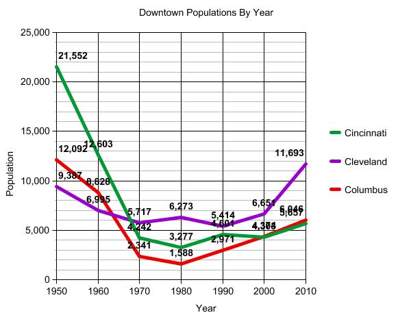
First, let’s look at the total Downtown populations since 1950. This graph, I think, will surprise most people. The first surprise is that downtown populations in 1950 were not nearly as high as most would have you believe. Cincinnati did have almost 22K people there, but even a city like Cleveland had less than 10K, and that was during the absolute peak of its city population. Another surprise is that Columbus was not always the lowest populated downtown and was more populated than Cleveland’s in 1950. Finally, the last surprise is that while all the downtowns are now growing, Columbus has regained 2nd place and Cleveland has seen the most growth so far.
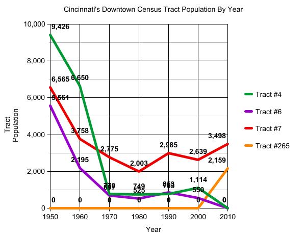
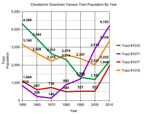
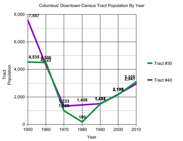
What about tract trends for the downtowns? Well first, here are the population trends for each downtown. For Cincinnati, Tracts #4 and #6 were combined into #265 in 2010. So no city had a single Downtown tract that was not growing in 2010. This is good news.
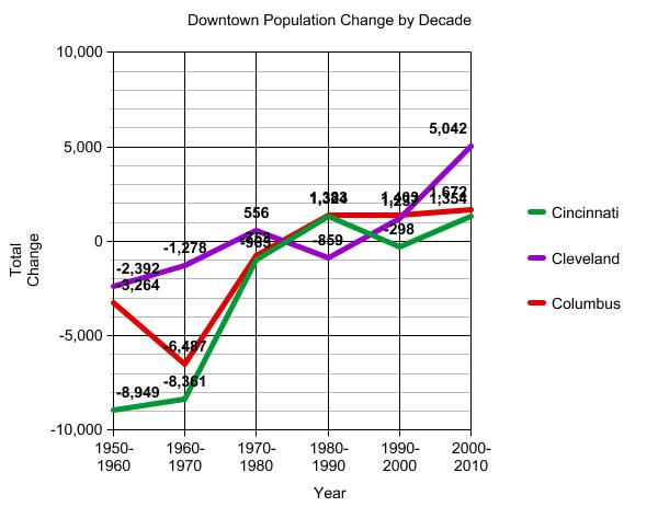
Here is the total population change by Downtown.
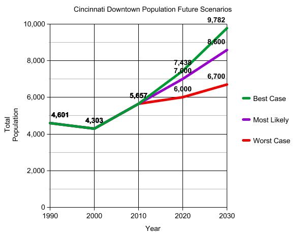
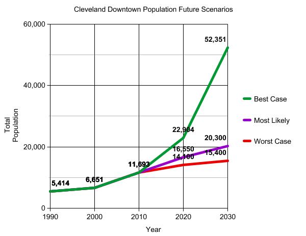
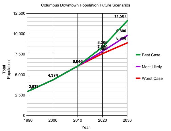
What about if these current trends continue, what might the downtown populations look like in 2020 or 2030?
If you think Cleveland has a very rapid rise for its Best Case scenario, that is because, to get the best case, I used the last decade’s growth rates and just assumed they would continue and compound growth. One of Cleveland’s tracts had a growth rate over 80% while another grew 271%. Still, while it’s the best case, it’s also highly unlikely to maintain growth rates that high for that long, so a more likely case is somewhere closer to Most Likely.
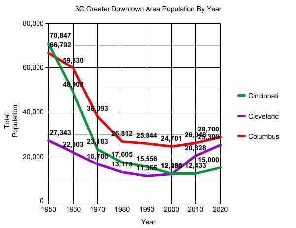
Finally, I wanted to look at more of the downtown area than just the central business district. “Downtown” for many includes more areas than that and may be a “Greater Downtown Area”, the measurement between the full 1950 boundaries and just the CBD.
Here are the tracts I considered to be the Greater Downtown area for each city.
And the graph for the population of these tracts since 1950 and a projection out to 2020. Cincinnati reached it’s lowest population for the past 60 years for this area in 2010, but just barely. It should be growing again by 2020, but I didn’t project the growth to be that high because it was still coming out of its lowest point. Cleveland’s greater downtown had the bottomed out in 1990 and had the fasted growth the past decade. Columbus managed to maintain the highest population in its greater downtown, bottomed out in 2000 and has grown since. However, not nearly as fast as in Cleveland. I expect Columbus to have better growth this decade and remain on top, but with Cleveland’s area closing the gap.
Columbus’ downtown has seen many many changes, especially over the last decade. Developments like the Arena District, Columbus Commons, the Scioto Mile and more have brought new life to the area. Dozens of new restaurants have opened the past year or two alone, and a new grocery store will be opening for area residents in February. More developments coming up include the Scioto River restoration project that will create acres of new Downtown park space and pathways, and the redevelopment of the Scioto Peninsula behind COSI should connect the two sides of the river. All of this had led to rising population, now approaching 7,000. More than 1,000 residential units are currently under construction and more is on the way. So the question I was wondering is how has population been changing not only in Columbus’ downtown, but in comparison to Cleveland and Cincinnati. Both of those cities have also seen major projects in their downtown cores and are seeing an uptick in their downtown populations.
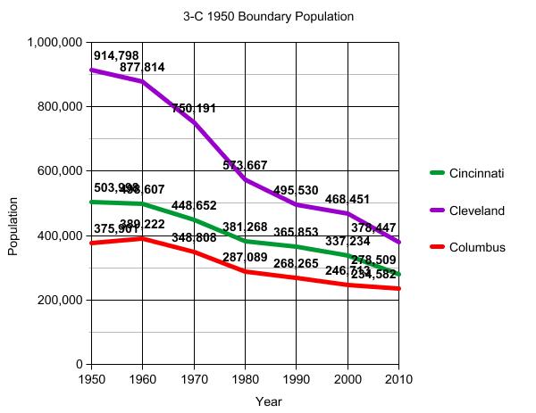
First, I examined the 1950 city limits for all three cities. This was the last census year before sprawl really took hold and changed the city dynamics and growth patterns. 1950 is also when most cities in Ohio reached their peak urban population, so I thought it would be interesting to see how those old boundaries had changed over the years. I went to the US census website and began to look up all the census tracts that existed in each city in 1950. Those would represent my base area that I would use to see the changes in the city core. All of the 3-Cs have grown beyond those 1950 boundaries, especially Columbus, but these areas were the hardest hit when the urban decline came the last 50-60 years while the suburbs grew. The results are both sobering and hopeful.
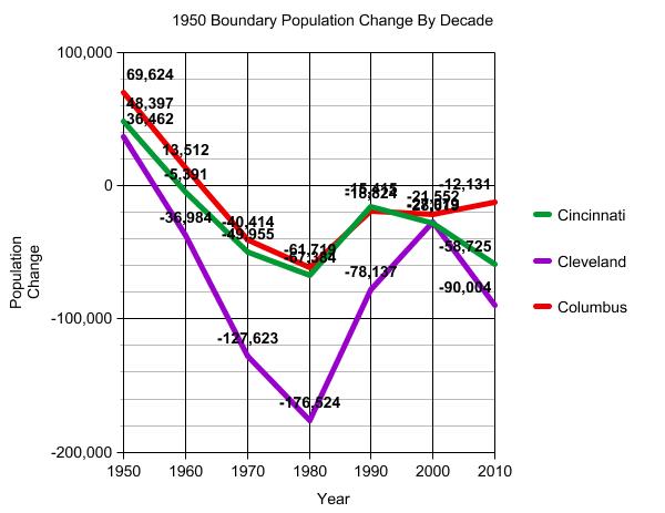
So what do these numbers show? Well, it’s clear that all 3 cities had urban core population declines the past 60 years just like just about every other city in the nation did. This was mostly a result of the suburban movement. In Cleveland, the rate of loss had gradually been slowing down since the 1970s, but suddenly skyrocketed again in the 2000s. I’m not sure what exactly caused this. The double recessions made it more difficult for people to move, so if anything, the losses should’ve not accelerated. Cleveland lost over 90,000 people in its urban core from 2000-2010, the highest lost by % and total of any Ohio city. In Cincinnati, population loss had peaked in the 1970s and the rate of loss fell substantially the following decade. However, the past 2 decades have actually seen a gradual acceleration of losses. The 2000-2010 period saw the second biggest total loss for the urban core. For Columbus, it’s been the opposite picture. Like the other 2-Cs, losses peaked in the 1970s. Since then, the urban core losses have been in gradual decline. The 2000-2010 period had the smallest rate and total loss of any decade the past 60 years.
So interesting results, but these numbers don’t show any trends of what’s going on inside the 1950 boundaries, especially not the relatively small part that would be the downtowns. So let’s break the numbers down to the tract level.
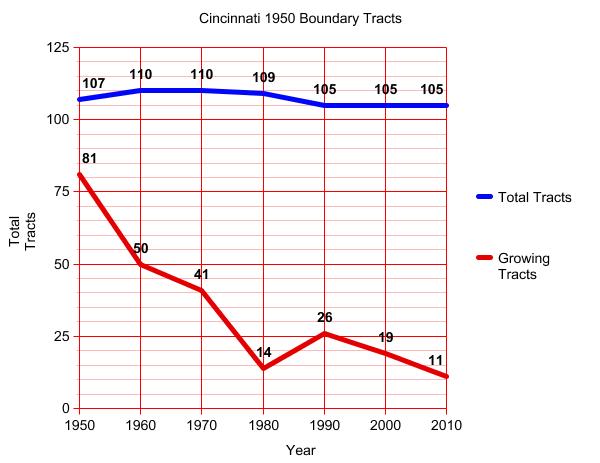
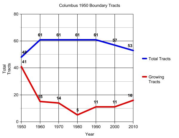
# of Tracts in 1950* Cincinnat: 107 Cleveland: 201 Columbus: 48
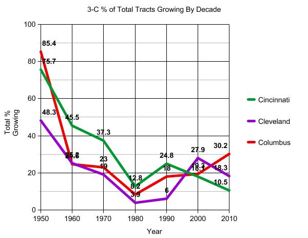
*The number of tracts changed from 1950 on as some were split or consolidated. This made it more complicated, but luckily the Census gives lists on how tracts changed over time, so one can figure out what tract became what and reasonably keep up with the same boundaries that existed in 1950. So with this breakdown, we can see more of the trends within the 1950 boundaries. In Cincinnati, a long decline was followed by a recovery in 1990, only to have the next 20 years show an increasing decline. The 2010 census showed the fewest number of tracts growing on record. This is the worst performance of the 3-Cs. Cleveland also had a steep decline followed by a recovery, but it too declined more at the last census, but not nearly to the low point it reached in the 1970s and 1980s.
Meanwhile, Columbus also faced an initial steep decline and barely had any tracts growing during the 1970s. Since then, the trend has been up. The 16 growing tracts in 2010 were the highest since the 1940s. This is the best performance of the 3-Cs, and Columbus had the highest % of growing tracts in its core. Still, those 16 represent less than 1/3rd of the total tracts within the 1950 boundaries. So while there appears to be recovery ongoing in Columbus, especially compared to Cleveland and Cincinnati, it’s not where it needs to be.
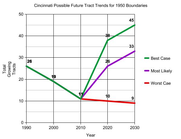
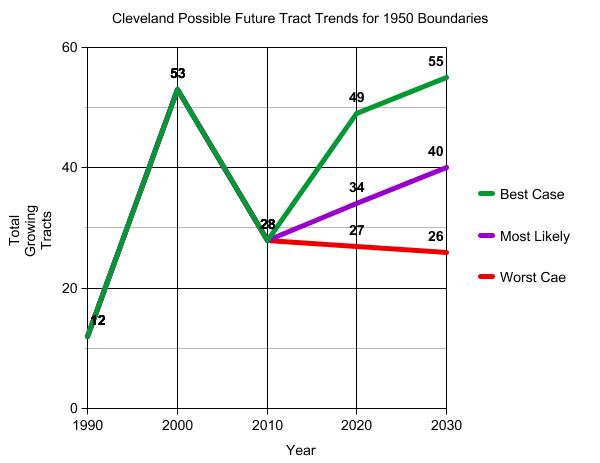
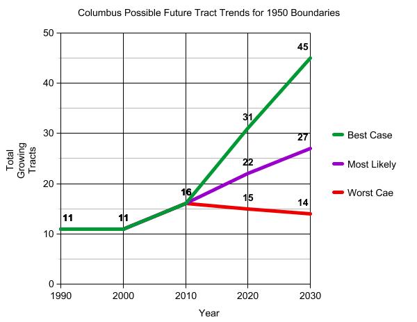
So let’s look to the future. All these tracts are trending in certain directions themselves. While they may be losing now, they may be trending toward an eventual gain, and vice versa. If we follow the trends ongoing for the urban core tracts, where might the picture look like in say, 2020?
Tract Trends for Those Tracts Growing in Population in 2010 Trends are listed from what, in my opinion are the most positive to the most negative.
Growing in both 2000 and 2010, but Growth Accelerating Over Time and % of Total Tracts Cincinnati: 0- 0% Cleveland: 7- 4.6% Columbus: 5- 11.3%
Shrinking in 2000 but Growing in 2010 and % of Total Tracts Cincinnati: 10- 9.5% Cleveland: 20- 13.1% Columbus: 10- 18.9%
Growing in both 2000 and 2010, but Growth Slowing Over Time and % of Total Tracts Cincinnati: 1- 1.0% Cleveland: 1- 0.7% Columbus: 1- 1.9%
Shrinking in both 2000 and 2010, but Loss Slowing Over Time and % of Total Cincinnati: 28- 26.7% Cleveland: 21- 13.7% Columbus: 15- 28.3%
These tracts are those most likely to switch to positive growth come 2020. This is arguably one of the more positive trends and may deserve to be bumped a bit higher on the list.
Growing in 2000 but Shrinking in 2010 and % of Total Cincinnati: 18- 17.1% Cleveland: 42- 27.5% Columbus: 5- 9.4%
Shrinking in both 2000 and 2010, but Loss Accelerating and % of Total Cincinnati: 48- 45.7% Cleveland: 93- 60.8% Columbus: 17- 32.1%
These are the worst of the worst tracts, likely representing the most declined parts of the urban core. It’s pretty surprising to see that almost 2/3rds of Cleveland’s tracts are in this condition.
The tract trends paint a very interesting picture about each city’s urban core future. If we expanded these trends to the next census in 2020, this is what you might see.
All this information, however, deals with the entire urban core. What about just the Central Business Districts, or the downtown areas for each city? In , I will examine those numbers and trends for the very heart of these cities.