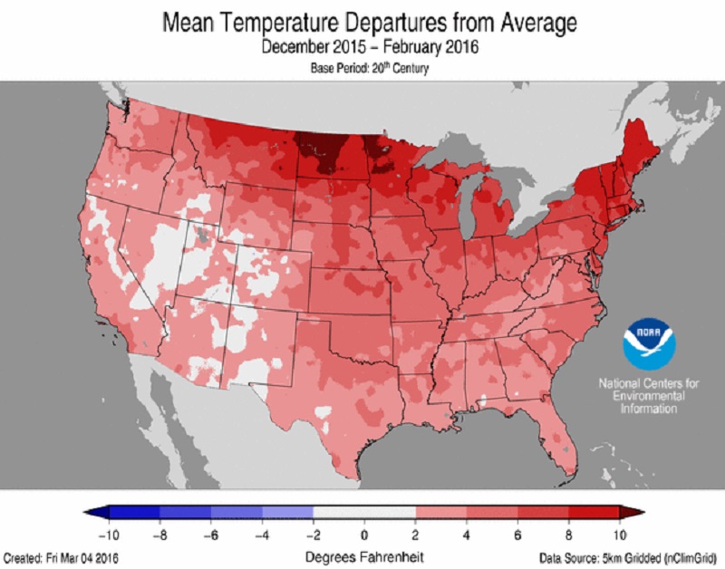
The winter of 2015-2016 featured warmer than normal temperatures across the country.
After the double cold and snowy winters between 2013-2015, the winter of 2015-2016 was drastically different. It featured general warm temperatures- including the warmest December ever- and little snowfall overall.
Temperature and snowfall ranking data goes back to the winter of 1878-1879. Snow depth ranking data goes back to 1940.
December-February Only
Average High: 44.0 8th Warmest
Average Low: 27.5 14th Warmest
Mean: 35.8 12th Warmest
Precipitation: 9.29″ 37th Wettest
Snowfall: 14.5″ 44th Least Snowy
Average Daily Snow Depth: 0.3″ 4th Lowest
Largest Snowstorm: 2.4″ on January 12th
32 or Below Highs: 21 15th Fewest
32 or Below Lows: 61 9th Fewest
Measurable Precipitation Days: 34 10th Fewest
Measurable Snowfall Days: 14 10th Fewest
Deepest Snow Depth: 3″ on February 16th
Days with 1″+ Snow Depth: 14 11th Fewest
Entire Cold Season: October-April
Average High: 53.7 3rd Warmest
Average Low: 35.3 10th Warmest
Mean: 44.5 5th Warmest
Precipitation: 20.92″ 48th Wettest
Snowfall: 17.1″ 36th Least Snowy
Average Snow Depth: 0.1″ 2nd Lowest
Largest Snowstorm: 2.4″ on January 12th
32 or Below Highs: 21 11th Fewest
32 or Below Lows: 87 7th Fewest
Measurable Precipitation Days: 82 17th Fewest
Measurable Snowfall Days: 17 8th Fewest
Deepest Snow Depth: 3″ on February 16th
Days with 1″+ Snow Depth: 15 8th Fewest
Average High By Month
October 2015: 65.4 45th Warmest
November 2015: 57.7 7th Warmest
December 2015: 52.5 1st Warmest
January 2016: 36.7 56th Warmest
February 2016: 42.9 26th Warmest
March 2016: 57.8 8th Warmest
April 2016: 62.5 41st Warmest
Average Low By Month
October 2015: 45.7 34th Warmest
November 2015: 39.5 6th Warmest
December 2015: 36.9 1st Warmest
January 2016: 20.1 44th Coldest
February 2016: 25.4 39th Warmest
March 2016: 39.1 7th Warmest
April 2016: 40.4 28th Coldest
Mean By Month
October 2015: 55.5 37th Warmest
November 2015: 48.6 5th Warmest
December 2015: 44.7 1st Warmest
January 2016: 28.4 45th Coldest
February 2016: 34.2 34th Warmest
March 2016: 48.5 7th Warmest
April 2016: 51.4 42nd Coldest
Precipitation By Month
October 2015: 2.68″ 44th Wettest
November 2015: 2.37″ 57th Driest
December 2015: 4.88″ 8th Wettest
January 2016: 1.12″ 9th Driest
February 2016: 3.29″ 31st Wettest
March 2016: 4.27″ 36th Wettest
April 2016: 2.31″ 35th Driest
Snowfall By Month
October 2015: 0″ 1st Least Snowy
November 2015: Trace 2nd Least Snowy
December 2015: Trace 2nd Least Snowy
January 2016: 5.4″ 39th Least Snowy
February 2016: 9.1″ 29th Snowiest
March 2016: 2.3″ 22nd Least Snowy
April 2016: 0.3″ 5th Least Snowy
Average Snow Depth By Month
October 2015: 0″
November 2015: 0″
December 2015: 0″
January 2016: 0.2″
February 2016: 0.8″
March 2016: 0.1″
April 2016: 0″
Maximum High By Month
October 2015: 79 on the 6th and 8th
November 2015: 75 on the 3rd and 5th
December 2015: 68 on the 12th
January 2016: 60 on the 31st
February 2016: 68 on the 20th
March 2016: 75 on the 27th
April 2016: 81 on the 18th
Maximum High Records
-The 68 on December 12th was a record for the date, beating the old record of 65 set in 1949.
-The 65 on December 14th tied the record for the date set in 1901 and 1995.
-The 65 on December 23rd was a record for the date, beating the old record of 62 set in 1933.
-The 68 on February 20th tied the record for the date set in 1891.
-The 65 on February 28th tied the record for the date set in 1896, 1939 and 1955.
Minimum High By Month
October 2015: 49 on the 17th and 30th
November 2015: 37 on the 22nd
December 2015: 33 on the 19th
January 2016: 13 on the 18th
February 2016: 16 on the 13th
March 2016: 33 on the 2nd
April 2016: 36 on the 9th
Maximum Low By Month
October 2015: 57 on the 24th
November 2015: 59 on the 5th
December 2015: 56 on the 12th
January 2016: 49 on the 31st
February 2016: 44 on the 20th
March 2016: 56 on the 14th
April 2016: 59 on the 21st
Maximum Low Records
-The 57 on November 18th was a record for the date, beating the old record of 56 set in 1921.
-The 47 on December 22nd was a record for the date, beating the old record of 46 set in 1931.
-The 51 on December 23rd tied the record for the date set in 1941.
-The 49 on December 31st tied the record for the date set in 1988.
Minimum Low By Month
October 2015: 28 on the 18th
November 2015: 21 on the 23rd
December 2015: 21 on the 20th
January 2016: 2 on the 13th
February 2016: 2 on the 14th
March 2016: 22 on the 2nd and 3rd
April 2016: 23 on the 5th
Highest Daily Precipitation By Month
October 2015: 1.25″ on the 28th
November 2015: 0.55″ on the 28th
December 2015: 1.19″ on the 27th
January 2016: 0.47″ on the 10th
February 2016: 1.22″ on the 24th
March 2016: 0.98″ on the 10th
April 2016: 1.05″ on the 11th
Precipitation Records
-The 1.25″ on October 28th was a record for the date, beating the old record of 1.10″ set in 1883.
-The 1.19″ on December 27th was a record for the date, beating the old record of 0.90″ set in 1968.
Highest Daily Snowfall By Month
October 2015: 0.0″
November 2015: Trace on the 22nd
December 2015: Trace on the 3rd, 18th and 31st
January 2016: 2.4″ on the 12th
February 2016: 1.9″ on the 16th
March 2016: 1.5″ on the 4th
April 2016: 0.3″ on the 9th
Deepest Snow Depth By Month
October 2015: 0″
November 2015: 0″
December 2015: 0″
January 2016: 2″ on the 13th and 14th
February 2016: 3″ on the 16th
March 2016: 2″ on the 4th
April 2016: 0″
For more winter records and local weather information, visit the following links.
Winter Season Records
Wilmington National Weather Service
Other Winter Season Reviews
Winter 2014-2015