Perhaps the beaches of Florida aren’t the best place to retire after all?
There are a LOT of rankings out there related to the best states for retirement. And yet none of them produce the same list. Because of different criteria used, websites produce vastly different rankings. Some lists prioritize climate, others tax rates, others still healthcare costs. Some others having a long criteria list. No two are exactly alike. Further complicating the matter is that while there are hundreds of websites that list rankings, the vast majority of them just reprint a half-dozen or so studies from other websites, but with slightly different framing. What I haven’t seen, however, is an average of all those rankings. That is what I attempted here. I tried to find as many rankings using original criteria and that ranked all 50 states and DC, and then averaged all those rankings into a new number. This helped to smooth out the varying criteria that can offer wildly opposing results into a more consistent ranking.
I definitely went into this thinking that Florida, Arizona, Texas and other warm-weather states would all come out near or at the very top, but it didn’t quite work out that way. Instead, the top 25 positions were much more mixed, and the Sunbelt region did not have the most states. Instead, the Midwest led the way with 10, followed by the Southeast with 8, the West with 6 and the Northeast with 5. If going purely by average score, here is the breakdown of states by region with a score of under 25 versus those with an average score over 25, indicating the line between top and bottom-ranking states. Score Below 25 Midwest: 9 Southeast: 6 Northeast: 5 West: 4 Score Above 25 West: 9 Southeast: 8 Northeast: 7 Midwest: 4
This all suggests that the Midwest is the best overall region to retire. The cold winters may not be everyone’s favorite, but favorable tax rates, quality of life metrics, low healthcare costs, low housing costs and other metrics make it otherwise a very attractive region. Ohio, too, comes in fairly favorable in the overall rankings, though it seems many retirees don’t consider Ohio or the greater Midwest as a retirement destination, and that’s to their detriment. It all comes down to what individuals prefer and prioritize, of course. The US Census does “Reason for Move” estimates of those people who move from one state or region to another, and they support that most people move for family, employment, education or health reasons. Contrary to popular belief, change of climate is way down at the bottom of the list. Cold-weather states, then, are perhaps just not capitalizing on their own net positives to attract more people.
The local housing market update March 2022 has been release by Columbus Realtors. Here are the numbers!
Note: LSD= Local School District, CSD= City School District. In both cases, school district boundaries differ from city boundaries.
Top 15 Most Expensive Locations By Median Sales Price in March 2022 1. New Albany: $682,500 2. German Village: $667,500 3. Powell: $638,000 4. New Albany Plain LSD: $535,000 5. Grandview Heights: $535,000 6. Upper Arlington CSD: $525,000 7. Big Walnut LSD: $520,000 8. Olentangy LSD: $500,000 9. Dublin: $481,000 10. Short North: $480,000 11. Granville CSD: $460,000 12. Dublin CSD: $430,000 13. Jonathan Alder LSD: $413,500 14. Bexley: $410,000 15. Pickerington: $408,000 16. Worthington: $408,000
Top 15 Least Expensive Locations by Median Sales Price in March 2022 1. Whitehall: $160,250 2. Circleville CSD: $162,500 3. Newark CSD: $180,000 4. Lancaster CSD: $180,000 5. Hamilton LSD: $185,000 6. Obetz: $209,000 7. Miami Trace: $214,000 8. Columbus CSD: $234,000 9. Groveport Madison LSD: $237,500 10. Jefferson LSD: $240,950 11. Columbus: $248,000 12. London CSD: $250,000 13. South-Western CSD: $260,000 14. Blacklick: $270,000 15. Reynoldsburg CSD: $286,250
Overall Market Median Sales Price in March: $279,265 Based on the 10 Columbus Metro Area counties.
Top 15 Locations with the Highest Median Sales Price % Growth Between March 2021 and March 2022 1. Johnstown-Monroe LSD: +60.0% 2. Miami Trace LSD: +40.9% 3. German Village: +40.4% 4. Reynoldsburg CSD: +39.5% 5. Teays Valley LSD: +36.9% 6. Big Walnut LSD: +35.1% 7. Jefferson LSD: +30.2% 8. Jonathan Alder LSD: +29.2% 9. Pataskala: +28.6% 10. Northridge LSD: +28.5% 11. Groveport Madison LSD: +28.4% 12. Canal Winchester CSD: +25.6% 13. Hilliard CSD: +24.7% 14. Delaware CSD: +24.3% 15. Newark CSD: +23.3%
Top 15 Locations with the Lowest Median Sales Price % Growth Between March 2021 and March 2022 1. Circleville CSD: -22.6% 2. Lithopolis: -15.6% 3. Obetz: -8.1% 4. Buckeye Valley LSD: -3.0% 5. Bexley: -0.7% 6. London CSD: -0.4% 7. New Albany Plain LSD: +2.2% 8. Dublin CSD: +2.6% 9. Blacklick: +2.7% 10. Dublin: +4.1% 11. Grove City: +4.4% 12. New Albany: +4.7% 13. Sunbury: +5.5% 14. Worthington CSD: +9.7% 15. Westerville: +10.1%
Curiously, New Albany has not yet seen significant housing cost increases despite the news of the Intel development announced a few months ago, but that may just be due to the fact that housing prices there exceed all other markets by a good margin already.
Overall Market Median Sales Price % Change March 2022 vs. March 2021:+19.6% Based on 52 metro market locations.
Top 10 Locations with the Most New Listings in March 2022 1. Columbus: 1,161 2. Columbus CSD: 773 3. South Western CSD: 205 4. Olentangy LSD: 151 5. Westerville CSD: 144 6. Hilliard CSD: 121 7. Dublin CSD: 113 8. Pickerington LSD: 94 9. Worthington CSD: 85 10. Grove City: 84
Top 10 Locations with the Fewest New Listings in March 2022 1. Valleyview: 1 2. Minerva Park: 1 3. Lithopolis: 3 4. Sunbury: 10 5. Northridge LSD: 10 6. Obetz: 12 7. Johnstown Monroe LSD: 12 8. German Village: 13 9. Powell: 13 10. Jefferson LSD: 14 11. Whitehall: 14
Total New Listings in the Columbus Metro in March 2022:+2,901 Overall Metro New Listings % Change March 2022 vs March 2021:+3.7%
New listings did increase in March versus a year ago, but only slightly. Listings tend to increase as the weather warms up.
Top 10 Fastest-Selling Locations by # of Days Homes Remain on the Market Before Sale in March 2022 1. Lithopolis: 2 2. Miami Trace LSD: 3 3. Minerva Park: 3 4. Pickerington: 4 5. German Village: 5 6. Westerville: 5 7. Worthington: 5 8. Worthington CSD: 5 9. Dublin: 7 10. Gahanna: 7 11. Groveport Madison LSD: 7 12. New Albany: 7
Top 10 Slowest-Selling Locations by # of Days Homes Remain on the Market Before Sale in March 2022 1. Northridge LSD: 78 2. Downtown: 60 3. Granville CSD: 52 4. Short North: 51 5. Grandview Heights: 38 6. Oberz: 27 7. Circleville CSD: 25 8. Delaware CSD: 22 9. Hamilton LSD: 22 10. Johnstown Monroe LSD: 22
Top 10 Locations with the Greatest % Decline of # of Days on the Market Before Sale March 2022 vs. March 2021 1. Lithopolis: -96.6% 2. Miami Trace LSD: -85.7% 3. Pickerington: -84.6% 4. Dublin: -81.1% 5. Worthington CSD: -76.2% 6. Big Walnut LSD: -75.5% 7. Worthington: -72.2% 8. German Village: -70.6% 9. Westerville: -68.8% 10. Powell: -67.3%
Top 10 Locations with the Lowest % Decline of # of Days on the Market Before Sale March 2022 vs. March 2021 1. Canal Winchester CSD: +466.7% 2. Johnstown Monroe LSD: +450.0% 3. Northridge LSD: +254.5% 4. Granville CSD: +126.1% 5. Hilliard: +100.0% 6. Hamilton LSD: +69.2% 7. Obetz: +50.0% 8. Whitehall: +44.4% 9. London CSD: +30.0% 10. Grove City: +28.6% 11. Teays Valley LSD: +28.6%
% Change for the # of Days Homes Remain on the Market Before Sale Across the Metro Overall: 20.4 Overall Metro Days on Market % Change March 2022 vs March 2021: -12.1%
In today’s cool link edition, we have a new study by the site Demographia that offers a housing affordability comparison for more than 90 markets across 8 different countries/places around the world. What is different about this study is that the comparison is done including a housing cost to income ratio, meaning that it takes into account local incomes versus housing prices. That makes it much more accurate in terms of an overall market comparison.
Columbus ranks fairly well, overall, along with Ohio’s other 2 main markets in Cincinnati and Cleveland. Despite all the local complaints about housing becoming unaffordable, relative to just about everywhere else in the US, Ohio markets are actually inexpensive. That doesn’t mean that housing costs aren’t rising quickly or that more and more people aren’t being priced out of buying and owning a home, because that’s definitely happening and certainly an increasing problem. It just means that the problem isn’t quite as bad locally as it is in most other places.
A few years back, I wrote about the outcomes of Columbus Landmarks’ historic buildings under threat from development or demolition. A few of the buildings had already been lost, a few had been saved, but several had no resolution. Since then, however, the list has seen more historic building preservation results arrive. Additionally, other buildings that were not on the Columbus Landmarks list of endangered buildings have recently come under threat.
Columbus Landmarks List Buildings
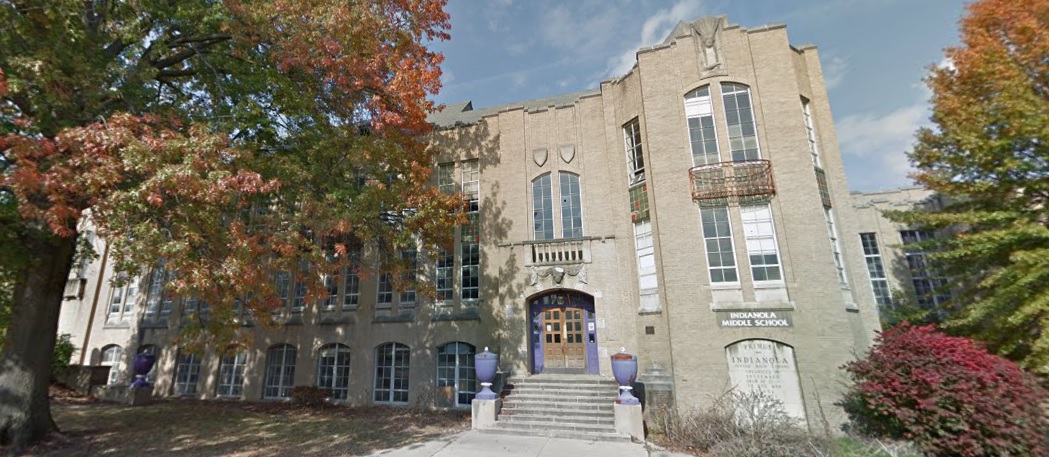
Indianola Junior High School Address: 420 E. 19th Avenue Built: 1929 Status as of April 2022: Existing, with a Renovation Plan
Indianola in 2015.
Some good news for the very first Junior High building in the United States. An independent STEM school chain, Metro Schools, announced in May of last year that they will be renovating the old school for grades 6-12. Through April of this year, renovation does not appear to have started, however.
Bellows Avenue Elementary Address: 725 Bellows Avenue Built: 1905 Status as of April 2022: Existing, with a Renovation Plan In November of 2021, Columbus City Council approved redevelopment plans that would renovate the school into a mix of office space and apartments. Additionally, the remaining school site land would be filled with new townhomes. Work has yet to begin on this project, however.
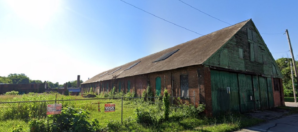
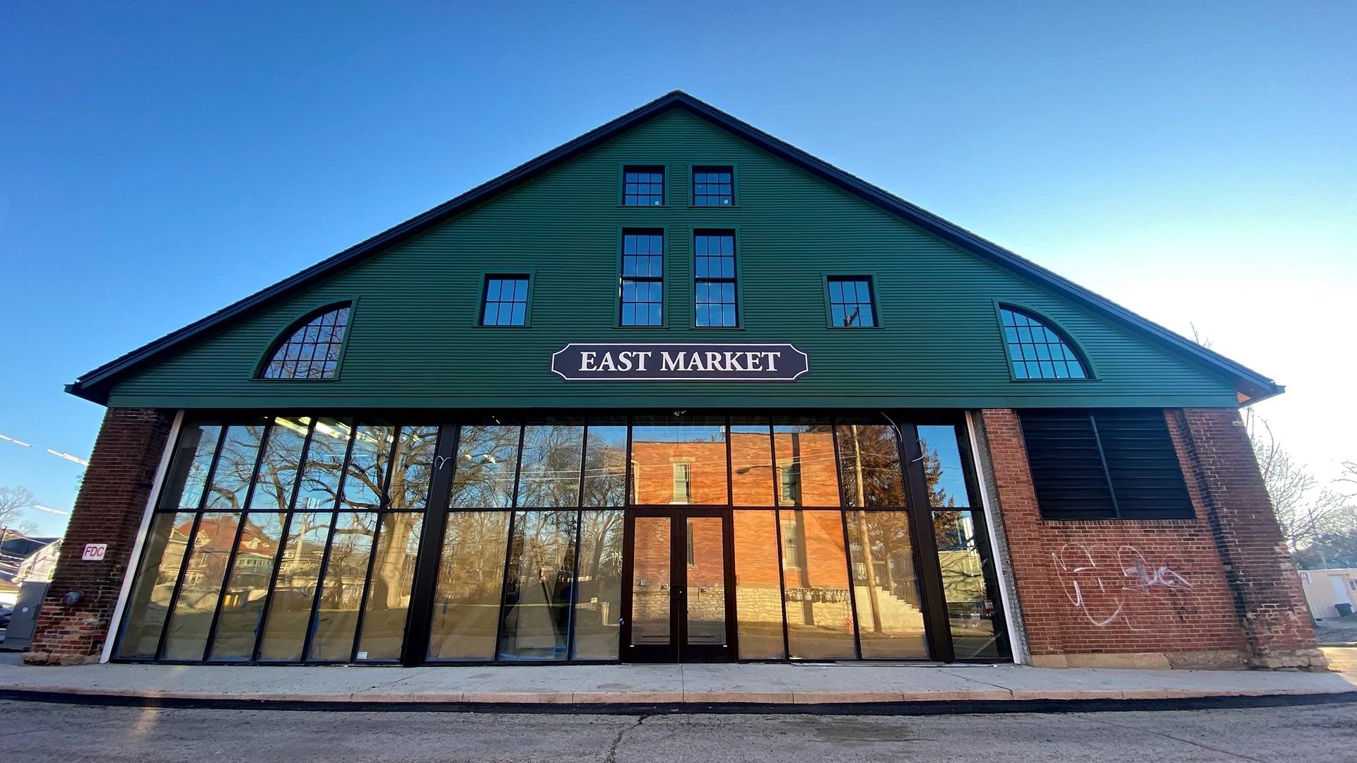
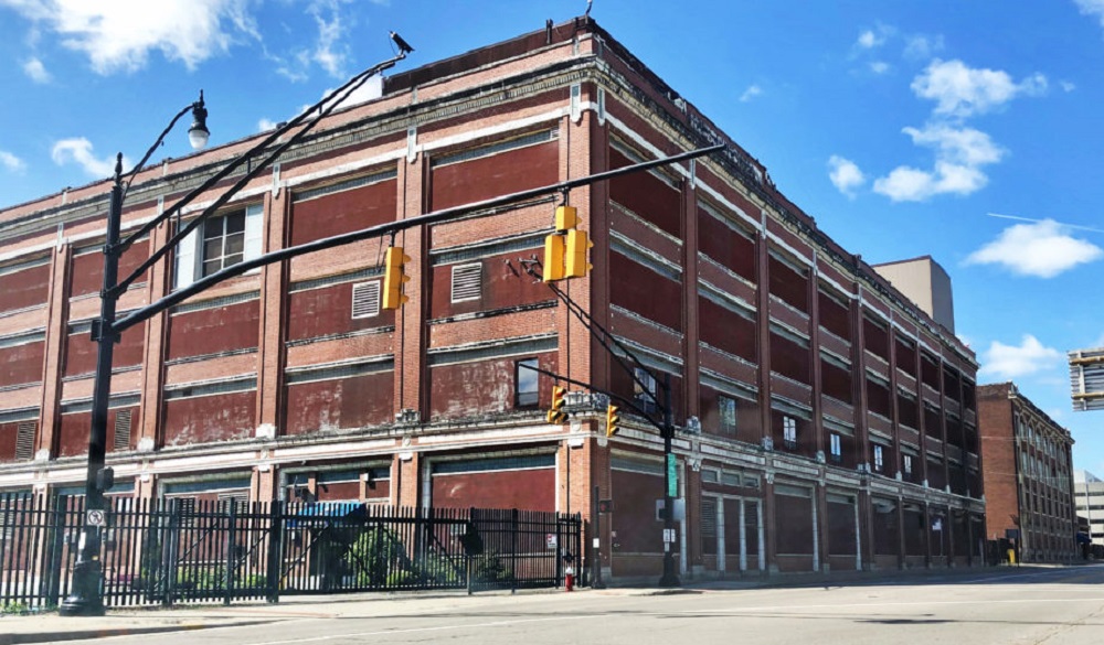
Near East Trolley Barn Complex Address: 1600 Oak Street Built: 1880-1900 Status as of April 2022: Renovated
The main trolley barn and grounds in 2019.
The old trolley barn as of April 2022.
A renovation to turn the trolley barn into East Market has more or less been completed, and the surrounding grounds have also been rebuilt.
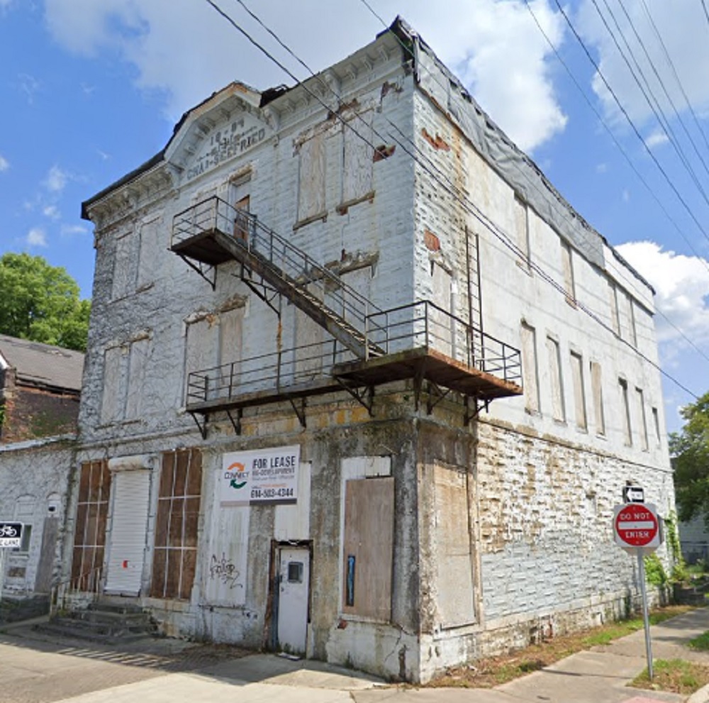
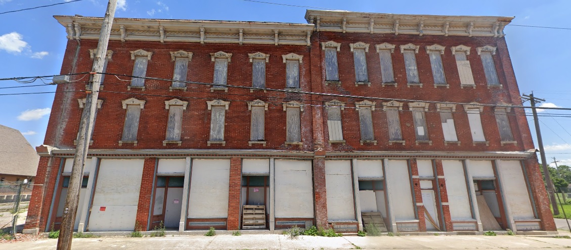
Kessler’s Corner Grocery Address: 553-555 W. Town Street Built: 1884 Status as of April 2022: Existing, but to be Demolished
Kessler’s in 2019.
The building had been vacant for more than 30 years, with a slew of owners not spending a dime on maintaining the structure- and apparently the city doing nothing about it. Ironically, the current owner has some history with restoring buildings like this, but claim the building is too far gone to save. The reality, however, is that only very rarely can a building not be saved. It largely comes down to the cost-return analysis, meaning that restoring this building would likely cost more than the return the owner wants to get out of it. They will say it’s beyond saving, but really it’s just beyond what they want to spend. And so, another piece of Columbus history is lost.
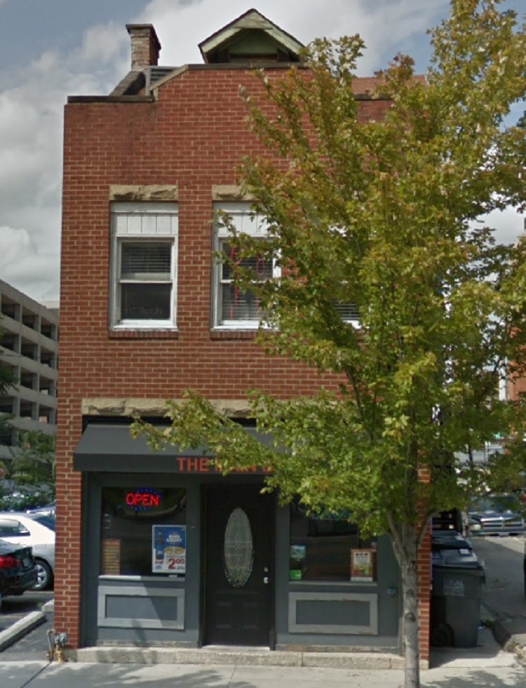
The Main Bar Address: 16 W. Main Street Built: 1880s Status as of April 2022: Demolished
The Main Bar building in 2016.
This one really irks me. The Main Bar building was a small, historic building that was in great condition. It was demolished in 2021 not because of a proposed development project or because it was unsafe or in poor condition. Nope, it was torn down… for parking. The Downtown Commission allowed the demolition despite the fact that their own development standards forbid demolition without a replacement project planned, and also forbids it solely for surface parking space. Yet it happened, anyway. Why? At this point, who knows. Downtown development standards are rarely enforced by the Downtown Commission. Half the recently-built projects along High Street shouldn’t have been allowed as built, so the fact that they weren’t followed here, either, is no surprise. The owner promised that there would eventually be a development proposal for the site, but they didn’t have one at the time of demolition and still don’t.
Macon Hotel Building Address: 366 N. 20th Street Built: 1888 Status as of April 2022: Existing, with a Renovation Plan
The Macon in 2019.
This old building, famous for its jazz history, has been vacant for decades. Various redevelopment and renovations proposals have come and gone. A new one from the summer of 2021, and hopefully one that we see finally come to fruition, wants to renovate the structure back into a hotel with first-floor retail and restaurant space. No movement, however, has occurred on this project.
Kroger Bakery Building Address: 457 Cleveland Avenue Built: 1914 Status as of April 2022: Existing, with a Renovation Plan A proposal from last spring seeks to renovate the structures into a mix of uses with apartments and retail, with more apartment buildings proposed around the historic bakery buildings. This project has been approved, but work has yet to begin.
Threatened Buildings Not on the Columbus Landmarks List
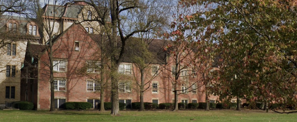
South Dormitory Address: 240 Parsons Avenue Built: 1935 Status as of April 2022: Existing, likely to be Saved
The South Dormitory in 2021.
This building was one of the dormitory buildings that were part of the old Institution for the Blind building that is now used by the City of Columbus. The City had been using it for offices, but claimed that it no longer functioned well for their purposes, so they proposed tearing it down for expanded parking space. Ironically, the complex already has a very large parking lot and garage that could be expanded upwards without requiring any demolition. Because the building itself is in good condition and because of the reason for the proposed demolition, there was immediate and heavy criticism of the plan. So much so that funding was pulled. While a new parking proposal hasn’t been released publicly, given the outcry, it seems unlikely that the City will move forward with the demolition itself.
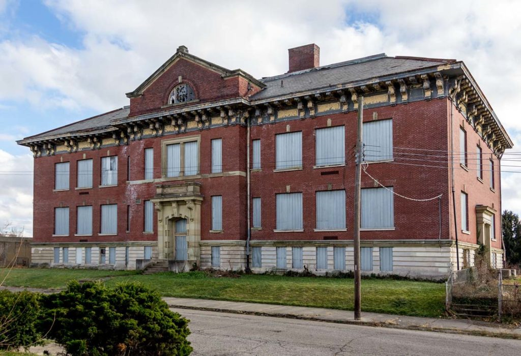
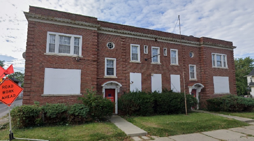
South Side Learning Center Address: 255 Reeb Avenue Built: 1927 Status as of April 2022: Existing, but with Demolition Plan
255 Reeb in 2019.
The former South Side Learning Center is being proposed to be demolished as part of Nationwide Realty’s Healthy Homes affordable housing company. The existing building is in good condition, but Healthy Homes says that it can be best renovated only into 1 bedroom units and efficiencies, but they prefer to build 2-3 bedroom units. That’s it… that’s the reasoning. So as with the Main Bar, there is nothing really wrong with the historic building other than that it can’t accommodate the specific desired unit size. If Healthy Homes only owned this specific lot, I could see how that may be an issue. However, they also own the few vacant lots to the west along Reeb and the land back to the rear alley. The overall site is more than large enough to build 3-4 multi-unit new buildings each with 2-3 bedroom units in addition to renovating the existing structure into 1-bedroom units, creating a dense pocket of necessary housing for all potential parties. In fact, such a proposal could potentially more than double the units actually proposed. Yet for some inexplicable reason, Healthy Homes doesn’t want to do that despite the claim that they need more housing.
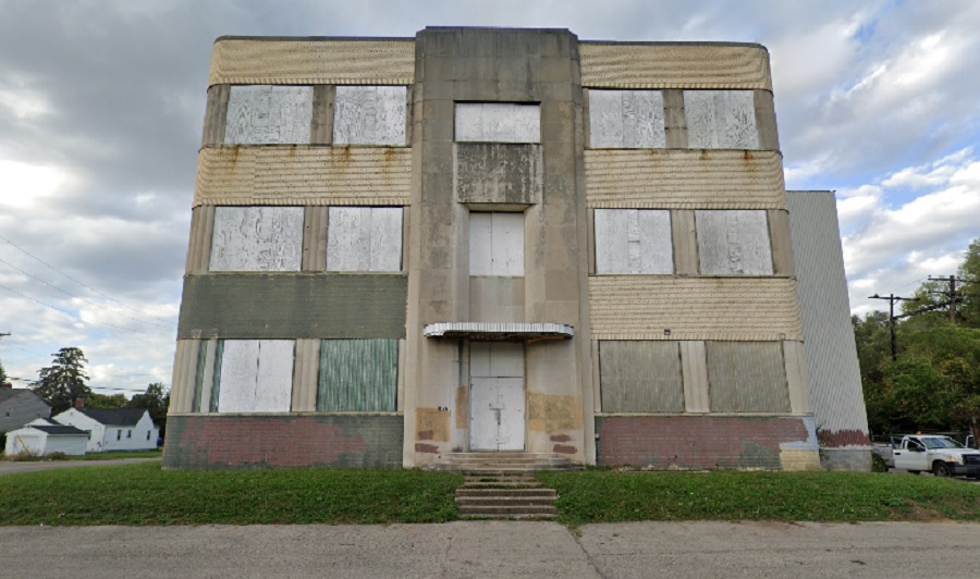
Jersey Farm Bakery Building Address: 1826 E. Livingston Avenue Built: 1949 Status as of April 2022: Existing, but with Demolition Plan
The bakery building in 2021.
While not as old as some of the other buildings on this list, this large art-deco style factory building still has some architectural interest and history attached. Woda Companies initially planned to renovate the building into residences, but now want to tear it down and replace it with a 4-story affordable housing complex with some retail space. Unfortunately, the latest proposal is fairly generic and somewhat garish with the choice of colors. A project that would’ve at least incorporated the Livingston-facing part of the building would’ve gone a long way to make this project more interesting. The overall site is very large at nearly 3.3 acres, so there was plenty of space to do something unique here. This seems like a huge missed opportunity.
Columbus and the greater region are set to change significantly in the coming years, with its trajectory of population growth only meaning greater pressure to build. But as those projects come, more and more old buildings could be lost if forward thinking fails.
To explore other proposals around Columbus, the best place is here.
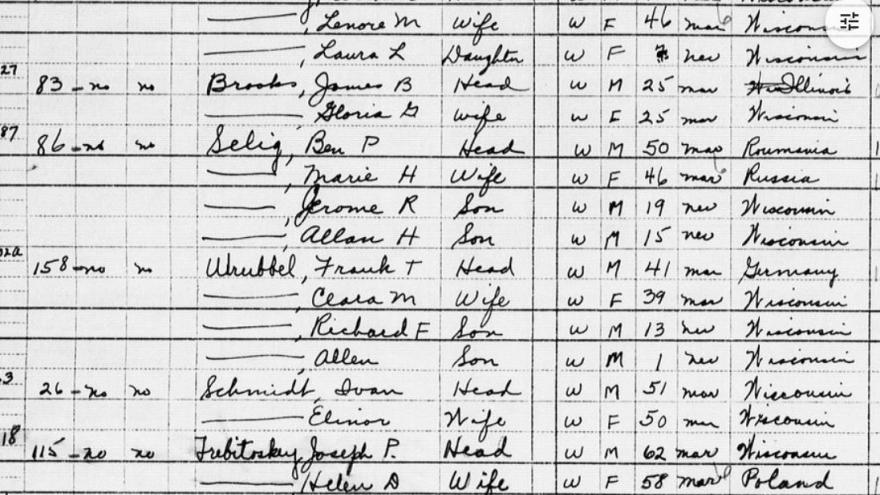
In today’s edition of the series, we have a Cool Link for the 1950 Census. 1950 census data was already available on different websites, but it was general population and demographic data only. The National Archives and Record Administration, or NARA, has now released complete records. Many of these records were unavailable to the general public prior to this release because the data fell under what’s called the “72 Year Rule”, in which the US government will not release any personally identifiable information until 72 years has passed after the date of data collection. With the 1950 Census, that time has come.
You can search the records by place, record type or even by a person’s name. This is great not only for historic population and demographic data, but also for genealogical research into family histories.