Columbus Economy February 2022

Columbus economy February 2022

The Columbus economy in February 2022 continued its slow recovery from the Covid pandemic crash of 2020. Let’s break it down.

Overall Metro Area February 2022 and Change from February 2021
Labor Force: 1,126,967 +9,435
Employed: 1,085,393 +27,948
Unemployed: 41,574 -18,513
Unemployment Rate: 3.7% -1.7
Total Non-Farm Jobs: 1,102,000 +25,400

Overall Metro Area February 2022 and Change from February 2020 (Pre-Pandemic)
Labor Force: 1,126,967 +10,719
Employed: 1,085,393 +13,820
Unemployed: 41,574 -3,101
Unemployment Rate: 3.7% -0.3
Total Non-Farm Jobs: 1,102,000 -9,400
In most categories, the metro area overall has fully recovered to levels just before the pandemic crash- and has improved upon most metrics. Non-farm jobs is the only area that has not yet fully recovered.

Now let’s view the results by industry.

Mining/Logging/Construction
2/2020———–2/2021———-2/2022

42,500————41,000———44,400
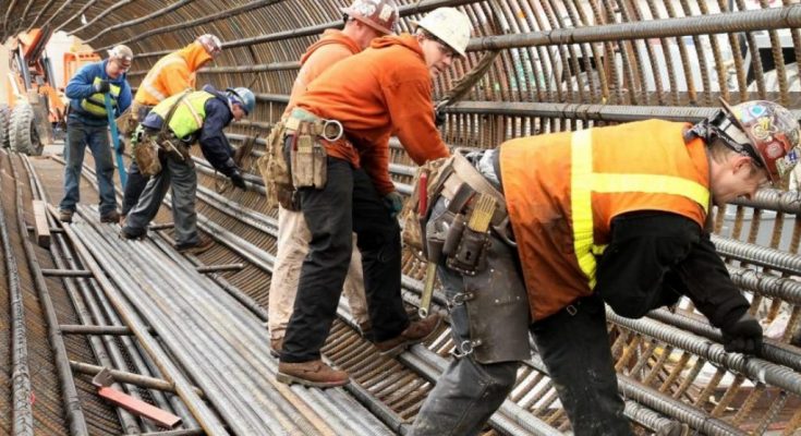
The construction industry (Columbus doesn’t have a significant mining or logging industry) has surpassed pre-Covid levels.

Manufacturing
2/2020———–2/2021———-2/2022

73,000———–71,700———-72,600
Manufacturing hasn’t fully recovered, but appears likely to within the next few months.

Trade/Transportation/Utilities
2/2020———–2/2021———-2/2022

215,600———-222,800———234,900
This industry has gone well past pre-pandemic levels is one of the strongest performing in the metro area.

Information
2/2020———–2/2021———-2/2022

16,500———–15,200———-16,500
Information has fully recovered to pre-pandemic levels, but only just. It remains to be seen how much further it will improve as the industry had been losing jobs steadily since the end of 2018.

Financial Activities
2/2020———–2/2021———-2/2022

85,900———–85,000———-84,600
Unlike other industries, financial activities did not drop significantly during the crash. It did fully recover all lost jobs by November of 2021, but has slid some since.

Professional and Business Services
2/2020———–2/2021———-2/2022
178,800———-176,500———175,400
As with the Financial Activities sector, this industry did fully recover by the fall of 2021, but is now lagging a bit.

Education and Health Services
2/2020———–2/2021———-2/2022

165,100———-158,500———159,700
Although recovering slowly and ahead of last year, this industry has yet to return to pre-pandemic levels. Part of the reason for this may have been the mass resignations within the health industry due to burnout from stress.

Leisure and Hospitality
2/2020———–2/2021———-2/2022
106,800———-87,200———-96,500
This industry was arguably hit the hardest of any during the pandemic crash (jobs fell by nearly 50%), and in many cases has struggled to fill existing jobs as the economy has improved. Still, trends suggest that the industry will be fully recovered by this summer.

Other Services
2/2020———–2/2021———-2/2022

41,900———–38,800———-40,400
Another industry that will likely be fully recovered by summer or early fall.

Government
2/2020———–2/2021———-2/2022

185,300———-179,900———177,000
As the state capital, Columbus has always been heavy in this industry. However, for whatever reason, government jobs just haven’t been coming back as much and may not recover fully until sometime next year.

While the overall metro has largely recovered, several industries have not. However, most are trending towards passing pre-pandemic levels by this summer- barring any other economic problems from Covid or global events.

The Bureau of Labor Statistics, the source of this data, is useful for local employment data for any metro area in the United States.


Politics and Covid-19


Politics and Covid-19 Ohio

I largely avoid politics here because it’s a much more subjective topic that is far less data-focused in nature than what I try to provide here, so the most political I’ve gotten was to provide past election results and county voting trends with no political commentary. This post will attempt to maintain that line between data and opinion, but I understand that the topic of politics and Covid-19 is already a very controversial mix, and simply sticking to the data won’t necessarily be perceived as unbiased by all who read this. With that in mind, I can only say that this post is based on existing, straightforward data, and I have made no attempts to add any personal biases to the results one way or another.
With all that said, I was curious whether there was any correlation between voting patterns and Covid cases/deaths locally, specifically with Ohio’s 88 counties. There has been some suggestion in the media that Red- or Republican-voting places- have generally had worse outcomes than Blue- or Democratic-voting counties. So we will look at the following factors to see if that holds true locally:
1. Total Cases
2. Total Cases Per Capita
3. Total Deaths
4. Total Deaths Per Capita

But we first must establish what the Red vs. Blue counties are. Ohio doesn’t register voters by party affiliation, so instead, I used county voting results for the past 6 presidential elections, or since 2000. Based on the % of voters voting for either Republican or Democrat, I created 5 different levels of political bias.
Deep Blue: Counties where Democratic voters beat Republican voters by 25 points or more.
Light Blue: Counties where Democratic voters beat Republican voters by 5-24 points.
Neutral: Counties where Democratic/Republican voter advantage falls under 5 points.
Light Red: Counties where Republican voters beat Democratic voters by 5-24 points.
Deep Red: Counties where Republican voters beat Democratic voters by 25 points or more.
The point system is taken from the average of the past 6 elections, so keep in mind that some counties may be more Red or Blue currently than the average suggests.

So based on that criteria, which Ohio counties are Red vs. Blue vs. Neutral? Well, Ohio’s overwhelming rural counties are mostly in the Deep Red category (39 of 88), followed by Light Red (34 of 88), Neutral (7 of 88), Light Blue (7 of 88) and just 1 Deep Blue county in the state. The map below breaks the counties down and gives the average voting bias across the last 6 elections.

Now we need to take those established voting biases and compare them to how the counties performed during Covid-19.
Case Numbers Through 3/31/2022
Total All Red Counties: 1,230,285
Total All Neutral Counties: 498,375
Total All Blue Counties: 944,141
Average Total Cases by County Group
Deep Red Counties: 15,138.8
Light Red Counties: 18,819.8
Neutral Counties: 71,196.4
Light Blue Counties: 96,563.6
Deep Blue County: 268,196
On first glance, it would seem that Red counties did much better on average despite having more cases overall, but the problem is that those counties have much lower populations and literally cannot have the same average totals of more populated ones. That’s why we instead have to look at per-capita cases.
Total Cases Per 100K People
All Red Counties: 23.9
All Neutral Counties: 22.8
All Blue Counties: 21.9
Deep Red Only: 23.7
Light Red Only: 24.0
Neutral Only: 22.8
Light Blue Only: 22.0
Deep Blue Only: 21.7
With per-capita, the story is exactly the opposite, with Red counties having more cases by population. If you’re wondering why the Deep Red counties had a slightly lower per-capita rate than Light Red, the answer is Holmes County. Perhaps due to its heavy Amish population that tends to avoid modern medicine and technology- and largely keep to themselves in the process- reported per-capita cases there were the lowest in the state by far, and single-handedly lowered the entire Deep Red county grouping below Light Red counties. Regardless, the outcome was still the same- Red did worse.
Top 10 Highest Per-Capita Case Rate
1. Marion: 30.5
2. Lawrence, Scioto: 30.0
3. Pickaway: 29.9
4. Muskingum: 29.3
5. Jackson: 27.4
6. Fayette: 27.3
7. Guernsey: 26.9
8. Allen, Defiance, Pike: 26.8
9. Union: 26.4
10. Clark, Erie: 26.1
Top 10 Lowest Per-Capita Case Rate
1. Holmes: 11.6
2. Geauga: 17.1
3. Carroll: 19.5
4. Wayne: 20.0
5. Meigs: 20.1
6. Ashtabula: 20.3
7. Washington: 20.6
8. Summit: 20.7
9. Ottawa: 20.9
10. Trumbull: 21
Of course, one of the caveats with this data is that many, many cases went unreported, and those cases were more likely to be in rural areas with lower access to testing and medical facilities. There’s also the issue that Covid doesn’t always present with symptoms. So, it’s possible that the per-capita discrepancy was even larger.
Deaths, however, are more concrete. Not all of them have been counted either, obviously, but it’s a lot harder to hide a death than it is a symptomless case.
Total Deaths Through 3/31/2022
All Red Counties: 18,295
All Neutral Counties: 7,219
All Blue Counties: 12,523
Average Total Deaths by County Group
Deep Red: 227.6
Light Red: 277.0
Neutral: 1,031.3
Light Blue: 1,253.3
Deep Blue: 3,750.0
Again, on the surface, the average looks bad for Blue counties despite having the lower overall total, but the truth again rests with the per-capita figures.
Total Deaths Per Capita by County Group
Deep Red: 394.4
Light Red: 390.4
Neutral: 345.4
Light Blue: 328.6
Deep Blue: 304.0
On a per-capita basis, Blue counties lost 76 fewer people per 100K than did Red counties. That’s a lot of lives.

So what can be concluded from all this? The first is that the results in Ohio were not isolated. Across almost all states, Blue-leaning states had better outcomes per-capita than Red. Speculation as to why that is runs the gamut, from better overall local policies to differing views on science to even education levels and access to harmful media sources that disseminate misinformation. Whatever the case may be, the United States has lost more people than any other nation in the world, at now over 1 million. It is by far the worst pandemic and the worst natural disaster in American history. With so much bad news these days, we can only hope that something valuable has been learned in all this terrible mess.

What the Intel Semiconductor Fabs Mean for Columbus


What the Intel Semiconductor Fabs Mean for Columbus

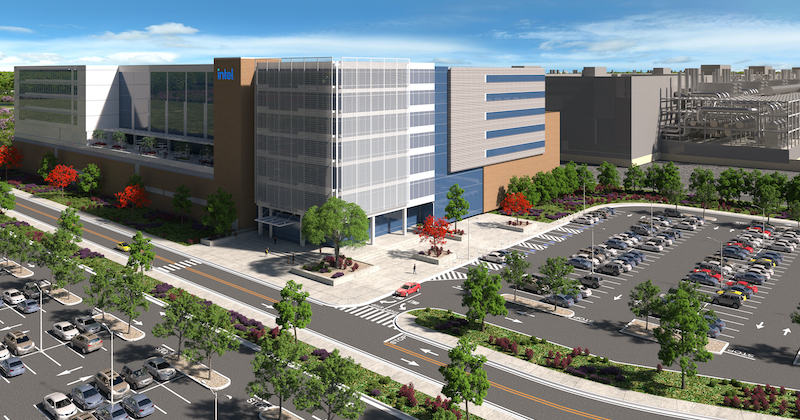
The Columbus area will soon be home to Ohio’s largest private investment in history with the Intel semiconductor fab planned for the Franklin County/Licking County line in New Albany. While this is not within Columbus itself, this project has massive implications for the city, region and possibly even Ohio overall. Let’s examine exactly what the Intel semiconductor fabs mean for Columbus, and some of the potential impacts the project may have for years to come.

What is it?
Semiconductors -at their most basic- conduct electricity, and are essentially what are used to make microchips. As such, they are crucially important for virtually all types of electronics, from cars to computers to ATMS to household appliances. Because they are so important, everyone needs them. Unfortunately, however, their production is more complex than many other types of manufacturing. Their production plants require large amounts of power and water, and manufacturing areas have to be free of things like static electricity and humidity, which can damage semiconductors. Furthermore, the jobs typically require specialized training and degrees. What all this means is that building a semiconductor factory- or fab- is enormously expensive. A single fab can easily cost $10-$20 billion, so there aren’t that many companies in the world that can actually build them- in fact, there are currently just 38 companies in the entire world capable of manufacturing them.

The proposed fab in New Albany is significant in several ways. First of all, as mentioned above, it will be Ohio’s largest single private investment in history, significantly more than any auto manufacturer or other industry. The first phase of the project has been announced, and will include two fabs at a cost of $20 billion, and will provide 3,000 direct jobs, 10,000 ancillary jobs and 7,000 construction jobs. The fab jobs will have an average salary of $135,000, about 2.5x the Ohio average. While this first phase is huge on its own, it seems that it will just be the beginning.

For some time, Intel has been talking about building a “mini-city” type development somewhere in the US. This mini tech city would include up to 8 or more fabs, and along with supporting development would be an investment greater than $100 billion. When news first broke about the New Albany project, there was some speculation that this site would be where this gigantic development would go, especially given that it included more than 3,000 acres of available land. Now, it seems that we have confirmation that Central Ohio is indeed the location of this mini city. In a recent Time article, this section stood out:

“Our expectation is that this becomes the largest silicon manufacturing location on the planet,” Intel CEO Pat Gelsinger told TIME; the company has the option to eventually expand to 2,000 acres and up to eight fabs. “We helped to establish the Silicon Valley,” he said. “Now we’re going to do the Silicon Heartland.”

So now that Central Ohio is about to rocket to the potential forefront of microchip manufacturing on a global scale, what might be the consequences long term?

Impacts

It’s hard to overstate how significant this development will be for the Columbus area. Here are just a few.

Housing Market
While the effects of this project won’t be felt by most right away, the areas and communities nearest to it will likely see home prices escalate fairly quickly. Places like Johnstown, New Albany, Alexandria and Granville, among others, will likely see the fastest- and most significant- realization of this increase, but virtually every community within 50 miles will likely see upward pressure- certainly including Columbus, which will probably end up with a healthy majority of any new workers into the region.
What that means long term is that housing construction will also explode. The region, if anything, has been underbuilding for years despite high demand. Even before this news, it was estimated that Central Ohio needed roughly 2x-4x the residential units constructed each year just to meet existing demand. Because of that existing issue, the area has faced a deep housing shortage and a near monthly new median housing price record.
So housing construction will almost inevitably increase, but the makeup of that housing and where it will be built remains to be seen. No doubt suburban sprawl around the construction area will accelerate, but what happens in Columbus itself is likely to be somewhat different. The city could see a massive upward movement in urban infill projects that make the past decade look paltry in comparison.
You might be wondering why all this development would even occur just because of this one project, no matter how large it is, and that brings us to the next impact.

Population
A project as large as the Intel mini-city doesn’t happen everyday, and arguably nowhere else in the country is going to have something like it in the industry. Because of the scale and notoriety alone, it is inevitable that other companies- and not just tech- take notice and give the Columbus are a new look for investment or relocation. Columbus, and indeed Ohio, doesn’t have the high costs associated with the West Coast or even parts of the Sun Belt. Ohio doesn’t struggle with water supplies like the Southwest, has stable power, does not suffer from significant natural disaster threats, is positioned well for climate change and is arguably the best-located state for access to a majority of the US population. Seeing Intel make such a large investment in the state will attract other investments as well, and these new companies investing will need supporting infrastructure and companies of their own, as well.
In fact, this process has already begun. Intel itself has said that multiple other companies, such as Air Products, Applied Materials, LAM Research and Ultra Clean Technology, among others, are already moving to invest in the area. Many more will follow.
Over time, this will lead to a greater influx of people, spurring more and more development.
Obviously, this is not going to happen overnight. Intel’s first fab isn’t even due to be completed for potentially another 3-4 years, but the stars are aligning for the Columbus population to really begin taking off and enter a true golden age.

Infrastructure
Up to now, the Columbus region’s infrastructure has been more or less sufficient in handling the needs of the population, with some exceptions. The highway system has been more than adequate to ensure that most trips around the area are relatively quick and easy, but should a rapidly-rising population manifest, that highway and road system may quickly fall behind. Even with current growth levels, traffic is becoming more of an issue. It’s been rumored that the State is going to invest up to a billion dollars improving infrastructure in the area surrounding the site, but this most likely is limited to roadway expansion, if anything.
One big negative for the region has always been mass transit. Columbus remains one of the few large US cities without rail service of any kind. It’s certainly possible, if not likely, that MORPC and other local planning groups are going to be faced with increasing pressure to invest in driving alternatives. COTA can only go so far. The plan to build BRT routes in some areas of the city is a start, but rail needs to be part of the longer-term picture. At the very least, a few lines between Downtown and the airport, and perhaps the airport and New Albany is something that needs to seriously be considered. The Columbus region can no longer afford to keep putting these investments off. Planning needs to start now, not later.

John Glenn International Airport is another potential weakness. While it is fine as a regional airport, all this news should put greater emphasis on the plan to replace the current terminal with a new one. Originally, city planners were talking about 2030 or later for this to happen. Due to the pandemic and a drop in overall air traffic, those plans were likely moved back even later, but if anything, the plans should go forward even sooner. This will allow the city to gain more flights- perhaps even some truly international ones- that are going to be increasingly in-demand.

The reality is that these are just a handful of the potential long-term impacts for the city and region, but they are the ones most obviously likely to be impacted the greatest. In effect, Intel’s mini-city is not just a single economic boost for Central Ohio, but it could also be the first wave in a tsunami of transformation that will change Columbus- good or bad- forever.


Cool Link Columbus City Schools Covid Tracker


Columbus City Schools Covid tracker

With the Omicron variant running rampant, Columbus schools are facing significant absences from both students and staff. Keep track of this data with this hand link, which ranks the best and worst schools for absences, shows how many cases are being reported, quarantine data and more.

Columbus Schools Covid Tracker

How Columbus Changed in 10 Years Part 2


how Columbus changed in 10 years part 2 Columbus, Ohio

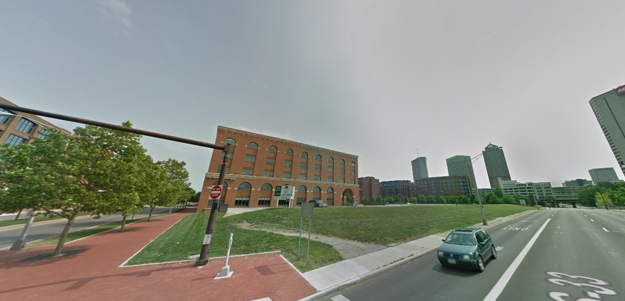
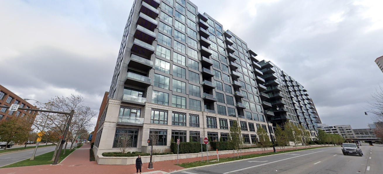
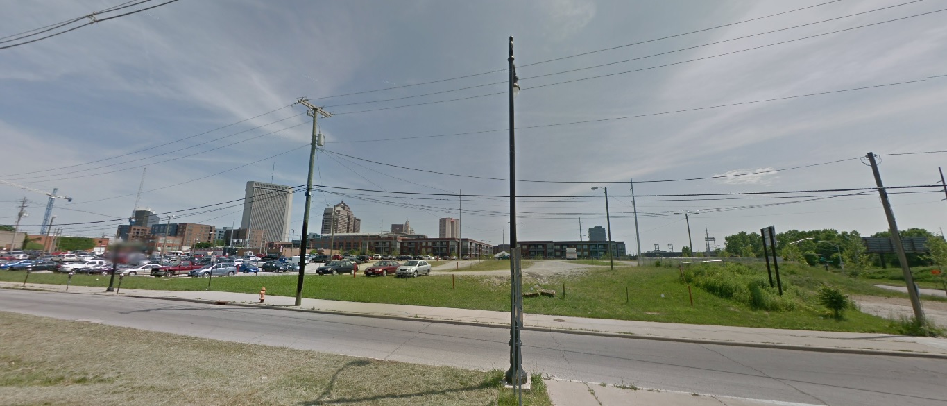
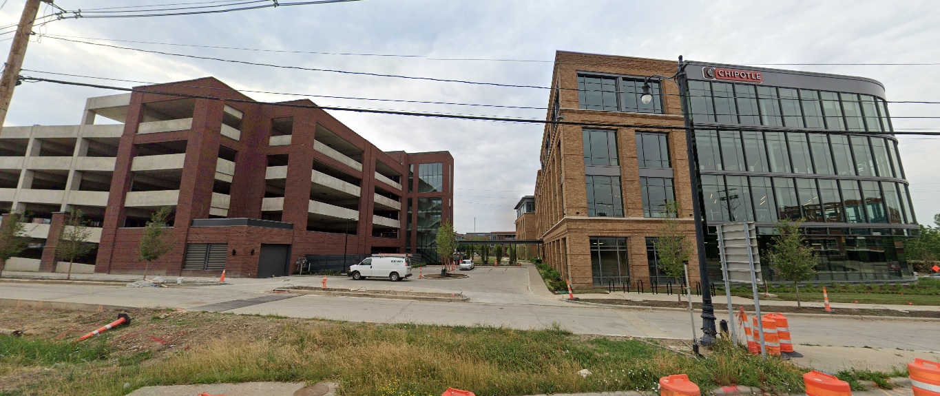
An overcast day in 2011.

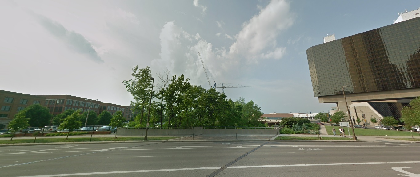
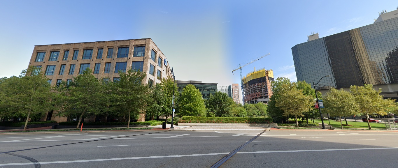
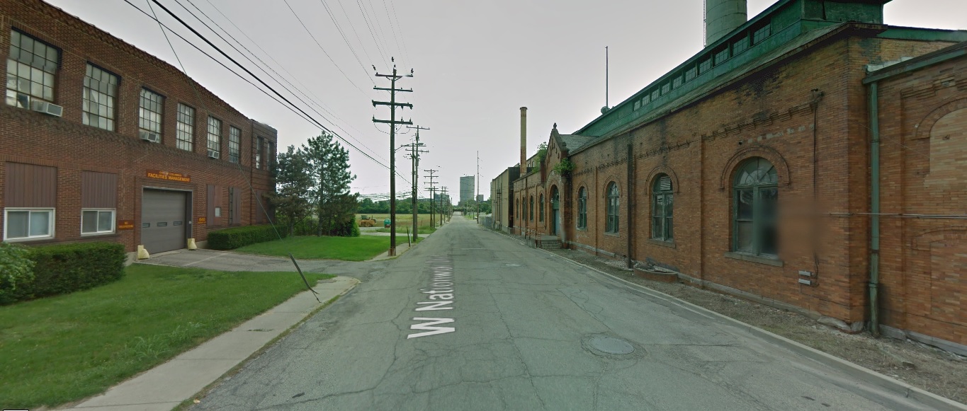
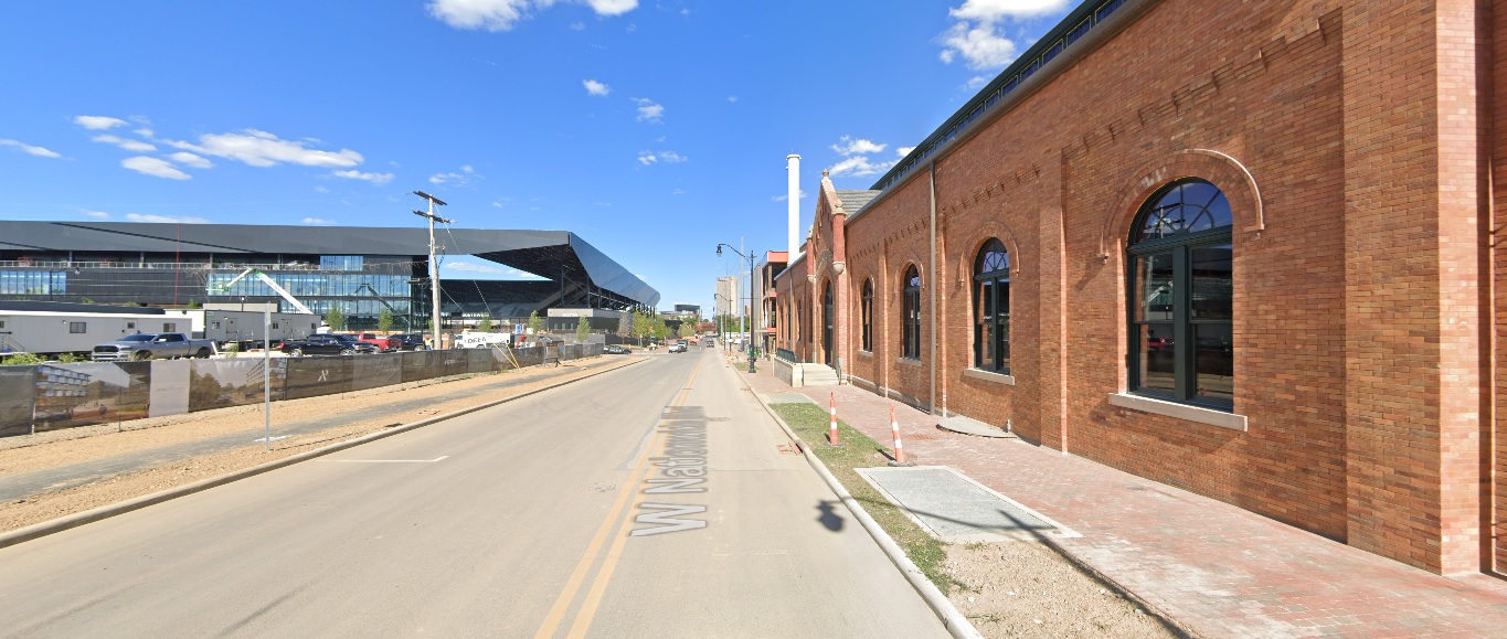
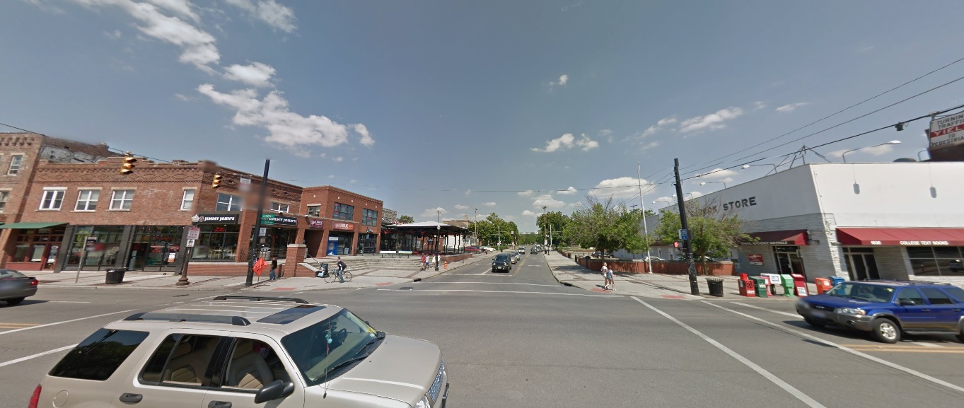
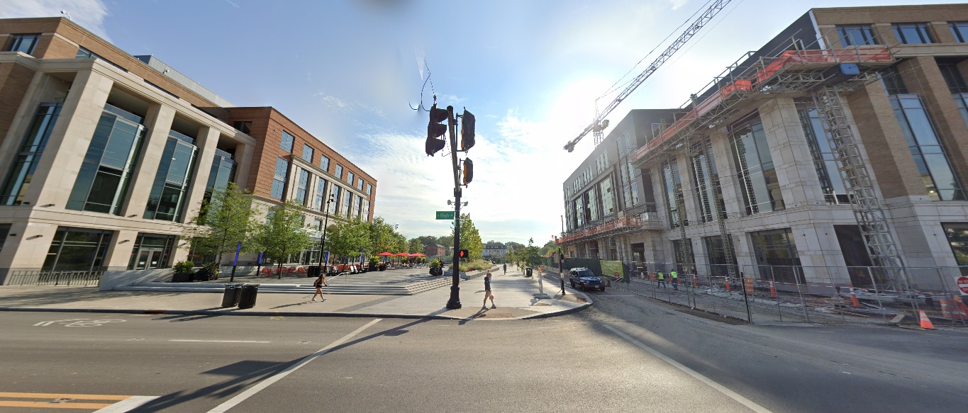
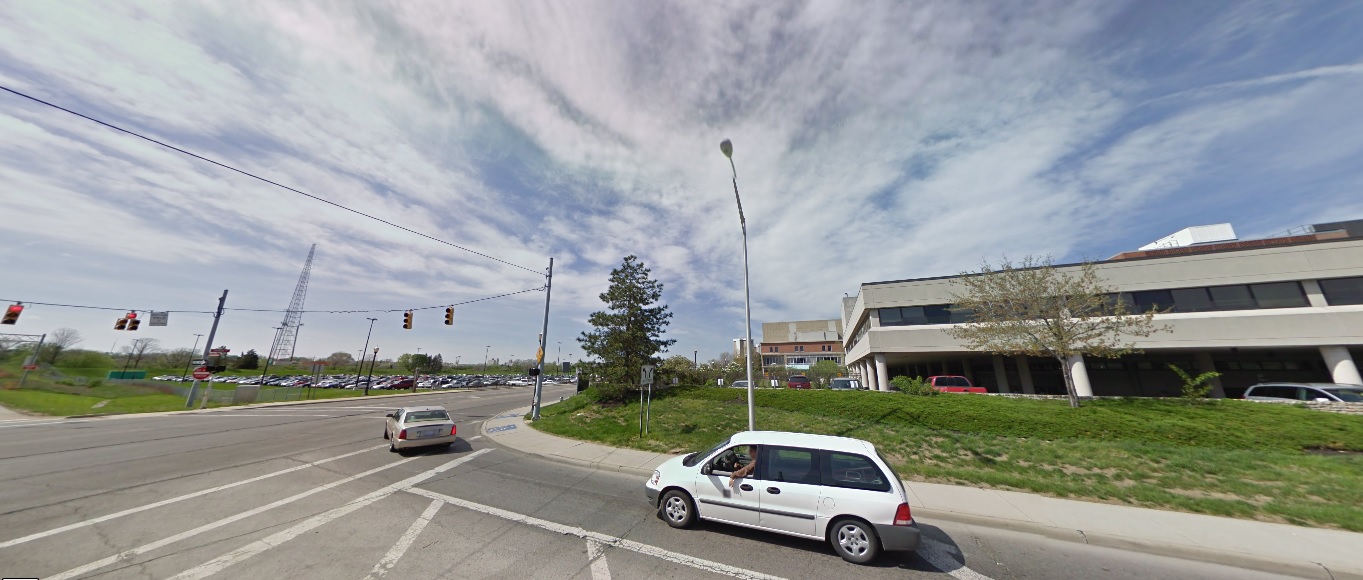
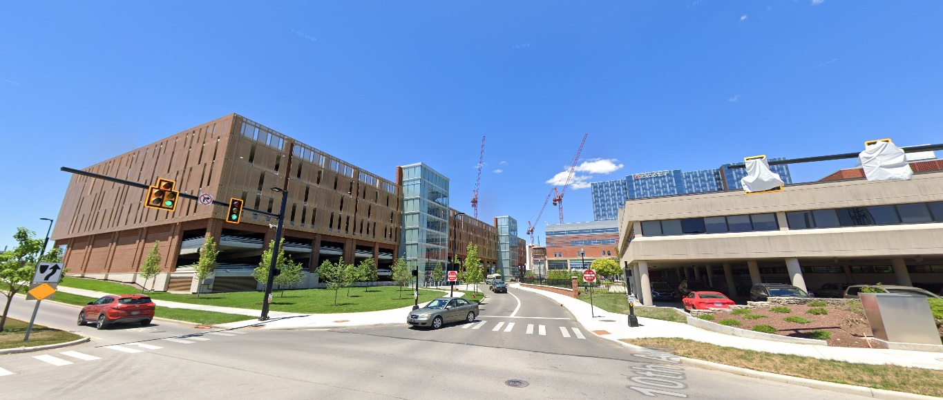
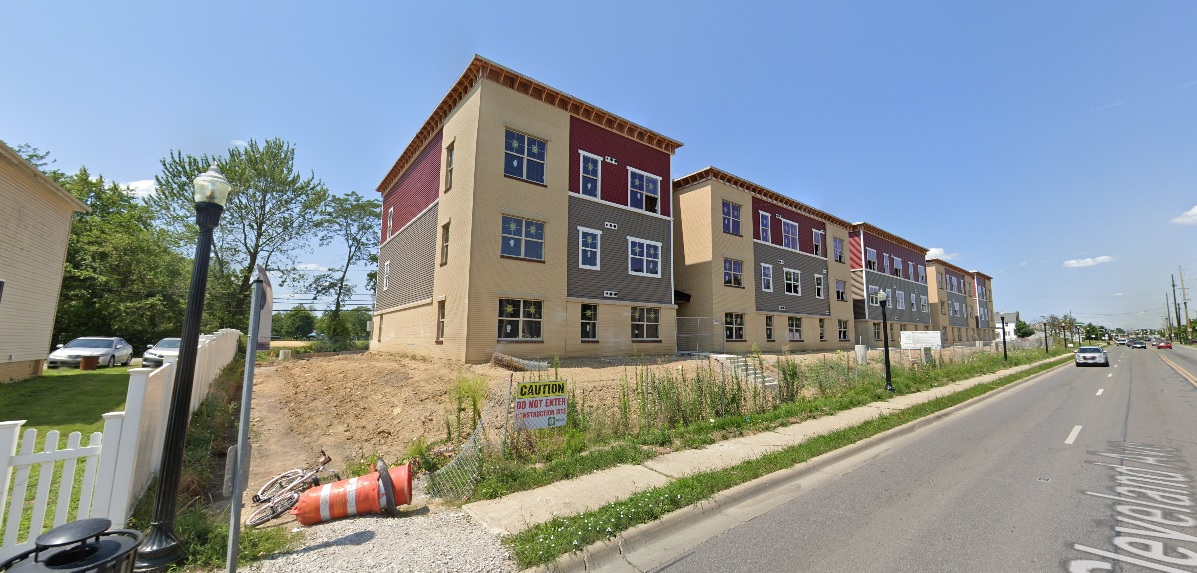
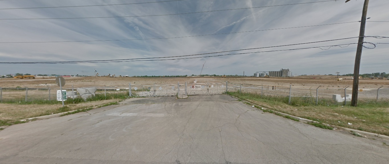
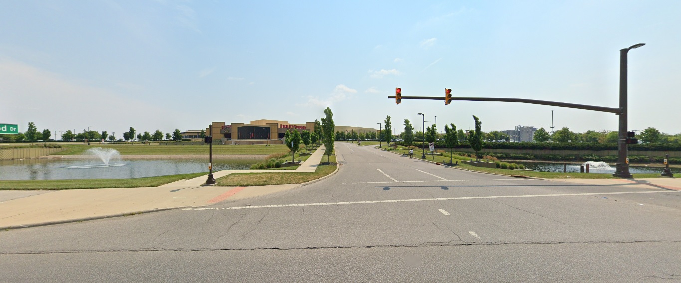
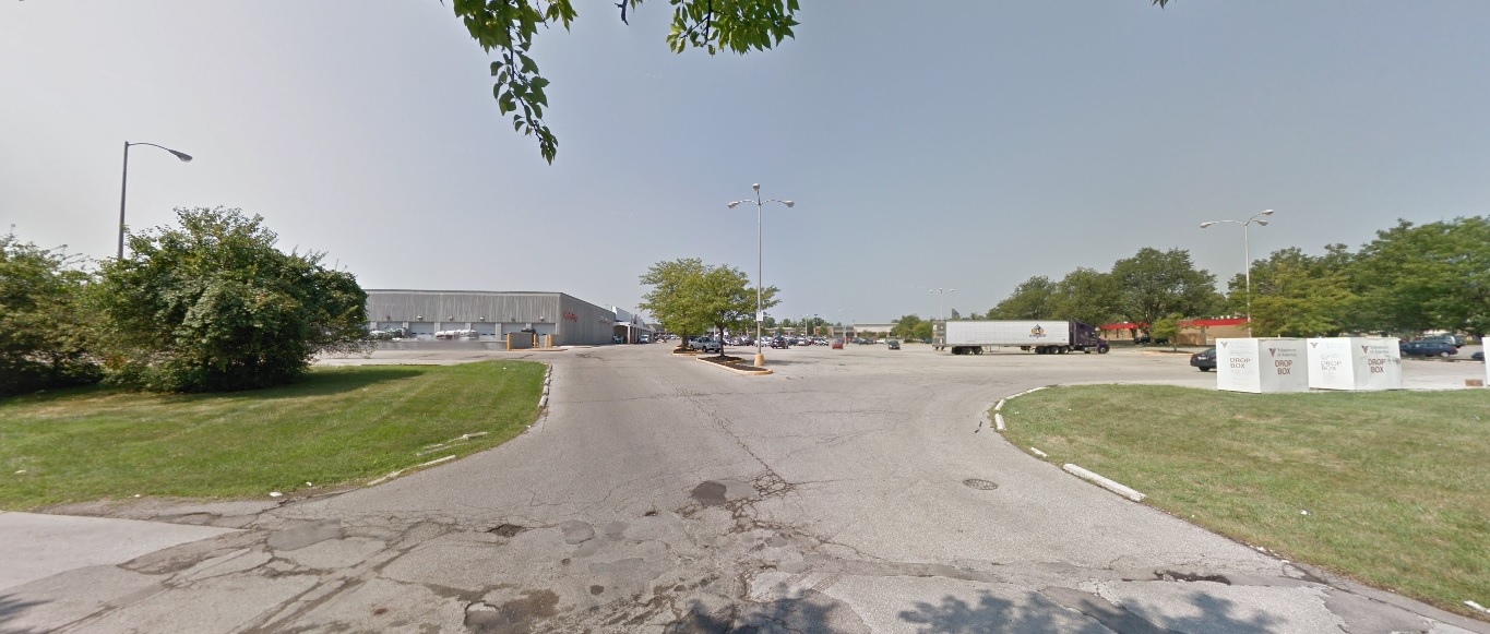
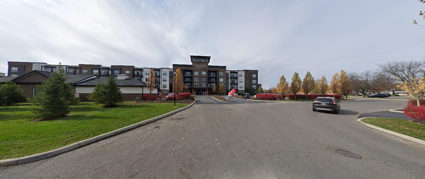
I received a massive positive response for the first version of this series, which was just a simple mashup of before and after photos of different parts of Columbus urban neighborhoods over the course of a decade. Because of that response, I have decided to do this How Columbus has changed in 10 years part 2 series. This time, besides adding more photos from core neighborhoods, I will expand the series out to other parts of the city and some suburbs, though still remaining within the 270 Outerbelt. In some ways, these before and after photos are even more drastic than the first set.

Downtown

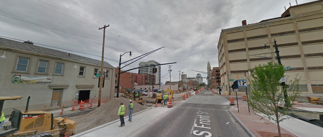
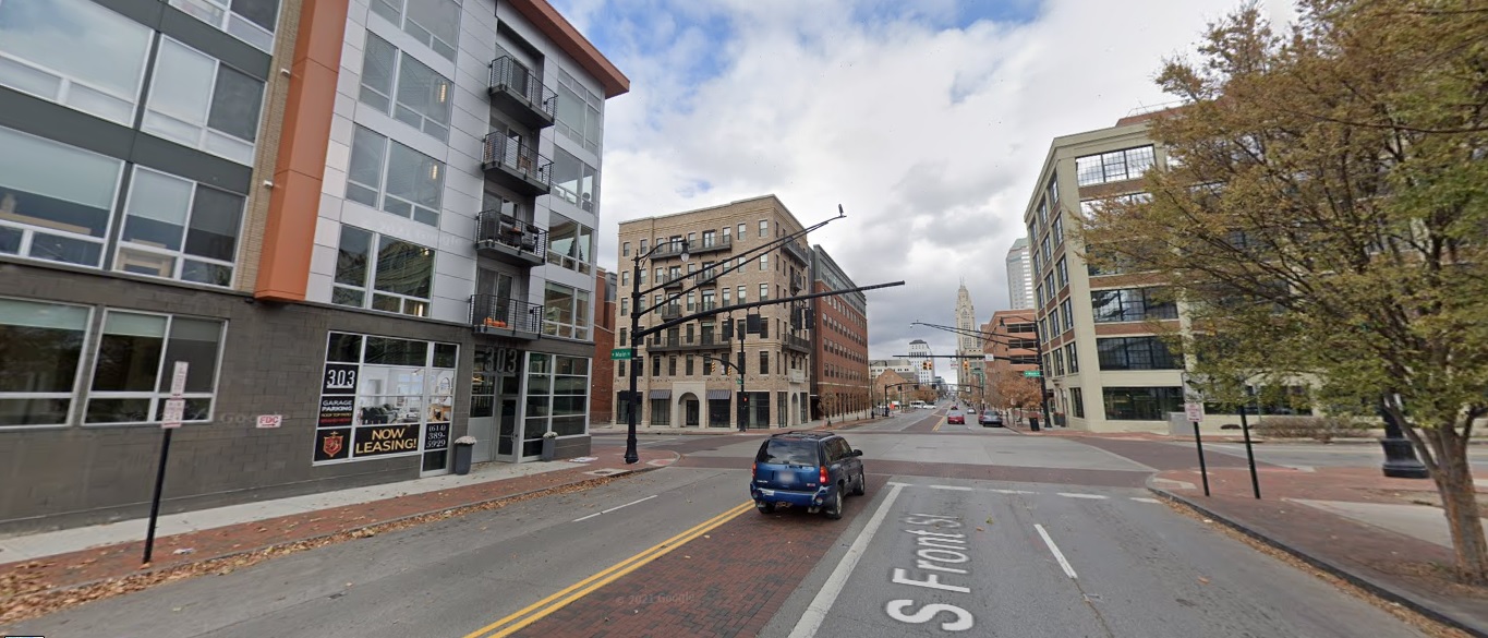
Front Street, looking north from Main Street.
Before: 2011

After: 2021

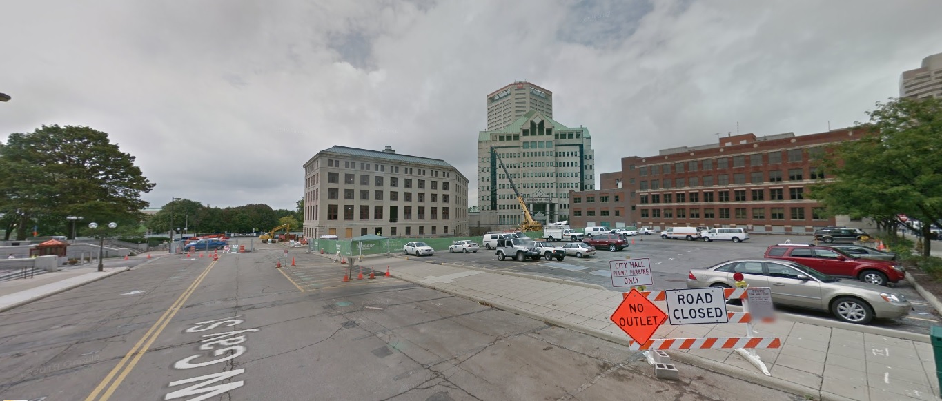
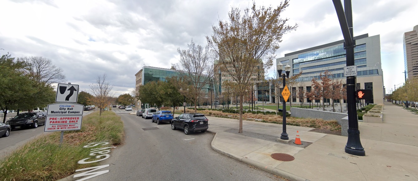
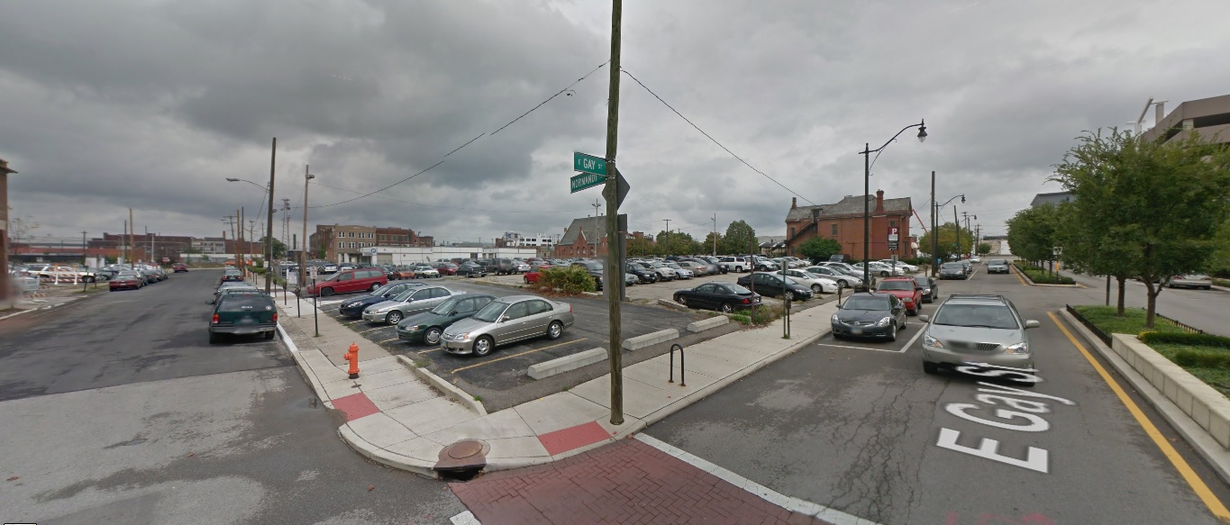
Gay Street, looking west from Front Street.
Before: 2011

After: 2020

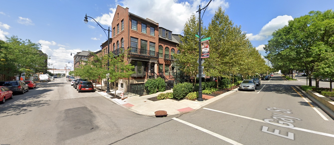
Gay Street, looking northeast from Normandy Avenue.
Before: 2011

After: 2021

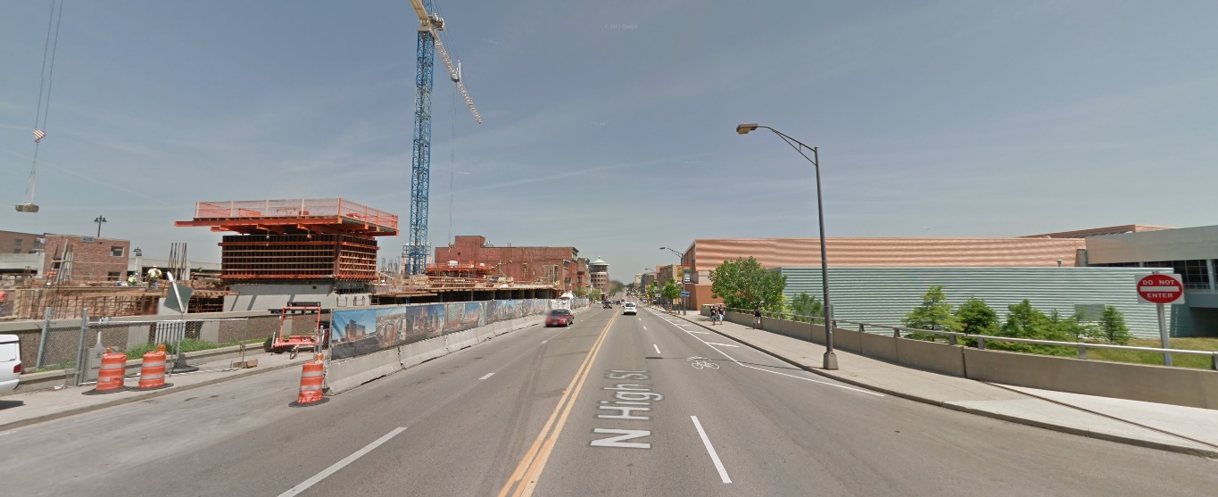
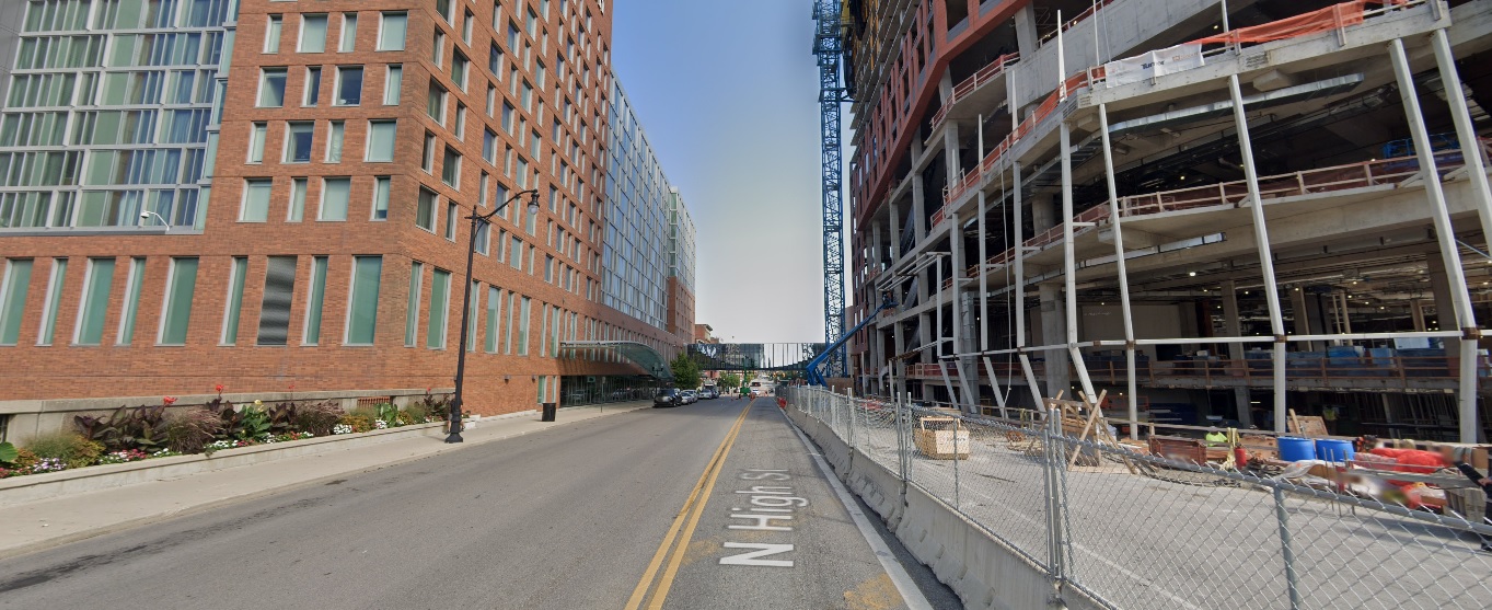
High Street, looking north at the Convention Center.
Before: 2011

After: 2021

Nationwide Boulevard, looking north just east of Front Street.
Before: 2011

After: 2021

Nationwide Boulevard, looking east from the Olentangy River.
Before: 2011

After: 2021

Spring Street, looking northeast from Neil Avenue.
Before: 2011

After: 2020

Spruce Street, looking south from 670.
Before: 2011

After: 2021

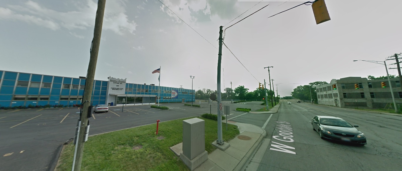
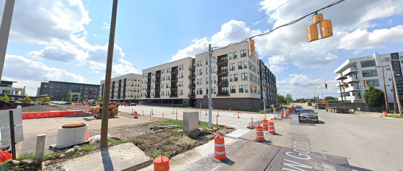
Goodale Street, looking west from the 315 Exit.
Before: 2011

After: 2021

Short North

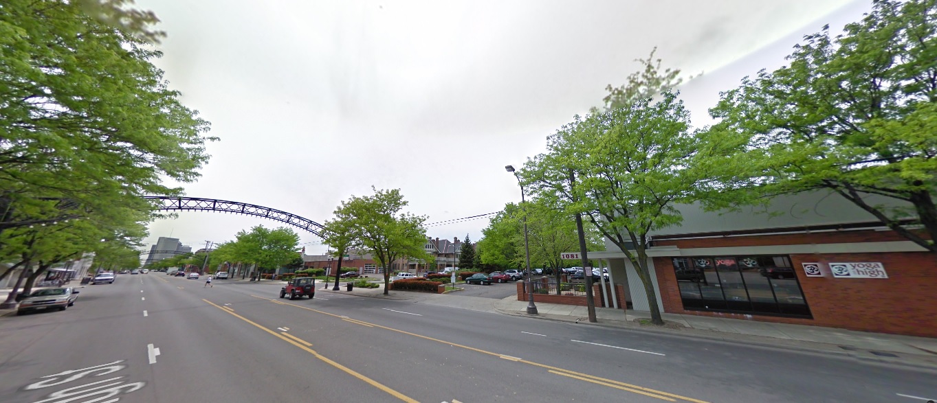
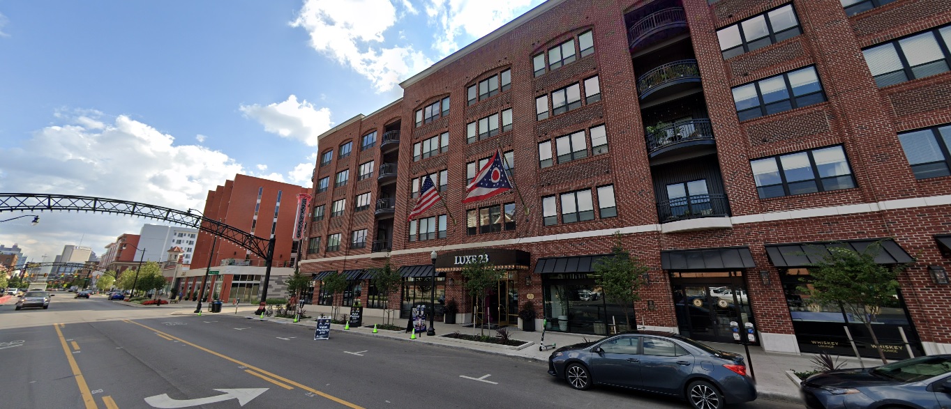
High Street, looking south just north of 3rd Avenue.
Before: 2009

After: 2021

Weinland Park

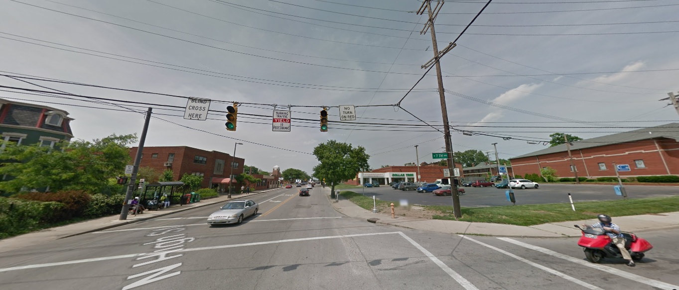
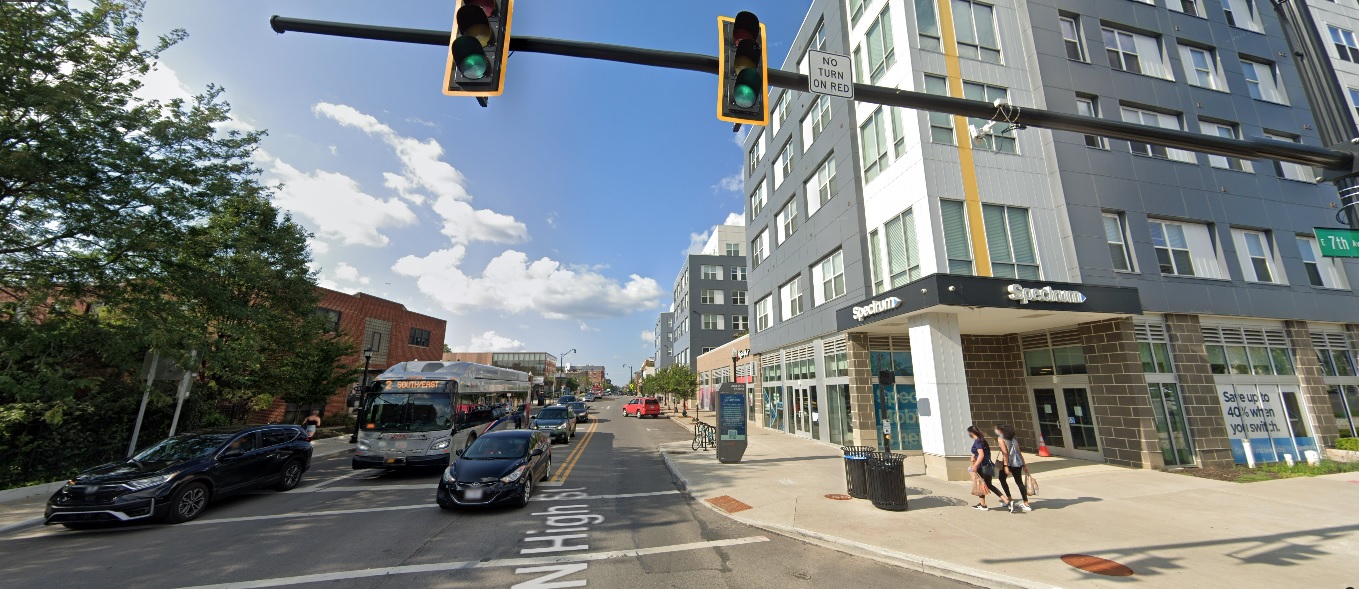
High Street, looking north at 7th Avenue.
Before: 2011

After: 2021

Italian Village

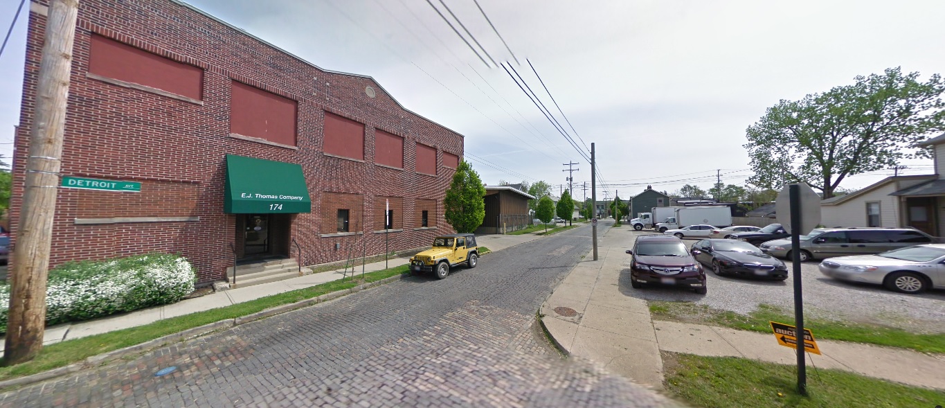
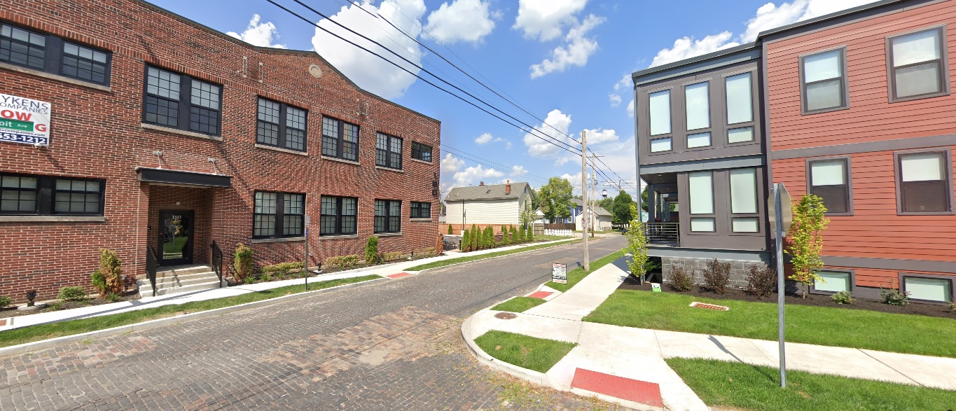
Detroit Avenue, looking east at Hamlet.
Before: 2009

After: 2019

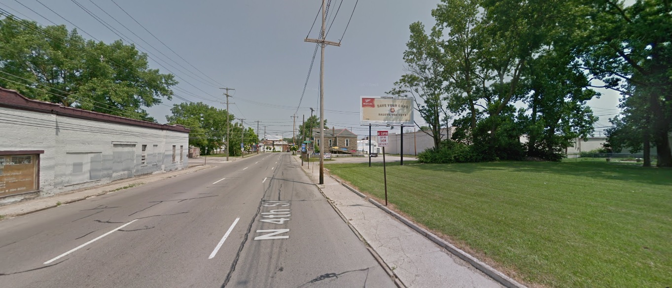
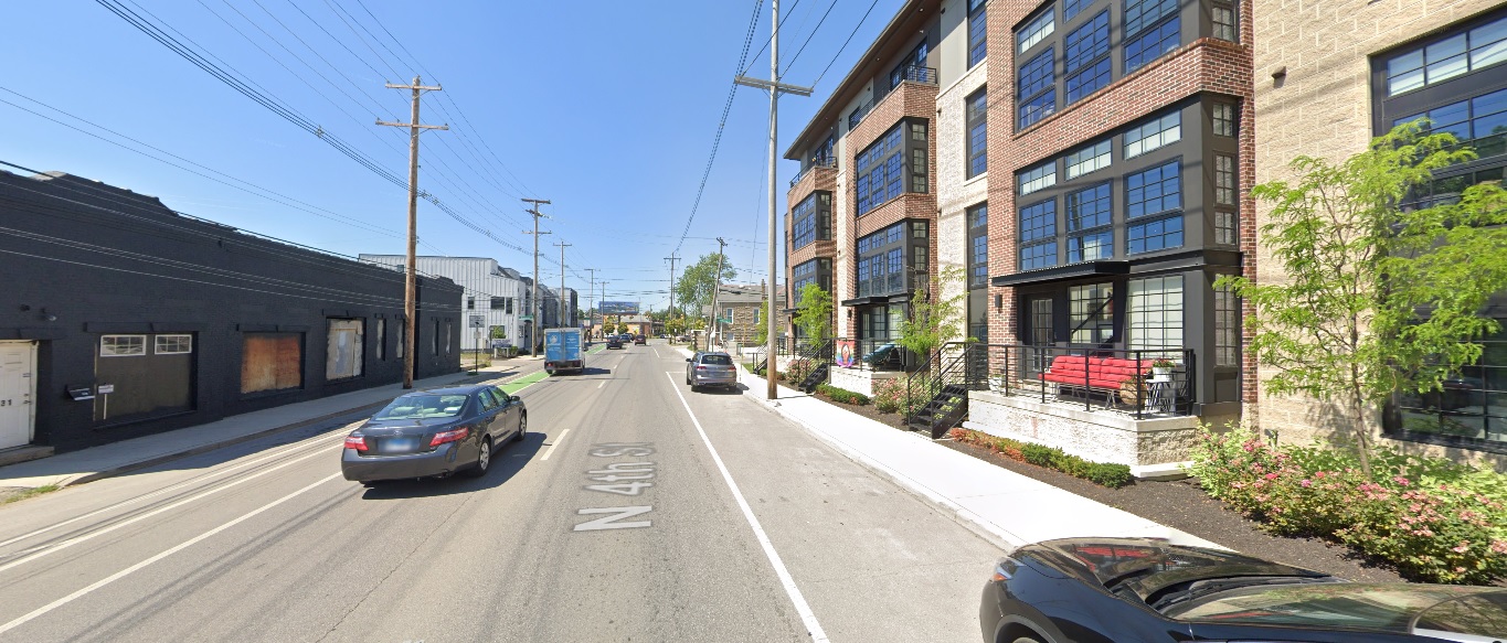
4th Street, looking north from 4th Avenue.
Before: 2011

After: 2021

OSU Campus

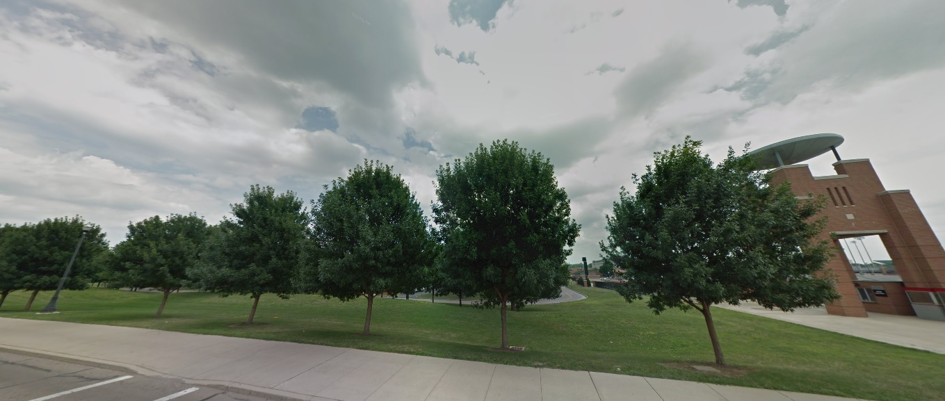
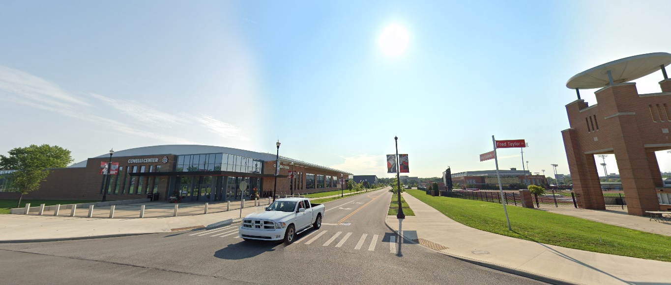
Fred Taylor Drive, looking east at Defiance Drive.
Before: 2011

After: 2021

High Street, looking east at 15th Avenue.
Before: 2011

After: 2021

Medical Center Drive, looking north at Old Cannon Drive.
Before: 2009

After: 2021

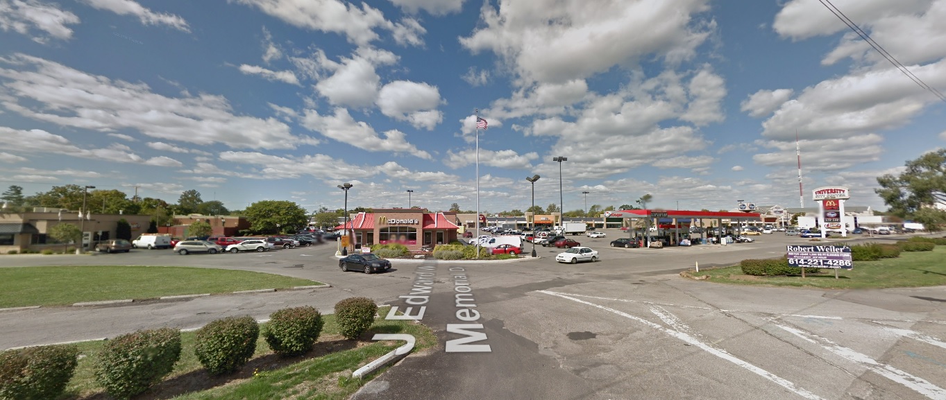
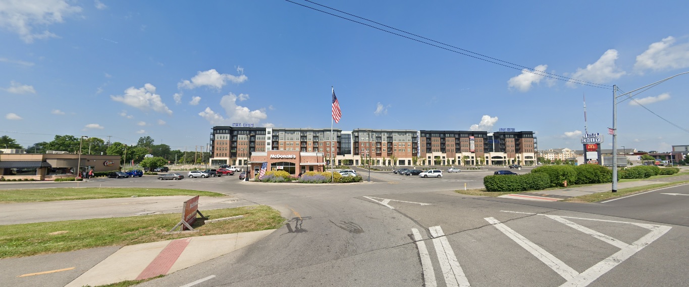
Olentangy River Road, looking west at J Edward Weaver Memorial Drive.
Before: 2011

After: 2021

Milo-Grogan

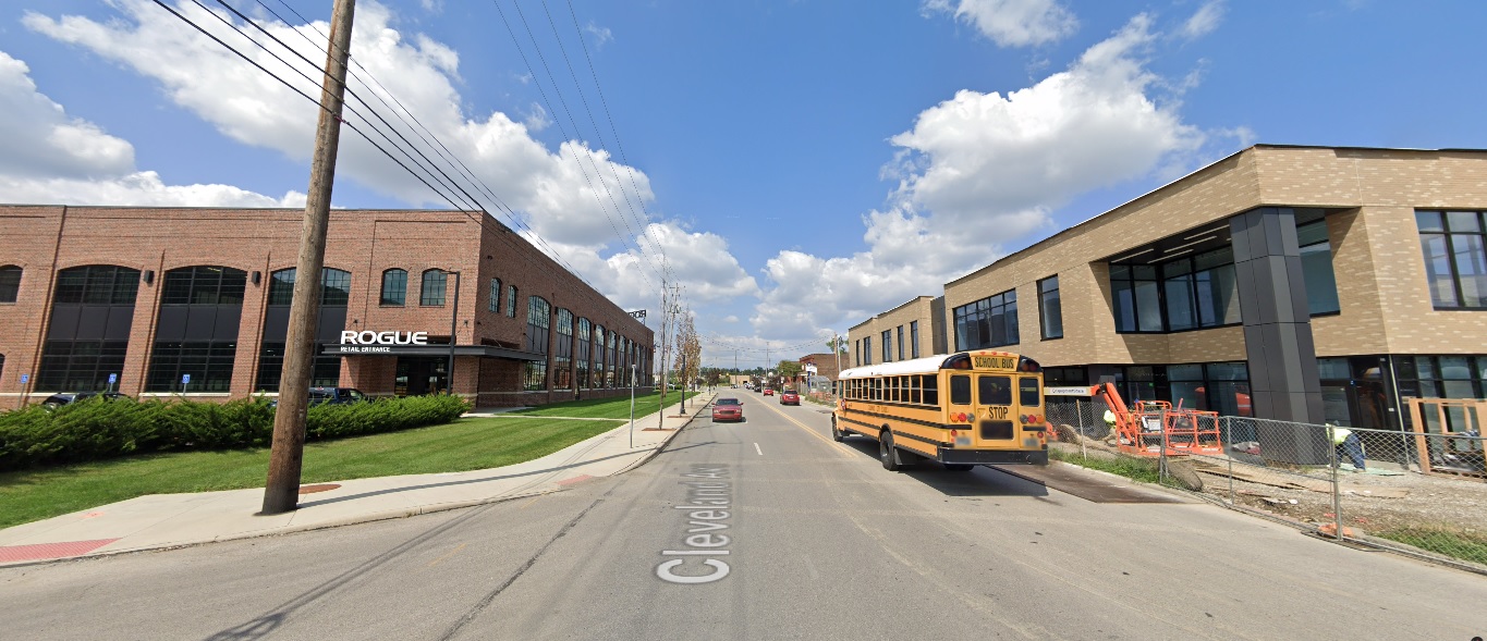
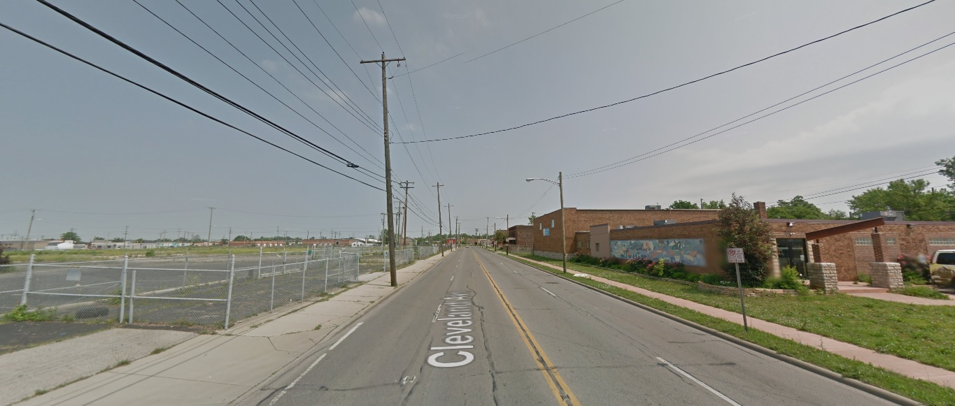
Cleveland Avenue, looking north towards 5th Avenue.
Before: 2011

After: 2021

American Addition

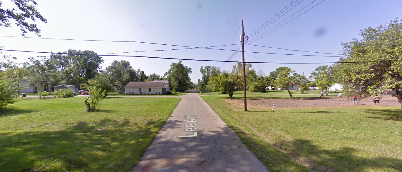
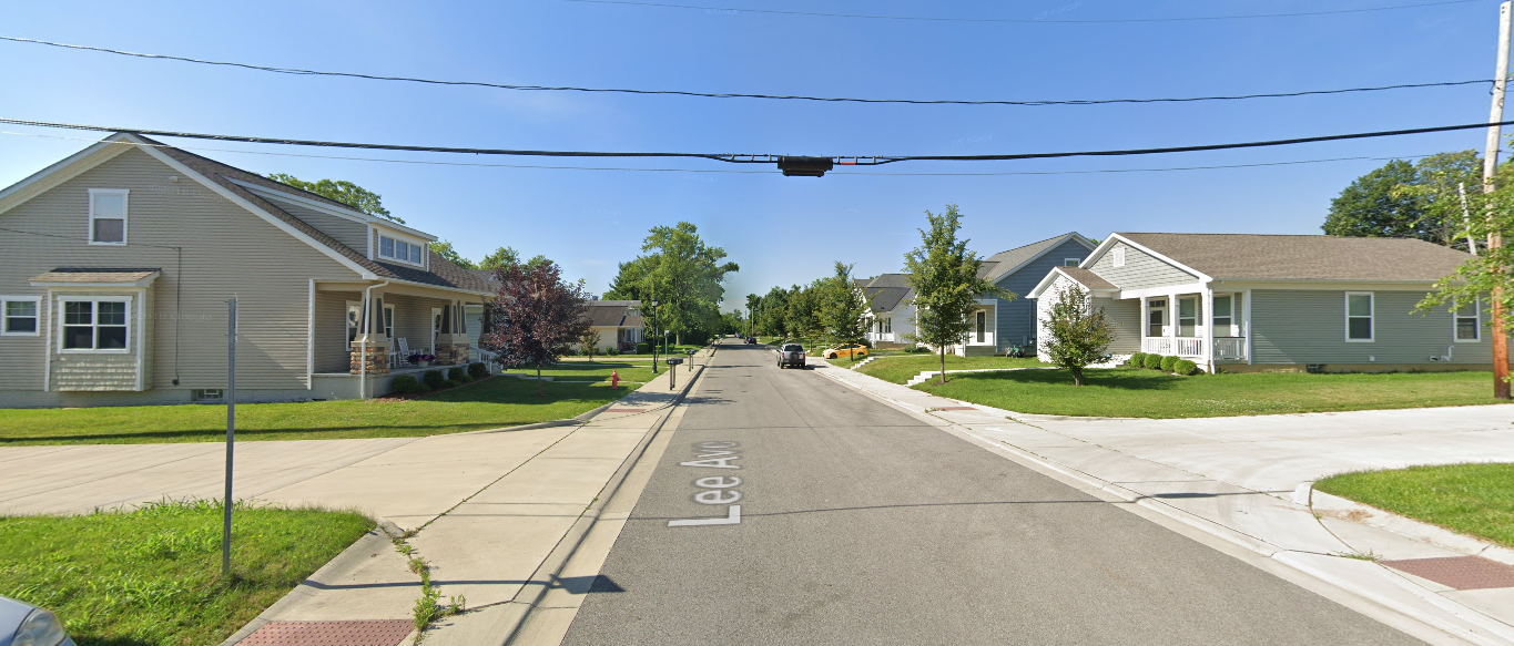
Lee Avenue, looking south from 12th Avenue.
Before: 2009

After: 2019

Linden

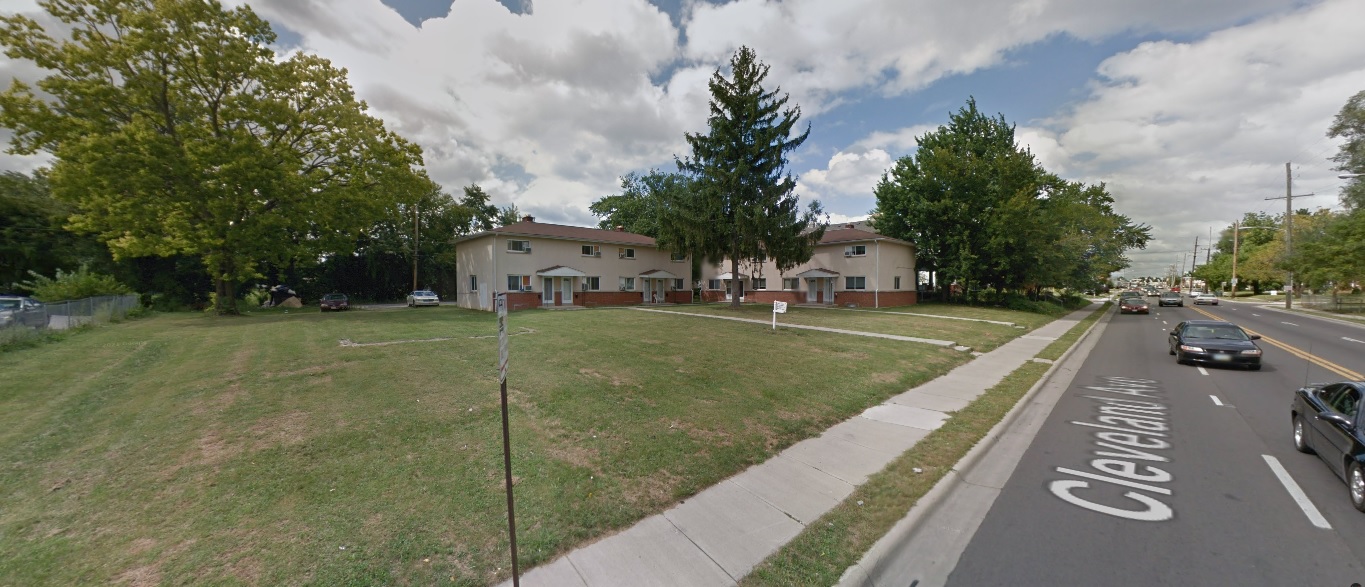
Cleveland Avenue, looking north at Agler Road.
Before: 2011

After: 2021

Easton

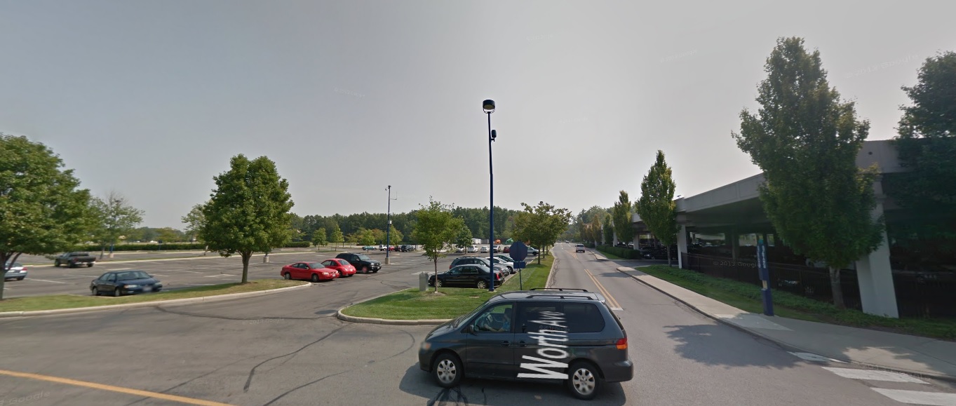
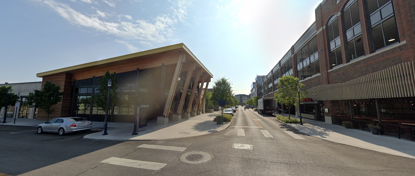
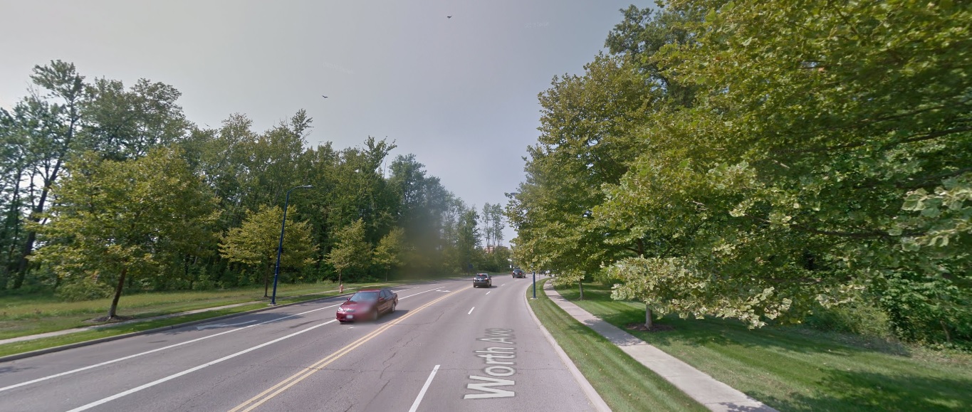
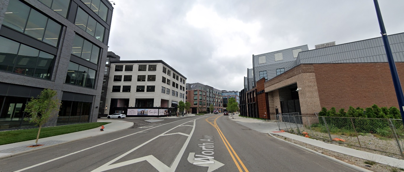
Worth Avenue, looking east from Fenlon Street.
Before: 2011

After: 2021

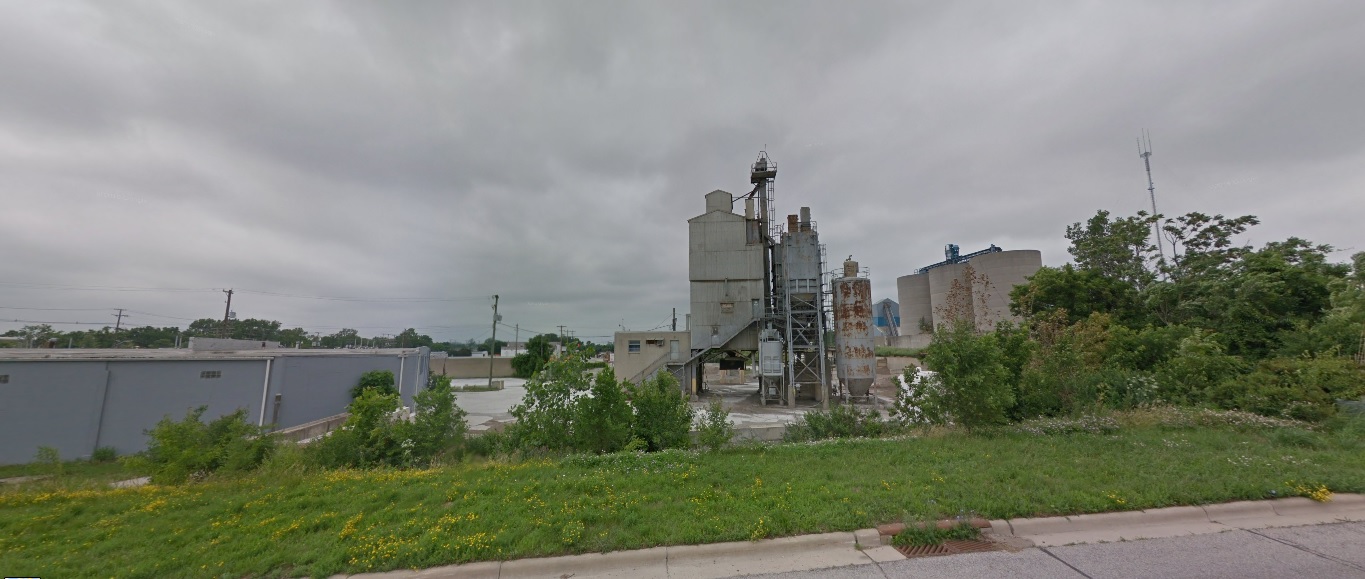
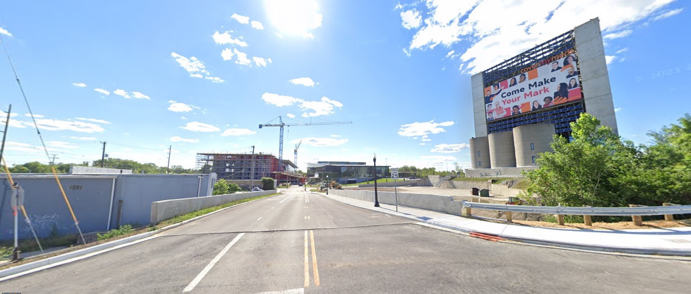
Worth Avenue, looking east from Stelzer Road.
Before: 2011

After: 2021

Franklinton

Souder Avenue, looking west just south of I-70.
Before: 2011

After: 2021

Fifth by Northwest

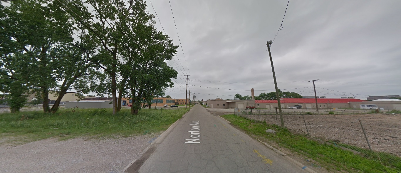
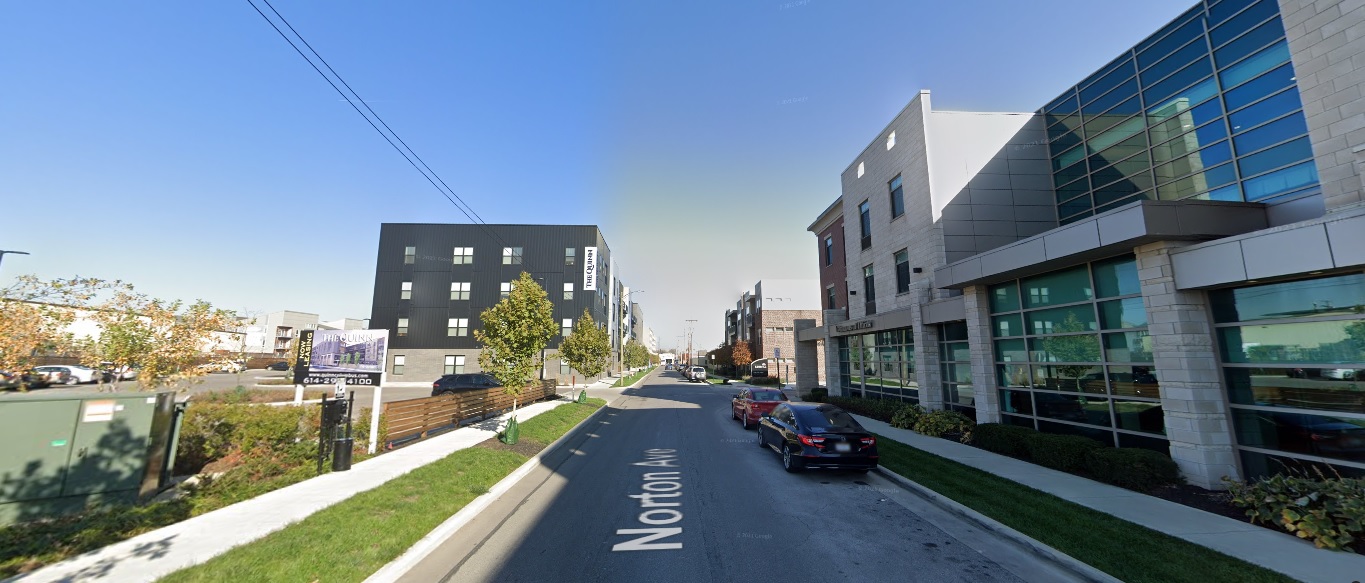
Norton Avenue, looking north halfway between 3rd and 5th.
Before: 2011

After: 2020

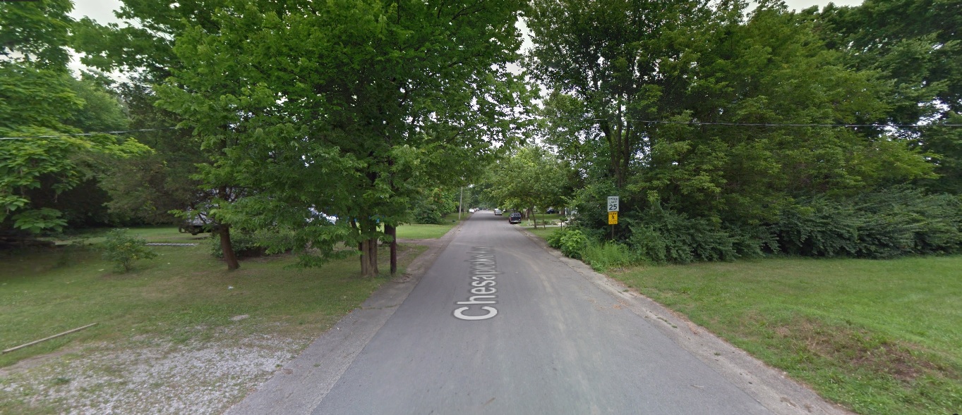
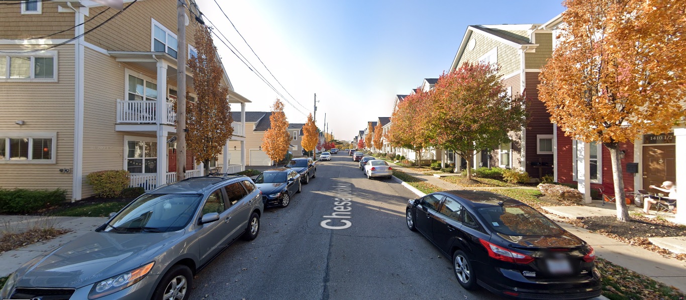
Chesapeake Avenue, looking west.
Before: 2011

After: 2020

King-Lincoln

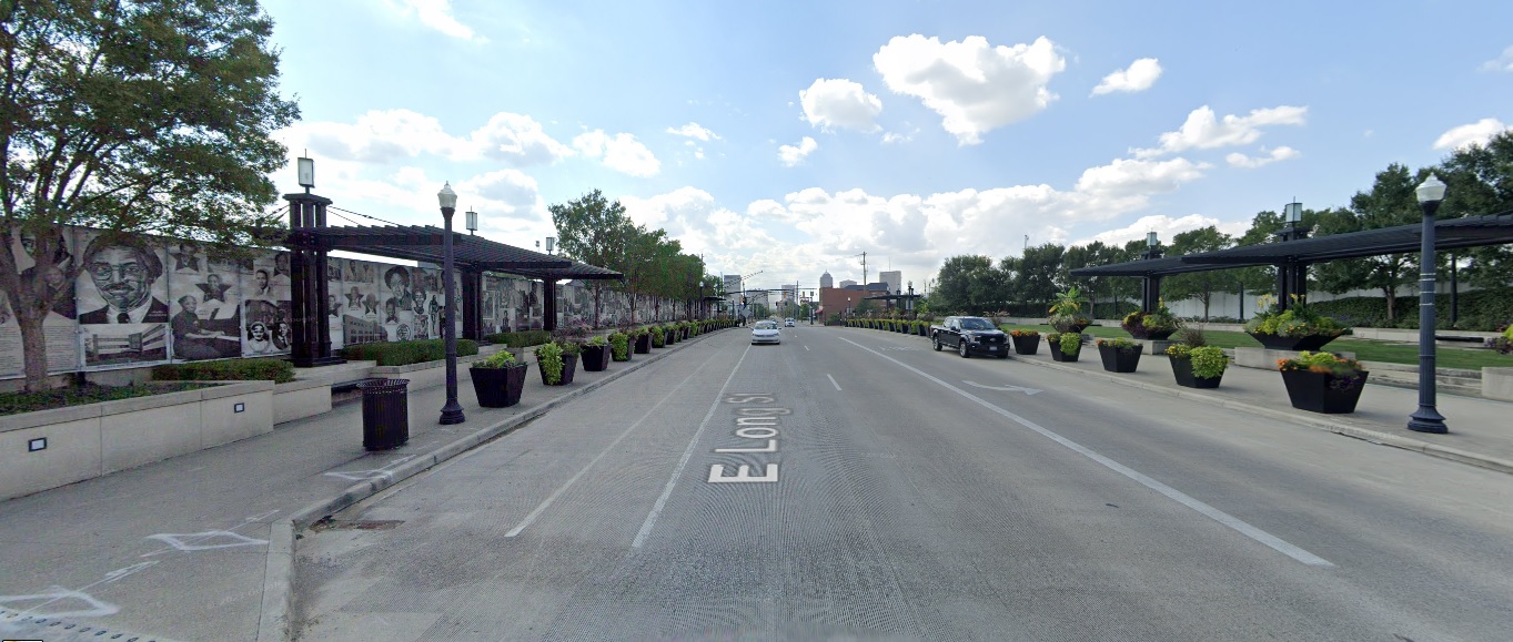
Long Street, looking west at I-71.
Before: 2011


After: 2021

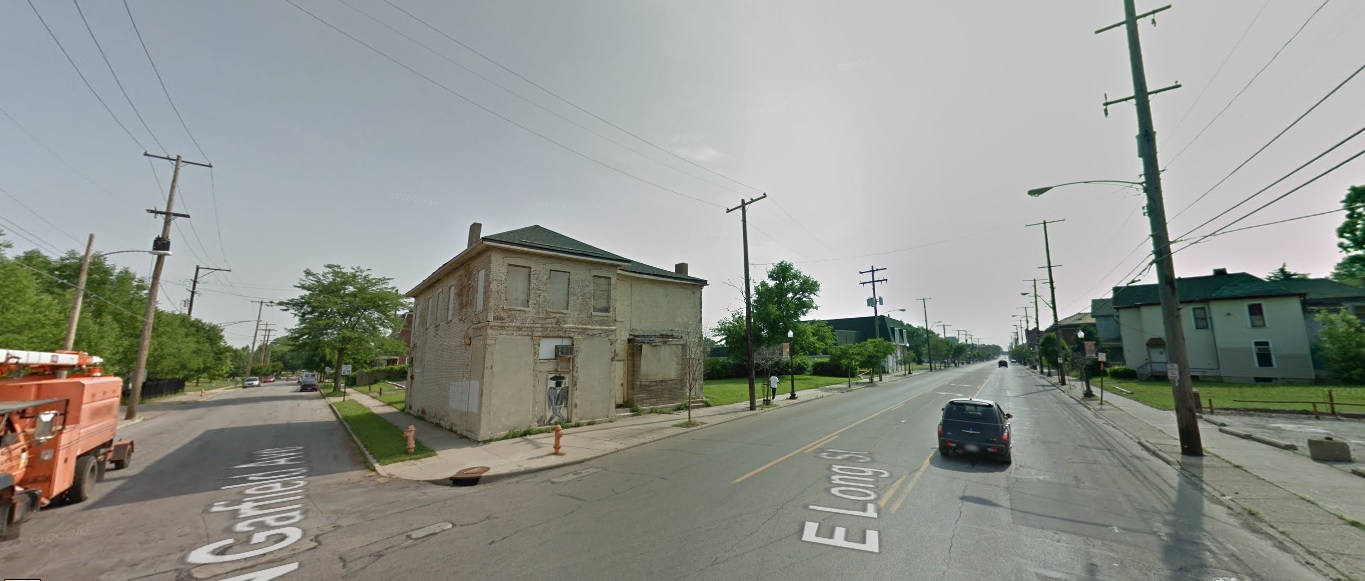
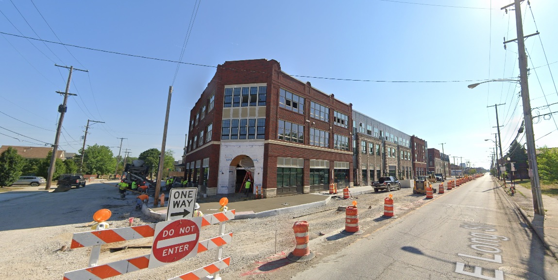
Long Street, looking northeast at Garfield Avenue.
Before: 2011


After: 2021

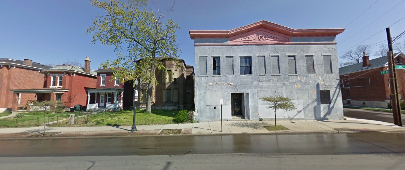
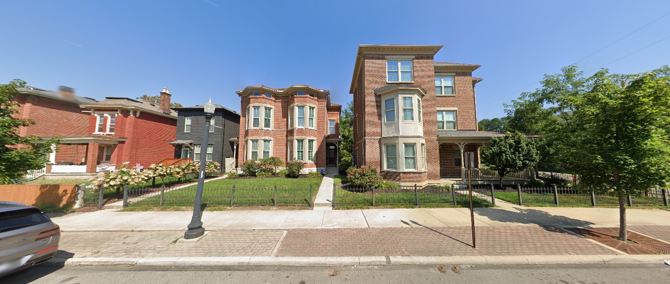
Long Street, looking north just west of 21st Street.
Before: 2011


After: 2021

West Side

Georgesville Road, looking east south of Broad Street.
Before: 2011

After: 2021


North Side

Wakeford Street, looking west from Olentangy River Road.
Before: 2011

After: 2021

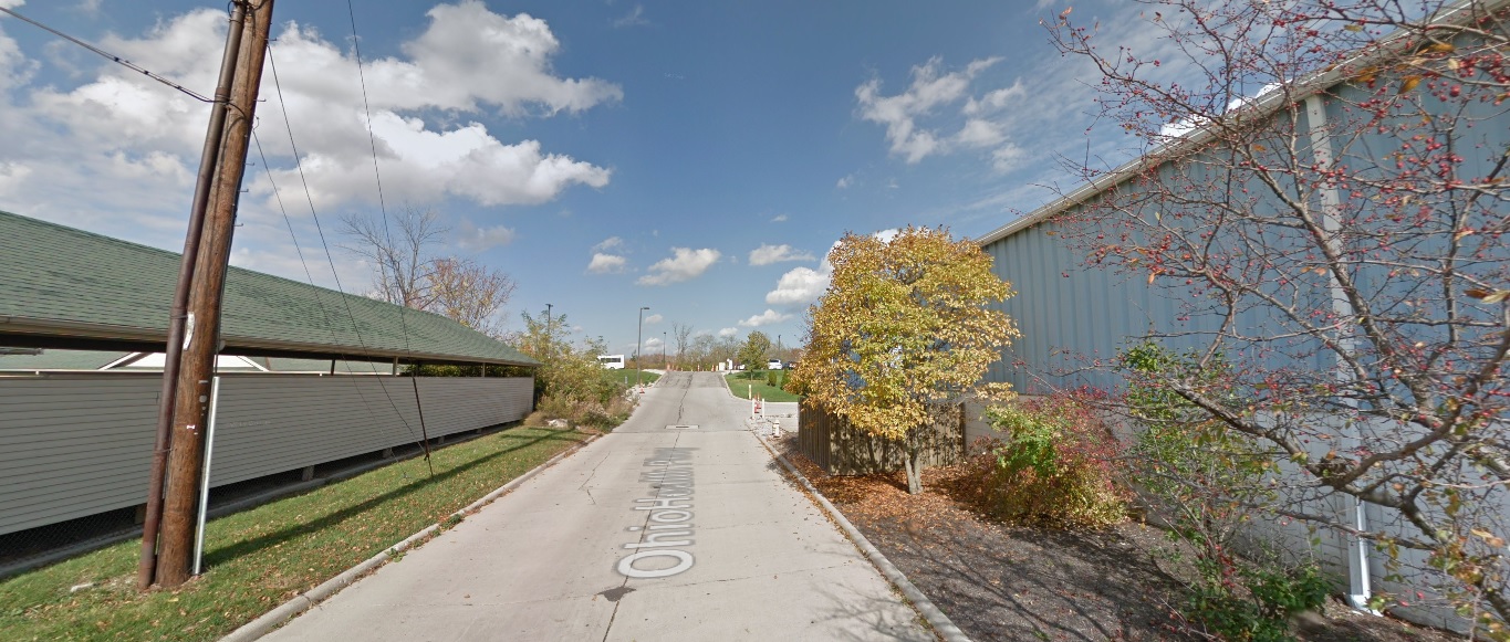
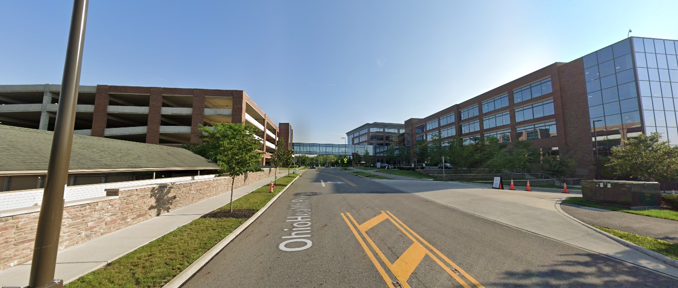
Ohio Health Parkway, looking north from Healthy Community Way.
Before: 2015

After: 2021

East North Broadway, looking north at 315.
Before: 2011

After: 2021

Grandview Heights

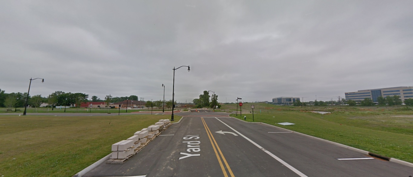
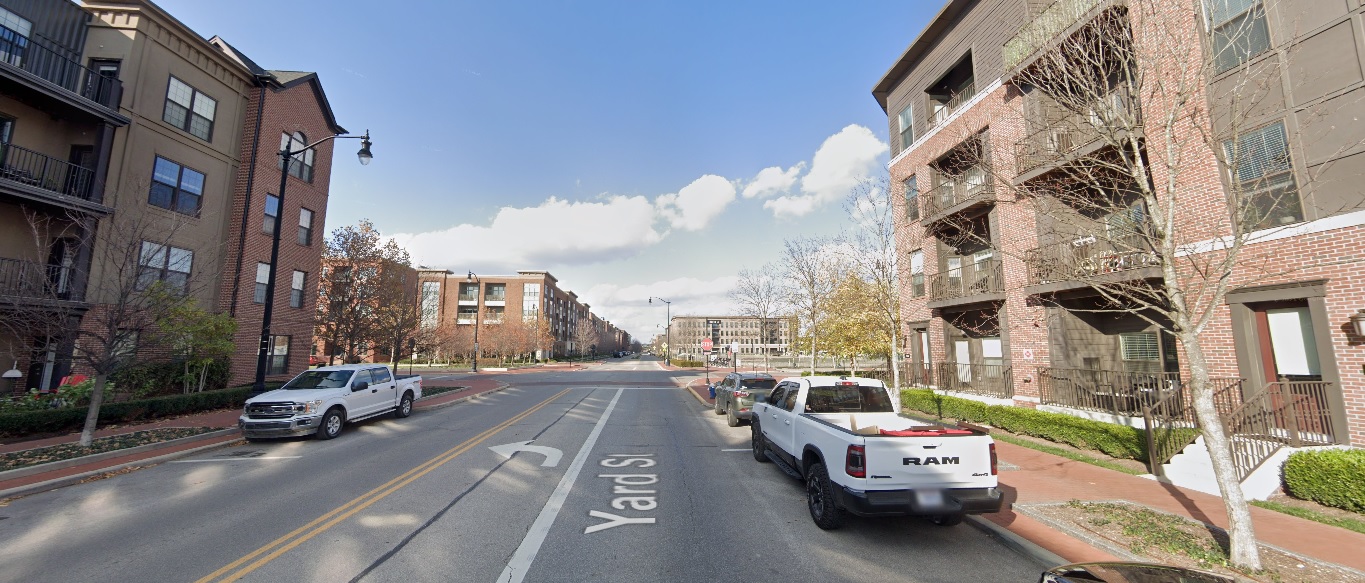
Yard Street, looking north from just south of Burr Avenue.
Before: 2011

After: 2020

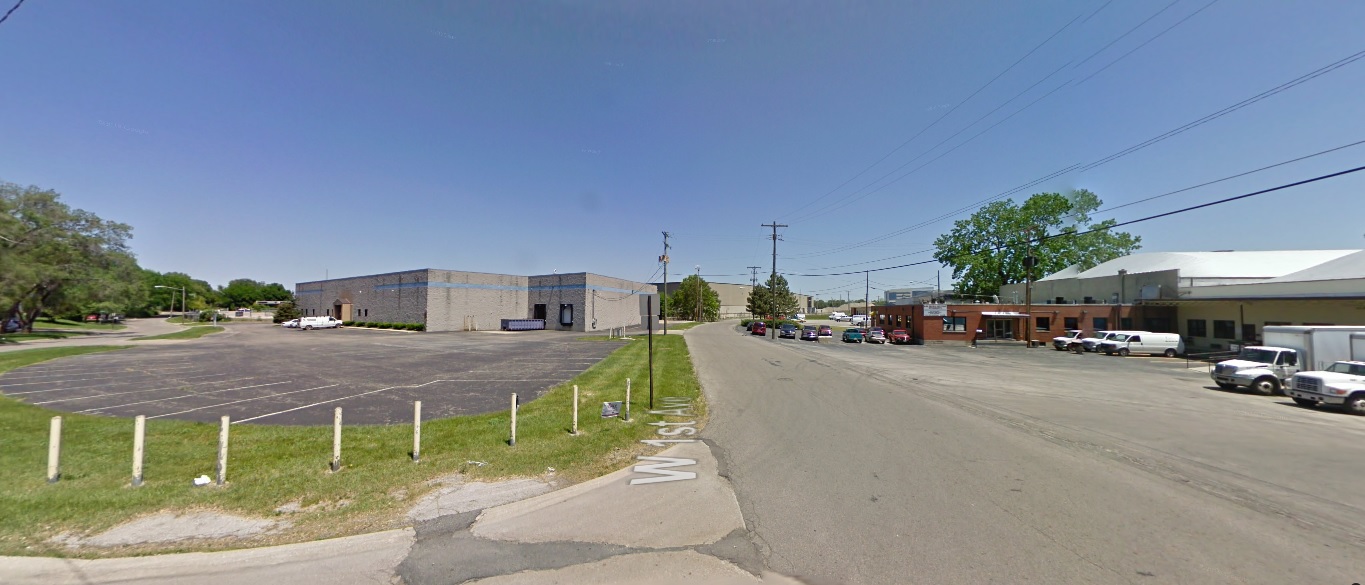
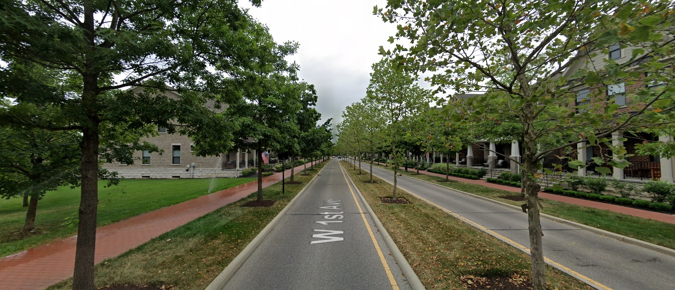
First Avenue, looking northeast at Edgehill Road.
Before: 2012

After: 2021

Dublin

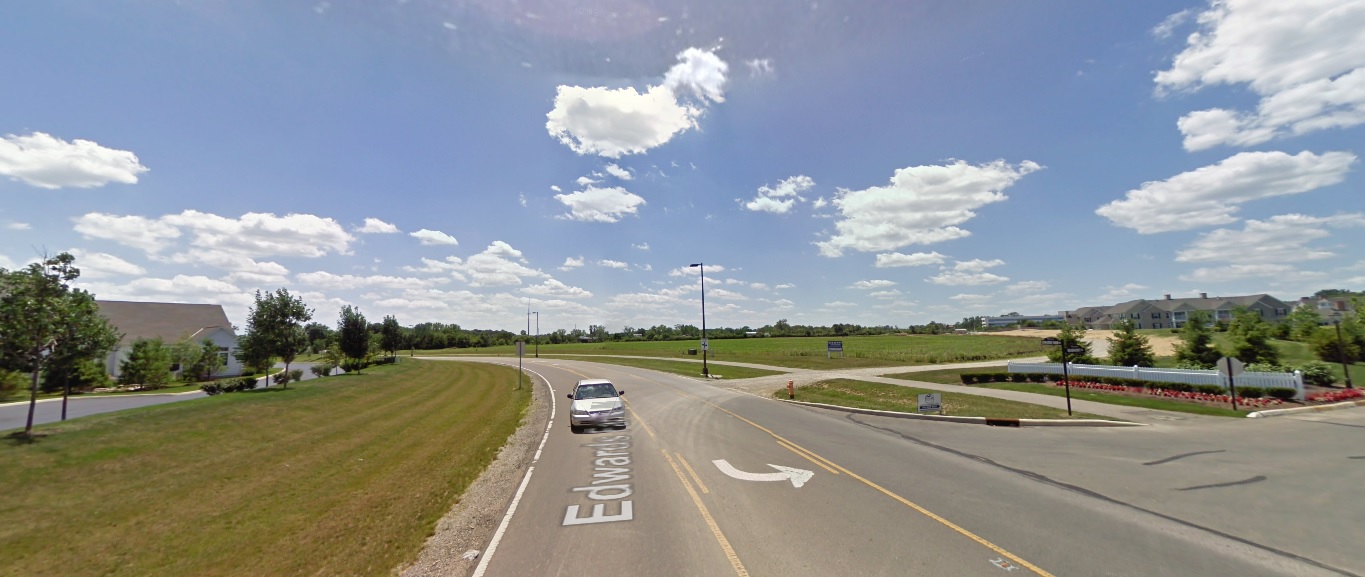
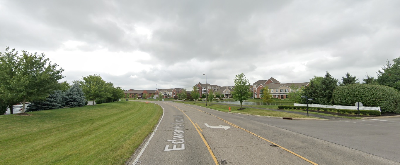
Edwards Farms Drive, looking south at Frawley Drive.
Before: 2011

After: 2021

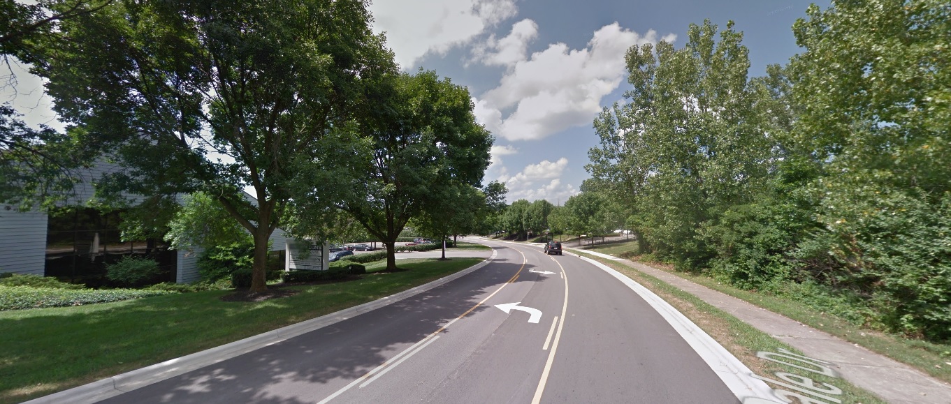
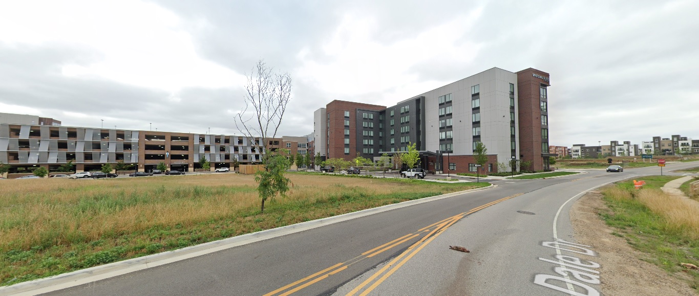
Dale Drive, looking northwest north of Banker Drive.
Before: 2011

After: 2021

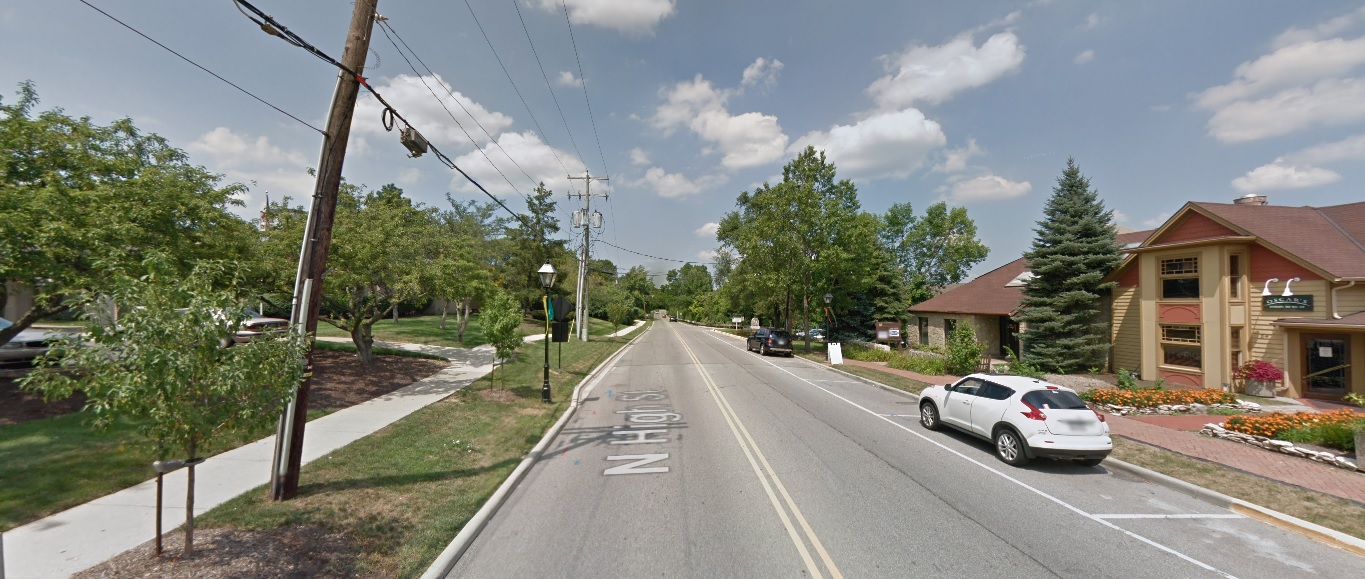
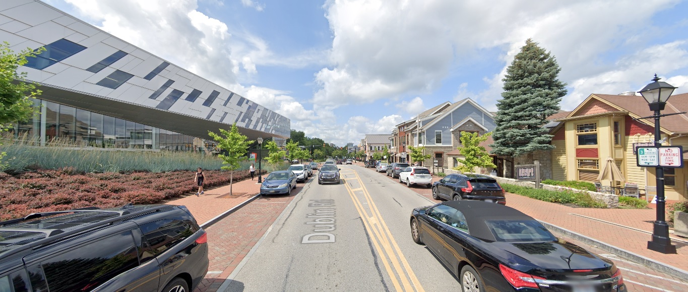
High Street, looking north from North Street.
Before: 2011

After: 2021

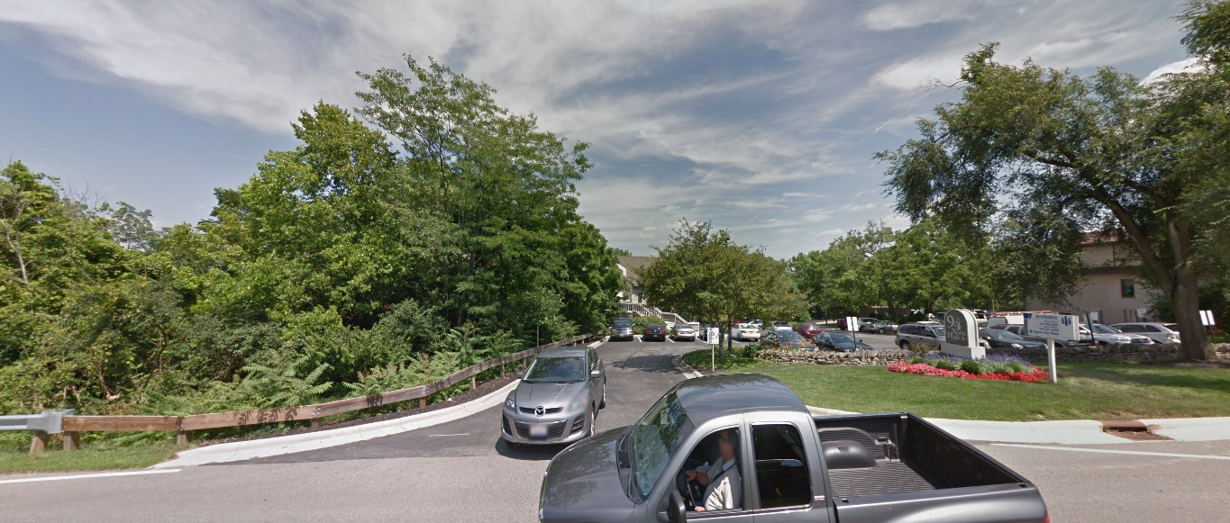
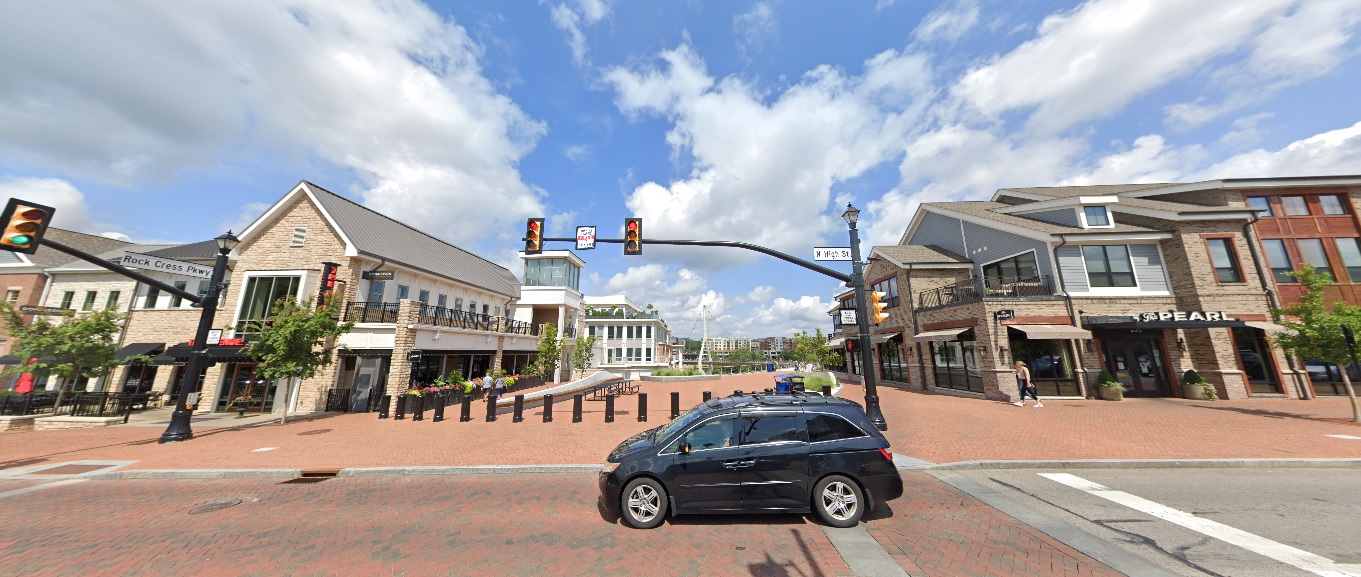
High Street, looking east at Rock Cress Parkway.
Before: 2011

After: 2021

Upper Arlington

Riverside Drive, looking east just south of Bethel Road.
Before: 2011

After: 2021

Bexley

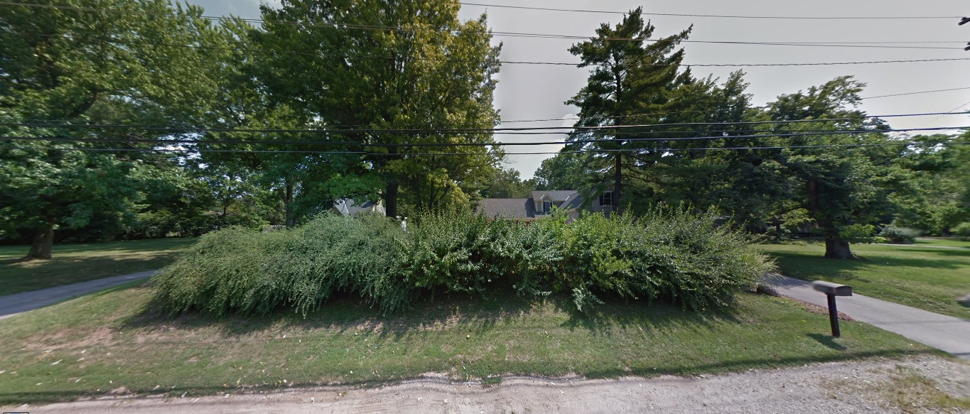
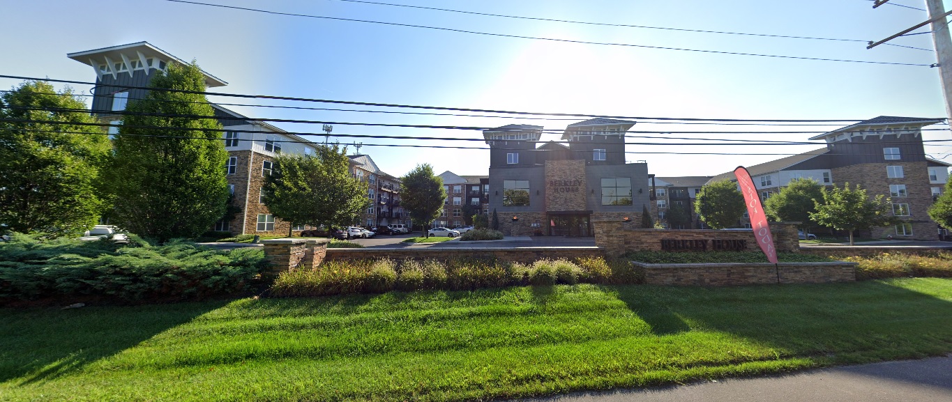
Parkview Avenue, looking southwest just north of Main Street.
Before: 2011


After: 2021

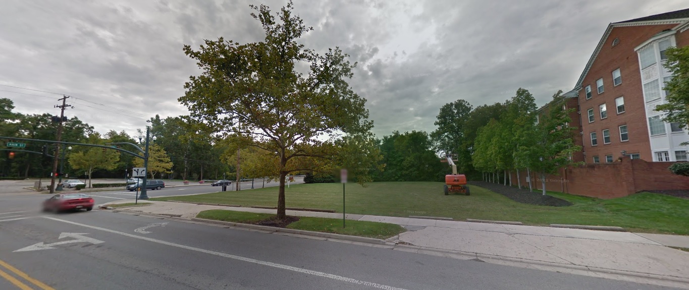
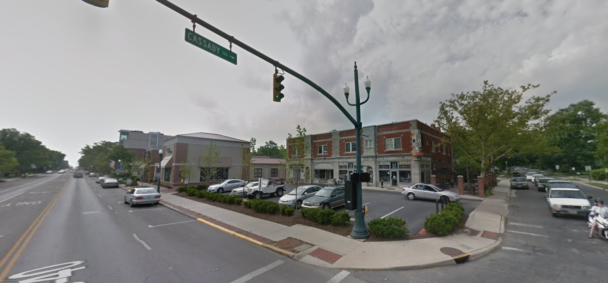
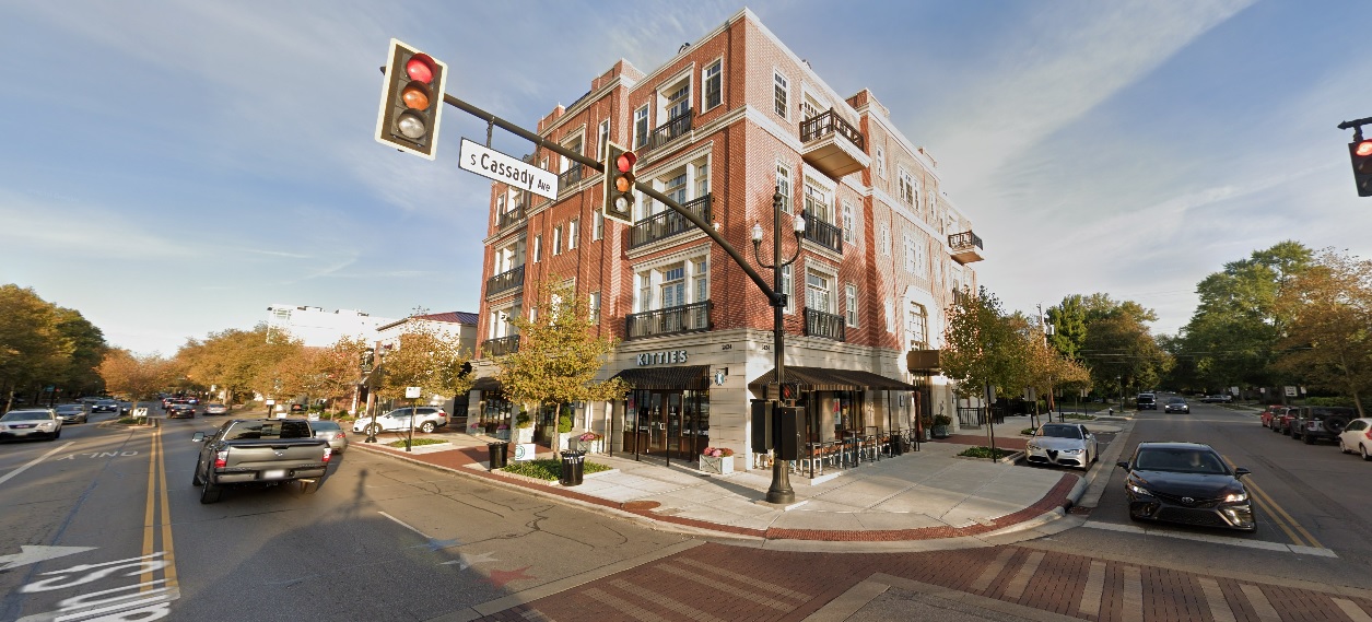
Main Street, looking northwest at Cassady Avenue.
Before: 2011


After: 2021

As I stated in the previous installment, these photos still just represent a small fraction of the development and changes that have occurred across the city and its suburbs in the past decade. These are meant to be representative of those changes, not to suggest that other neighborhoods not featured didn’t change as well. Either way, enjoy!

This 2-part before and after series highlights many projects that have changed the landscape around the city. Many other projects that will continue to transform the area for the next decade and beyond are still in development or construction phases. A list of local area commissions provide monthly updates on potential new projects around the city.