Major Ohio State Housing Project


Ohio State University has been engaged in long-term housing developmentand improvements on its campus for a few years now, and is set to begin the next and largest phase to date.

The first phase along W. 11th Avenue, called the South Campus High Rise Renovation and Addition Project, is nearing completion. The $171 million project began in 2010 and focused on Stradley, Smith, Park, Steeb and Siebert Halls. The residential buildings, which were all constructed between 1957 and 1960, would see major changes.

-New 12-story additions would connect Park with Stradley and Steeb to Smith.
-10-story Siebert Hall would receive a major renovation.

Major Ohio State housing project Columbus, Ohio

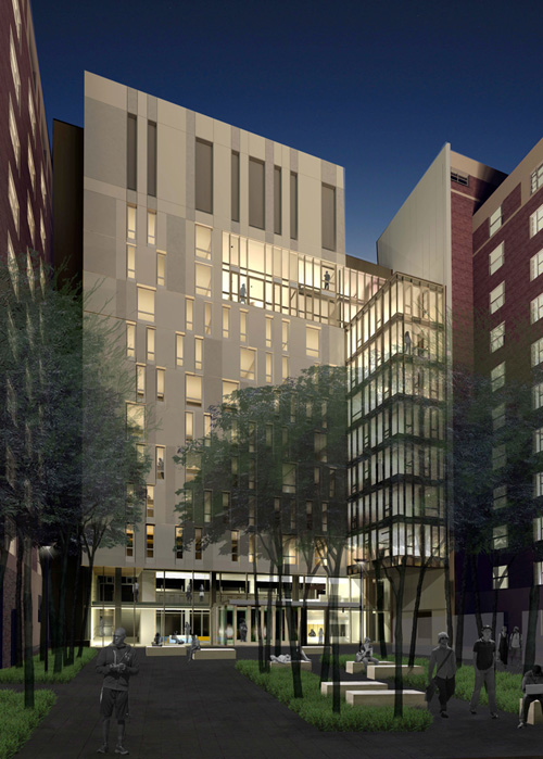
Rendering of the additions between Park/Stradley and Steeb/Smith.


In addition to the building additions, air conditioning, new elevators, lobbies and other improvements were made. The air conditioning was provided by drilling 450 geothermal wells. The additions would bring an additional 360 student beds.

Also renovated and added to was the William H. Hall housing complex at W. 11th and Worthington Street. Opened in August 2012, the building added 530 new beds.

The South Campus High Rise Renovation and Addition Project will ultimately add about 900 new student beds, but this is a far cry from the project just beginning along Lane Avenue.

Announced around the same time as SCHRRAP, the North Campus Residential District Project began just this past week. This project focuses on the large cluster of dorms and other buildings at the southwest corner of N. High Street and W. Lane Avenue. Most were built in the 1960s and 1970s and look it.

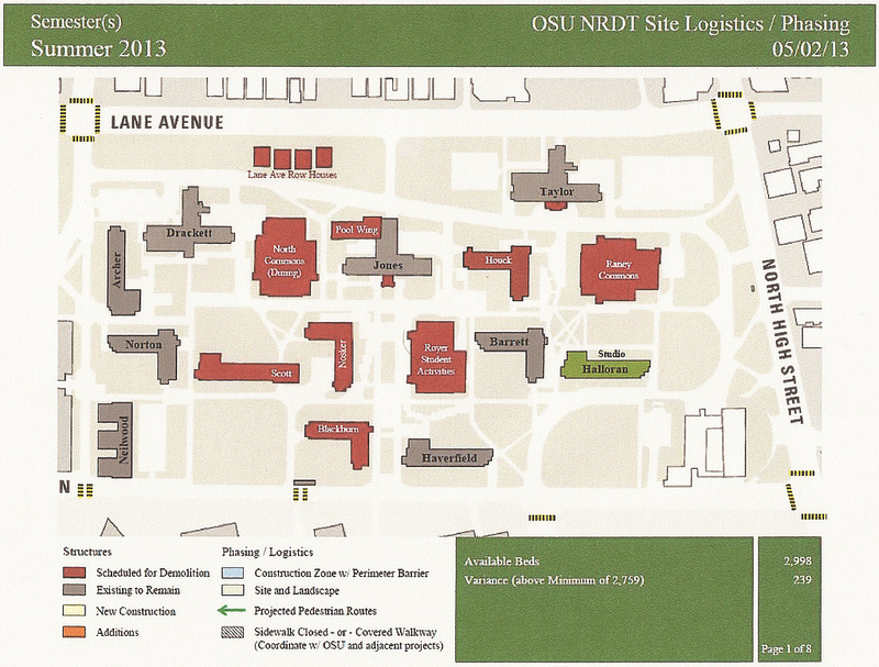
North Campus in 2013.


The image above shows how the area looks currently. As the key says, the buildings in red are scheduled to be demolished. The road that goes through the complex, Curl Drive, is also scheduled to be removed.

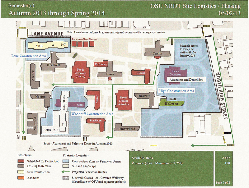
The image above shows the first phases of construction through Spring 2014. As you can see, there will be 3 main areas of construction during this period.
-A new dorm will be constructed at the southeast corner of W. Lane and Neil Avenues. This area is currently a surface parking lot.
-Scott Hall will be demolished and the site will be replaced with a much larger building.
-Raney Commons will be demolished, and site preparation will take place for new buildings, as well as removing Curl Drive and other infrastructure.
-Once site preparation is complete, 3 new dorm buildings will be constructed at the corner of N. High and W. Lane.

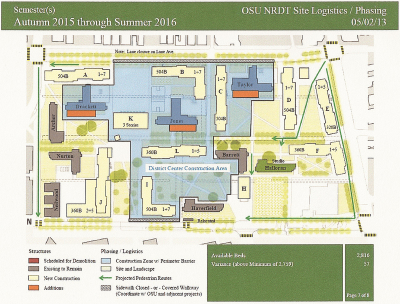
The last image above shows the final phase of construction, from Fall 2015 to Summer 2016. During this period, several changes take place.
-4 row homes along W. Lane will be demolished, as well as North Commons, Houck, Blackburn and Nosker Halls, the Royer Student Activities building and the Jones Pool.
-5 new buildings will be built in this area, as well as new addtions to Taylor, Jones and Drackett Halls.
-A central pedestrian corridor will be completed through the entire complex.
-High and Lane will be landscaped, and park spaces will be created throughout.
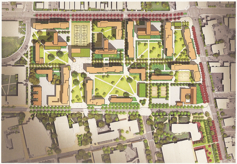
Final rendering.


In the end, 3,200 new beds will be created in the $370 million project. This will drastically change the look and feel of this area, and will continue to add density to the campus area, already Columbus’ most dense.


Columbus Housing Market July 2013


Columbus housing market July 2013

In this edition of the Columbus Housing Market July 2013, we see from Columbus Realtorsthat the housing market has been pretty white hot, and metro area sales set monthly records in July with an increase over 28%. July also featured the 3rd highest sales of any month on record.

I looked at the 21 major areas of Franklin County (11 urban, 10 suburban). Here is what the July market looked like.

Top 10 July Sales Totals
1. Columbus: 1,055
2. Dublin: 95
3. Upper Arlington: 91
4. Clintonville: 85
5. Westerville: 68
6. Grove City: 66
7. Hilliard: 60
8. Reynoldsburg: 46
9. Gahanna: 42
10. Pickerington: 38

Top 10 July Sales Increases Over July 2012
1. Minerva Park: +300.0%
2. German Village: +154.5%
3. Grove City: +83.3%
4. Reynoldsburg: +70.4%
5. Canal Winchester: +60.0%
6. Whitehall: +55.6%
7. Pataskala: +41.2%
8. Clintonville: +37.1%
9. Columbus: +35.8%
10. New Albany: +32.0%

Top 10 Total YTD Sales Through July
1. Columbus: 6,072
2. Dublin: 480
3. Upper Arlington: 447
4. Clintonville: 423
5. Westerville: 375
6. Grove City: 363
7. Hilliard: 338
8. Gahanna: 315
9. Reynoldsburg: 310
10. Pickerington: 203

Top 10 YTD Sales Increases Through over July 2012
1. Whitehall: +42.7%
2. Hilliard: +42.0%
3. Bexley: +38.7%
4. Reynoldsburg: +36.6%
5. Pataskala: +35.9%
6. German Village: +34.7%
7. Pickerington: +34.4%
8. Minerva Park: +31.3%
9. Clintonville: +31.0%
10. Westerville: +29.8%

Average Sales July 2013
Urban: 124.7
Suburban: 50.4
Urban without Columbus: 31.7

Average % Change July 2013 vs. July 2012
Urban: +48.3%
Suburban: +35.0%
Urban without Columbus: +54.0%

Average Sales YTD Through July
Urban: 699.1
Suburban: 283.4
Urban without Columbus: 161.8

Average % Change YTD vs. YTD 2012 (Through July)
Urban: +19.7%
Suburban: +28.2%
Urban without Columbus: +18.8%

Top 10 Average Sales Price
1. New Albany: $563,891
2. Upper Arlington: $389,264
3. Bexley: $370,056
4. Dublin: $350,545
5. Downtown: $329,266
6. German Village: $325,721
7. Worthington: $272,706
8. Grandview Heights: $254,470
9. Hilliard: $240,506
10. Westerville: $209,706

Top 10 Average Sales Price % Increases vs. July 2012
1. Upper Arlington: +22.3%
2. Hilliard: +18.7%
3. Grandview Heights: +13.1%
4. Downtown: +12.5%
5. Pickerington: +12.4%
6. Pataskala: +11.6%
7. Canal Winchester: +11.3%
8. Worthington: +7.5%
9. Dublin: +6.7%
10. Columbus: +6.5%

Top 10 Average Sales Price YTD
1. New Albany: $545,545
2. Upper Arlington: $355,993
3. Bexley: $347,920
4. Dublin: $333,285
5. German Village: $310,179
6. Downtown: $285,807
7. Worthington: $243,009
8. Grandview Heights: $219,100
9. Hilliard: $218,104
10. Gahanna: $202,527

Top 10 Average YTD Sales Price % Change vs. YTD 2012
1. Whitehall: +33.5%
2. Downtown: +18.6%
3. Gahanna: +13.8%
4. Minerva Park: +13.0%
5. Upper Arlington: +12.4%
6. Reynoldsburg: +9.9%
7. New Albany: +9.1%
8. Hilliard: +5.5%
9. Gahanna: 5.0%
10. Canal Winchester: +4.9%

Average Price July 2013
Urban: $230,605
Suburban: $236,871
Urban without Columbus: $239,388

Average Price % Change vs. July 2012
Urban: +1.8%
Suburban: +6.3%
Urban without Columbus: +1.3%

Average Price YTD
Urban: $214,207
Suburban: $223,511
Urban without Columbus: $223,053

Average Price % Change YTD vs. YTD 2012
Urban: +6.3%
Suburban: +5.0%
Urban without Columbus: +6.6%

Top 10 Fastest Selling Markets July 2013 (based on # of Days listings sell)
1. Grandview Heights: 9
2. Obetz: 9
3. Hilliard: 25
4. Worthington: 26
5. Upper Arlington: 29
6. Bexley: 31
7. Westerville: 38
8. Reynoldsburg: 40
9. New Albany: 42
10. Clintonville: 44

Top 10 Fastest Selling Markets YTD
1. Worthington: 36
2. Grandview Heights: 47
3. Upper Arlington: 47
4. Clintonville: 56
5. Westerville: 56
6. Hilliard: 58
7. Dublin: 59
8. New Albany: 60
9. Gahanna: 62
10. Pataskala: 62

Average # of Days before Sale, July 2013
Urban: 49.8
Suburban: 48.7
Urban without Columbus: 48.8

Average # of Days before Sale, YTD
Urban: 64.6
Suburban: 62.3
Urban without Columbus: 64.4

Top 10 Lowest Housing Supplies (based on # of months to sell all listings), July 2013
1. Worthington: 1.9
2. Grandview Heights: 2.4
3. Upper Arlington: 2.4
4. Clintonville: 2.5
5. Hilliard: 2.7
6. Westerville: 2.8
7. Dublin: 3.1
8. Bexley: 3.2
9. Gahanna: 3.6
10. Downtown: 4.0

Average # of Months to Sell All Listings
Urban: 3.7
Suburban: 4.2
Urban without Columbus: 3.6

Average % Change of Single-Family Home Sales, July 2013 vs. July 2012
Urban: +55.0%
Suburban: +33.4%
Urban without Columbus: +58.0%

Average % Change of Condo Sales, July 2013 vs. July 2012
Urban: +78.4%
Suburban: +89.0%
Urban without Columbus: +82.3%

Average % Change of Single-Family Home Sales YTD vs. YTD 2012
Urban: +14.4%
Suburban: +28.5%
Urban without Columbus: +13.0%

Average % Change of Condo Sales YTD vs. YTD 2012
Urban: +42.8%
Suburban: +32.7%
Urban without Columbus: +44.0%

Seems like most areas are doing fairly well, including the urban core. Of course, these number do not measure rentals, which is what is really booming right now in the residential scene.


May 2013 Jobs Data


May 2013 jobs data

The latest May 2013 jobs data is now out from the Bureau of Labor Statistics.

Columbus City
Unemployment Rate: 6.0%
Unemployment Rate Change since May 2012: +0
Unemployment Rate Change since January 2013: -0.8
Civilian Labor Force: 431,500
Civilian Labor Force Change since May 2012: +3,600
Civilian Labor Force Change since January 2013: +5,100
Employment: 405,500
Employment Change since May 2012: +3,400
Employment Change since January 2013: +8,200
Unemployment: 26,000
Unemployment Change since May 2012: +100
Unemployment Change since January 2013: -3,100

Franklin County
Unemployment Rate: 6.0%
Unemployment Rate Change since May 2012: +0
Unemployment Rate Change since January 2013: -0.8
Civilian Labor Force: 631,000
Civilian Labor Force Change since May 2012: +5,300
Civilian Labor Force Change since January 2013: +7,300
Employment: 593,100
Employment Change since May 2012: +5,100
Employment Change since January 2013: +12,100
Unemployment: 37,900
Unemployment Change since May 2012: +200
Unemployment Change since January 2013: -4,700

Columbus Metro Area
Unemployment Rate: 6.0%
Unemployment Rate Change since May 2012: +0.1
Unemployment Rate Change since January 2013: -1.0
Civilian Labor Force: 977,400
Civilian Labor Force Change since May 2012: +8,600
Civilian Labor Force Change since January 2013: +9,500
Employment: 919,100
Employment Change since May 2012: +7,800
Employment Change since January 2013: +18,600
Unemployment: 58,300
Unemployment Change since May 2012: +800
Unemployment Change since January 2013: -9,100

Ohio Overall
Unemployment Rate: 7.0%
Unemployment Rate Change since May 2012: -0.3
Unemployment Rate Change since January 2013 : +0
Civilian Labor Force: 5,750,000
Civilian Labor Force Change since May 2012: -5,000
Civilian Labor Force Change since January 2013: +10,000
Employment: 5,345,000
Employment Change since May 2012: +9,000
Employment Change since January 2013: +4,000
Unemployment: 405,000
Unemployment Change since May 2012: -15,000
Unemployment Change since January 2013: +6,000

Metro Non-Farm Jobs
Total: 966,900
Change from May 2012: +12,200
Change from January 2013: +23,300

By Industry
Mining/Logging/Construction Total: 30,600
Change from May 2012: +500
Change from January 2013: +3,700

Manufacturing Total: 66,600
Change from May 2012: +600
Change from January 2013: +1,600

Trade/Transportation/Utilities Total: 180,700
Change from May 2012: -1,200
Change from January 2013: -2,500

Information Total: 16,400
Change from May 2012: -200
Change from January 2013: -100

Financial Activities Total: 71,300
Change from May 2012: -200
Change from January 2013: -400

Professional and Business Services Total: 161,000
Change from May 2012: +1,100
Change from January 2013: +5,400

Education and Health Services Total: 142,600
Change from May 2012: +4,500
Change from January 2013: +3,100

Leisure and Hospitality Total: 99,700
Change from May 2012: +4,900
Change from January 2013: +11,200

Other Services Total: 35,800
Change from May 2012: -600
Change from January 2013: -400

Government Total: 162,200
Change from May 2012: -200
Change from January 2013: +1,700


Columbus Murders by Census Tract 2008-2012


A few days ago, I posted maps for murders by zip code. Because zip codes encompass such large areas, they aren’t as accurate in showing where murders are taking place within them. To help show this more, I broke the maps down into Columbus murders by census tract. While the tracts can include large areas also, they are much smaller than zip codes and allow us to see more at the neighborhood level.

So here they are.


The same forces spreading murder further out into the suburbs in the zip codes seems to be at play in tracts as well.
Here are the totals for the entire period.

The High Street corridor from Merion Village up through Worthington has very low or non-existent murder rates. This is also true for most of Whitehall, surprisingly, Bexley, most of the Northwest Side and much of the North Side, apart from the Tamarack Circle area.

Columbus Crime Statistics provide additional maps and data for local crime back to 1985.


Columbus Murders by Zip Code 2008-2012


I have been wanting to do these maps for awhile now, as there have been several searches on the site for them and they weren’t available. The maps look at Columbus murders by zip code 2008-2012, highlighting which zip codes have seen the most murders by year and across the period as a whole.

2008
Columbus murders by zip code
In 2008, almost all murders were contained within the I-270 boundaries. The East and South Sides were the worst areas.

2009

In 2009, there began to be a bit of diffusion on where murder was taking place. While parts of the urban core remained the worst areas, suburban areas also saw the occasional murder.

2010

The diffusion continued in 2010.

2011

And in 2011.

2012

2012 was the most diffuse of all the years, with no heavily concentrated areas, even in the urban core as much. Meanwhile, most of the suburban zip codes within Franklin County saw at least 1 murder.

The question is, what do we make of this? This is only a 5-year data set, but it may be supporting evidence for current urban trends. The first trend being that the urban core is rapidly gentrifying in many areas. The second being that poverty is, through economic and development trends, is spreading further out from the core. Concentrated poverty and crime go hand in hand, so while the suburbs may see a bit of increase in crime, the urban core is starting to see less. Something to watch over time to see if such trends continue.

2008-2012

What strikes me about the 5-year map is that Grandview/Upper Arlington have been entirely murder free while every zip around them have had at least one. Also, Downtown is also relatively murder free, as is Bexley and the Clintonville areas.

Of course, zip codes include large areas. What are the neighborhoods that are actually seeing murders and which ones are not? To find out, we’ll have to go down to the tract level. Over the next few days, I’ll post those maps.

More local crime statistics back to 1985 can be found here: Columbus Crime Statistics
The https://www.columbus.gov/police/ site provides annual reports, crime descriptions and other local department information.