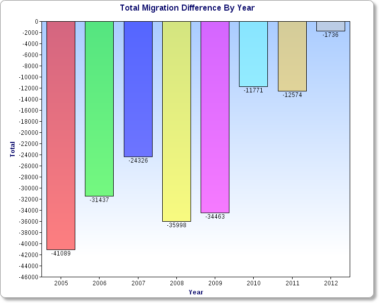
Back in November, I wrote about Ohio’s improving growth outlook. In that post, I examined domestic out-migration and domestic in-migration 2005-2012, and discovered that the net change had been improving. The state was losing fewer people over time domestically, and the difference had declined to under 2,000 people by 2012, a HUGE improvement from the start of the period.
Recently, the US Census released 2013 state population estimates, along with components of population change for the July 1st, 2012-July 1st, 2013 period. More positive news was to be found in those estimates.
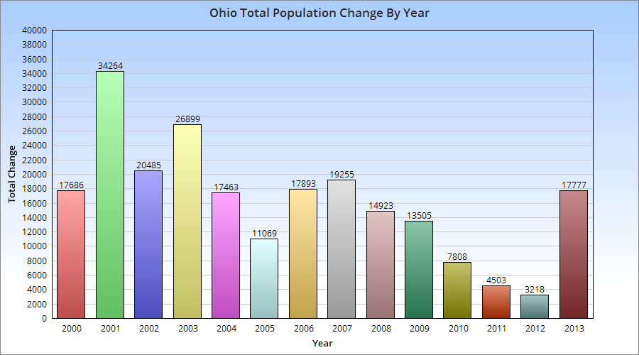
First, Ohio’s population increased to 11,570,808, representing an annual increase of 17,777. While the increase is not particularly great, especially in comparison to states nationally, there are some positive nuggets with that number. The state held on to its position as the 7th most populous state, and the increase was the highest since pre-recession. The state moved up 18 spots in the total annual growth rankings 2012-2013 vs. 2011-2012. This was the best increase of all 50 states. It was also the best growth for the state since 2007. Did the state bottom out in 2012? Perhaps, but way too early to tell. Still, a very good improvement that halted a general decline.
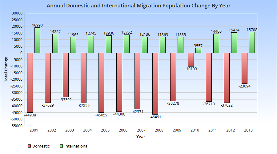
The components of change are also interesting.
The migration patterns show a few things. First, 2013 had the 2nd highest rate since 2000 of in-international migration. It was also one of the best years (since 1996) for domestic in-migration.
The question is, can Ohio keep improving or is this just a temporary blip? Time will tell.
2013 was a pretty significant year for Columbus, if only because it saw its busiest residential developmentyear in and around the urban core in many years. Here are the highlights of some of the biggest 2013 residential projects.
1. The South Campus High Rise and Addition Project # of New Units: 360 Project Cost: $171.6 Million Project Height: 7-8 Stories in Multiple Buildings Some might suggest that this isn’t strictly a residential project because it was student housing. However, I disagree with that. The projects added significant additions to already existing Park, Stradley, Steeb and Smith Halls by connecting the pairs together with what essentially amounted to a brand new building stuck in-between. It also involved significant renovations to other residential buildings in South Campus. This was the first part of a major renovation and expansion project for housing on OSU’s campus.
2. HighPoint at Columbus Commons # of New Units: 302 Project Cost: $50 Million Project Height: 6 Stories in 2 Buildings HighPoint was a rather unexpected surprise for Downtown. When Columbus Commons was being constructed, the plan called for residential buildings running along High Street on the west side of the park. Unfortunately, that plan was not supposed to happen for perhaps a decade or more, depending on development interests. Within a year of the completion of the park, however, HighPoint was being proposed. While not exactly the most inspired design or preferred height for such a prominent location Downtown, the projects potential 450+ residents will greatly help the neighborhood’s goal of increased vitality and 24-hour activity. In fact, it may not be too much to assume that this project has encouraged others, such as the 12-story 250 High Project and LC’s double 8-story tower project, both of which will begin construction soon just across the street from HighPoint and the park. Collectively, they will add, at minimum, over 650 new residents.
3. Liberty Place, Phase II Address: 250 Liberty Street # of New Units: 207 Project Cost: $25-$30 Million Project Height: 4 Stories Liberty Place, in the Brewery District, was completed in 2006, the last of a slew of development projects in the Brewery District beginning in the 1990s and came in the middle of a relative quiet period that began when the Arena District stole some of the neighborhoods momentum. That momentum has returned in recent years as urban living has gained significant traction in public opinion. Phase II of Liberty Place was supposed to have been built years ago, but the recession and the uncertainty regarding the exact layout of the rebuilt I-70/I-71 split which runs past the site put the project on hold. All told, Liberty Place now has 342 units.
4. Tribeca Address: 700 West Third Avenue # of New Units: 205 Project Cost: Unknown Project Height: 4 Stories Tribeca, from Edwards Communities, was built along Third Avenue in the 5thxNW neighborhood. While adding significant density to the area, the project is mostly known for its strange layout. Dubbed the “Fortress” or the “prison”, the project has a long, blank wall along Third Avenue with tower-like structures along it, resembling the fortifications of a prison. The ugly design and lack of interaction with Third because of this layout caused the project to receive a lot of criticism.
5. Lennox Flats Address: Kinnear Road, Lennox Town Center # of New Units: 194 Project Cost: Unknown Project Height: 3 Stories Lennox Flats was built over two phases, the first with 92 units and the second with 102. Built in a mostly vacant lot just to the west of Lennox Town Center (across the railroad tracks), these were built in modern-styles and were targeted at students from OSU.
6. 600 Goodale Address: 600 West Goodale Street # of New Units: 174 Project Cost: Unknown Project Height: 5 Stories 600 Goodale is likely the most strangely located new project of 2013. It was built on a small strip of land located north of Goodale Street across from White Castle’s HQ building. The location is strange because the land is bordered by the Olentangy River on the west and a highway exit ramp to the north and east sides. In fact, the site sits on a section of land between 315, 670 and major ramps for both to the north. The land is not directly connected to any major neighborhood. Despite the strange location, the modern building was, at last count, 96% leased.
So those were the top 6 largest projects from 2013. More than 2,200 total units were completed in the urban areas of Columbus.
But what’s coming for 2014? Here are the top 5.
1. Jeffrey Park Phase 1 Address: E. 1st Avenue and N. 4th Street, Italian Village # of New Units: 334 Project Cost: $180 Million+ For all phases. Project Height: 4 Stories The Jeffrey Manufacturing site has long been planned for redevelopment. It is, by far, the largest undeveloped site in Italian Village or anywhere in the Short North. Previous plans from the early-mid 2000s fell through, but were revived by a new developer in recent years. The first phase calls for the completion of a mix of townhomes and apartments in a mix of styles. A community center is also planned with a gym and pool. Although this project was supposed to start in the fall of 2013, calls are now for it to begin before winter is over. This may delay the finish for this project into 2015, but for now, it’s still the biggest project for 2014. The entire Jeffrey site will eventually have more than 1,300 new units.
2. Taylor House Address: 5005 Olentangy River Road # of New Units: 329 Project Cost: Unknown Project Height: 4 Stories This project along Bethel Road will go into the site of a former K-Mart. Construction began over the fall and should wrap up toward the end of the year.
3. View on 5th Address: 965 West 5th Avenue # of New Units: 285 Project Cost: $50 Million Project Height: 6 Stories The View on 5th, in 5thxNW, is a 2-building complex along 5th and Holly Avenues. The 6-story building along 5th will contain 153 apartments with ground-floor retail, while the Holly Avenue building would be 3-stories and contain 132 units. The project is scheduled for completion this coming summer.
4. Berkeley House Address: Bethel Road and Riverside Drive # of New Units: 256 Project Cost: Unknown Project Height: 4-5 Stories Berkeley House is being built by the same company as Taylor House, only on opposite ends of Bethel Road. This will be a mixed-use complex featuring apartments and offices. There was some controversy surrounding this project as it sought to demolish a small stone house from around 1808. Unfortunately, no one seemed to realize the historical significance or age of the structure until the project was set to begin construction. The lack of time made it impossible to raise the money to move the house, so it was demolished. The Upper Arlington Historical Society saved the stone from the house and plans to build some type of marker with it.
Unfortunately, I have not seen any renderings for this project yet, but it has begun construction.
5. Neighborhood Launch Address: East Long Street, Downtown # of New Units: 130 Project Cost: Unknown Project Height: 5 Stories Neighborhood Launch is an ongoing project Downtown. About 200 units have already been completed along and near the Gay Street Corridor. The project is continuing with the first of 2 buildings, each containing 130 units, along Long Street. The first of these 2 should be complete later this year, with the 2nd beginning construction over the summer.
There’s been some discussion over the last few years about how driving habits are changing nationally. I’ve seen at least a few reports suggesting that overall driving is actually on the decline and has been for some time. This even while the population of the US continues to rise. A http://uspirg.org/sites/pirg/files/reports/US_Transp_trans_scrn.pdf”>new report has come out detailing the changing habits of cities, including the changing Columbus transit scene.
Percent Change in Per-Capita Vehicle Miles Traveled from 2006-2011 Columbus: -5.7% Dayton: -0.2% Akron: +1.2% Cleveland: +5.1% Youngstown: +5.4% Cincinnati: N/A Toledo: N/A
Columbus saw the largest drop in vehicle miles traveled, indicating that people there are driving less. Northeast Ohio all saw increases, which goes against the national trend. Toledo and Cincinnati did not have comparable numbers.
Percent Change in Per-Capita Passenger Miles Traveled on Mass Transit 2005-2010 Columbus: +1.6% Dayton: -0.6% Akron: -2.8% Youngstown: -8.3% Toledo: -28.8% Cleveland: -34.2% Cincinnati: -34.8%
Columbus was the only city to see an increase in its mass transit miles. Cleveland, Cincinnati saw drops of more than 1/3rd.
Change in the Proportion of Workers who Commuted by Car, 2000-2011 Dayton: -1.5% Columbus: -1.2% Toledo: -1.0% Youngstown: -1.0% Akron: -0.8% Cleveland: -0.4% Cincinnati: -0.2%
All 7 saw declines.
Change in the Proportion of Workers who Biked to Work, 2000-2011 Columbus: +0.3% Akron: +0.1% Cleveland: +0.1% Dayton: +0.1% Toledo: +0.1% Cincinnati: +0% Youngstown: +0%
Columbus saw the largest increase of all 7, although the actual changes are all small. No city measured in the US saw a change of more than +1.7%. The majority of cities were less than 0.3%.
Change in the Proportion of Workers Who Worked From Home, 2000-2011 Columbus: +1.4% Cincinnati: +0.9% Dayton: +0.8% Cleveland: +0.6% Toledo: +0.6% Youngstown: +0.6% Akron: +0.5%
Columbus again leads, though all cities saw increases.
Total Per-Capita Vehicle Miles Traveled in 2006 Cleveland: 8,285 Youngstown: 8,806 Akron: 9,379 Columbus: 9,956 Dayton: 10,084 Cincinnati: N/A Toledo: N/A
Total Per-Capita Vehicle Miles Traveled in 2011 Cleveland: 8,705 Youngstown: 9,284 Columbus: 9,385 Akron: 9,490 Dayton: 10,068 Cincinnati: N/A Toledo: N/A
Total Per-Capita Mass-Transit Miles Traveled in 2005 Cleveland: 172.0 Cincinnati: 110.0 Dayton: 64.7 Columbus: 52.6 Toledo: 51.6 Akron: 42.9 Youngstown: 17.3
Total Per-Capita Mass-Transit Miles Traveled in 2010 Cleveland: 113.0 Cincinnati: 71.8 Dayton: 64.1 Columbus: 53.4 Akron: 41.7 Toledo: 36.7 Youngstown: 15.9
% of Workers who Traveled by Car, 2011 Cleveland: 89.2% Columbus: 89.8% Cincinnati: 90.6% Dayton: 91.4% Akron: 92.5% Toledo: 93.1% Youngstown: 94.4%
National Rank (of 100 cities) in the % Change for those who Biked to Work, 2000-2011 Columbus: 15th Dayton: 37th Cleveland: 38th Akron: 39th Toledo: 49th Cincinnati: 74th Youngstown: 81st
% Change of Households with No Vehicle, 2006-2011 Akron: +2.2% Dayton: +1.0% Cleveland: +0.9% Columbus: +0.9% Cincinnati: -0.3% Toledo: -0.4% Youngstown: N/A
So what does all this data tell us? Well, for the most part, all Ohio cities are seeing car use decline in some way or another. Columbus performs strongly in car use declines and increases in at-home workers and increases in bike commuting. Mass-transit was where it performed the weakest, where it’s middle of the pack. Yet even there, it saw increases in its use.
Home values are, in part, tied to how well a neighborhood is performing. In the case of urban neighborhoods, how home values change over time may be a good indication of how that neighborhood is revitalizing. I looked at median home values by census tract for the years 2000 and 2010. Here is the map of how values changed during that period. What the different colors indicate are different levels of performance, obviously. Yellow and oranges indicate decline, which few areas experienced. Light green, which makes up quite a bit of the suburban areas in and outside 270, indicates mostly stability or slow growth (but below average) in home values. Dark green is average to a bit above average growth. Blues and purple are high growth areas.
What the map shows it that the strongest growth in median home values occurred in the urban core neighborhoods, especially along the High Street corridor. Pockets of strong growth also occurred around Easton and sporadically in some suburban areas. What this says, particularly for the urban core, is that quite a few neighborhoods are on the rise. Grandview, Upper Arlington, the Short North, Campus, Clintonville, German and Merion Villages, the western half of Weinland Park, Downtown, and the Near East Side around Franklin Park were some of the best performing areas. This would seem to indicate that strong gentrification is taking place.
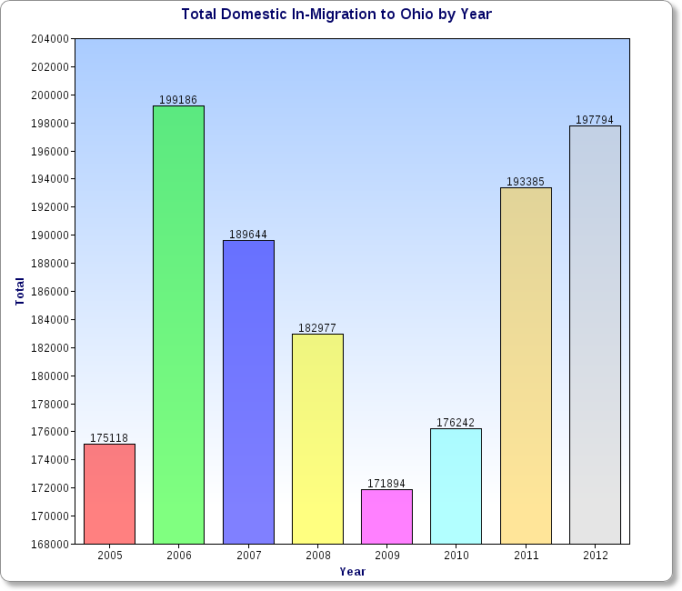
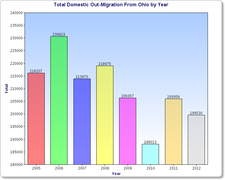
Ohio has been growing fairly slowly for several decades now. In fact, if it was not for Columbus’ population growth and international migration, the state would’ve been losing population in recent years. But is the picture really that bad? Are things changing? I decided to find out. The first chart above shows the total population that moved to Ohio from all other 49 states plus Puerto Rico and DC by year. The drop during the recession is pretty obvious, as mobility greatly decreased during that time. 2012 had the 2nd highest total of the period, only slightly behind 2006. What the out-migration chart shows is that the total is gradually going down, meaning fewer people, on average, are leaving Ohio each year. So what is the overall difference of in vs. out migration to Ohio? As the chart shows, the trend has been improving over time, and 2012 barely registered a loss at all. Will the state begin seeing positive domestic in-migration in the very near future? Based on this chart, the answer seems to be yes. A lot can still happen, but it does appear that Ohio is finally shaking off its long-term population issues.