The 1810 US Census doesn’t exactly have a lot of information available. The earliest censuses seem to focus more on economic information rather than population and demographics.
In 1810, Ohio had just 36 counties and Columbus had not been founded yet. Franklin County, however, did exist at the time, as well as Franklinton and a few other towns.
Franklin County Cotton Goods Value in Dollars: $6,043 Rank of Ohio’s Counties: 3rd Flaxen Goods Value in Dollars: $13,935 Rank of Ohio’s Counties: 13th Blended and Unnamed Cloths and Stuffs Value in Dollars: $9,927 Rank of Ohio’s Counties: 15th Woolen Goods Value in Dollars: $2,496 Rank of Ohio’s Counties: 13th # of Looms: 150 # of Naileries: 1 # of Tanneries: 5
That’s all I have for now, but if I find more information about the area in 1810, I will add it here.
One of the more interesting things the Census measures is the population from “City Hall”, or basically the metro population by distance from downtown. The metric measure population at every mile out from the center of each city’s downtown area. Since city boundaries come in all different sizes, this is a good way to compare urban populations.
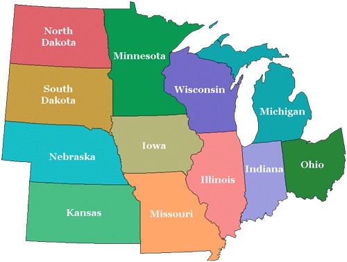
I looked at the 15 largest Midwest metros for these numbers.
First, here is a breakdown of aggregate population at each mile marker in 2010. Aggregate means that with each mile added, the population within all previous miles are added together.
This is a pretty bad showing in this list. In 2010, Columbus had the lowest downtown population, or population at Mile 0, of any of the largest 15 Midwest metros.
So while Columbus’ downtown is down at the bottom in this list to start, it ends up being a top 5 within just a few miles. Clearly, though, the city needs to do better at getting people in the center.
Columbus seems to hold its own from Mile 2 through about Mile 15 or 16, and then begins to fall back as full metro populations begin to take shape.
So now we know the exact populations by distance, but what about how those are changing over time? Here are the same miles and their total change from 2000 to 2010.
I posted the 2012 city estimates from the US Census yesterday. Within them may be an interesting trend that has long-term implications for Columbus and other cities, so today we’re going to go over 2012 urban population trends, and see how they compare.
A lot of the talk in the news in recent years has been how urban core cities are seeing a comeback of sorts. I’ve made mention of it several times, myself, with hard data located on the Demographics and Population part of this site. However, there is some disagreement between urban proponents and suburban proponents about what’s really going on, and that disagreement seems to focus mostly around if the city is growing faster than the suburbs, and if so, if that trend can be sustained.
Looking over the estimates, I noticed something that may support the urban back-to-the-city argument, at least in Columbus. What I noticed was that those villages/towns/cities that were growing tended to be clustered closer to the urban core of the metro than those that were losing population.
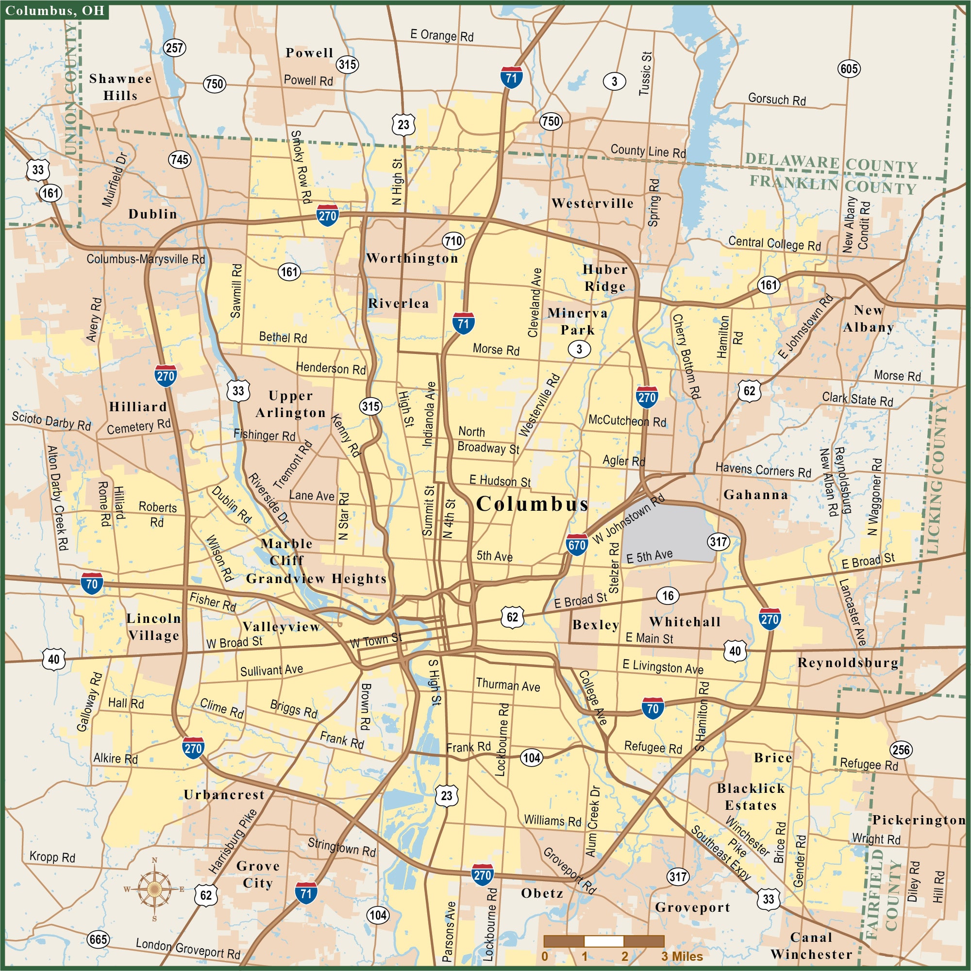
I first gathered the data on the Columbus metro area’s 99 incorporated places, ranging in population from 36 on up to Columbus’ 809,798. I then measured the distance between Columbus’ Downtown center and the center of all 99 places. I then broke them up into increments of about 5 miles each. Here is some of what I found.
Average Total Population Growth by Place 2010-2012 by Distance from Columbus’ Center 0-4.9 Miles: 3,962.8 5-9.9 Miles: 438.4 10-14.9 Miles: 342.8 15-19.9 Miles: 26.5 20-24.9 Miles: 148.9 25+ Miles: 10.5
What this says, is that for the most part, the closer a place is to the center, the more total average growth it’s had since 2010. While the 0-4.9 mile distance is somewhat skewed because it includes Columbus’ growth, there is also a significant drop-off beyond 15 miles from the center.
Next, I looked at all the places that saw either 0 population change or a loss during the 2010-2012 period. Again, it was separated by the distance from Columbus’ center.
0-4.9 Miles: 0 of 6, or 0.0% 5-9.9 Miles: 0 of 12, or 0.0% 10-14.9 Miles: 1 of 12, or 8.3% 15-19.9 Miles: 2 of 8, or 25.0% 20-24.9 Miles: 2 of 10, or 20.0% 25+ Miles: 21 of 51, or 41.2%
What this shows is that the further the distance away from the center, in general, the more places there were that were stagnant or lost population since 2010.
Finally, I looked at the top 15 total population increases of all places from 2010-2012, as well as their distance from Columbus’ center. 1. Columbus (obviously): +22,765- 0 Miles 2. Hilliard: +2,129- 9.9 Miles 3. Grove City: +1,257- 7.4 Miles 4. Delaware: +1,172- 23.6 Miles 5. Dublin: +1,155- 11.3 Miles 6. Westerville: +953- 12.0 Miles 7. New Albany: +783- 13.0 Miles 8. Gahanna: +580- 7.5 Miles 9. Powell: +460- 14.2 Miles 10. Reynoldsburg: +454- 9.9 Miles 11. Upper Arlington: +432- 4.1 Miles 12. Pickerington: +401- 14.1 Miles 13. Grandview Heights: +374- 2.6 Miles 14. Whitehall: +341- 6.0 Miles 15. Canal Winchester: +292- 12.7 Miles
12 of the 15 are within Franklin County. Another 2 (Pickerington and Powell) are near the Franklin County border. Only Delaware is beyond 15 miles from Columbus’ center.
So do these numbers show a real trend? Maybe. Some of the questions are: Do 2 years of data support a real trend or just a blip? Is this really an urban movement or a rural decline… or both? Is this a new/recent trend or have the numbers been changing? Those questions and others need to be answered before making a definitive statement, but if nothing else, they are a positive indication that Columbus and it’s immediate surroundings remain the metro’s (and Ohio’s) strongest population draw.
For those counting, there are 99 places in that list. 79 of them, or 79.8%, show growth over the period. Every place within Franklin County saw growth- maybe not down to the neighborhood level- but in all of the towns and cities.
Columbus passed 800,000 for the first time, and its actual growth rate increased from about 1.1% annually to 1.6% annually.
New 2012 metro and county population estimates have been released by the US Census, so we’ll break down the numbers and see if any trends pop out.
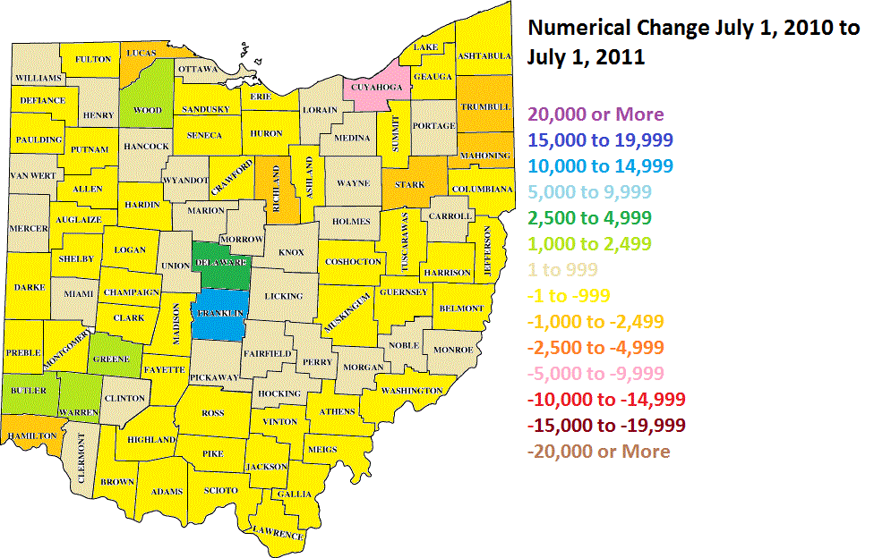
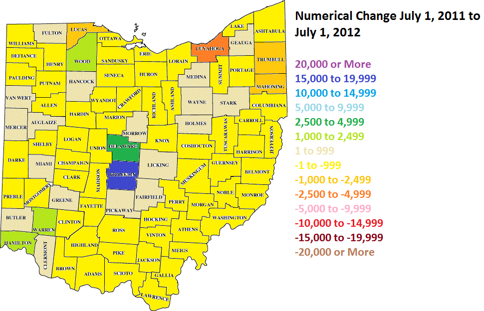
First the statewide county maps for numerical change for 2010-2011 and 2011-2012. Some good and bad with these. The bad is that fewer counties were estimated to be growing from 2011-2012 than were in 2010-2011. The good news it that central core counties improved their growth or slowed their losses, such as Franklin, Cuyahoga and Hamilton. This may mean that population is consolidating around urban cores rather than being spread out… or it may just mean that more counties are losing population.
If we take every county estimate, Ohio grew by 10,502, which is a slight improvement from 2011′s 8,447, which itself was faster than 2010′s 7,608. Still very slow, but seemingly getting a bit better each year.
As far as the metropolitan areas, their boundaries were changed last week as new definitions for what constitutes a metro area were introduced. This produced some rather drastic changes to metro areas and their populations.
Old and New Metro Boundaries and their Old and New Populations Akron: Did not change boundaries and still consists of Summit and Portage counties. 2011: 702,854 2012: 702,262
Canton: Did not change and is still Stark and Carroll counties. 2011: 403,164 2012: 403,455
Cincinnati: Added Union County, Indiana, but dropped Franklin County, Indiana. 2011: 2,122,330 2012: 2,128,603
Cleveland: Did not change and is still Cuyahoga, Lake, Lorain, Geauga and Medina counties. 2011: 2,068,397 2012: 2,063,535
Columbus: Added Perry and Hocking Counties. 2011: 1,925,137 2012: 1,944,002
Youngstown: Did not change, still Mahoning, Trumbull and Mercer County, PA. 2011: 561,697 2012: 558,206
As you can see, 5 of the 8 are losing population, though most had slower losses in 2012 than they did in 2011. This may also be a sign of population moving toward the urban centers, or again, could just be a blip.
One of the interesting pieces of data about the metro areas is the section on components of population change, meaning where did the growth or loss come from.
Total Metro Births July 1, 2011 to July 1, 2012 and Rank 1. Cincinnati: +27,374 2. Columbus: +25,910 3. Cleveland: +22,484 4. Dayton: +9,414 5. Akron: +7,418 6. Toledo: +7,285 7. Youngstown: +5,446
Total Metro Deaths July 1, 2011 to July 1, 2012 and Rank 1. Cleveland: -20,290 2. Cincinnati: -18,204 3. Columbus: -14,457 4. Dayton: -7,930 5. Youngstown: -6,811 6. Akron: -6,756 7. Toledo: -5,678
Natural Change (Births vs Deaths) July 1,2011 to July 1, 2012 and Rank 1. Columbus: +11,453 2. Cincinnati: +9,170 3. Cleveland: +2,194 4. Toledo: +1,607 5. Dayton: +1,484 6. Akron: +662 7. Youngstown: -1,365
Domestic Migration July 1, 2011 to July 1, 2012 and Rank 1. Columbus: +2,688 2. Akron: -2,248 3. Youngstown: -2,341 4. Dayton: -2,717 5. Toledo: -2,931 6. Cincinnati: -6,036 7. Cleveland: -10,579
Columbus is the only metro seeing positive domestic migration in Ohio.
International Migration July 1, 2011 to July 1, 2012 and Rank 1. Columbus: +4,729 2. Cleveland: +3,555 3. Cincinnati: +3,217 4. Dayton: +1,175 5. Akron: +1,009 6. Youngstown: +778 7. Toledo: +676
Total In-Migration July 1, 2011 to July 1, 2012 and Rank 1. Columbus: +7,417 2. Youngstown: -974 3. Akron: -1,239 4. Dayton: -1,542 5. Toledo: -2,255 6. Cincinnati: -2,819 7. Cleveland: -7,024
Canton is the only other Ohio metro that saw a net postive in-migration for the time period besides Columbus.