In Franklin County, the immigrant- or foreign-born- population has been growing rapidly for the last few decades. Latin American immigration was dominant for many years, but has recently taken secondary position to even faster Asian growth. But where does the immigrant population live, exactly? Where they end up in the county is perhaps not where common belief would always suggest. The interactive map below breaks down not only the main continent of origin for immigrants by census tract, but also gives the top 5 specific origin nations. While at first glance, the continents seem heavily grouped together, a deeper look at nations of origin indicate that immigrant populations are much more diverse and spread out much more evenly than it appears.
The US Census recently released updated estimates for 2016 for smaller-area designations like tracts and blocks. Looking at them, I wanted to see where racial groups were growing the fastest at that level. The first map is based on the % change from 2010 to 2016. What’s interesting about this map is that it is such a hodgepodge. No single part of the county is dominated by growth in any specific racial group. However, a few things can be generally determined. For example, almost all of the tracts where the White population is growing the fastest are within I-270, and the majority of those within the eastern half of the Columbus in what have long been dominated by Black majority populations. These areas include parts of Linden, the Near South and Near East sides. That said, the White population was growing the fastest in just 30 census tracts by % change. This compared to 53 for the Black population, 83 for the Asian population and 107 for the Hispanic population.
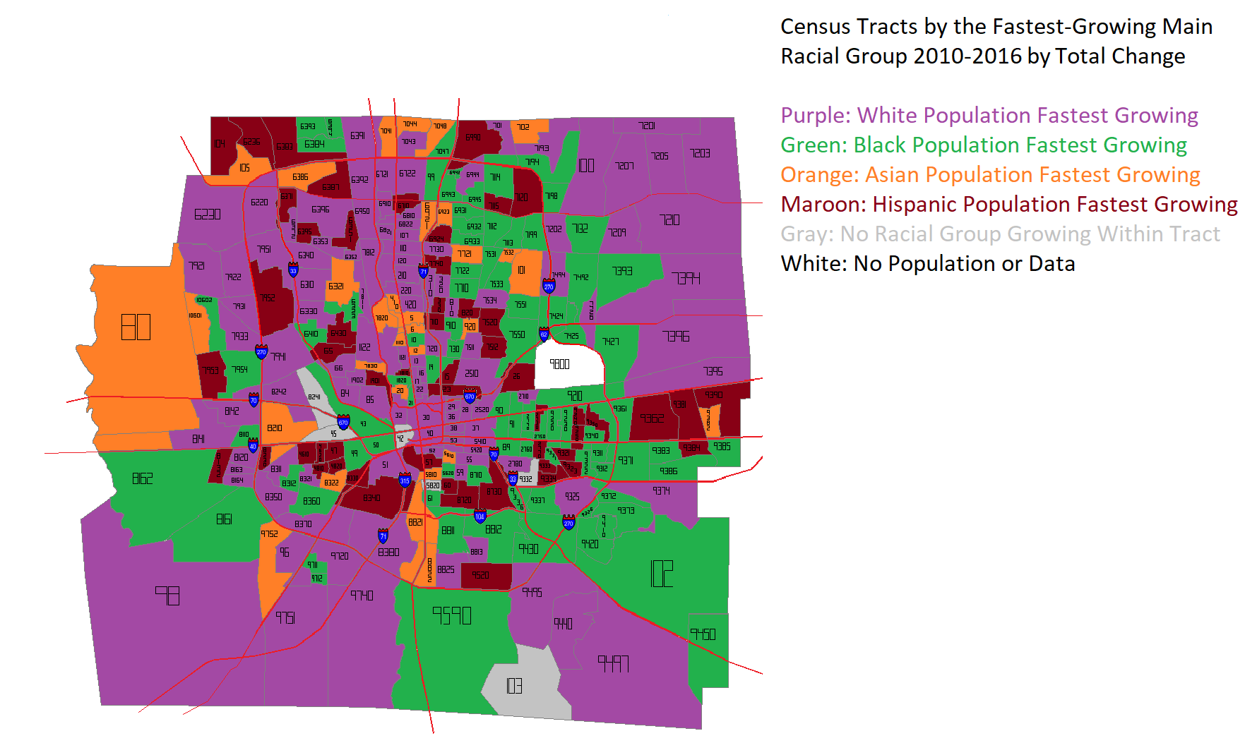
The next map takes a slightly different approach, measuring the TOTAL change in population, rather than by %. Again, a hodgepodge, but much less so than before. Instead of being the fastest-growing in just 30 tracts, the White population rockets up to 108 tracts. This shows that, while Asian and Hispanic populations have respectable % growth, this is largely based on comparatively small population bases. Still, non-White populations are clearly making inroads throughout Franklin County.
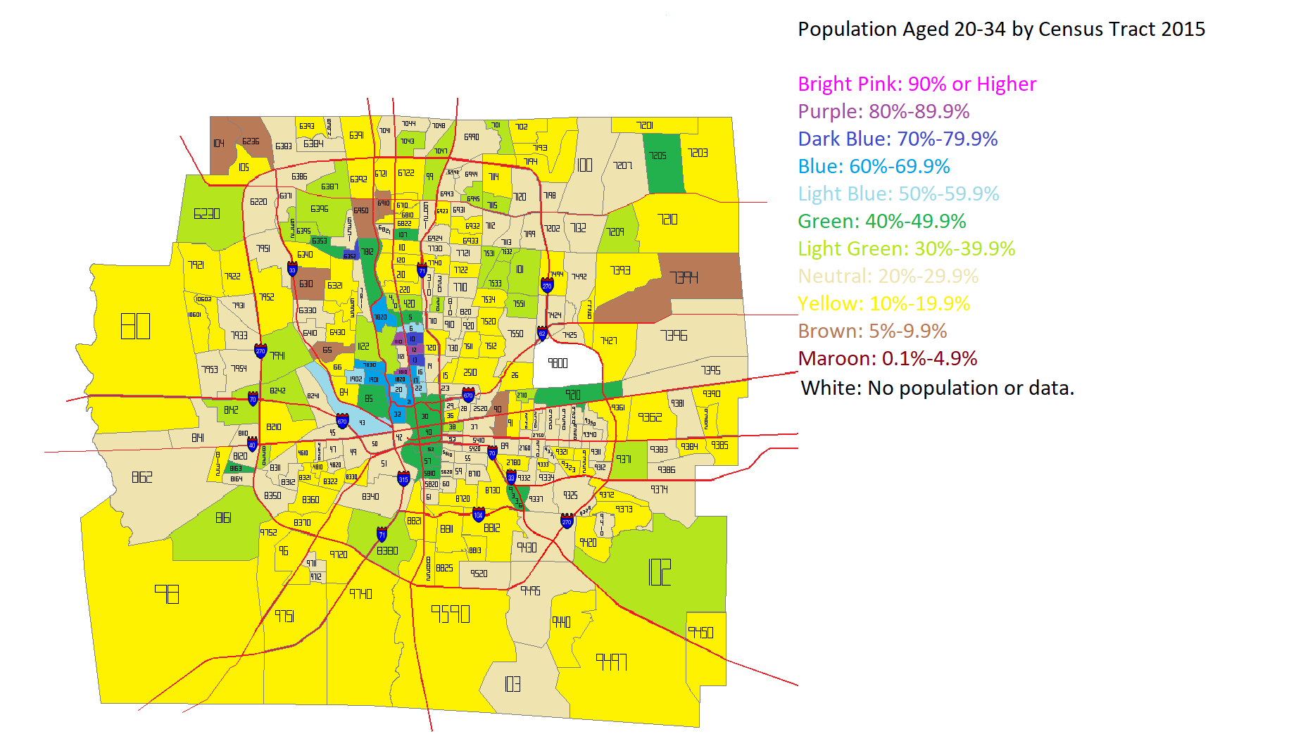
I’ve seen several articles across the internet lately questioning the idea that Millennials and young adults prefer density and urban areas. I decided to see how this played out in Franklin County overall. I first looked at the total population aged 20-34 in the year 2000 and the year 2015 by Census Tract. Here were the maps for those years.
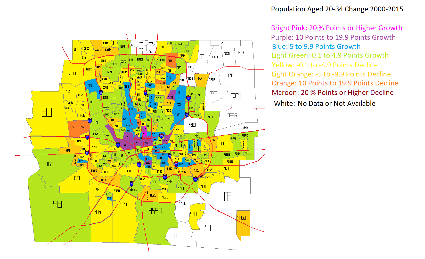
After looking at the numbers for both years, I came up with this map for how that age group had changed in the 2000-2015 period.
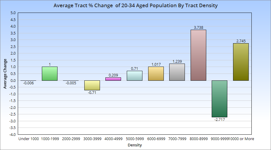
Unfortunately, some tracts, particularly in the eastern suburban areas, did not exist in 2000, and so I was not able to figure out the change for them during the period. The rest of the map, however, shows that the strongest growth in this age group was not only inside 270, but closest to Downtown and central corridors along Broad and High Streets. These maps don’t tell us about the relationship between those changes and the population density of the census tracts. So I went further and broke the tracts into increments of density to see where the strongest growth was occurring.
With a few exceptions, there appears to be a correlation between average 20-34 aged population growth and the density of the census tracts it occurs in. This suggests that this age group, at least in Franklin County, prefers areas with moderate to high density, which typically translates to urban living.
A little more than 4 years ago, I posted numbers on the recovery of Ohio downtowns, and what that might mean for the future. That post has proven to be one of the site’s most popular. I figured it was time to take a look at their continuing changes.
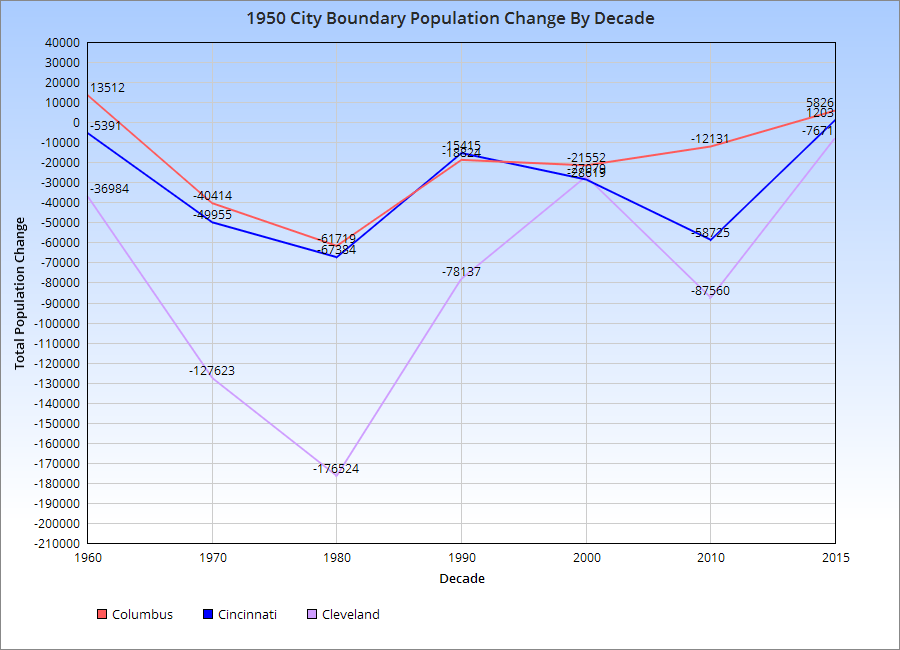
You can see by the chart for the 1950 Boundary population, the urban core of each city, that all 3-Cs suffered population losses post-1950. However, the rate of losses gradually declined, and 2 of the cities, Columbus and Cincinnati, appear to be growing in this boundary since at least 2010. Cleveland continues to lose.
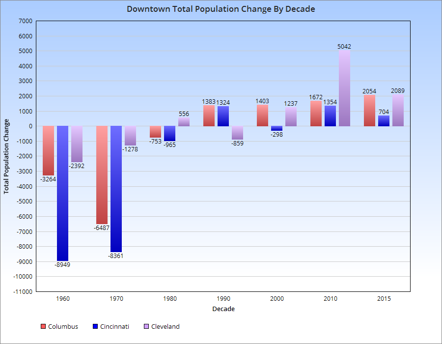
This is shown further by the chart below.
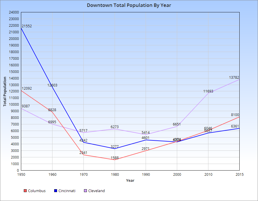
As far as the actual Downtowns of each, here are the population trends.
For the most part, population declines in the 3-Cs peaked around 1980, give or take a decade. Since then, all of them have seen increases, with Cleveland seeing the most rapid increase and Cincinnati the least. Columbus has seen steady, but increasingly rapid growth with each subsequent decade since 1980.
The US Census recently released 2015 census tract population density data, including census tract population density. I figured midway through the decade would be a good point to update where these stand because they give greater insight in smaller-scale population changes. I looked at all the census tracts in Franklin County and came up with the following map series.
First, the population in 2015.
Next, the population density of tracts in 2010, as reference.
And now 2015.
On the surface, it’s difficult to see the changes, but put side by side, you can tell there have been a lot of increases across the county. To make this more visible, I made the following maps.
You can see that some of the strongest density increases occurred around Downtown and the Short North, New Albany, parts of the Campus area, and Dublin.
The map above gives a straightforward look at where the density increased and decreased. As you can see, the increases FAR outweighed the decreases. Most of the latter were scattered except across the Far South Side and parts of the Whitehall area.
Here were the top 20 most dense census tracts in 2015. 1. 1810: 29,508.2 South Campus/Victorian Village 2. 1121: 25,287.9 Main Campus 3. 13: 21,961.4 Campus/Indianola Terrace 4. 1110: 18168.6 North Campus/Tuttle Park 5. 10: 17386.3 Campus/SoHud 6. 12: 16,981.9 Campus/Iuka Ravine 7. 20: 13,030.5 Short North/Victorian Village 8. 17: 12,872.3 Weinland Park 9. 6: 12,153.6 Old North Columbus 10. 21: 10,853.5 Short North/High Street 11. 8163: 10,255.3 Lincoln Village/Southwest Columbus 12: 4810: 9,557.4 South Central Hilltop 13. 47: 9,492.7 North Central Hilltop 14. 6352: 9,434.0 Northwest Columbus/Henderson Road 15. 57: 9,257.4 Brewery District/South German Village 16. 5: 9,177.9 Old North Columbus 17. 6933: 9,090.9 Forest Park East 18. 16: 8,980.5 Weinland Park 19. 4620: 8,928.6 North Central Hilltop 20. 1820: 8743.3 Victorian Village
It’s obvious that the High Street corridor is the most dense of the city, racking up most of the top 20.
Now here are the 20 tracts with the largest density increases 2010-2015. 1. 1121: 4,375.9 2. 6: 2,178.5 3. 21: 1,934.9 4. 22: 1,478.1 5. 40: 1,107.7 South Downtown 6. 1820: 1,044.1 7. 20: 921.7 8. 38: 904.3 Old Towne East 9. 5: 861.2 10. 210: 833.9 Clintonville 11. 32: 751.1 Arena District West/West Victorian Village 12. 730: 736.9 13. 7551: 656.0 Somerset/South Easton 14. 7951: 610.4 West Columbus 15. 6372: 574.6 Hayden Falls/Sawmill Road 16. 7209: 514 New Albany 17. 7395: 497.6 Blacklick/East Broad 18. 10: 492.8 19. 8230: 449.3 Westland 20. 710: 447.3 West-Central Linden
And finally, the top 20 largest declines 2010-2015. 1. 13: -2,964.3 2. 12: -1,625.1 3. 42: -1,620.8 Scioto Peninsula/East Franklinton 4. 920: -902.2 Northeast Linden 5. 17: -775.4 6. 50: -554.4 Franklinton 7. 61: -485.7 South High Street 8. 59: -441.9 Near South Side/Deshler Park 9. 4620: -380.4 10. 720: -380.2 11. 4610: -335.4 12. 820: -305.4 North Linden 13. 7721: -305.2 North Linden 14. 45: -258.1 North Hilltop 15. 60: -253.2 Vassor Village 16. 810: North Central Linden 17. 7532: -240.3 Morse Road/Easton 18. 2520: -240.1 Near East Side/King-Lincoln 19. 47: -206.6 20. 9333: -194.9 Linwood
So there you have it. The Census Tract Maps page gives demographic and population data for census tracts going back to 1930.