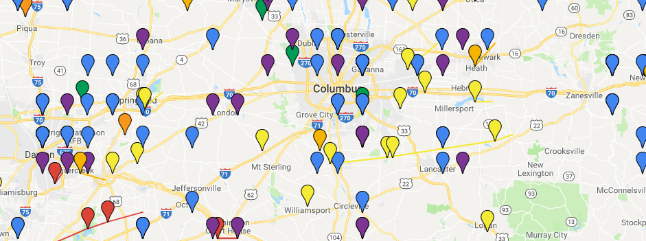
This program from the United States Geological Survey website, EarthExplorer, allows users to search information on both geological and manmade features across both the US and rest of the world. Just about every possible feature is available, from zip codes to cemeteries, bridges to waterfalls, military sites and oil fields.
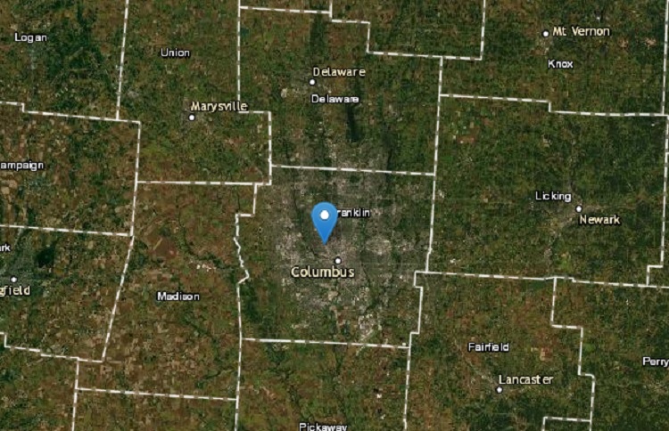
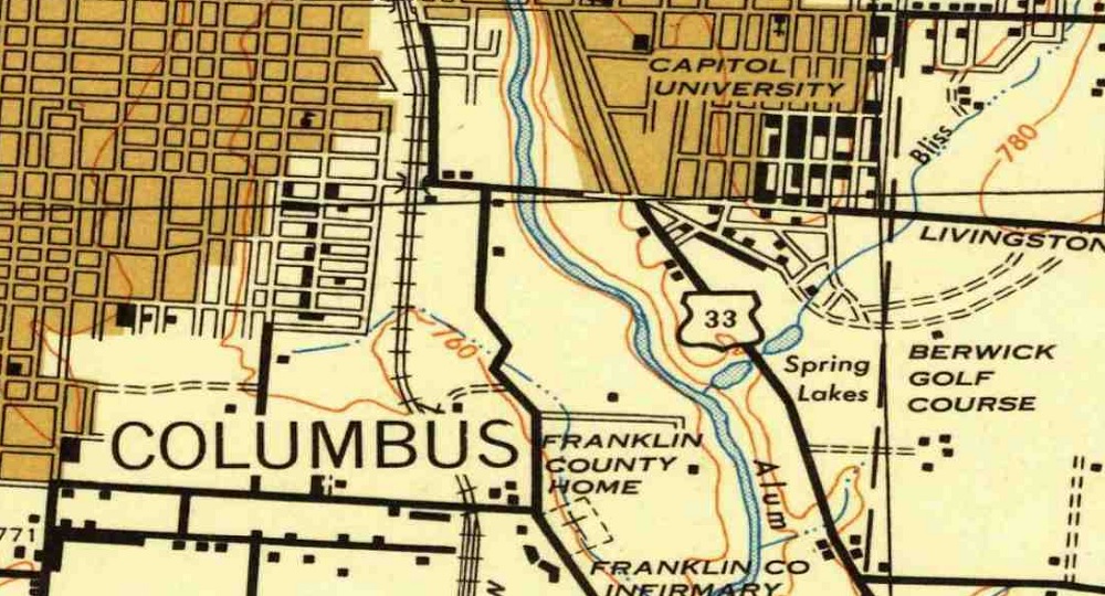
This link is a great resource to find old local maps for cities, counties and states from the US to around the world. For Columbus, maps go back to the 1920s, but other locations have even older versions. The maps are helpful for those doing research on this history of their cities.
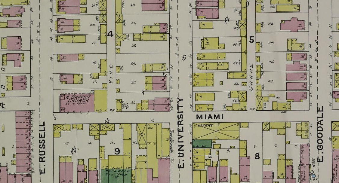
Another favorite link is the Sanborn Fire Insurance Maps. These maps are even more detailed and you can view individual buildings down to the street level back to the 19th Century. These maps are available at the Library of Congress and require a bit more searching to find what you’re looking for.
Columbus Development Maps 2010-2013 Development 2014-2019 Development 2020-2025 Development All these pages are basically just map versions of the development pages. However, the maps are organized by year and include before and after photos of the development sites.
Columbus Fantasy Transit Map 2019 Transit Map The transit map for the Columbus Metro Area is just one example of many existing fantasy maps for Central Ohio. This one includes routes for light rail, BRT (Bus Rapid Transit) and interurban rail to neighboring counties.
The Redevelopment of Westland Mall Mall Site Westland Mall and the larger surrounding area is in desperate need of a revamp. Recently, a proposal to make the site into a “Weston” development in the potential style of Easton has emerged. I made this map several years ago as a basic blueprint for how the entire area could be rebuilt into a much more urban, walkable, vibrant corridor.
Columbus Area Bike Lanes, Multi-use Paths and Sidewalk Infrastructure Bike Infrastructure This map attempts to include all the existing bike and multi-use infrastructure in the area, along with general pedestrian infrastructure. The map will is not fully updated yet through 2019.
Downtown Columbus Parking Infrastructure Parking Lots and Garages This map, last updated in 2015, documents all existing parking garages and surfaces lots throughout Downtown.
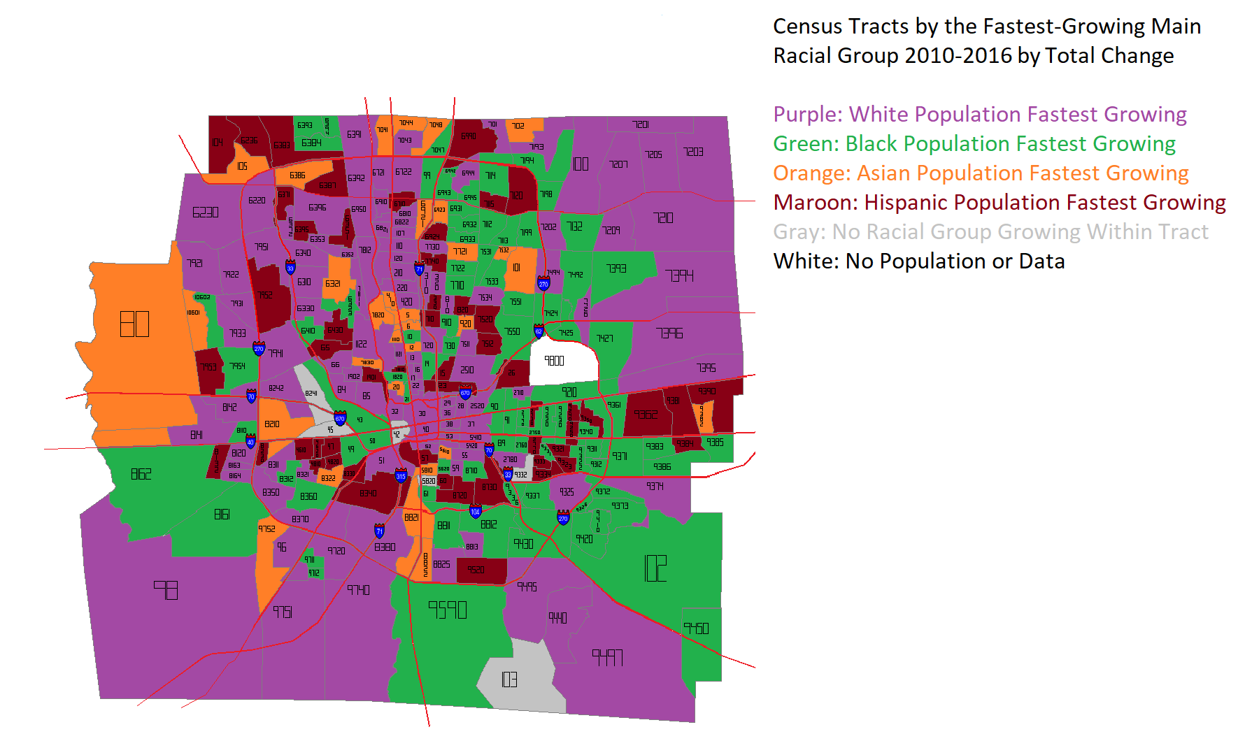
The US Census recently released updated estimates for 2016 for smaller-area designations like tracts and blocks. Looking at them, I wanted to see where racial groups were growing the fastest at that level. The first map is based on the % change from 2010 to 2016. What’s interesting about this map is that it is such a hodgepodge. No single part of the county is dominated by growth in any specific racial group. However, a few things can be generally determined. For example, almost all of the tracts where the White population is growing the fastest are within I-270, and the majority of those within the eastern half of the Columbus in what have long been dominated by Black majority populations. These areas include parts of Linden, the Near South and Near East sides. That said, the White population was growing the fastest in just 30 census tracts by % change. This compared to 53 for the Black population, 83 for the Asian population and 107 for the Hispanic population.
The next map takes a slightly different approach, measuring the TOTAL change in population, rather than by %. Again, a hodgepodge, but much less so than before. Instead of being the fastest-growing in just 30 tracts, the White population rockets up to 108 tracts. This shows that, while Asian and Hispanic populations have respectable % growth, this is largely based on comparatively small population bases. Still, non-White populations are clearly making inroads throughout Franklin County.
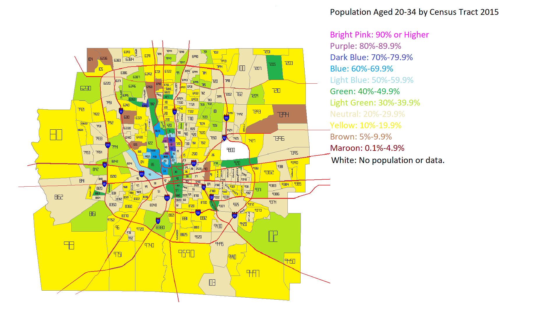
I’ve seen several articles across the internet lately questioning the idea that Millennials and young adults prefer density and urban areas. I decided to see how this played out in Franklin County overall. I first looked at the total population aged 20-34 in the year 2000 and the year 2015 by Census Tract. Here were the maps for those years.
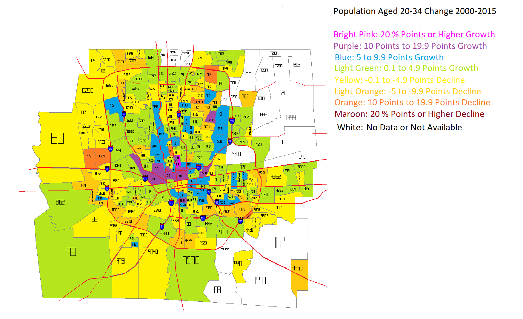
After looking at the numbers for both years, I came up with this map for how that age group had changed in the 2000-2015 period.
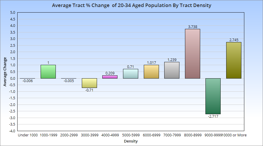
Unfortunately, some tracts, particularly in the eastern suburban areas, did not exist in 2000, and so I was not able to figure out the change for them during the period. The rest of the map, however, shows that the strongest growth in this age group was not only inside 270, but closest to Downtown and central corridors along Broad and High Streets. These maps don’t tell us about the relationship between those changes and the population density of the census tracts. So I went further and broke the tracts into increments of density to see where the strongest growth was occurring.
With a few exceptions, there appears to be a correlation between average 20-34 aged population growth and the density of the census tracts it occurs in. This suggests that this age group, at least in Franklin County, prefers areas with moderate to high density, which typically translates to urban living.