2011 Census Tract Estimates


2011 census tract estimates Columbus, Ohio

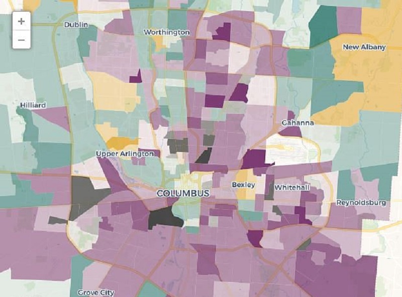
While I wouldn’t normally make a post on the 2011 census tract estimates- or any other estimates for them- because I really don’t know what their reliability is, I thought it might be an interesting exercise.

I only looked at those tracts that made up the original 1950 boundaries as well as some of the adjacent areas. I won’t go into too much detail, but…

In 2010, only 20 of the 78 tracts I looked at were growing. Well, specifically, only 20 grew during the 2000-2010 period, not just in 2010 alone. So several more could’ve been starting to recover in 2010, but since it measured the whole decade, it might still show up as a loss. In any case, the 2011 estimates are interesting just because they show a much different picture.

If I use the exact estimate used, 34 of the 78 tracts were growing in 2011, a significant improvement. However, some of the estimates were hard to understand where they came from. For example, they had Downtown tracts, which have had rapid growth the last decade, as declining in population for 2011, even while more and more residential units are built and more people move into the area. Also, they showed some tracts gaining population when the long-term trend is for significant loss and no reason to see that reversing.

So using the margin of error as a guide, I went back over them and did my own estimates. Of the 78 tracts, I only did my own for 14, as they were the only ones I felt didn’t match the reality on the ground or the long-term trends. With those changes, 38 of the 78 were growing, a slight increase of the official 34.

If we use the official estimates, the total population for the 78 tracts was 232,297, a loss of 2,285 since 2010. If we use my estimates, the population would be 237,806, or an increase of 3,224. So what’s the real story? Well, new 2012 tract estimates will be coming out soon. When they do, I will compare and see what, if any, updates should be made. The only real way to know, however, is to wait until 2020 with the next census. Still, until that time, it’s fun to look at the numbers- or maps– and see if the urban core is recovering in the same way that cities and towns are in and around Franklin County.


2012 Urban Population Trends


2012 urban and suburban population trends

I posted the 2012 city estimates from the US Census yesterday. Within them may be an interesting trend that has long-term implications for Columbus and other cities, so today we’re going to go over 2012 urban population trends, and see how they compare.

A lot of the talk in the news in recent years has been how urban core cities are seeing a comeback of sorts. I’ve made mention of it several times, myself, with hard data located on the Demographics and Population part of this site. However, there is some disagreement between urban proponents and suburban proponents about what’s really going on, and that disagreement seems to focus mostly around if the city is growing faster than the suburbs, and if so, if that trend can be sustained.

Looking over the estimates, I noticed something that may support the urban back-to-the-city argument, at least in Columbus. What I noticed was that those villages/towns/cities that were growing tended to be clustered closer to the urban core of the metro than those that were losing population.

I first gathered the data on the Columbus metro area’s 99 incorporated places, ranging in population from 36 on up to Columbus’ 809,798. I then measured the distance between Columbus’ Downtown center and the center of all 99 places. I then broke them up into increments of about 5 miles each. Here is some of what I found.

Average Total Population Growth by Place 2010-2012 by Distance from Columbus’ Center
0-4.9 Miles: 3,962.8
5-9.9 Miles: 438.4
10-14.9 Miles: 342.8
15-19.9 Miles: 26.5
20-24.9 Miles: 148.9
25+ Miles: 10.5

What this says, is that for the most part, the closer a place is to the center, the more total average growth it’s had since 2010. While the 0-4.9 mile distance is somewhat skewed because it includes Columbus’ growth, there is also a significant drop-off beyond 15 miles from the center.

Next, I looked at all the places that saw either 0 population change or a loss during the 2010-2012 period. Again, it was separated by the distance from Columbus’ center.

0-4.9 Miles: 0 of 6, or 0.0%
5-9.9 Miles: 0 of 12, or 0.0%
10-14.9 Miles: 1 of 12, or 8.3%
15-19.9 Miles: 2 of 8, or 25.0%
20-24.9 Miles: 2 of 10, or 20.0%
25+ Miles: 21 of 51, or 41.2%

What this shows is that the further the distance away from the center, in general, the more places there were that were stagnant or lost population since 2010.

Finally, I looked at the top 15 total population increases of all places from 2010-2012, as well as their distance from Columbus’ center.
1. Columbus (obviously): +22,765- 0 Miles
2. Hilliard: +2,129- 9.9 Miles
3. Grove City: +1,257- 7.4 Miles
4. Delaware: +1,172- 23.6 Miles
5. Dublin: +1,155- 11.3 Miles
6. Westerville: +953- 12.0 Miles
7. New Albany: +783- 13.0 Miles
8. Gahanna: +580- 7.5 Miles
9. Powell: +460- 14.2 Miles
10. Reynoldsburg: +454- 9.9 Miles
11. Upper Arlington: +432- 4.1 Miles
12. Pickerington: +401- 14.1 Miles
13. Grandview Heights: +374- 2.6 Miles
14. Whitehall: +341- 6.0 Miles
15. Canal Winchester: +292- 12.7 Miles

12 of the 15 are within Franklin County. Another 2 (Pickerington and Powell) are near the Franklin County border. Only Delaware is beyond 15 miles from Columbus’ center.

So do these numbers show a real trend? Maybe. Some of the questions are: Do 2 years of data support a real trend or just a blip? Is this really an urban movement or a rural decline… or both? Is this a new/recent trend or have the numbers been changing? Those questions and others need to be answered before making a definitive statement, but if nothing else, they are a positive indication that Columbus and it’s immediate surroundings remain the metro’s (and Ohio’s) strongest population draw.


2012 City Population Estimates


2012 city population estimates Columbus, Ohio

Here are the 2012 city population estimates for just about every location within the Columbus Metro Area.

The numbers show what the 2010 Census population was, the July 1, 2012 estimate, and the total change over that period.

City- 2010 – 2012 – Change
Alexandria 517 518 +1
Amanda 737 741 +4
Ashley 1,330 1,344 +14
Ashville 4,097 4,115 +18
Baltimore 2,966 2,968 +2
Bexley 13,057 13,252 +195
Bremen 1,425 1,438 +13
Brice 115 116 +1
Buckeye Lake 2,746 2,723 -23
Canal Winchester 7,101 7,393 +292
Cardington 2,047 2,046 -1
Carroll 524 524 0
Chesterville 228 229 +1
Circleville 13,314 13,453 +139
Columbus 787,033 809,798 +22765
Commercial Point 1,582 1,587 +5
Corning 583 579 -4
Crooksville 2,534 2,518 -16
Darbyville 222 224 +2
Delaware 34,753 35,925 +1172
Dublin 41,751 42,906 +1155
Edison 437 439 +2
Fulton 258 259 +1
Gahanna 33,248 33,828 +580
Galena 653 666 +13
Glenford 173 176 +3
Grandview Heights 6536 6910 +374
Granville 5646 5638 -8
Gratiot 221 221 0
Grove City 35575 36832 +1257
Groveport 5363 5540 +177
Hanover 921 1002 +81
Harrisburg 320 326 +6
Hartford 397 393 -4
Heath 10310 10389 +79
Hebron 2336 2350 +14
Hemlock 155 155 0
Hilliard 28435 30564 +2129
Johnstown 4632 4806 +174
Junction City 819 816 -3
Kirkersville 525 528 +3
Lancaster 38780 38880 +100
Laurelville 527 523 -4
Lithopolis 1106 1181 +75
Lockbourne 237 241 +4
Logan 7152 7157 +5
London 9904 9876 -28
Magnetic Springs 268 270 +2
Marble Cliff 573 580 +7
Marengo 342 344 +2
Marysville 22094 22051 -43
Midway 322 322 0
Milford Center 792 802 +10
Millersport 1044 1047 +3
Minerva Park 1272 1291 +19
Mount Gilead 3660 3658 -2
Mount Sterling 1782 1716 -66
Murray City 449 445 -4
New Albany 7724 8507 +783
Newark 47573 47688 +115
New Holland 801 827 +26
New Lexington 4731 4751 +20
New Straitsville 722 720 -2
Obetz 4532 4628 +96
Orient 270 272 +2
Ostrander 643 656 +13
Pataskala 14962 15091 +129
Pickerington 18291 18692 +401
Plain City 4225 4221 -4
Pleasantville 960 955 -5
Powell 11500 11960 +460
Rendville 36 36 0
Reynoldsburg 35893 36347 +454
Richwood 2229 2238 +9
Riverlea 545 555 +10
Rushville 302 304 +2
St Louisville 373 374 +1
Shawnee 655 652 -3
Shawnee Hills 681 709 +28
Somerset 1481 1473 -8
South Bloomfield 1744 1770 +26
South Solon 355 355 0
Sparta 161 162 +1
Stoutsville 560 563 +3
Sunbury 4389 4605 +216
Tarlton 282 285 +3
Thornville 991 995 +4
Thurston 604 607 +3
Unionville Center 233 235 +2
Upper Arlington 33771 34203 +432
Urbancrest 960 975 +15
Utica 2132 2130 -2
Valleyview 620 627 +7
Westerville 36120 37073 +953
West Jefferson 4222 4199 -23
West Rushville 134 135 +1
Whitehall 18062 18403 +341
Williamsport 1023 1032 +9
Worthington 13575 13757 +182

For those counting, there are 99 places in that list. 79 of them, or 79.8%, show growth over the period. Every place within Franklin County saw growth- maybe not down to the neighborhood level- but in all of the towns and cities.

Columbus passed 800,000 for the first time, and its actual growth rate increased from about 1.1% annually to 1.6% annually.


Tract Demographic Changes Mapped


One of the most interesting things about the last census- at least to me- was the data on what demographic groups were moving where in Columbus. The following series of maps show the central core of Columbus and how the 4 major racial/ethnic groups have been changing in the area, both in 2000 and 2010.

While I can’t directly post images, the best way to look at the following map series is to open the 2000 and 2010 versions and do a side by side comparison.

White Demographic
2000

http://www.washingtonpost.com/wp-srv/special/nation/census/2010/?custommap=1,0,1,0,40.00535,-83.0034,11
In the 2000 map above, you could almost count the number of urban tracts with a growing White population on one hand. Even as far out as the I-270 corridor, there was a distinct lack of tracts where this group was growing. The vast majority of the growth in this demographic was in the far suburbs.
2010
http://www.washingtonpost.com/wp-srv/special/nation/census/2010/?custommap=1,0,2,0,40.00535,-83.0034,11
By 2010, there had been some interesting changes. First, the ring of strong suburban growth seems to have lessened some, or at the very least, spread out more. Meanwhile, the tracts that were losing the White demographic pushed further out as well into some of these suburban areas. In the city’s urban core, the White population has clearly also been on the rise. While there were just a few positive tracts in 2000, just about every tract between Merion Village and Clintonville was growing in White population by 2010, as well as strong growth in the Near East Side, the Easton area and Downtown. Even a few tracts in the southern portions of Linden saw increases.

The question is, how will the map look in 2020? If the trends continue, the urban core should continue to expand its growth in this demographic. Sort of a reverse donut hole growth pattern.

Black Demographic
2000

http://www.washingtonpost.com/wp-srv/special/nation/census/2010/?custommap=1,1,1,0,40.00535,-83.0034,11
In 2000, much of the urban core of Columbus was losing the Black demographic. While not nearly as stark as the 2000 map for Whites, the suburbs were once again the easy winner for this demographic’s best growth.
2010
http://www.washingtonpost.com/wp-srv/special/nation/census/2010/?custommap=1,1,2,0,40.00535,-83.0034,11
The 2010 map does show improvement, with more urban tracts gaining. The area of losses are almost exclusively concentrated on the Near East Side and Southeast Side. These same areas have historically been largely African American neighborhoods, so it may just be a case of majority population shift.

Asian Demographic
2000

http://www.washingtonpost.com/wp-srv/special/nation/census/2010/?custommap=1,3,1,0,40.00535,-83.0034,11
In 2000, Asian growth was fairly widespread, even in the urban core. There were weak spots, but not nearly as bad as the ones above.
2010
http://www.washingtonpost.com/wp-srv/special/nation/census/2010/?custommap=1,3,2,0,40.00535,-83.0034,11
By 2010, though, there were some big changes. Out of the 4 demographic groups looked at, Asians were the only group which looks to have left the urban core more in the 2000s than they did in the 1990s. While other groups are increasing their presence in the city, Asians are doing just the opposite. There are still strong pockets of growth, and it’s still not as bad as Whites, but clearly there is a different dynamic to their moving patterns than with the other 3.

Hispanic Demographic
2000

http://www.washingtonpost.com/wp-srv/special/nation/census/2010/?custommap=1,2,1,0,40.00535,-83.0034,11
Hispanics had the best overall growth map in 2000, with widespread, strong growth across most areas of the city. The inner West Side did the worst and the suburbs did the best, but overall it’s not bad.
2010
http://www.washingtonpost.com/wp-srv/special/nation/census/2010/?custommap=1,2,2,0,40.00535,-83.0034,11
2010 showed an even stronger growth by Hispanics across the city. There were only about 15 tracts total between Downtown and the suburbs that did not see growth in this demographic, out of more than 200.

It seems clear from these maps that the urban areas of Columbus are starting to become more attractive, or at least were the previous decade. Recent years have only seemed to strengthen this trend.

To see census tract data for Columbus going back to 1930, visit here: Census Tract Maps


Cool Link Columbus Job Density


The Brookings Institute recently released a study on job density, or basically where jobs are most heavily concentrated within metro areas.

Here is how Columbus job density compared to other Ohio metros.

Total Jobs Located within 3 Miles of the Central Business District (Downtown) in 2010, Most to Least
1. Columbus: 157,193
2. Cincinnati: 151,956
3. Cleveland: 127,846
4. Dayton: 75,481
5. Akron: 66,247
6. Toledo: 59,552
7. Youngstown: 54,368

% of Total Metro Jobs Located within 3 Miles of the Central Business District (Downtown) in 2010, Highest to Lowest
1. Youngstown: 27.3%
2. Akron: 24.9%
3. Dayton: 24.5%
4. Toledo: 23.8%
5. Columbus: 21.2%
6. Cincinnati: 17.7%
7. Cleveland: 15.4%

So Columbus has the highest total number of jobs within 3 miles of the CBD, but is in the bottom half for % of total metro jobs in that area.

Jobs Change from 2000-2010 for all Jobs Located within 3 Miles of the CBD, Best to Worst
1. Toledo: -15,412
2. Akron: -16,700
3. Youngstown: -17,307
4. Columbus: -30,338
5. Cincinnati: -31,717
6. Dayton: -32,420
7. Cleveland: -54,134

% Jobs Change from 2000-2010 for all Jobs Located within 3 Miles of the CBD, Best to Worst
1. Cincinnati: -1.9%
2. Cleveland: -2.1%
3. Akron: -2.5%
4. Columbus: -2.5%
5. Toledo: -2.5%
6. Youngstown: -2.9%
7. Dayton: -3.9%

At first glance, this may seem like horrible news, and while it’s not necessarily good, almost all metros lost jobs in this area, even high growth cities like Charlotte, Atlanta, Dallas, etc. This has a lot to do with the suburbanization of the nation over the last several decades, including during most of the 2000s. Jobs left the central core to spread out into the suburban areas people were moving to.

Total Jobs Located Between 3 and 10 Miles from the CBD in 2010, Highest to Lowest
1. Columbus: 321,508
2. Cleveland: 317,128
3. Cincinnati: 252,789
4. Dayton: 164,453
5. Toledo: 137,339
6. Akron: 117,986
7. Youngstown: 89,711

% of Total Metro Jobs Located Between 3 and 10 Miles from the CBD in 2010, Highest to Lowest
1. Toledo: 54.8%
2. Dayton: 53.4%
3. Youngstown: 45.1%
4. Akron: 44.3%
5. Columbus: 43.4%
6. Cleveland: 38.1%
7. Cincinnati: 29.5%

% Jobs Change 2000-2010 for all Jobs Located Between 3 and 10 Miles from the CBD, Best to Worst
1. Dayton: +1.5%
2. Youngstown: +1.1%
3. Akron: +0.7%
4. Toledo: -0.1%
5. Cincinnati: -1.4%
6. Cleveland: -1.4%
7. Columbus: -2.4%

The positive % changes even while the area lost jobs has to do with how many the share of total metro jobs. While the area may have lost jobs, its share of the entire metro grew as other areas shrank faster.

Finally, the far suburbs…

Total Jobs Located between 10 and 35 Miles from the CBD in 2010, Highest to Lowest
1. Cincinnati: 452,895
2. Cleveland: 386,727
3. Columbus: 262,003
4. Akron: 82,260
5. Dayton: 67,838
6. Youngstown: 54,709
7. Toledo: 53,736

% of Total Metro Jobs Located Between 10 and 35 Miles from the CBD in 2010, Highest to Lowest
1. Cincinnati: 52.8%
2. Cleveland: 46.5%
3. Columbus: 35.4%
4. Akron: 30.9%
5. Youngstown: 27.5%
6. Dayton: 22.0%
7. Toledo: 21.4%

% Jobs Change 2000-2010 for all Jobs Located Between 10 and 35 Miles from the CBD, Best to Worst
1. Columbus: +5.0%
2. Cleveland: +3.5%
3. Cincinnati: +3.3%
4. Dayton: +2.5%
5. Toledo: +2.5%
6. Akron: +1.7%
7. Youngstown: +1.7%

So what do all these numbers show? Well, the larger the metro, the more spread out it seems to be as far as where jobs are located. Smaller metros like Akron and Dayton are more compact. Columbus is the most compact of the 3-Cs and has the most total jobs, by far, within 10 miles of its core of any metro, but not by %. None of the metros saw real jobs growth within 10 miles of their cores, which is to be expected. However, in recent years, urban development has exploded, and companies seem to be shifting jobs closer to the center. It remains to be seen if these are long term trends or just a blip.