The 2015 housing market was one of the strongest since before the recession, and 2016 looks to do even better. An ongoing problem, especially within the more urban markets, is a historically low inventory of available homes for sale. This has been a problem for several years now, as construction has failed to match demand.
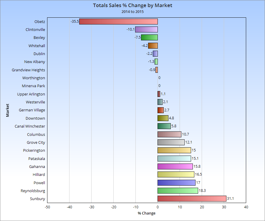
That lack of inventory really shows up in the yearly % change chart. Few urban markets have increased year over year, as they have a much more limited supply of housing, even as demand for urban housing has increased.
Let’s see how this impacted prices.
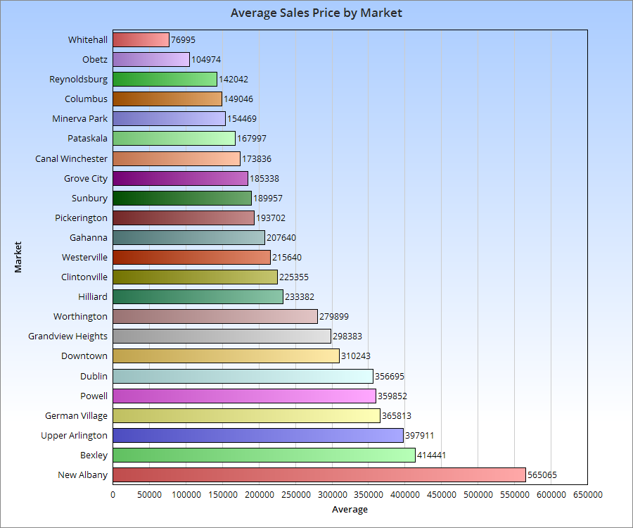
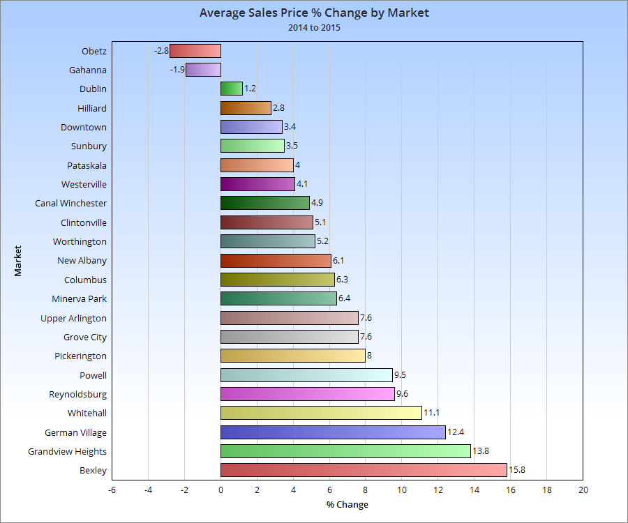
While urban markets were not necessarily the most expensive compared to suburban, more of them were generally towards the top half of price increases last year.
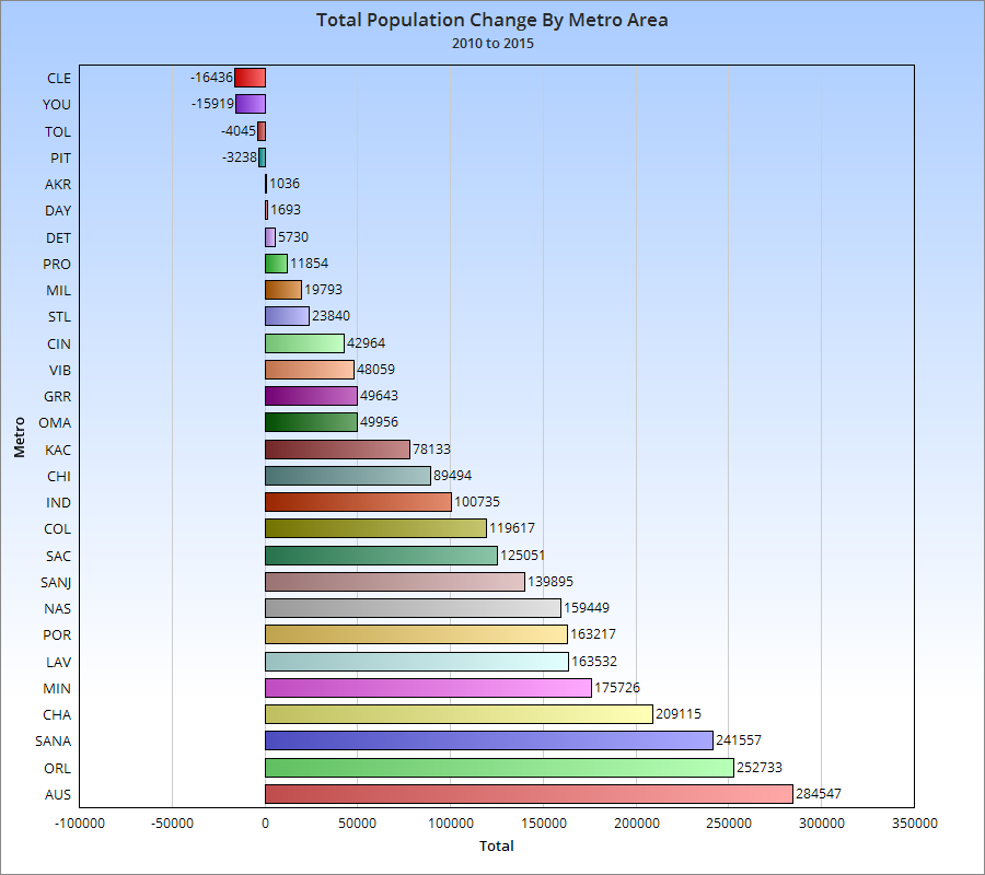
As promised, here are the 2015 metro area population estimates for Columbus and its regional and national peers.
2015 Metro Population Estimates Chicago, IL: 9,551,031 Detroit, MI: 4,302,043 Minneapolis, MN: 3,524,583 St. Louis, MO: 2,811,588 Charlotte, NC: 2,426,363 Portland, OR: 2,389,228 Orlando, FL: 2,387,138 San Antonio, TX: 2,384,075 Pittsburgh, PA: 2,353,045 Sacramento, CA: 2,274,194 Cincinnati: 2,157,719 Las Vegas, NV: 2,114,801 Kansas City, MO: 2,087,471 Cleveland: 2,060,810 Columbus: 2,021,632 Austin, TX: 2,000,860 Indianapolis: 1,988,817 San Jose, CA: 1,976,836 Nashville, TN: 1,830,345 Virginia Beach, VA: 1,724,876 Providence, RI: 1,613,070 Milwaukee, WI: 1,575,747 Grand Rapids, MI: 1,038,583 Omaha, NE: 915,312 Dayton: 800,909 Akron: 704,243 Toledo: 605,956 Youngstown: 549,885
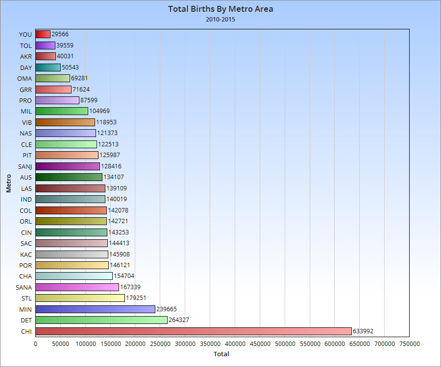
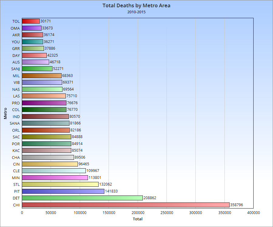
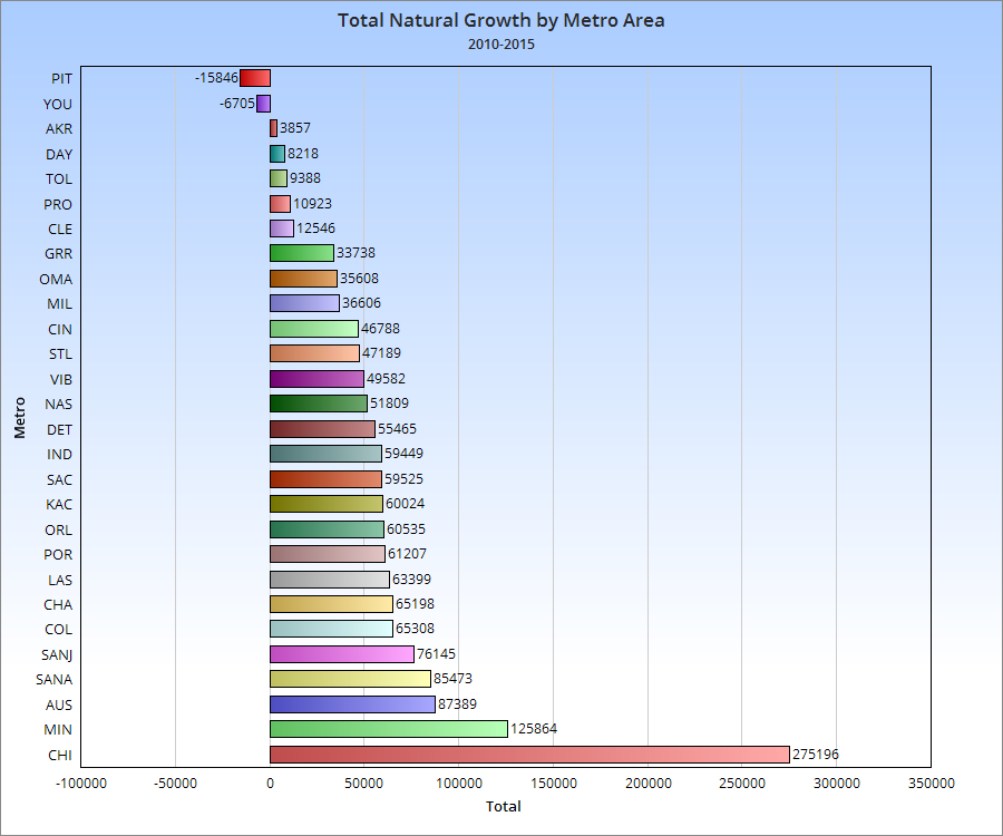
Components of Metro Area Population Change As you can see, while Columbus has a middle of the road birth rate for its peers, its relatively low death rate means that it manages to be near the top of the its peer group in natural growth.
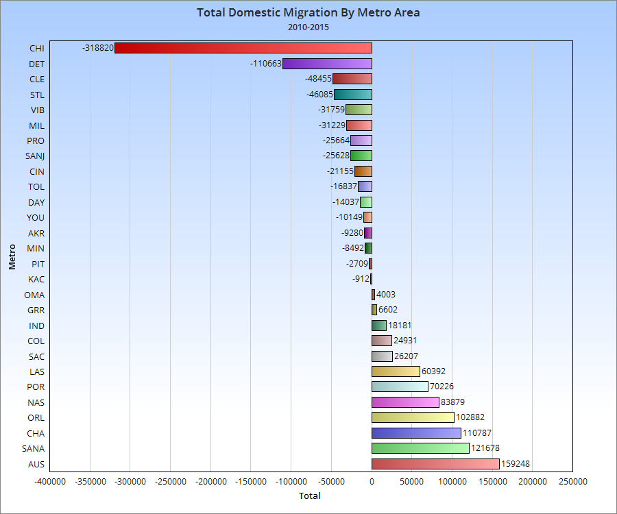
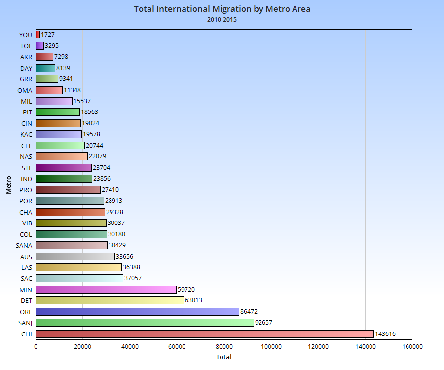
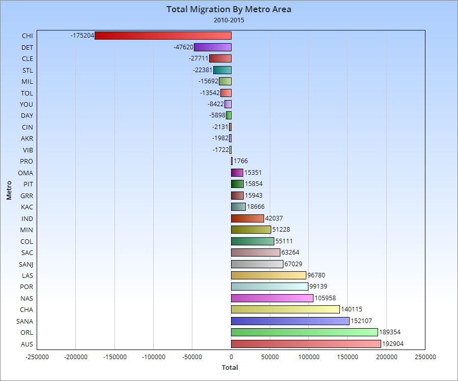
It seems that while international migration is competitive with peers in the Columbus metro, domestic migration would need to improve to truly be at the upper peer level. At the very least, it is positive.
Economic segregation is basically where people living in the same city are segregated in terms of financial characteristics, such as housing prices or income. This is considered negative as the more economically segregated an area is, the harder it is for people, especially in lower income brackets, to move up financially. My report on economic segregation in Columbus focuses on household income within census tracts in Franklin County and where those household incomes are changing the most.
First of all, let’s look at the household income levels around the county, both in 2000 and 2014. In 2000, the median household income for the county was highest in the Upper Arlington and Grandview, Dublin, Bexley, Hilliard and the New Albany area. Downtown and adjacent areas had the lowest, as well as the general urban core and East Side.
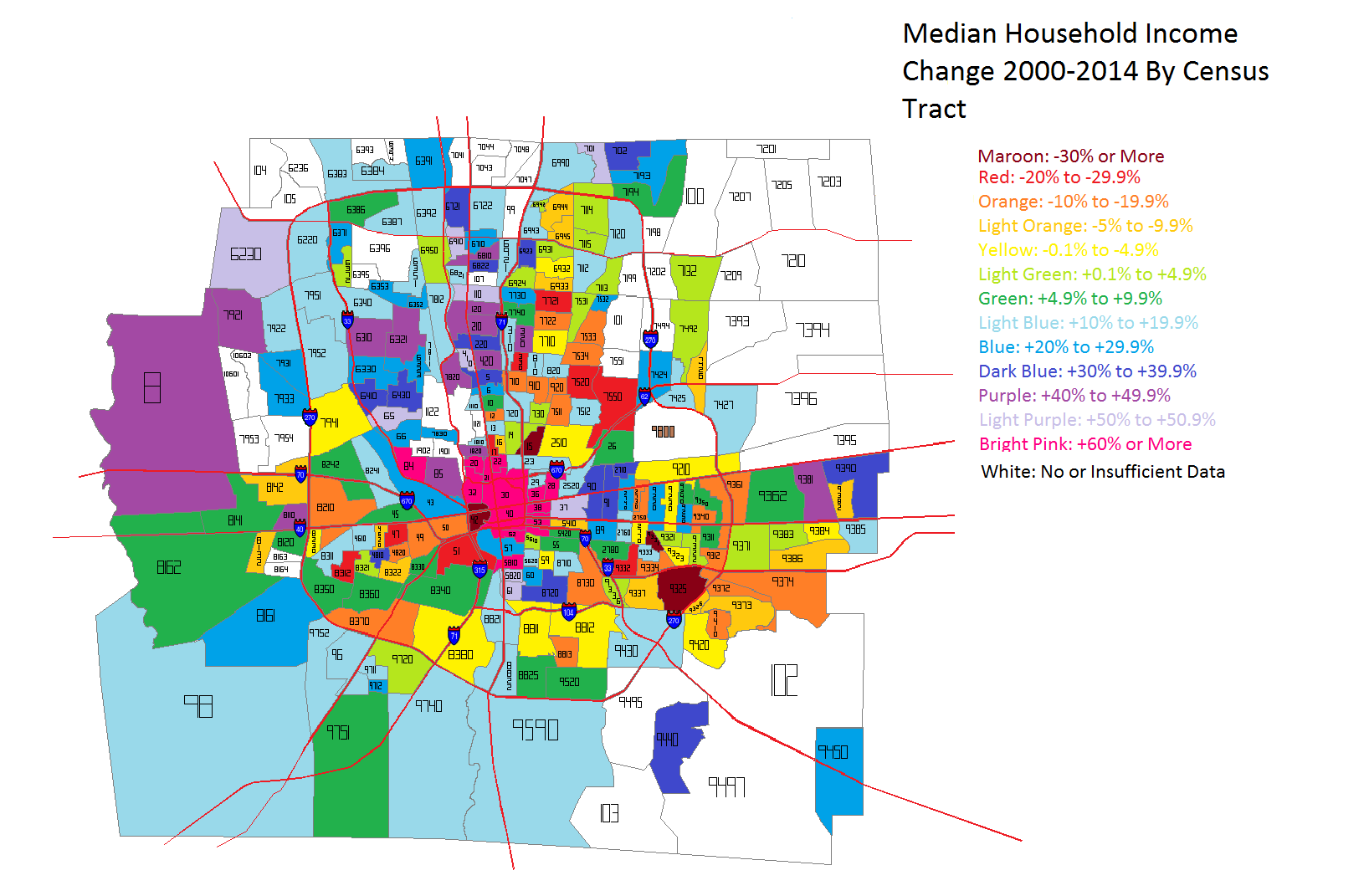
By 2014, household income remained the highest in the same areas it was in 2000, but there were major improvements in many parts of the urban core, especially around Downtown, the Near East Side, Near South, Clintonville and the Short North. To illustrate this change better, take a look at the next map.
Unfortunately, because not all of 2014’s census tracts existed in 2000, I don’t have data for the entire county for comparison. But the trend is very clear. The areas that saw the biggest improvements in median household incomes were in the dead center of the county- Downtown, Near South and East Sides, as well as the Short North and Grandview. Only parts of Hilliard, Clintonville and Worthington really saw anything remotely as close. This indicates, at least to me, that the beating heart of revitalization and growth in the county is along the High Street corridor.
So now that we’ve established what the incomes look like across the county, let’s break it down further into income level brackets. This will help determine where economic segregation is a problem and where it isn’t.
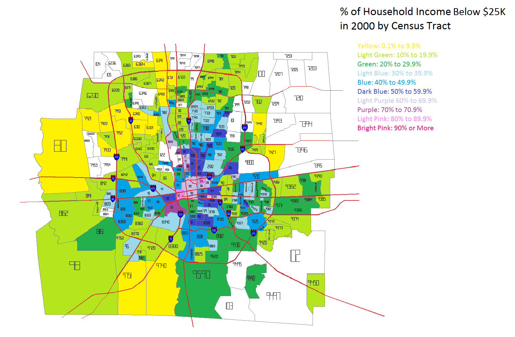
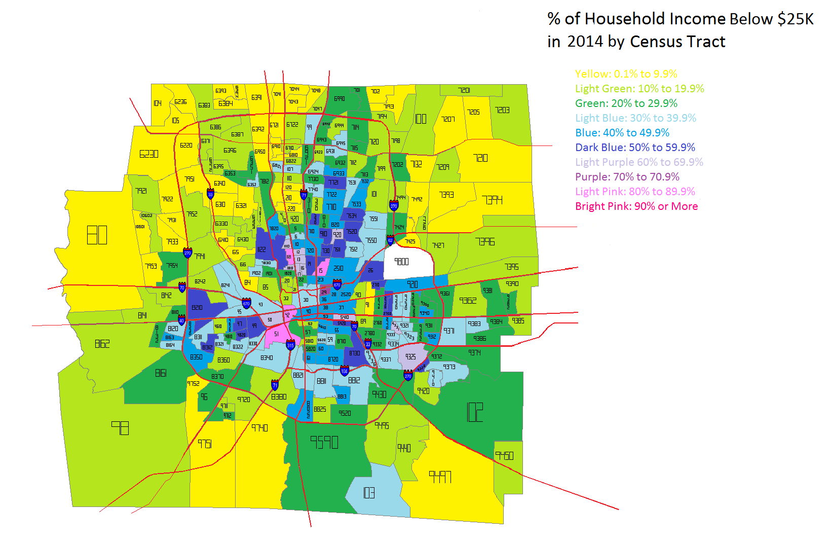
The lowest household income I looked at was Below $25K a year. In 2000, this income level was most heavily concentrated in the Downtown area and adjacent neighborhoods. The Near East Side, as well as Linden down through the east side of I-71 had the county’s highest % of households that earned this level of income. Hilltop and the West Broad Corridor were also fairly high.
By 2014, the lowest household income level looked largely the same. However, there were also some noticeable difference. Downtown, the Near East Side, the Near South Side and parts of the North High Corridor saw obvious declines in this population, while it seemed to spread further east outside of 270 into suburban areas.
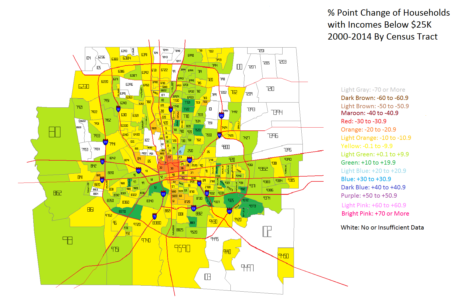
In the map above, we can see how Below $25K household incomes had changed in the tracts between 2000 and 2014 by % point change. Ironically, the urban core, especially along High and Broad streets saw the most consistent declines in this population while areas around and outside of 270 saw the most consistent increases. The good news is that more tracts saw declines than increases, but the map does indicate that poverty is perhaps moving further out from the core.
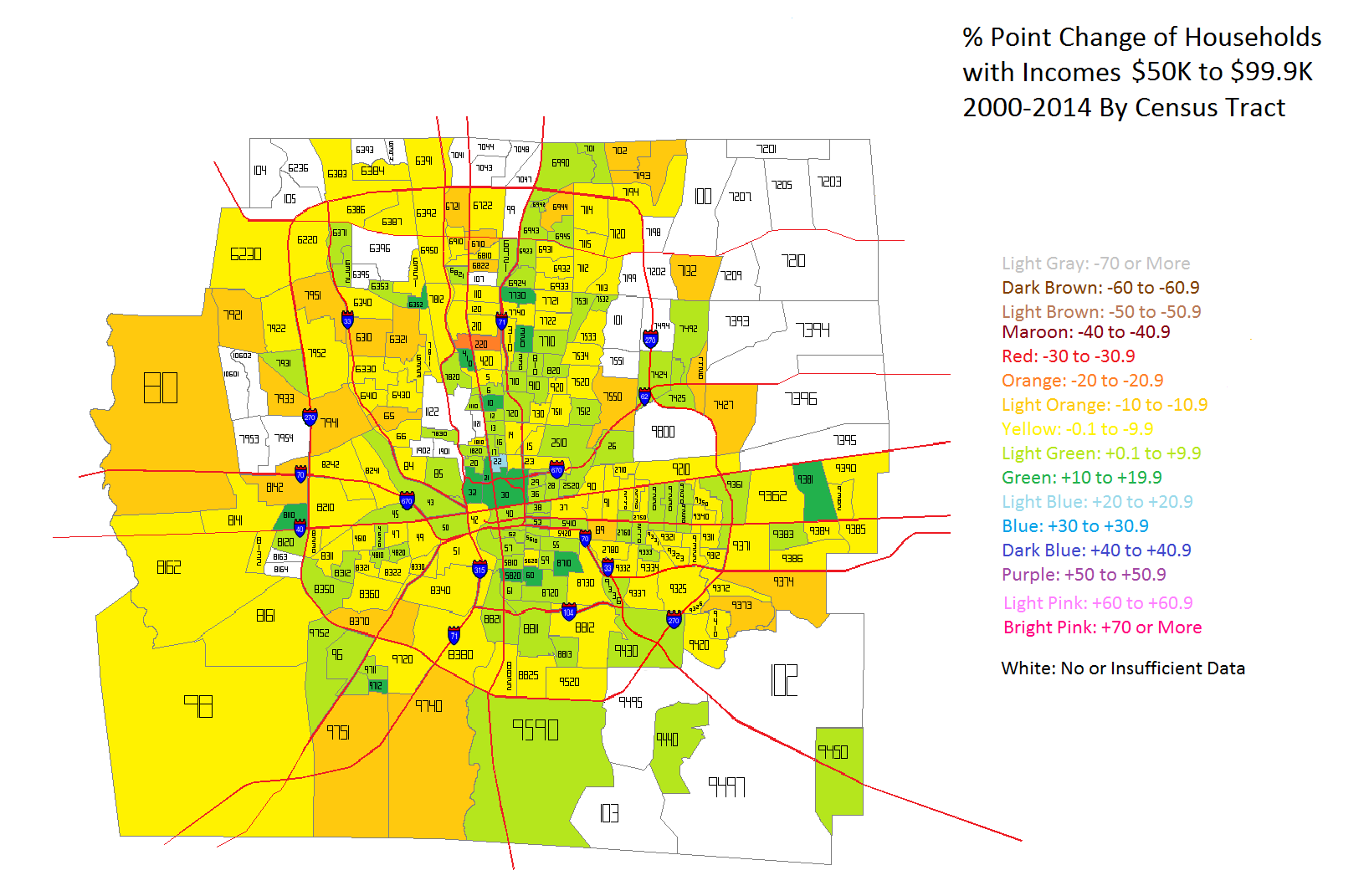
Next up is the household income level change that would be considered closest to middle class- $50K-$99K.
The urban core areas clearly saw the most consistent increases in middle class household income levels, while the outer suburbs almost universally declined in this metric. One explanation for this is that the lowest incomes in the core moved up into the middle class, while in the suburbs, middle class incomes moved into the upper class incomes. That would explain both the rise in the core, but the decline in the suburbs. But to prove if this is true or not, we have to look at the highest income levels- those of $100K and above.
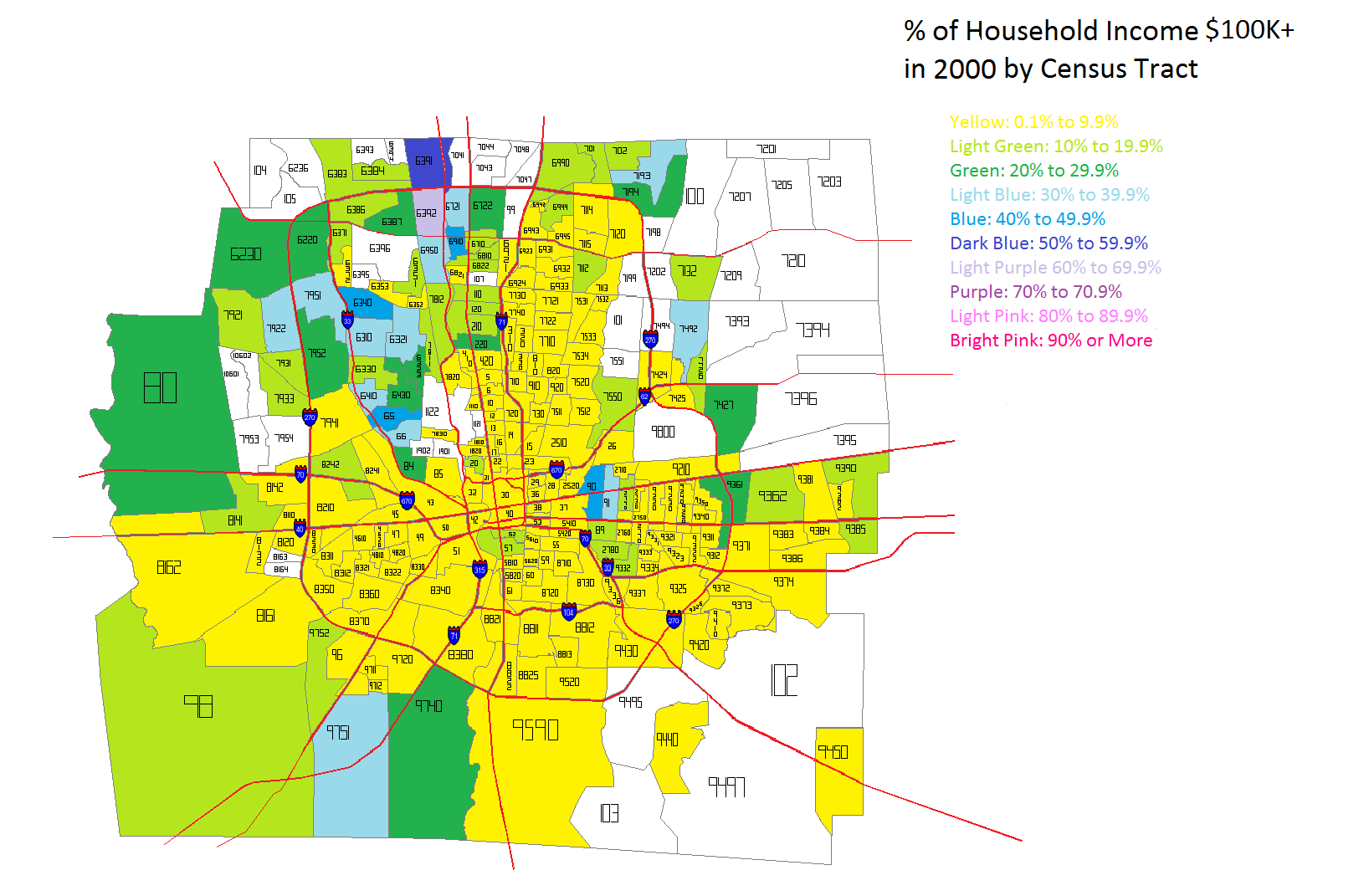
In 2000 the highest incomes were almost entirely outside of 270 except for Bexley and the Northwest Side communities like Dublin and Upper Arlington. It is likely that the New Albany area also had high incomes, but again, those tracts didn’t exist in 2000, so it is difficult to give that information.
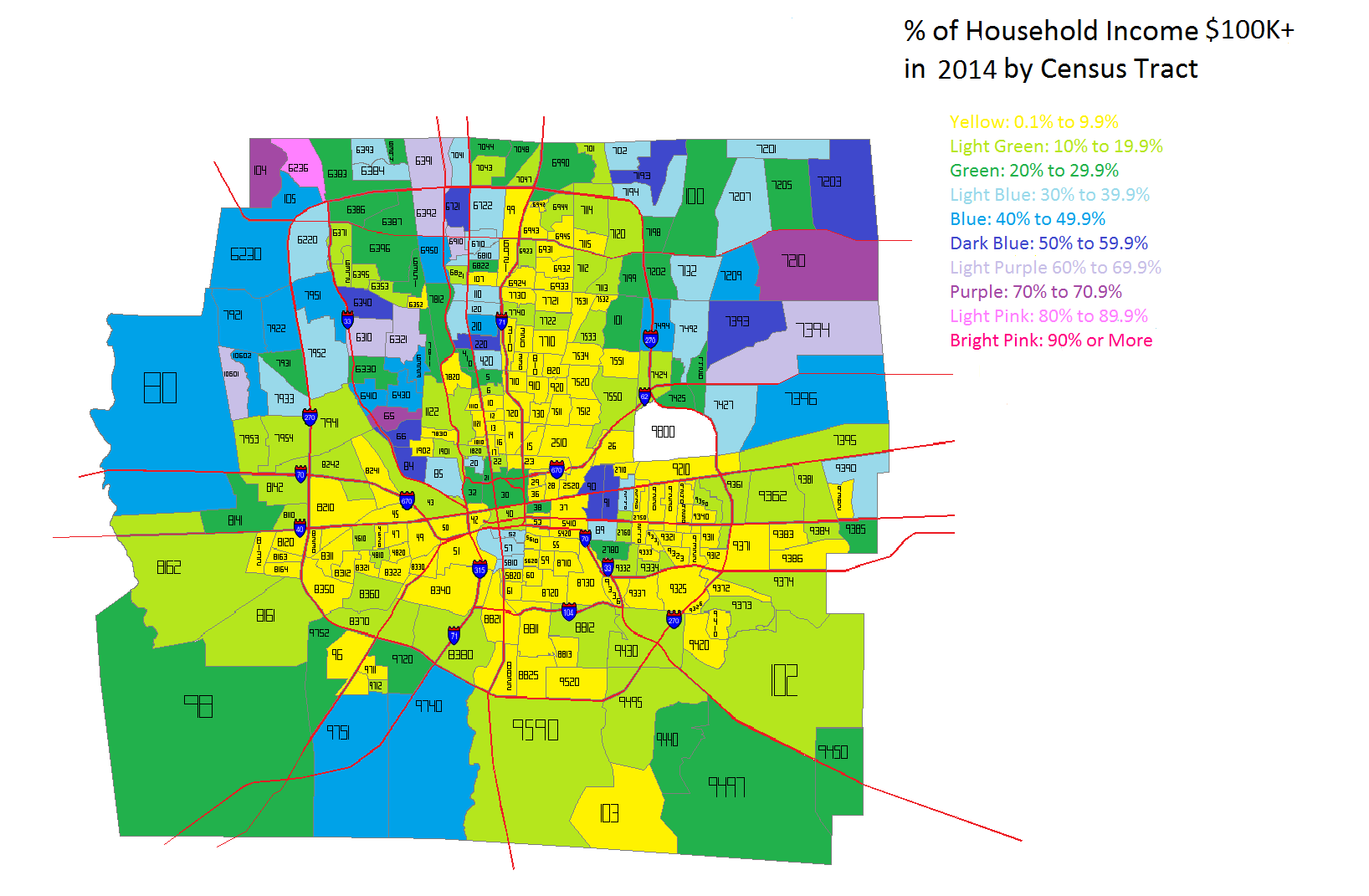
By 2014, while the Northern areas of Franklin County continued to have the highest incomes in general, gains were made in many parts of the county, including several within the urban core area.
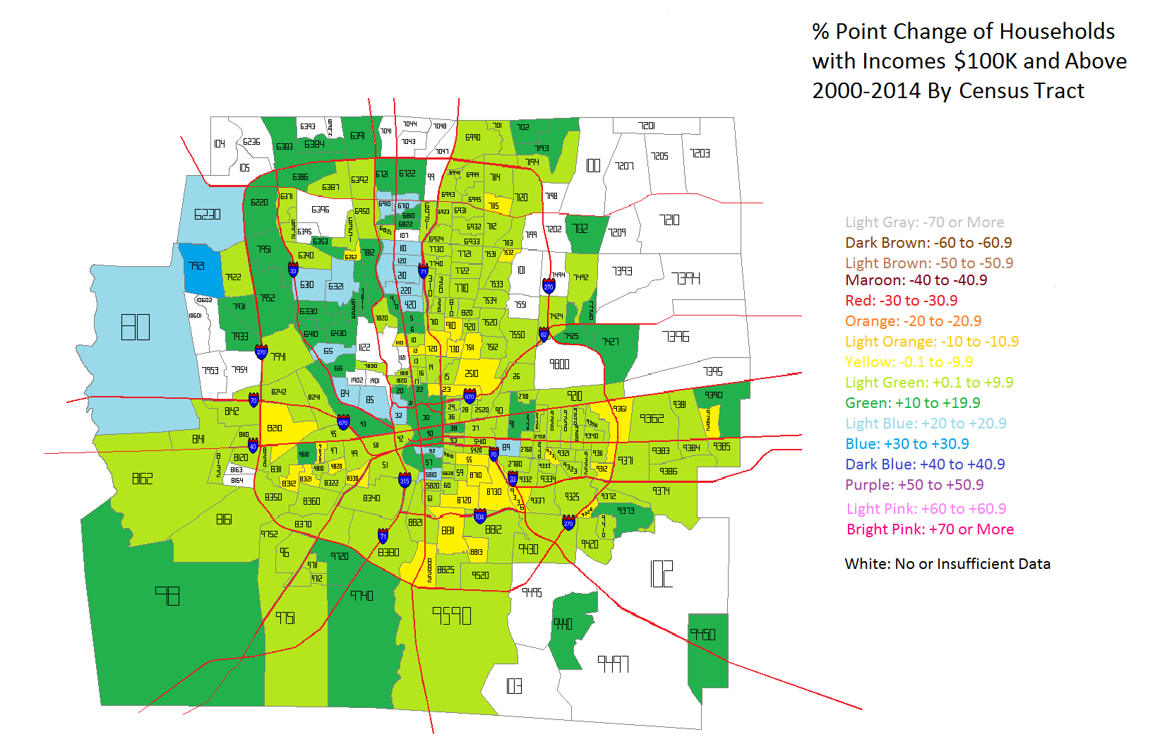
Between 2000 and 2014, there was almost universal growth of $100K+ incomes in Franklin County, with only small areas seeing declines. The Northwest communities, as well as areas in and around Downtown seemed to do the best.
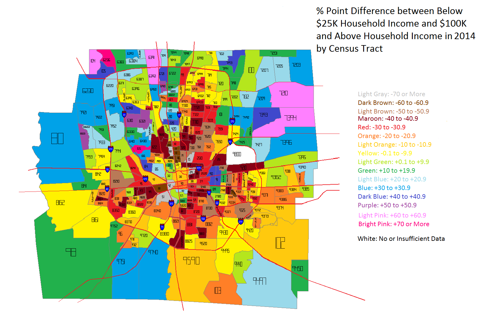
Okay, so incomes levels are clearly improving in most of the county, but especially in urban core areas. But what is the difference between the highest and lowest incomes within each census tract? To find out, I took the % of households in each tract earning less than $25K a year vs. the % of households earning $100K or more. The % point difference between these two groups is a good indication of how much economic segregation exists. The closer this number is to 0, the more economically integrated a tract is. Negative numbers indicate that Below $25K household incomes outweigh those making $100K or more, while positive numbers are the reverse.
The 2000 map shows that Below $25K household incomes dominate inside I-270, particularly around Downtown and the East Side. Many tracts contain at least 40 % points more $25K incomes than $100K incomes. This shows that poverty was deeply concentrated around the center of the county. Suburban areas were more dominated by the reverse, where middle and upper class households were concentrated.
In 2014, the severely concentrated levels of the lowest incomes have eased in most locations. There are fewer tracts of 40+ point differences, especially around Downtown and the general High Street Corridor. Only the Campus area, for obvious reasons, and parts of Linden, largely remain unchanged.
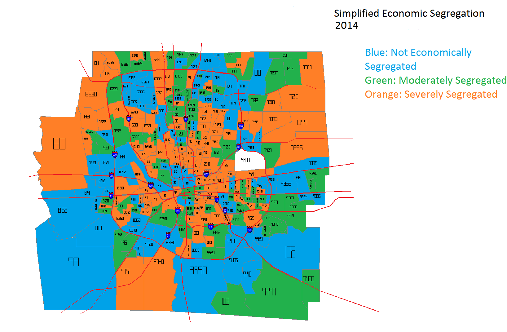
So what does all this ultimately mean about economic segregation in Frankly County? To get a simplified sense of that picture, considering the final set of maps.
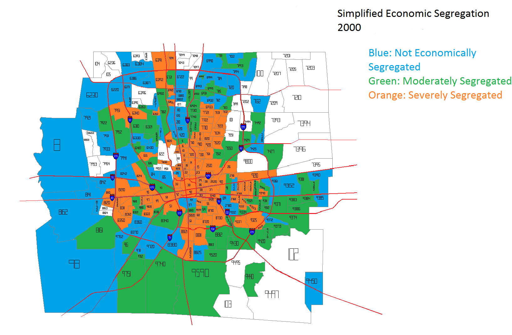
In the coloring, the blue tracts are tracts that have income point differences that are between -15 and +15. These are the tracts that are most economically integrated. Green tracts are those with differences of +/- 15 to 29 points, while orange represent those with +/- 30 points or more. Orange tracts are the most economically segregated. In 2000, most of the orange tracts were within I-270. In fact, they very closely represent the most urban part of Columbus- the 1950 city boundary. They are amazingly similar. Meanwhile, almost all the outer suburbs in 2000 were well integrated.
Fast forward to 2014 and the picture becomes significantly more convoluted. Being in the urban core vs. the suburbs does not automatically guarantee economic integration. Many suburbs are now as severely segregated as some of the urban core is, while parts of the urban core are as integrated as some suburbs.
Overall, it appears that Franklin County has improved its economic integration in the last decade or so, but there is still more than can be done. Economic incentives for providing more mixed-income housing and bringing more jobs to urban areas would likely help achieve a more integrated city and county.
This occasional series on failed and canceled projects around the city today talks about an unassuming parking garage that was originally supposed to be much more.
Beginning in 1984 and continuing into 1985, a parking garage/city office tower was being tossed around to house an increasing number of city office works. Space had become tight and many existing buildings were more than 50 years old and required extensive renovations. The Daimler Group started construction on the 10-story garage part of the project at the southeast corner of W. Gay and N. Front in late 1984. The 16-story office project that would’ve been built on top (for a total 26-story building) was just one of 3 options the city was considering to alleviate its office problems. The other two options consisted of a $75 million civic center about a block north of City Hall, or simply renovating the existing buildings.
In the end, it was deemed that there were too many other problems to spend public dollars on. At the time, there was quite an issue with road maintenance funding, and the city deemed that it was not the right time to build a brand new tower for city workers. By April 1985, the project was dead, although the garage was finished and remains to this day.
The Gay and Front garage in 2015.
Ironically, within a few years, the city would have several much larger office towers. 5 new towers were built between 1986 and 1991, though not all were specifically built for city offices. Renovation of existing buildings has been ongoing since.
Ohio maintained its 7th-place position through 2014. Now let’s look at the 20 states that had the biggest increases.
Total GDP Growth in Millions 2013-2014 1. California: +98,625 2. Texas: +90,843 3. New York: +62,927 4. Florida: +39,247 5. Pennsylvania: +22,596 6. Illinois: +21,080 7. Ohio: +20,416 8. Georgia: +20,000 9. Washington: +19,892 10. Massachusetts: +18,470 11. Colorado: +18,325 12. Michigan: +16,842 13. North Carolina: +16,051 14. New Jersey: +11,703 15. Oregon: +10,810 16. Tennessee: +10,479 17. Arizona: +9,422 18. Maryland: +9,222 19. Minnesota: +8,934 20. Virginia: +8,629
So Ohio is growing at the same position as its overall ranking. No states below it are set to pass it anytime in the near future. In fact, the gap is widening from its nearest threats.
What about per-capita GDP, which is a measure of the state’s total GDP divided by its population?