The US Census recently released demographic information for census tracts for 2015. Here are some quick maps for Franklin County for median household income.
First, median household income for both 2010 and 2015.
And the % change between 2010-2015.
As can be seen, a lot of the greatest improvements over the 5-year period were around Downtown, the Near East Side, North High, South High and around some of the higher-income suburbs like Upper Arlington and the New Albany area.
I saw this post the other day about changing neighborhood demographics in certain cities, particularly when it comes to racial segregation and gentrification. Surprisingly, of all the maps and posts I’ve done on demographics, I hadn’t thought to do one like this. Well, now I have, so here are Franklin County’s gentrification trends 1990-2014. A bit of an explanation is needed for the color coding: -For those categories marked “Steady”, the demographic listed has been the majority throughout the period, with little to no change of other demographics. -For those mixed categories of one decline and one rise, it means that the majority demographic has declined at least 5%, while a secondary demographic has risen at least 5%. -For the category of recent or steady integration, there are at least 2 demographics at 10% or more of the total population, as well as a 3rd demographic reaching at least 5% of the population.
A few things that stand out to me is that the Steady White population dominates at least 50% of the map, while there are very few areas with Steady Black population. One would be tempted to suggest that gentrification is forcing the Black population out of neighborhoods, but this doesn’t seem to be true. In terms of significant changes, there are FAR more areas with Black population growth and White population decline than vice-versa, suggesting that “White Flight” may continue to be an issue. Also, a surprising number of areas have reached full integration, or have at least been maintaining it over the period of question. These neighborhoods of demographic equilibrium are largely the result of increasing Hispanic and Asian populations, particularly on the Northeast and West Sides, as well as the Whitehall area. In the center core, almost all of the High Street corridor has remained steady White, suggesting that other demographics have, so far, been unable to tap into the building boom along and adjacent to this corridor.
Here are the most integrated tracts by year, based the above criteria. 1990 1. #8720- South Side 2. #7820- Riverview-NW Side 3. #1122- West Campus 4. #1121- Campus 5. #29- King-Lincoln Only 5 tracts counted as being integrated in 1990.
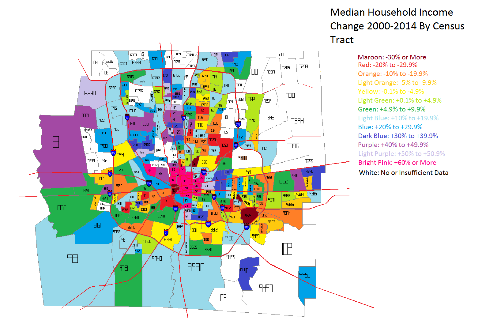
Economic segregation is basically where people living in the same city are segregated in terms of financial characteristics, such as housing prices or income. This is considered negative as the more economically segregated an area is, the harder it is for people, especially in lower income brackets, to move up financially. My report on economic segregation in Columbus focuses on household income within census tracts in Franklin County and where those household incomes are changing the most.
First of all, let’s look at the household income levels around the county, both in 2000 and 2014. In 2000, the median household income for the county was highest in the Upper Arlington and Grandview, Dublin, Bexley, Hilliard and the New Albany area. Downtown and adjacent areas had the lowest, as well as the general urban core and East Side.
By 2014, household income remained the highest in the same areas it was in 2000, but there were major improvements in many parts of the urban core, especially around Downtown, the Near East Side, Near South, Clintonville and the Short North. To illustrate this change better, take a look at the next map.
Unfortunately, because not all of 2014’s census tracts existed in 2000, I don’t have data for the entire county for comparison. But the trend is very clear. The areas that saw the biggest improvements in median household incomes were in the dead center of the county- Downtown, Near South and East Sides, as well as the Short North and Grandview. Only parts of Hilliard, Clintonville and Worthington really saw anything remotely as close. This indicates, at least to me, that the beating heart of revitalization and growth in the county is along the High Street corridor.
So now that we’ve established what the incomes look like across the county, let’s break it down further into income level brackets. This will help determine where economic segregation is a problem and where it isn’t.
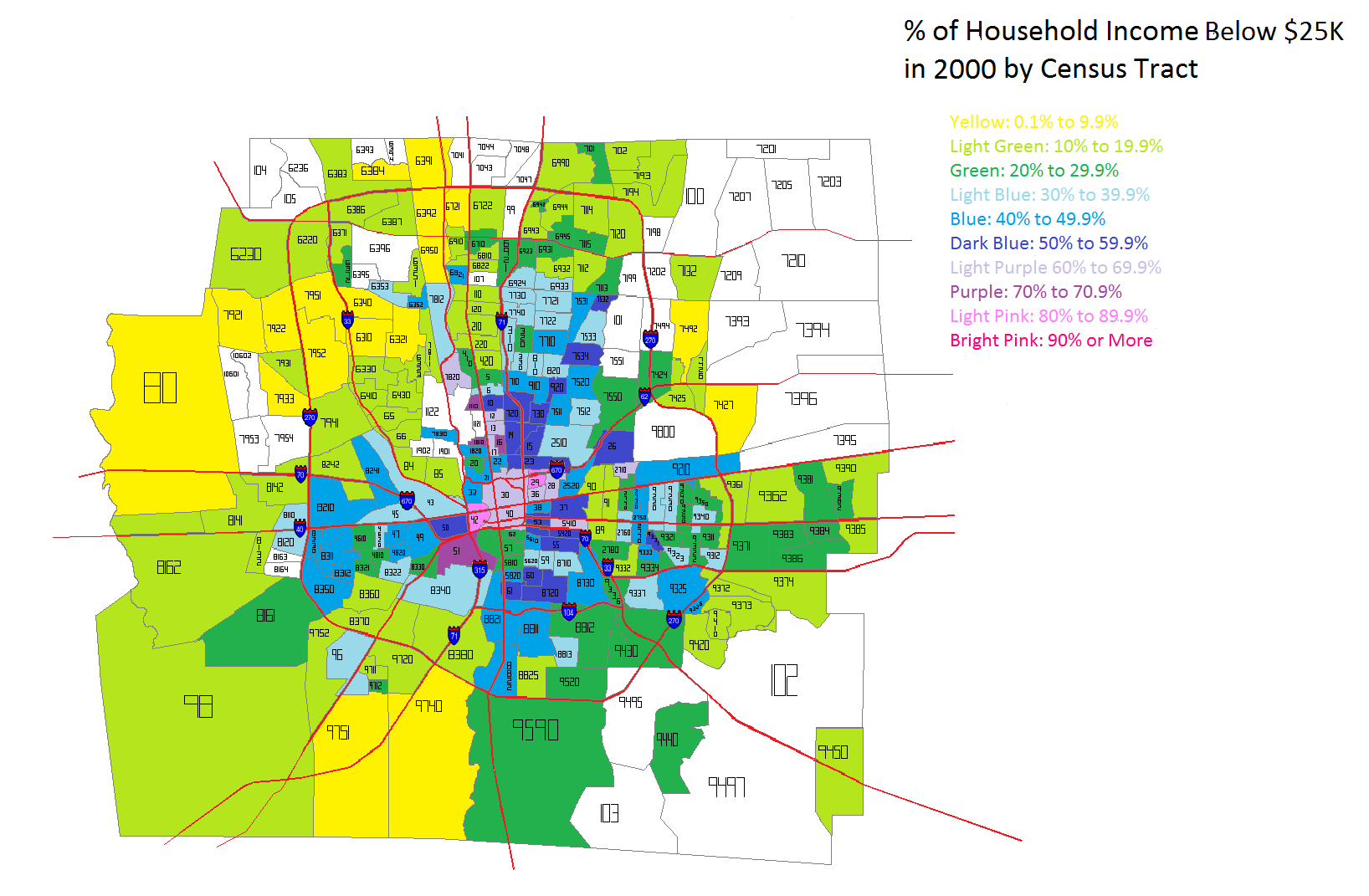
The lowest household income I looked at was Below $25K a year. In 2000, this income level was most heavily concentrated in the Downtown area and adjacent neighborhoods. The Near East Side, as well as Linden down through the east side of I-71 had the county’s highest % of households that earned this level of income. Hilltop and the West Broad Corridor were also fairly high.
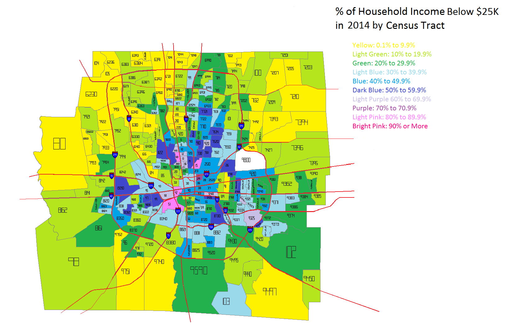
By 2014, the lowest household income level looked largely the same. However, there were also some noticeable difference. Downtown, the Near East Side, the Near South Side and parts of the North High Corridor saw obvious declines in this population, while it seemed to spread further east outside of 270 into suburban areas.
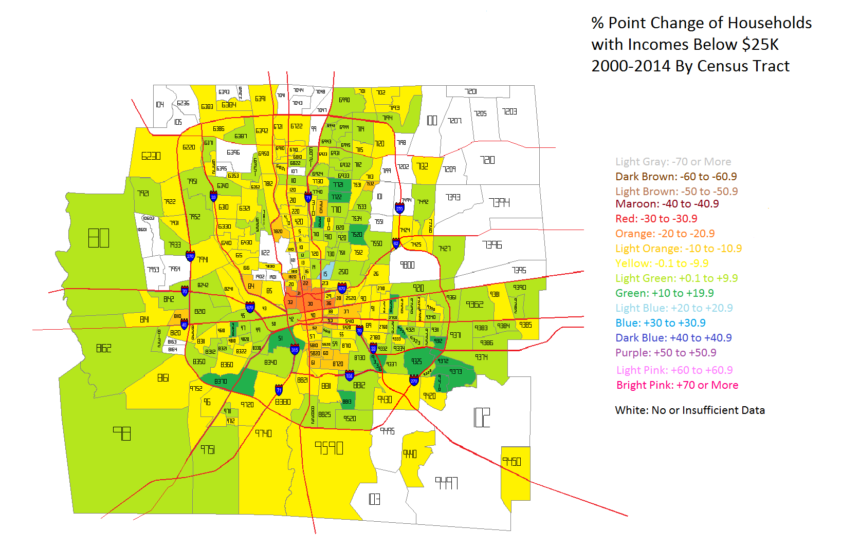
In the map above, we can see how Below $25K household incomes had changed in the tracts between 2000 and 2014 by % point change. Ironically, the urban core, especially along High and Broad streets saw the most consistent declines in this population while areas around and outside of 270 saw the most consistent increases. The good news is that more tracts saw declines than increases, but the map does indicate that poverty is perhaps moving further out from the core.
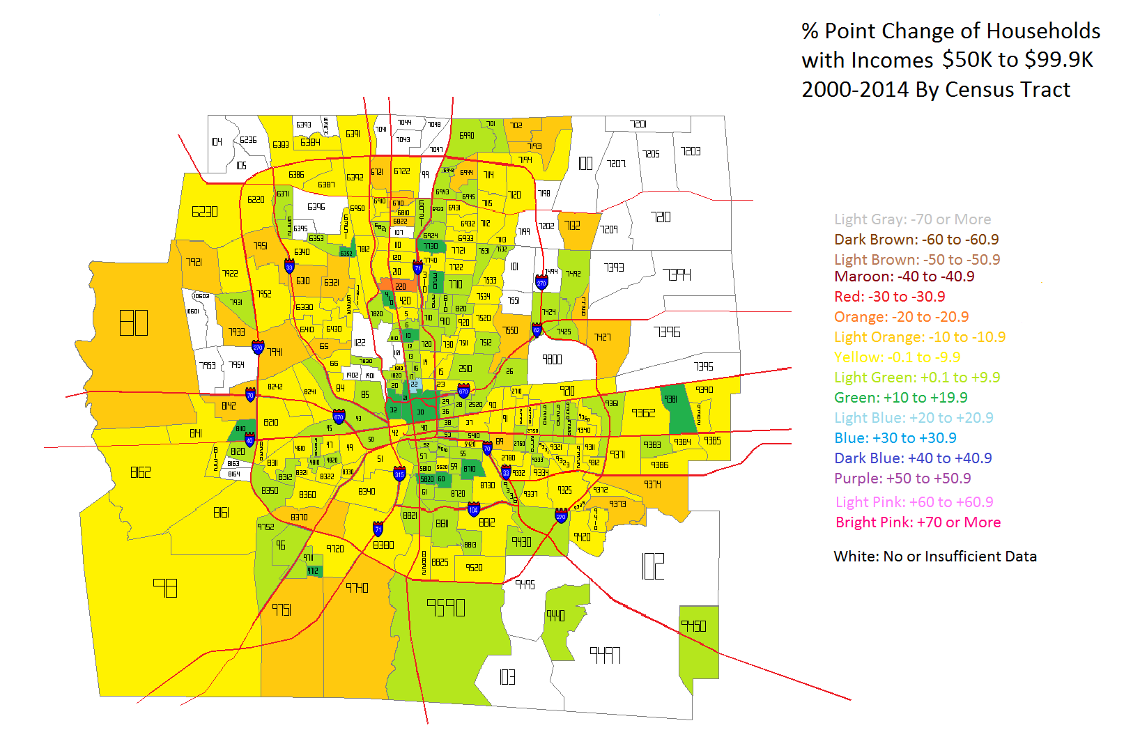
Next up is the household income level change that would be considered closest to middle class- $50K-$99K.
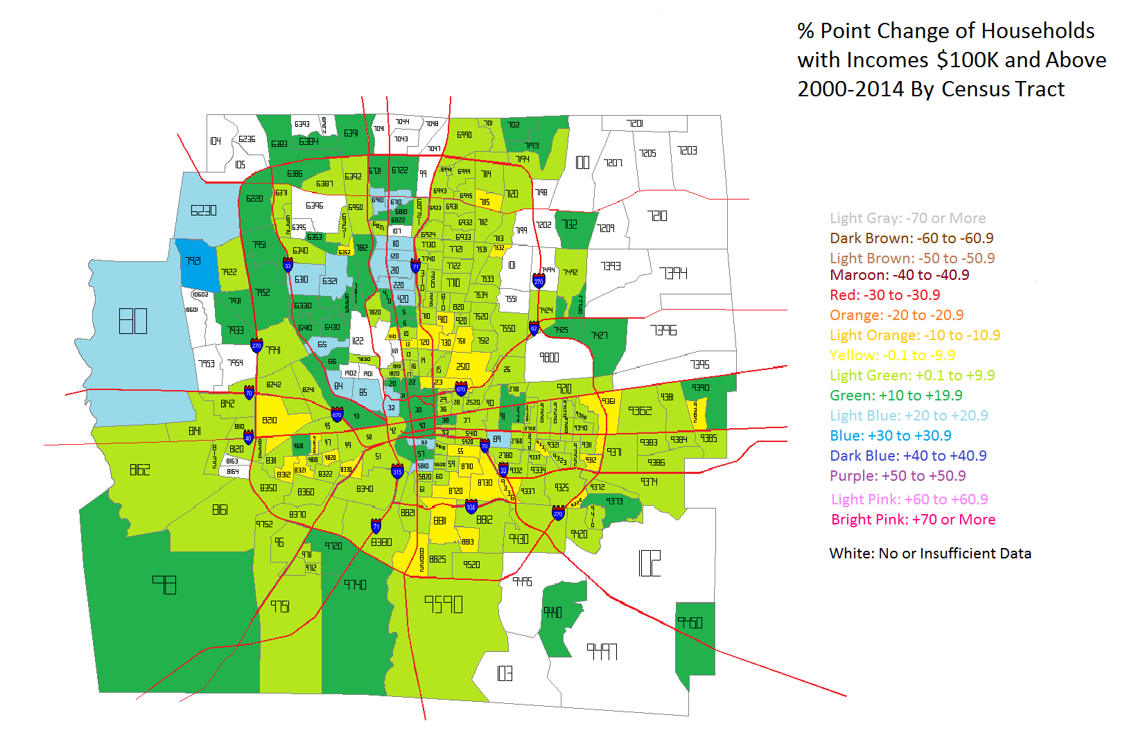
The urban core areas clearly saw the most consistent increases in middle class household income levels, while the outer suburbs almost universally declined in this metric. One explanation for this is that the lowest incomes in the core moved up into the middle class, while in the suburbs, middle class incomes moved into the upper class incomes. That would explain both the rise in the core, but the decline in the suburbs. But to prove if this is true or not, we have to look at the highest income levels- those of $100K and above.
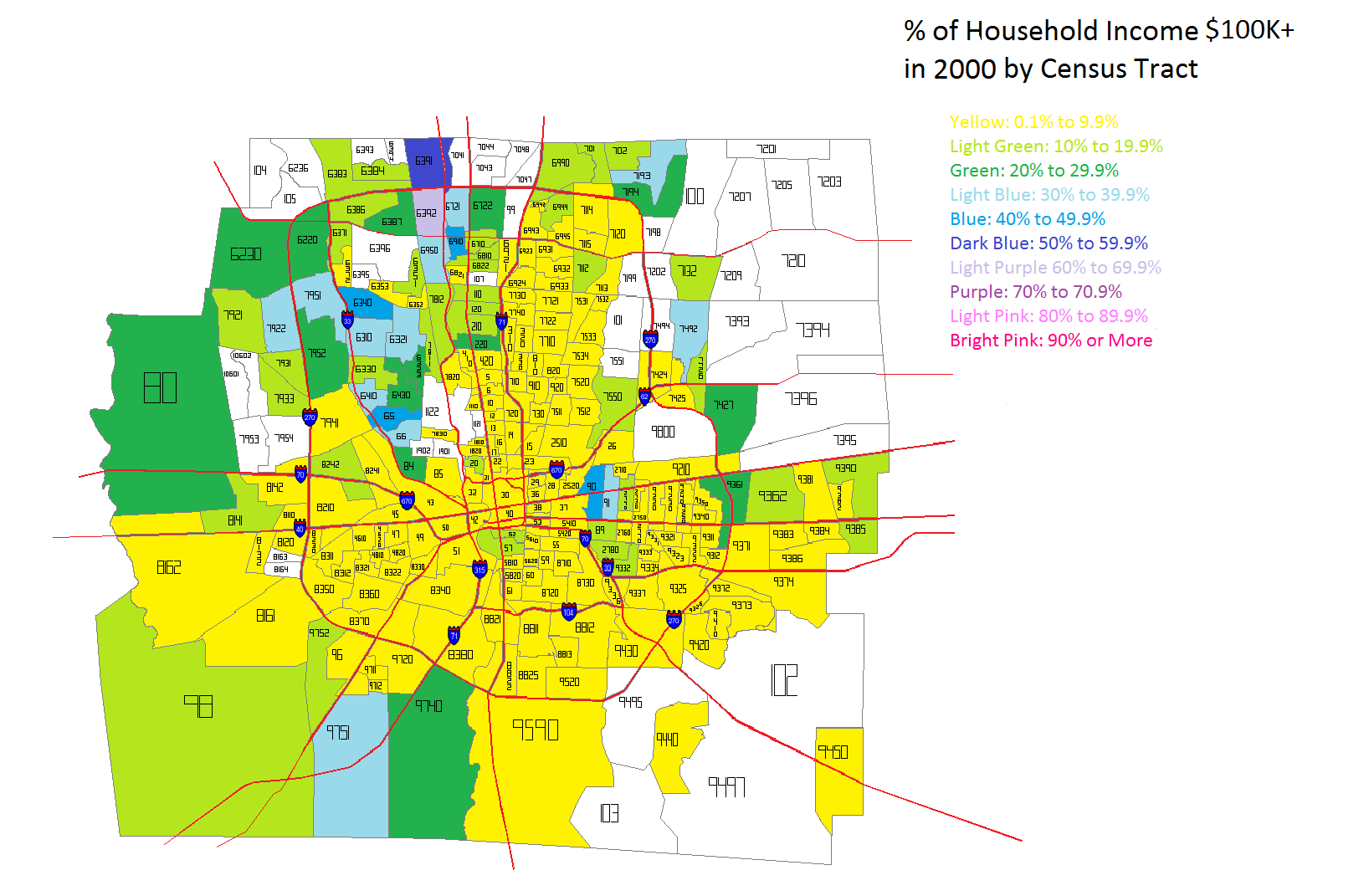
In 2000 the highest incomes were almost entirely outside of 270 except for Bexley and the Northwest Side communities like Dublin and Upper Arlington. It is likely that the New Albany area also had high incomes, but again, those tracts didn’t exist in 2000, so it is difficult to give that information.
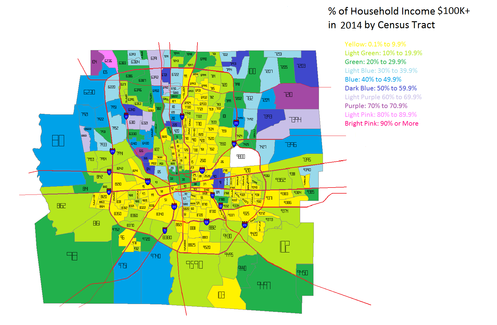
By 2014, while the Northern areas of Franklin County continued to have the highest incomes in general, gains were made in many parts of the county, including several within the urban core area.
Between 2000 and 2014, there was almost universal growth of $100K+ incomes in Franklin County, with only small areas seeing declines. The Northwest communities, as well as areas in and around Downtown seemed to do the best.
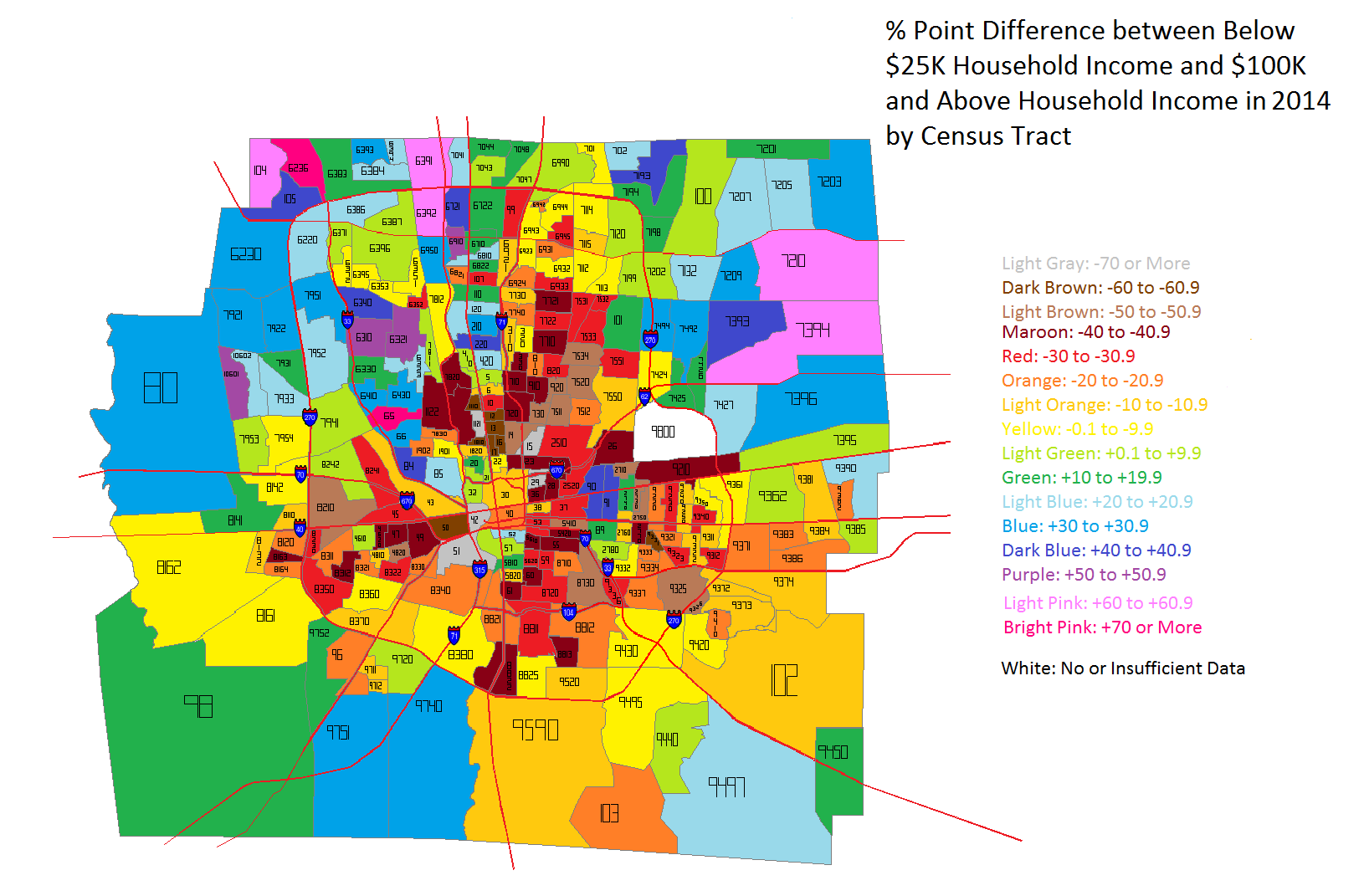
Okay, so incomes levels are clearly improving in most of the county, but especially in urban core areas. But what is the difference between the highest and lowest incomes within each census tract? To find out, I took the % of households in each tract earning less than $25K a year vs. the % of households earning $100K or more. The % point difference between these two groups is a good indication of how much economic segregation exists. The closer this number is to 0, the more economically integrated a tract is. Negative numbers indicate that Below $25K household incomes outweigh those making $100K or more, while positive numbers are the reverse.
The 2000 map shows that Below $25K household incomes dominate inside I-270, particularly around Downtown and the East Side. Many tracts contain at least 40 % points more $25K incomes than $100K incomes. This shows that poverty was deeply concentrated around the center of the county. Suburban areas were more dominated by the reverse, where middle and upper class households were concentrated.
In 2014, the severely concentrated levels of the lowest incomes have eased in most locations. There are fewer tracts of 40+ point differences, especially around Downtown and the general High Street Corridor. Only the Campus area, for obvious reasons, and parts of Linden, largely remain unchanged.
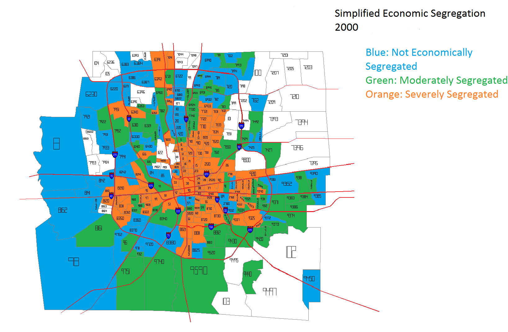
So what does all this ultimately mean about economic segregation in Frankly County? To get a simplified sense of that picture, considering the final set of maps.
In the coloring, the blue tracts are tracts that have income point differences that are between -15 and +15. These are the tracts that are most economically integrated. Green tracts are those with differences of +/- 15 to 29 points, while orange represent those with +/- 30 points or more. Orange tracts are the most economically segregated. In 2000, most of the orange tracts were within I-270. In fact, they very closely represent the most urban part of Columbus- the 1950 city boundary. They are amazingly similar. Meanwhile, almost all the outer suburbs in 2000 were well integrated.
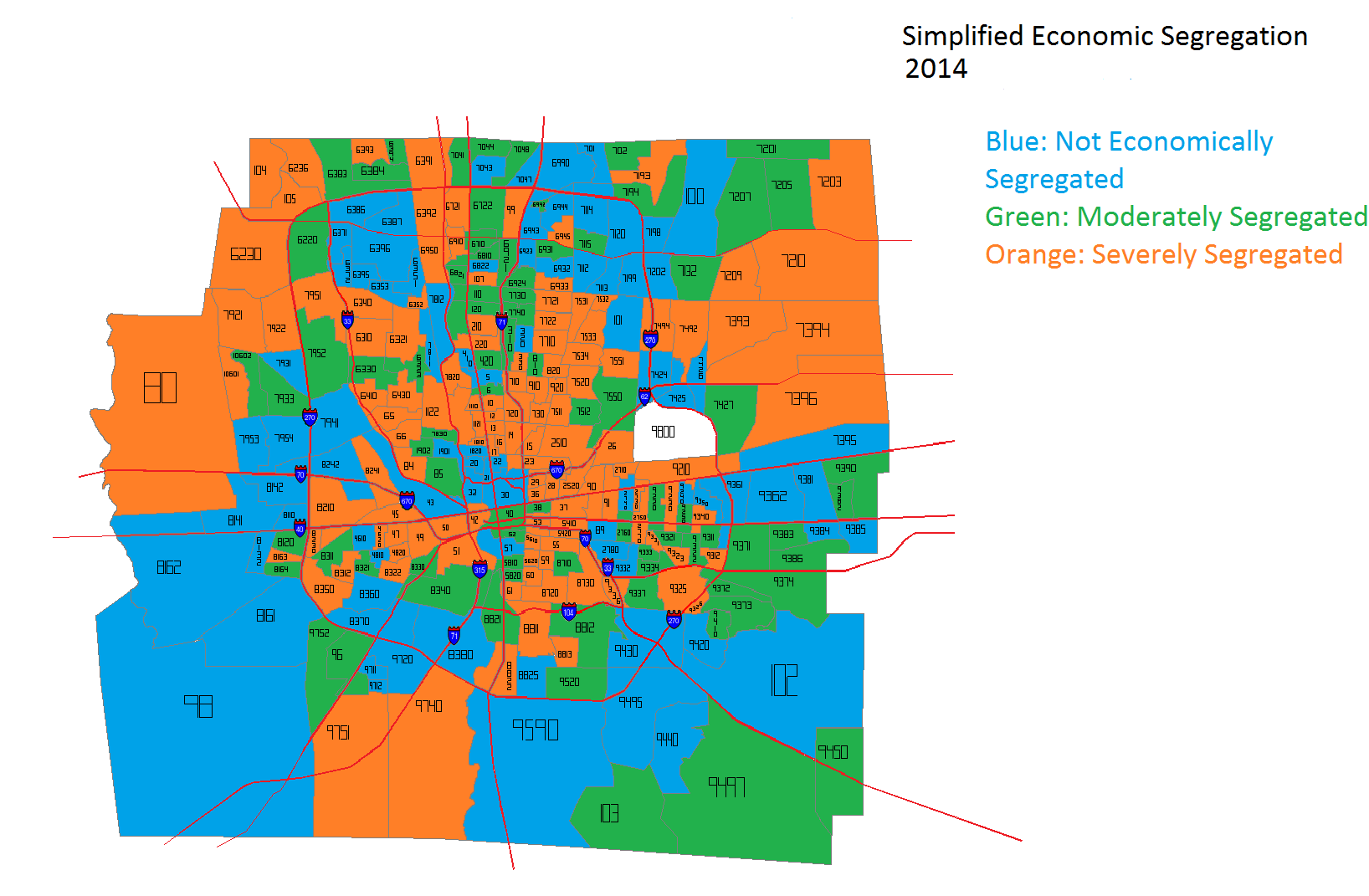
Fast forward to 2014 and the picture becomes significantly more convoluted. Being in the urban core vs. the suburbs does not automatically guarantee economic integration. Many suburbs are now as severely segregated as some of the urban core is, while parts of the urban core are as integrated as some suburbs.
Overall, it appears that Franklin County has improved its economic integration in the last decade or so, but there is still more than can be done. Economic incentives for providing more mixed-income housing and bringing more jobs to urban areas would likely help achieve a more integrated city and county.
The Census released updated 2013 census tract estimates, and they showed some interesting things. There are 285 census tracts that make up Franklin County.
First, let’s take a look at the Franklin County trends 2000-2013.
In regards to the above map, it’s a mix of both the 2013 official estimates and some that I did. For example, the official estimates had the Downtown tracts 30 and 40 losing population, as well as most of the Short North. That’s rather absurd considering the level of residential construction in these areas, as well as population estimates the city has done in the last few years for Downtown. In fact, the 2013 official estimates have Downtown tract population BELOW 2010. That’s just not the reality. So I looked over the tracts and adjusted them according to their long-term growth/decline trends. Most of them I left alone, but some adjustments had to be made. However, I was very conservative with any changes, and several tracts that the official estimates showed gains, I actually had losses.
Here are all the tracts that grew by at least 300 people between 2010 and 2013 in Franklin County, as well as their locations. Blacklick #7395: +1,609 Dublin #6230: +1,214 Columbus-West Side #7951: +1,002 Columbus-Northwest #6372: +966 Columbus Northeast #6931: +963 Hilliard #7921: +955 Columbus-East Side #9361: +952 Columbus-West Side #8350: +951 Columbus-Northwest: #6384: +949 Dublin #6220: +933 Columbus-West Side #8141: +921 Columbus-Easton #7551: +793 Columbus-Southeast #9373: +749 Hilliard #7933: +688 Minerva Park #7112: +675 Columbus-South Side #8340: +652 Hilliard #7954: +643 Columbus North Side #7044: +636 Columbus Northeast #7132: +615 Columbus Northwest #6396: +557 Dublin #6386: +549 Columbus North Side #6921: +540 Columbus Northwest #6393: +492 Columbus-West Side: +489 Gahanna #7492: +473 New Albany #7209: +472 Columbus-Hilltop #8321: +466 Columbus-Southeast #9374: +455 Grove City #9740: +441 Columbus Northeast #6945: +438 Hillard #7931: +432 Columbus-West Side #7812: +427 Columbus-South Side #9590: +411 Columbus-South Side #8710: +407 Hilliard #10602: +407 Columbus-South Side #8822: +403 Whitehall #9230: +398 Columbus-West Side #8163: +397 Columbus-East Side #9362: +389 Columbus-Downtown #30: +387 Hilliard #7953: +382 Columbus-West Side #6330: +371 Columbus-Northwest #6387: +361 Columbus-East Side #9322: +352 Columbus-South Side #8825: +349 Columbus-Southwest #8161: +346 West Side-Marble Cliff #43: +345 Columbus-Southwest #8370: +340 Grandview #85: +332 Columbus-Downtown #40: +321 Hilliard #7922: +320 Dublin #6371: +312 Grove City #9751: +304 Columbus-Campus Area #13: +303
As far as the core of the city, the 1950 boundaries, here are the results.
There are 78 tracts that make up the original 1950 city boundary. Using the official estimates, 38 of the 78 tracts grew between 2010-2013, yet had a total loss of 3,229. However, again, it had all the Downtown and adjacent tracts inexplicably losing population, yet the opposite is occurring in these areas. For Downtown, the combined loss was about 370, and for the Short North, it had the loss at more than 700.
Using my adjusted estimates, 35 tracts are growing, adding 1,166 people 2010-2013. Most of the gains were made in the Downtown and adjacent tracts, and some of the losses were simply not as steep. For example, the official estimates had tract #10, in the Campus area, losing nearly 1,300 people since 2010, which is a ridiculous loss, especially considering it grew by almost 8% 2000-2010. In fact, most of the largest losses from the official estimates were around Campus and the Short North. Nonsense.
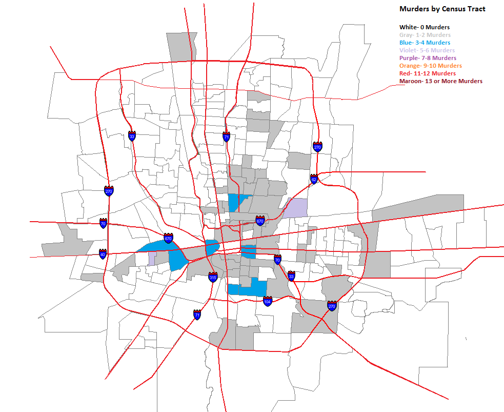
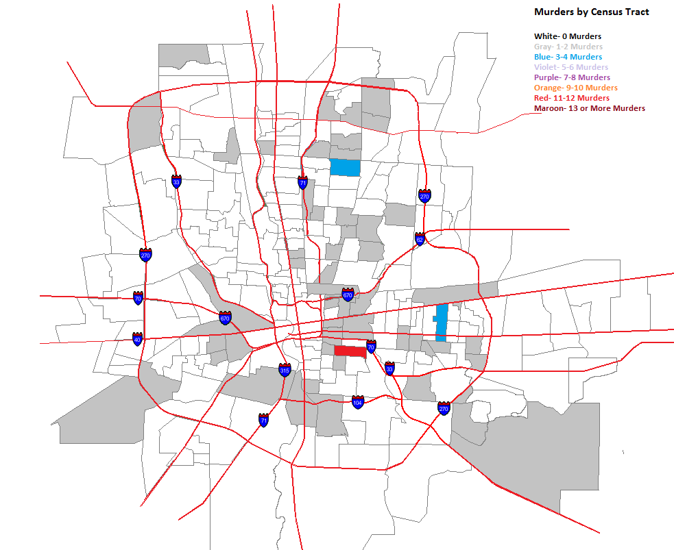
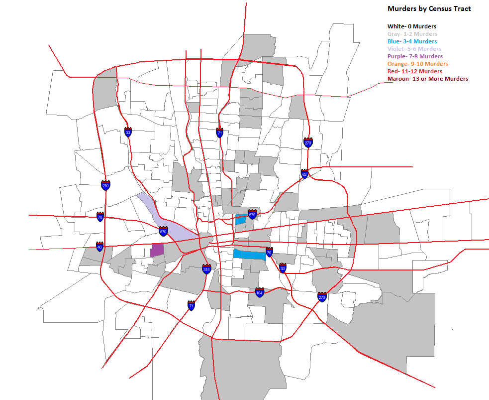
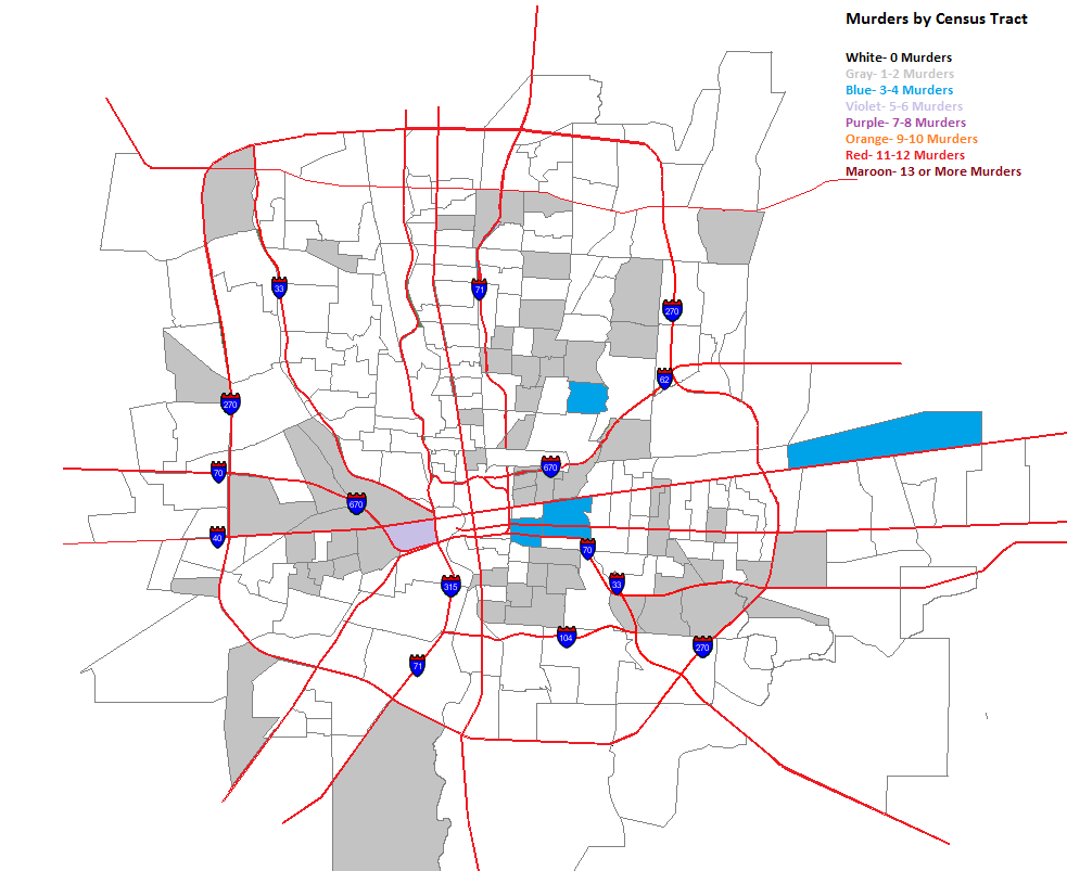
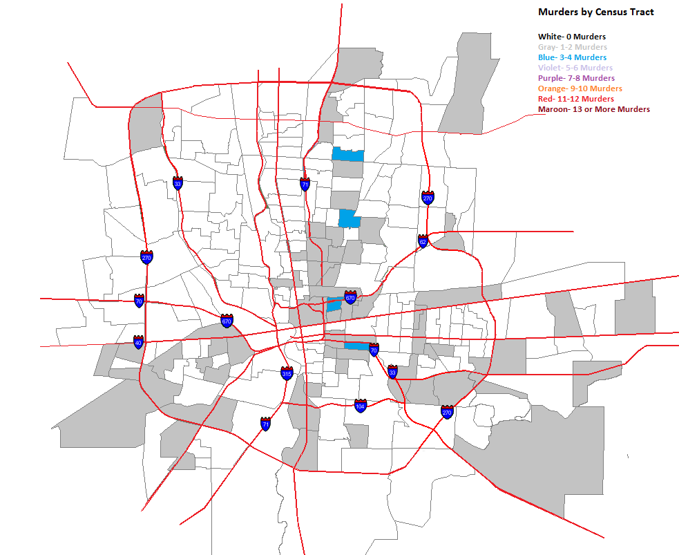
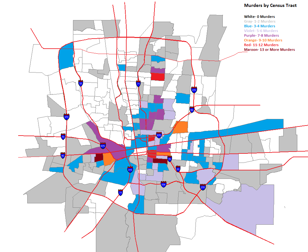
A few days ago, I posted maps for murders by zip code. Because zip codes encompass such large areas, they aren’t as accurate in showing where murders are taking place within them. To help show this more, I broke the maps down into Columbus murders by census tract. While the tracts can include large areas also, they are much smaller than zip codes and allow us to see more at the neighborhood level.
So here they are.
The same forces spreading murder further out into the suburbs in the zip codes seems to be at play in tracts as well. Here are the totals for the entire period.
The High Street corridor from Merion Village up through Worthington has very low or non-existent murder rates. This is also true for most of Whitehall, surprisingly, Bexley, most of the Northwest Side and much of the North Side, apart from the Tamarack Circle area.