The Random Columbus Photos 2 edition looks at one of the most infamous building complexes that had ever existed in the city.
Photo Date: Unknown, Pre-1910 Location: The southeastern corner watchtower of the Ohio Penitentiary site. The old Ohio Penitentiary first opened up in 1834. The Civil-War-era building that fronted Spring Street was easily the most iconic. It can be seen in the background of the photo as the lighter building. The Ohio Pen had an interesting, and occasionally disastrous, life. On April 21, 1930, a massive fire broke out that would kill 322 inmates and become the worst prison fire in United State history. Despite the fire, the prison’s population would continue to grow. At its peak in 1955, the prison held over 5,200 inmates- and singlehandedly provided a large population boost to Downtown. The following year, Ohio began transferring inmates to more modern facilities. The move took nearly 30 years. Ohio moved the last inmates in 1984 and then permanently closed the prison. After the closure, the abandoned prison deteriorated quickly. Due to a lack of state maintenance, a portion of the outer wall collapsed onto some cars in 1996, and the city began to aggressively plan a new life for the site. In 1998, despite some protests to save some of the historic buildings, the city demolished the entire complex to make way for the planned Arena District. Today, the only reminder of the prison site is that the eastern edge of McPherson Commons park runs along the same line as the original outer wall.
A link mapping commuting patterns can be very beneficial if you are curious to know how people get to work in every county in the United States. Luckily, this link does just that. http://flowingdata.com/2015/01/20/how-americans-get-to-work/
The map was constructed using 2013 data, so it’s fairly recent. As for Franklin County? Here’s the breakdown: Drive Alone: 82% Carpool: 8% Public Transit: 2% Walk: 2% Bicycle: 1% Taxi or Other: 1% Work from Home: 4%
The numbers are overwhelmingly auto-centric, as they are nearly everywhere, but what the numbers don’t show are any trends.
Random Columbus photos 1 is the first edition in a new, very occasional series highlighting historic views in and around the city.
Photo Date: January 15, 1936 Location: Parkwood Avenue, East Linden
This random street scene photo was taken during the frigid winter of 1935-36. I couldn’t pinpoint exactly where the photo was taken, only that the style of homes indicates that it was taken looking north between Earl and Denune Avenues. Little has changed on Parkwood in the last 79 years. The area still looks and feels a little rural, and there are still no sidewalks. The one change, however, is that the roads are no longer dirt.
The day of the photo was fairly mild, with highs in the mid-40s. The next day, however, a snowstorm struck that dropped about 5″ of snow, and just a week later, temperatures hit 16 degrees below zero.
The Census released updated 2013 census tract estimates, and they showed some interesting things. There are 285 census tracts that make up Franklin County.
First, let’s take a look at the Franklin County trends 2000-2013.
In regards to the above map, it’s a mix of both the 2013 official estimates and some that I did. For example, the official estimates had the Downtown tracts 30 and 40 losing population, as well as most of the Short North. That’s rather absurd considering the level of residential construction in these areas, as well as population estimates the city has done in the last few years for Downtown. In fact, the 2013 official estimates have Downtown tract population BELOW 2010. That’s just not the reality. So I looked over the tracts and adjusted them according to their long-term growth/decline trends. Most of them I left alone, but some adjustments had to be made. However, I was very conservative with any changes, and several tracts that the official estimates showed gains, I actually had losses.
Here are all the tracts that grew by at least 300 people between 2010 and 2013 in Franklin County, as well as their locations. Blacklick #7395: +1,609 Dublin #6230: +1,214 Columbus-West Side #7951: +1,002 Columbus-Northwest #6372: +966 Columbus Northeast #6931: +963 Hilliard #7921: +955 Columbus-East Side #9361: +952 Columbus-West Side #8350: +951 Columbus-Northwest: #6384: +949 Dublin #6220: +933 Columbus-West Side #8141: +921 Columbus-Easton #7551: +793 Columbus-Southeast #9373: +749 Hilliard #7933: +688 Minerva Park #7112: +675 Columbus-South Side #8340: +652 Hilliard #7954: +643 Columbus North Side #7044: +636 Columbus Northeast #7132: +615 Columbus Northwest #6396: +557 Dublin #6386: +549 Columbus North Side #6921: +540 Columbus Northwest #6393: +492 Columbus-West Side: +489 Gahanna #7492: +473 New Albany #7209: +472 Columbus-Hilltop #8321: +466 Columbus-Southeast #9374: +455 Grove City #9740: +441 Columbus Northeast #6945: +438 Hillard #7931: +432 Columbus-West Side #7812: +427 Columbus-South Side #9590: +411 Columbus-South Side #8710: +407 Hilliard #10602: +407 Columbus-South Side #8822: +403 Whitehall #9230: +398 Columbus-West Side #8163: +397 Columbus-East Side #9362: +389 Columbus-Downtown #30: +387 Hilliard #7953: +382 Columbus-West Side #6330: +371 Columbus-Northwest #6387: +361 Columbus-East Side #9322: +352 Columbus-South Side #8825: +349 Columbus-Southwest #8161: +346 West Side-Marble Cliff #43: +345 Columbus-Southwest #8370: +340 Grandview #85: +332 Columbus-Downtown #40: +321 Hilliard #7922: +320 Dublin #6371: +312 Grove City #9751: +304 Columbus-Campus Area #13: +303
As far as the core of the city, the 1950 boundaries, here are the results.
There are 78 tracts that make up the original 1950 city boundary. Using the official estimates, 38 of the 78 tracts grew between 2010-2013, yet had a total loss of 3,229. However, again, it had all the Downtown and adjacent tracts inexplicably losing population, yet the opposite is occurring in these areas. For Downtown, the combined loss was about 370, and for the Short North, it had the loss at more than 700.
Using my adjusted estimates, 35 tracts are growing, adding 1,166 people 2010-2013. Most of the gains were made in the Downtown and adjacent tracts, and some of the losses were simply not as steep. For example, the official estimates had tract #10, in the Campus area, losing nearly 1,300 people since 2010, which is a ridiculous loss, especially considering it grew by almost 8% 2000-2010. In fact, most of the largest losses from the official estimates were around Campus and the Short North. Nonsense.
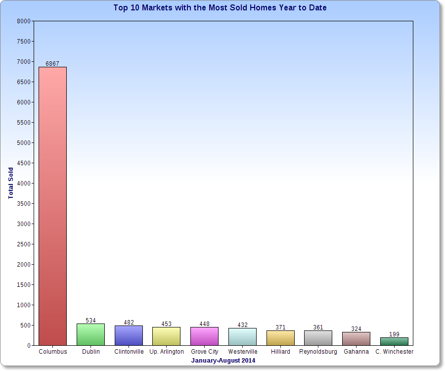
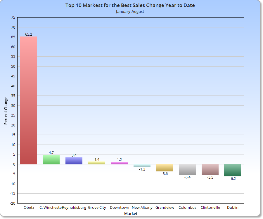
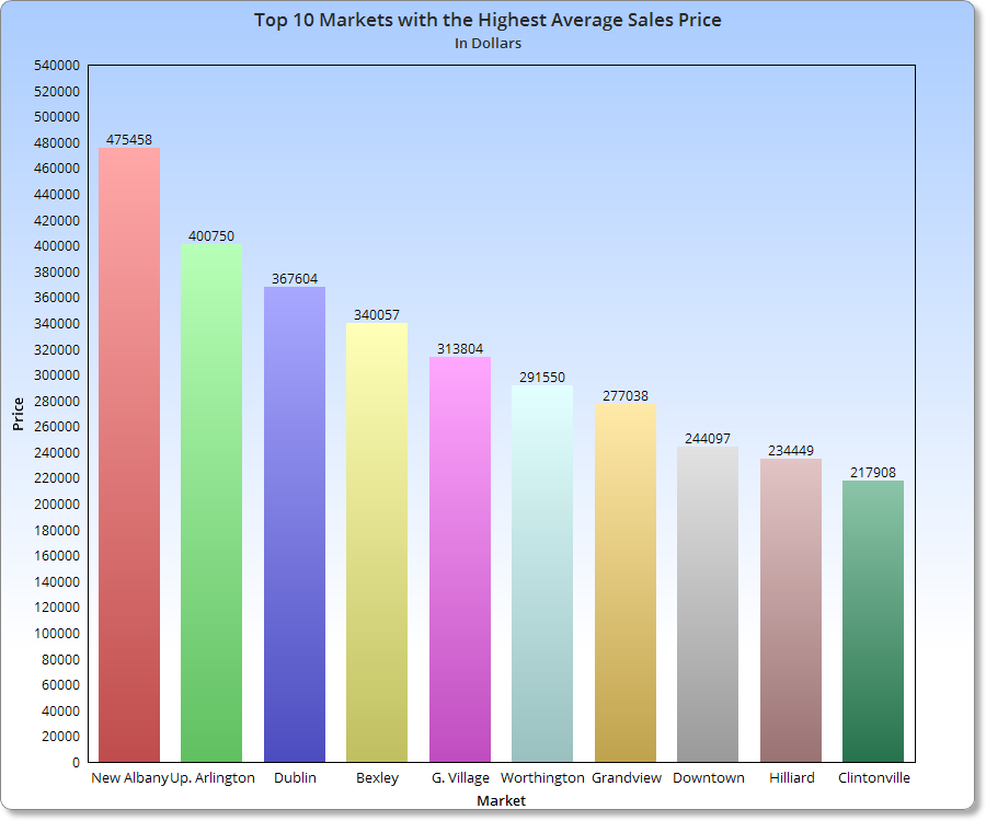
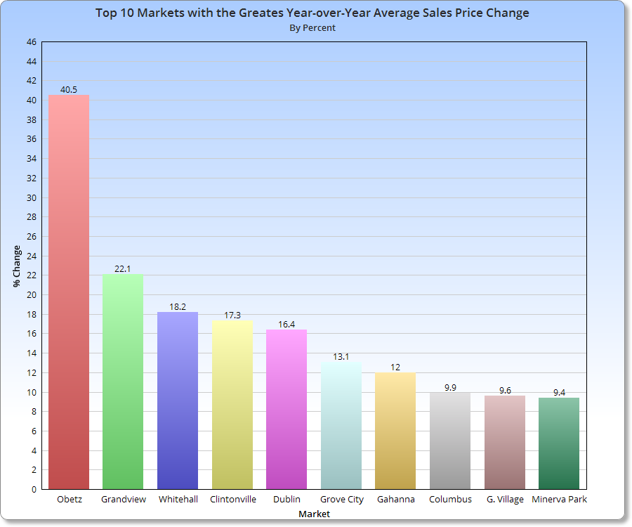
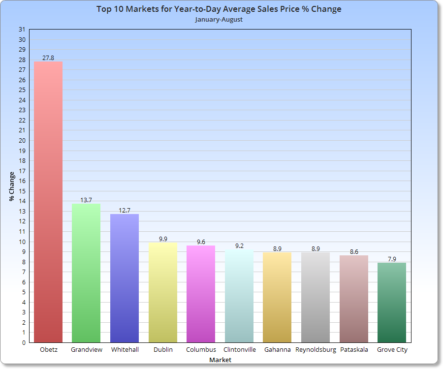
For this update, I’m going to do things a bit differently. In previous updates, I have done long ranking lists and it got to be a bit overwhelming. So starting with this update, I’m going to do more charts instead.
In any case, August continued the year-long trend of home sales being down, with the month coming in at more than 11% off from the same time last year. Prices, however, were up more than 6% to reach a monthly record. There continues to be a supply problem, which is the main mechanism driving both lower sales and higher prices.