The 1901 Mega Cold Front


1901 mega cold front

The 1901 mega cold front was a massive wake-up call after a relatively tranquil, if not cool, fall. Temperatures through November and early December 1901 had been persistently below normal. 24 days in November had been below normal, and but for a few days very early in December, this pattern continued. However, beginning on December 11th, temperatures began to rise ahead of an approaching weather system. By the 13th, temperatures reached record highs in Columbus when they spiked at 65 degrees. The following day started equally warm with a record high of 65. However, a change was coming.

To the northwest of Ohio, temperatures were plunging rapidly as a deep, cold high pressure system was being pulled south. Dispatch headlines warned of the record-breaking cold.

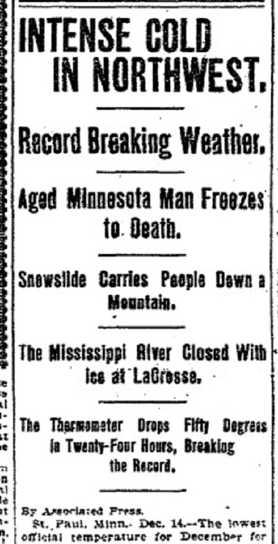
A powerful cold front would move through late on the 14th, and temperatures began to plummet. By midnight, the temperature had dropped all the way down to just 14 degrees, a single day drop of 51 degrees! A driving rain accompanied the frontal passage, but quickly changed over to heavy snow that accumulated 3″-5″ across the area.

On the 15th, the temperature continued to fall, albeit more slowly, and by midnight the reading was -4. This mega-cold front had produced a 69-degree total drop in Columbus, which made it one of the strongest cold fronts ever to move through the Ohio region.

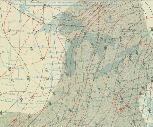
The weather map on December 14, 1901, as the front began pushing through Ohio.

The front would bring a major pattern change. Every day from the 15th-21st featured highs in the teens, which set many daily low maximum records, some of which still stand more than 100 years later.

The winter of 1901-02 was generally cold and snowy in the Ohio Valley, but no future front that winter would come close to December 14-15th of 1901.

To view more local and current weather, visit: Wilmington National Weather Service
And for more historic December records, check out: December Weather Records


The Changing Columbus Transit Scene


There’s been some discussion over the last few years about how driving habits are changing nationally. I’ve seen at least a few reports suggesting that overall driving is actually on the decline and has been for some time. This even while the population of the US continues to rise. A http://uspirg.org/sites/pirg/files/reports/US_Transp_trans_scrn.pdf”>new report has come out detailing the changing habits of cities, including the changing Columbus transit scene.

Percent Change in Per-Capita Vehicle Miles Traveled from 2006-2011
Columbus: -5.7%
Dayton: -0.2%
Akron: +1.2%
Cleveland: +5.1%
Youngstown: +5.4%
Cincinnati: N/A
Toledo: N/A

Columbus saw the largest drop in vehicle miles traveled, indicating that people there are driving less. Northeast Ohio all saw increases, which goes against the national trend. Toledo and Cincinnati did not have comparable numbers.

Percent Change in Per-Capita Passenger Miles Traveled on Mass Transit 2005-2010
Columbus: +1.6%
Dayton: -0.6%
Akron: -2.8%
Youngstown: -8.3%
Toledo: -28.8%
Cleveland: -34.2%
Cincinnati: -34.8%

Columbus was the only city to see an increase in its mass transit miles. Cleveland, Cincinnati saw drops of more than 1/3rd.

Change in the Proportion of Workers who Commuted by Car, 2000-2011
Dayton: -1.5%
Columbus: -1.2%
Toledo: -1.0%
Youngstown: -1.0%
Akron: -0.8%
Cleveland: -0.4%
Cincinnati: -0.2%

All 7 saw declines.

Change in the Proportion of Workers who Biked to Work, 2000-2011
Columbus: +0.3%
Akron: +0.1%
Cleveland: +0.1%
Dayton: +0.1%
Toledo: +0.1%
Cincinnati: +0%
Youngstown: +0%

Columbus saw the largest increase of all 7, although the actual changes are all small. No city measured in the US saw a change of more than +1.7%. The majority of cities were less than 0.3%.

Change in the Proportion of Workers Who Worked From Home, 2000-2011
Columbus: +1.4%
Cincinnati: +0.9%
Dayton: +0.8%
Cleveland: +0.6%
Toledo: +0.6%
Youngstown: +0.6%
Akron: +0.5%

Columbus again leads, though all cities saw increases.

Total Per-Capita Vehicle Miles Traveled in 2006
Cleveland: 8,285
Youngstown: 8,806
Akron: 9,379
Columbus: 9,956
Dayton: 10,084
Cincinnati: N/A
Toledo: N/A

Total Per-Capita Vehicle Miles Traveled in 2011
Cleveland: 8,705
Youngstown: 9,284
Columbus: 9,385
Akron: 9,490
Dayton: 10,068
Cincinnati: N/A
Toledo: N/A

Total Per-Capita Mass-Transit Miles Traveled in 2005
Cleveland: 172.0
Cincinnati: 110.0
Dayton: 64.7
Columbus: 52.6
Toledo: 51.6
Akron: 42.9
Youngstown: 17.3

Total Per-Capita Mass-Transit Miles Traveled in 2010
Cleveland: 113.0
Cincinnati: 71.8
Dayton: 64.1
Columbus: 53.4
Akron: 41.7
Toledo: 36.7
Youngstown: 15.9

% of Workers who Traveled by Car, 2011
Cleveland: 89.2%
Columbus: 89.8%
Cincinnati: 90.6%
Dayton: 91.4%
Akron: 92.5%
Toledo: 93.1%
Youngstown: 94.4%

National Rank (of 100 cities) in the % Change for those who Biked to Work, 2000-2011
Columbus: 15th
Dayton: 37th
Cleveland: 38th
Akron: 39th
Toledo: 49th
Cincinnati: 74th
Youngstown: 81st

% Change of Households with No Vehicle, 2006-2011
Akron: +2.2%
Dayton: +1.0%
Cleveland: +0.9%
Columbus: +0.9%
Cincinnati: -0.3%
Toledo: -0.4%
Youngstown: N/A

% Change of Households with 2+ Vehicles, 2006-2011
Toledo: -4.2%
Akron: -3.6%
Dayton: -2.8%
Cleveland: -2.6%
Columbus: -1.4%
Cincinnati: -1.1%
Youngstown: N/A

So what does all this data tell us? Well, for the most part, all Ohio cities are seeing car use decline in some way or another. Columbus performs strongly in car use declines and increases in at-home workers and increases in bike commuting. Mass-transit was where it performed the weakest, where it’s middle of the pack. Yet even there, it saw increases in its use.


Franklin County Home Values and Gentrification

Home values are, in part, tied to how well a neighborhood is performing. In the case of urban neighborhoods, how home values change over time may be a good indication of how that neighborhood is revitalizing. I looked at median home values by census tract for the years 2000 and 2010. Here is the map of how values changed during that period.
Franklin County home values
What the different colors indicate are different levels of performance, obviously. Yellow and oranges indicate decline, which few areas experienced. Light green, which makes up quite a bit of the suburban areas in and outside 270, indicates mostly stability or slow growth (but below average) in home values. Dark green is average to a bit above average growth. Blues and purple are high growth areas.

What the map shows it that the strongest growth in median home values occurred in the urban core neighborhoods, especially along the High Street corridor. Pockets of strong growth also occurred around Easton and sporadically in some suburban areas. What this says, particularly for the urban core, is that quite a few neighborhoods are on the rise. Grandview, Upper Arlington, the Short North, Campus, Clintonville, German and Merion Villages, the western half of Weinland Park, Downtown, and the Near East Side around Franklin Park were some of the best performing areas. This would seem to indicate that strong gentrification is taking place.


Thanksgiving Historic Climatology


Thanksgiving historic climatology

Thanksgiving historic climatology records go back to 1878.

Normals *1981-2010
High: 48
Low: 33
Mean: 40.5
Precipitation: 0.11″
Snowfall: 0.1″

Top 10 Coldest Highs
1. 1930: 12
2. 1936: 26
3. 1880, 1903, 1905: 27
4. 1938: 28
5. 1892, 1898: 29
6. 1881: 30
7. 2013: 31
8. 1945, 2002: 32
9. 1886, 1889, 1890, 1929, 1958: 33
10. 1882, 1885, 1901: 34

Top 10 Coldest Lows
1. 1930: 3
2. 1930, 2005: 15
3. 1929, 1984: 16
4. 2000: 17
5. 1880, 1881, 1892, 1894, 1958: 18
6. 1901, 1905, 2002: 19
7. 1898, 1936, 1938, 1950, 1982, 1989, 1996: 20
8. 1911, 1956, 2013: 31
9. 1882, 1886, 1912, 1945: 22
10. 1994, 2008: 23

Top 10 Warmest Highs
1. 1896: 70
2. 1915, 1940: 64
3. 1879, 1908, 1981, 2007, 2012: 63
4. 1966, 1968, 1973, 1979: 62
5. 1918, 1941: 61
6. 1914, 1927, 1983: 60
7. 1933: 59
8. 1899, 1957: 58
9. 1921, 1943, 1990, 2010: 57
10: 1887, 1922, 2006: 56

Top 10 Warmest Lows
1. 1979: 53
2. 1896: 52
3. 1940: 51
4. 1957: 49
5. 1879: 48
6. 1934, 1966: 47
7. 1968: 46
8. 1913, 1933, 1978, 1990, 2003: 43
9. 1899, 1927, 1961: 42
10. 1908, 1951, 1987, 1991, 1998: 41

Top 10 Wettest
1. 2010: 1.76″
2. 1961: 1.58″
3. 1968: 1.22″
4. 1990: 0.71″
5. 1921, 1925: 0.70″
6. 1926: 0.69″
7. 1980: 0.65″
8. 1887: 0.60″
9. 1957: 0.59″
10. 1951: 0.49″

Top 10 Snowiest
1. 1880: 3.2″
2. 1950: 1.1″
3. 1938: 0.8″
4. 1959: 0.7″
5. 1889: 0.4″
6. 1945, 1957: 0.3″
7. 1890, 1954, 2005: 0.2″
8. 1953, 2004: 0.1″
9. Multiple: Trace
10. Multiple: 0

Most Snow on the Ground
1959: 1″
2013: 1″
Trace: Multiple


Ohio Domestic Migration 2005-2012


Ohio has been growing fairly slowly for several decades now. In fact, if it was not for Columbus’ population growth and international migration, the state would’ve been losing population in recent years. But is the picture really that bad? Are things changing? I decided to find out.

The first chart above shows the total population that moved to Ohio from all other 49 states plus Puerto Rico and DC by year. The drop during the recession is pretty obvious, as mobility greatly decreased during that time. 2012 had the 2nd highest total of the period, only slightly behind 2006.

What the out-migration chart shows is that the total is gradually going down, meaning fewer people, on average, are leaving Ohio each year. So what is the overall difference of in vs. out migration to Ohio?

As the chart shows, the trend has been improving over time, and 2012 barely registered a loss at all. Will the state begin seeing positive domestic in-migration in the very near future? Based on this chart, the answer seems to be yes. A lot can still happen, but it does appear that Ohio is finally shaking off its long-term population issues.