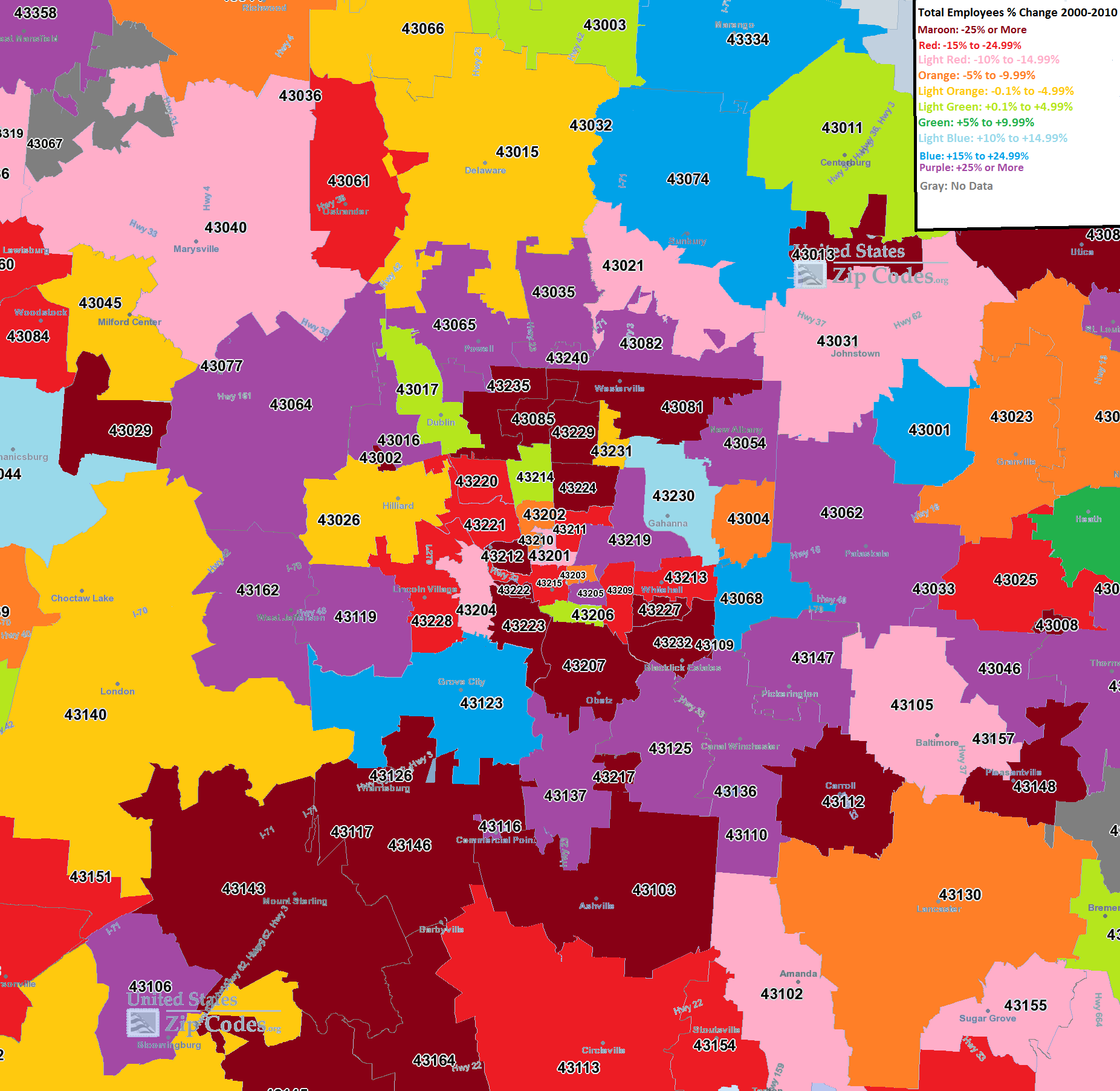
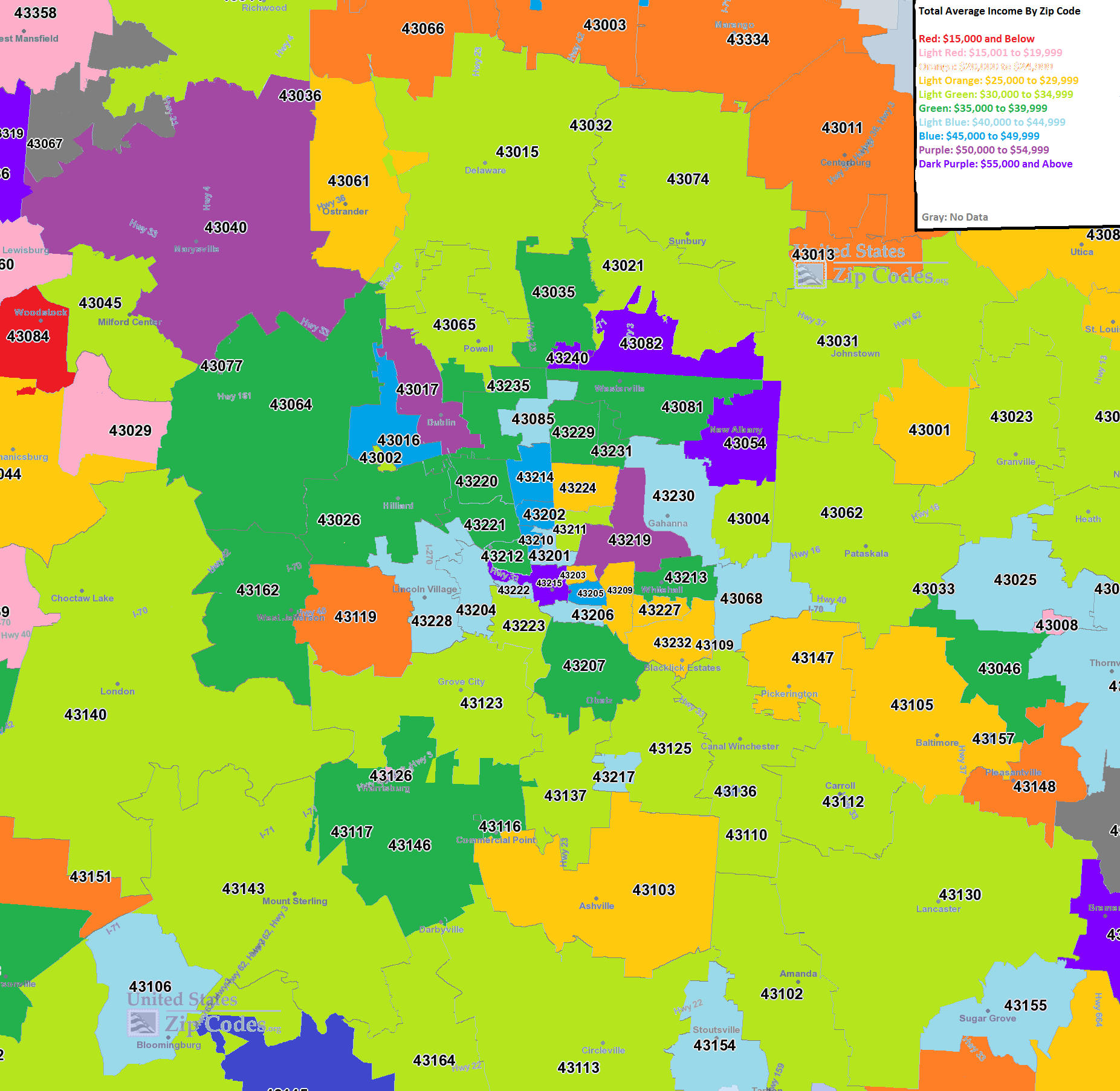
I have been wanting to do these maps for awhile now, as there have been several searches on the site for them and they weren’t available. It took a lot of work, but here are the maps for Columbus area murders by zip code 2008-2015.
2008
In 2008, almost all murders were contained within the I-270 boundaries. The East and South Sides were the worst areas.
2009
In 2009, there began to be a bit of diffusion on where murder was taking place. While parts of the urban core remained the worst areas, suburban areas also saw the occasional murder.
2010
The diffusion continued in 2010.
2011
And in 2011.
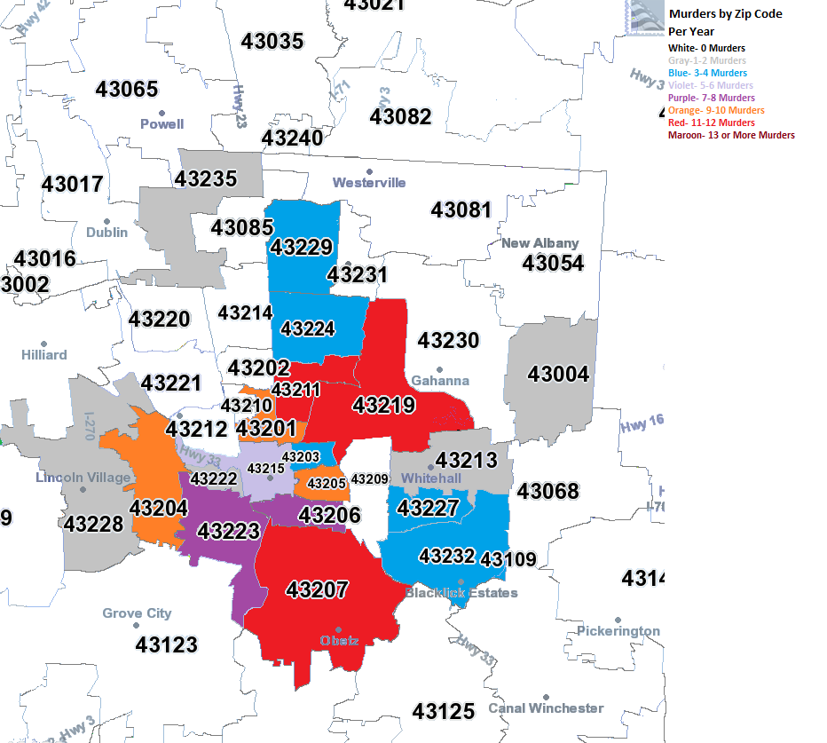
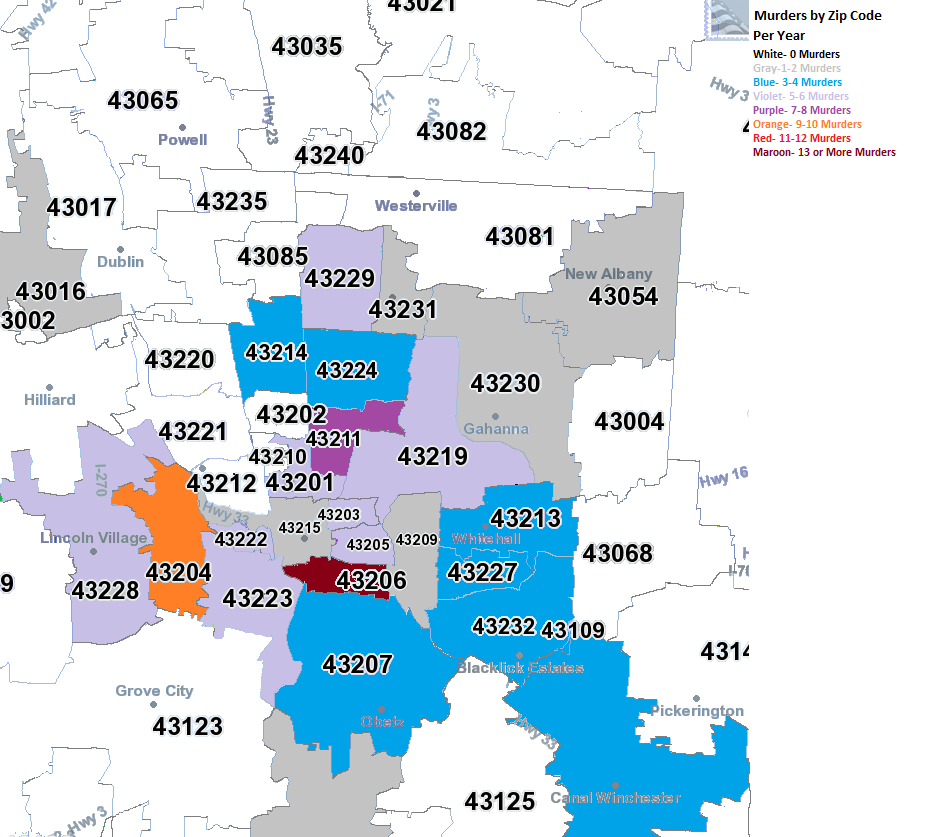
2012
2012 was the most diffuse of all the years, with no heavily concentrated areas, even in the urban core as much. Meanwhile, most of the suburban zip codes within Franklin County saw at least 1 murder.
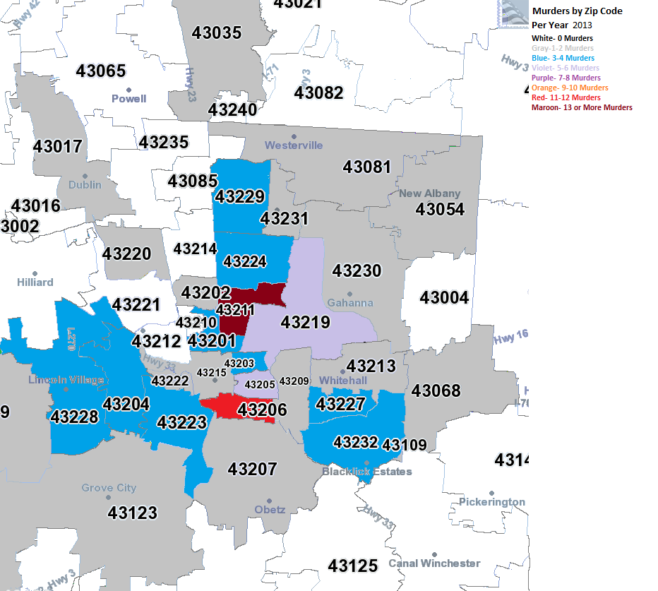
2013
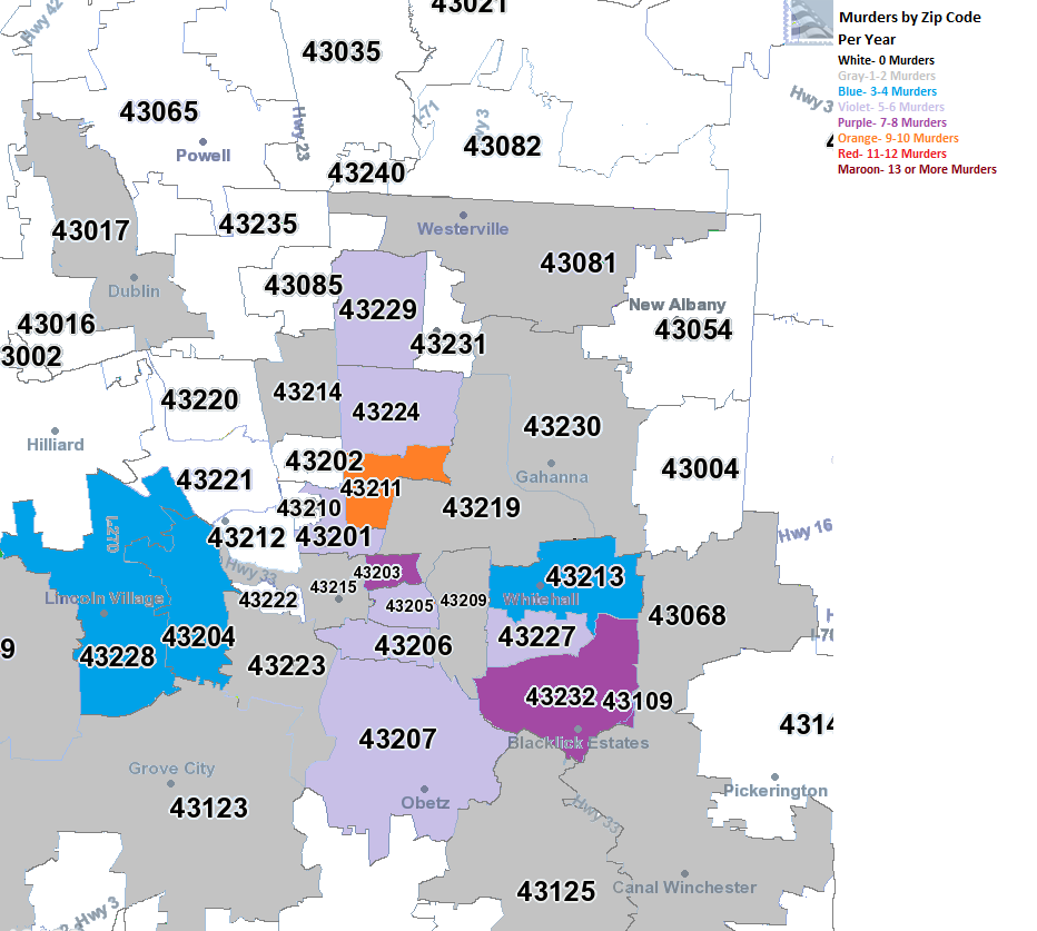
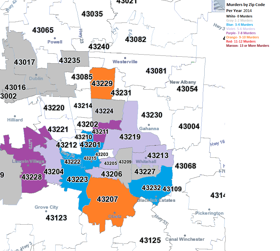
2014
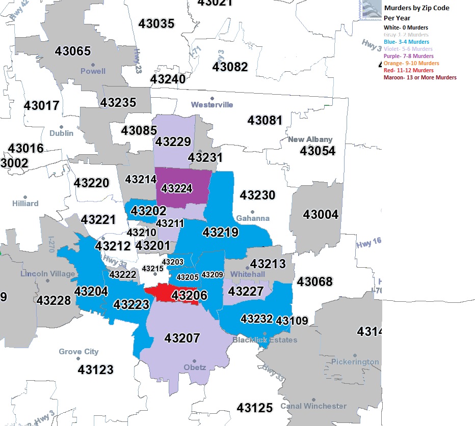
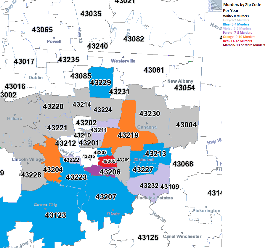
2015
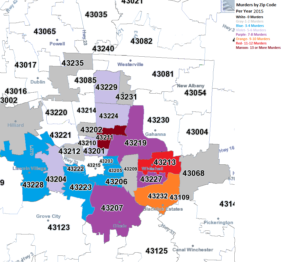
By 2015, most activity was on the eastern side of the city, particular South Linden and the Far East Side around Whitehall and Reynoldsburg, but all areas along the 270 area on the Far East Side had the highest levels of murder in the county. The central core generally stayed a lot lower, creating a much more prominent donut shape than what existed back in 2008.
This seems to indicate that as the central core gains in population and income, crime is also being pushed further out.