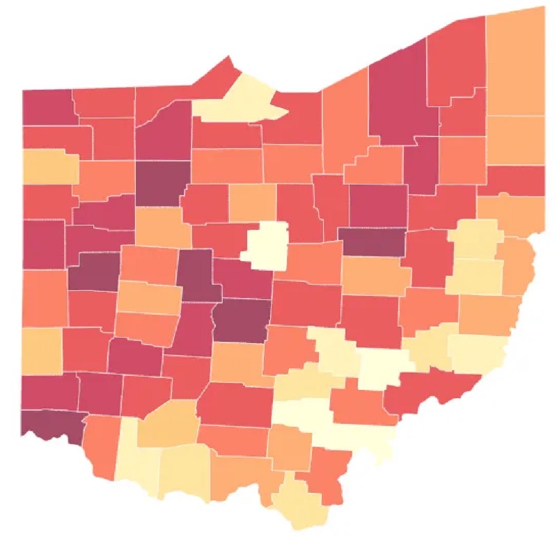
First up is a link to a story on the growing housing crisis across Ohio, with a focus on the Columbus area. https://kevinverhoff.com/index.php/2020/02/13/ohios-housing-crisis/ The article uses an interesting metric to quantify just how bad the housing shortage is in counties across the state- the number of jobs versus the number of available housing units. In Columbus, there is only about 0.7 units per 1 job, leading to a Central Ohio shortage of more than 200,000 units!
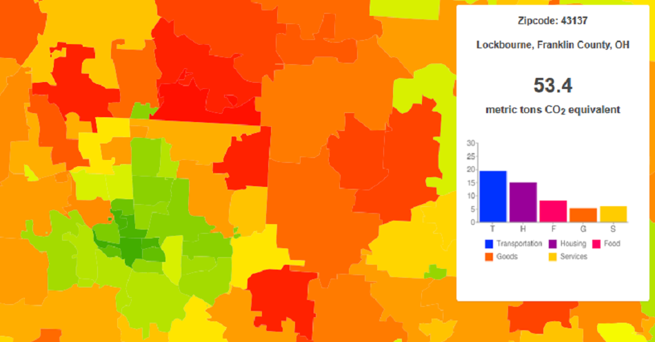
Second, here is a link that gives the average annual carbon footprint of all US zip codes. In general, it seems that the most urban zip codes have the lowest footprints, along with far rural areas. The highest footprints seem to be in suburban and exurban areas. In the Columbus area, the zip code with the highest carbon footprint is 43021, which contains much of Westerville. Second highest is 43054, which contains New Albany. Take a look at the interactive maps here: https://coolclimate.org/maps
A lot of requests for zip code data come into this site, so I thought it might be a good idea to provide some.
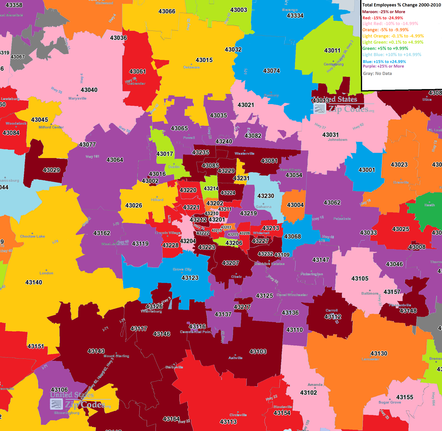
First, we have a map for the Columbus area that includes the % of of employees in a particular zip code from 2000-2010.
From this map, the urban areas of Columbus seem to have lost the most % of their employees the last decade, along with the far suburban and rural areas. The biggest growth was in the areas along and just outside of 270. This is an interesting map as it implies that the nearest suburban areas are attracting the most jobs, but that these suburbs are are both pulling from the inner core, but also from much further out.
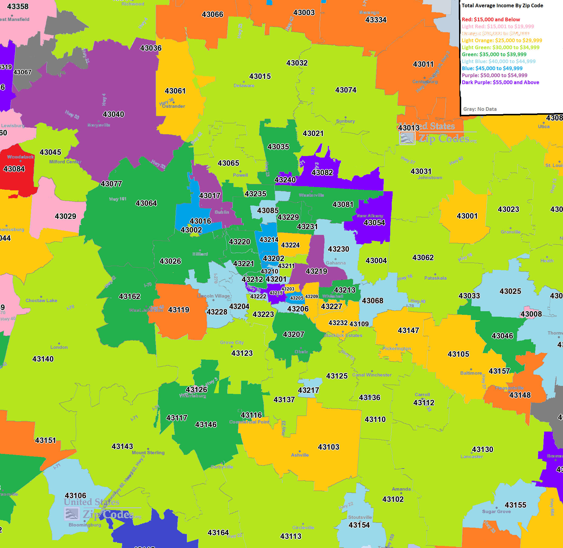
The second map is for average employee income by zip code.
What this map seems to show is that, while jobs may be moving to the I-270 suburbs, pay for those jobs is decidedly mixed across the city. Downtown, for example, averaged some of the highest incomes in the city. Other strong areas include parts of Westerville, New Albany and Dublin. Most of the High Street corridor was fairly strong as well. The lowest incomes were almost entirely in rural and far suburban areas.
Finally, the % change of average income from 2000-2010.
This map is also a mixed bag. Most of the area saw wage growth, but where it occurred the strongest was definitely all over the map. Some suburbs had good and bad, and so did the urban core areas.
So what’s all this mean? Well, certainly it means that the total # of jobs as far as growth shifted to the 270 suburbs the last decade, but at the same time, those jobs that remained in the core areas still grew in income. So it appears that the city is becoming richer about on par with the suburbs, at least the last 10 years. The question becomes, what happens the next decade? If urban trends continue the way they have the past few years (which these maps don’t really take into account), it is entirely possible that some of the job growth will move back inward towards the urban core.
To continue with local and national economic data, the US’ Bureau of Economic Analysis gives the option to look at cities, metro areas and other levels. Zip Code Maps gives population and demographic data in an interactive format.