Here is a map for all the listed 1950s Ohio severe weather reports during that era. Click on the pins for more information.
The map incudes information for tornadoes, high wind and hail reports.
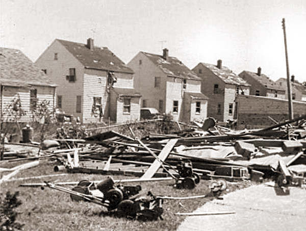
June 8, 1953 Northeast Ohio tornado damage.

Here is a map for all the listed 1950s Ohio severe weather reports during that era. Click on the pins for more information.
The map incudes information for tornadoes, high wind and hail reports.
June 8, 1953 Northeast Ohio tornado damage.
I saw this post the other day about changing neighborhood demographics in certain cities, particularly when it comes to racial segregation and gentrification. Surprisingly, of all the maps and posts I’ve done on demographics, I hadn’t thought to do one like this. Well, now I have, so here are Franklin County’s gentrification trends 1990-2014.

A bit of an explanation is needed for the color coding:
-For those categories marked “Steady”, the demographic listed has been the majority throughout the period, with little to no change of other demographics.
-For those mixed categories of one decline and one rise, it means that the majority demographic has declined at least 5%, while a secondary demographic has risen at least 5%.
-For the category of recent or steady integration, there are at least 2 demographics at 10% or more of the total population, as well as a 3rd demographic reaching at least 5% of the population.
A few things that stand out to me is that the Steady White population dominates at least 50% of the map, while there are very few areas with Steady Black population. One would be tempted to suggest that gentrification is forcing the Black population out of neighborhoods, but this doesn’t seem to be true. In terms of significant changes, there are FAR more areas with Black population growth and White population decline than vice-versa, suggesting that “White Flight” may continue to be an issue. Also, a surprising number of areas have reached full integration, or have at least been maintaining it over the period of question. These neighborhoods of demographic equilibrium are largely the result of increasing Hispanic and Asian populations, particularly on the Northeast and West Sides, as well as the Whitehall area. In the center core, almost all of the High Street corridor has remained steady White, suggesting that other demographics have, so far, been unable to tap into the building boom along and adjacent to this corridor.
Here are the most integrated tracts by year, based the above criteria.
1990
1. #8720- South Side
2. #7820- Riverview-NW Side
3. #1122- West Campus
4. #1121- Campus
5. #29- King-Lincoln
Only 5 tracts counted as being integrated in 1990.
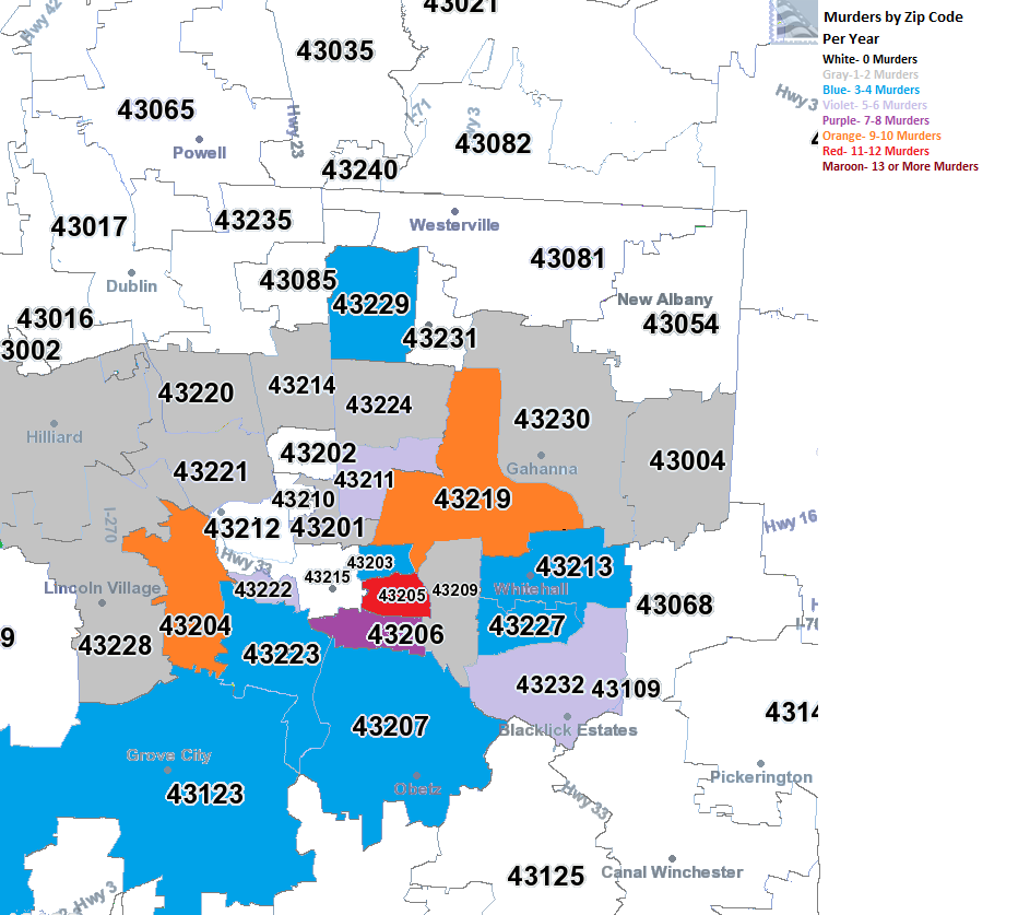
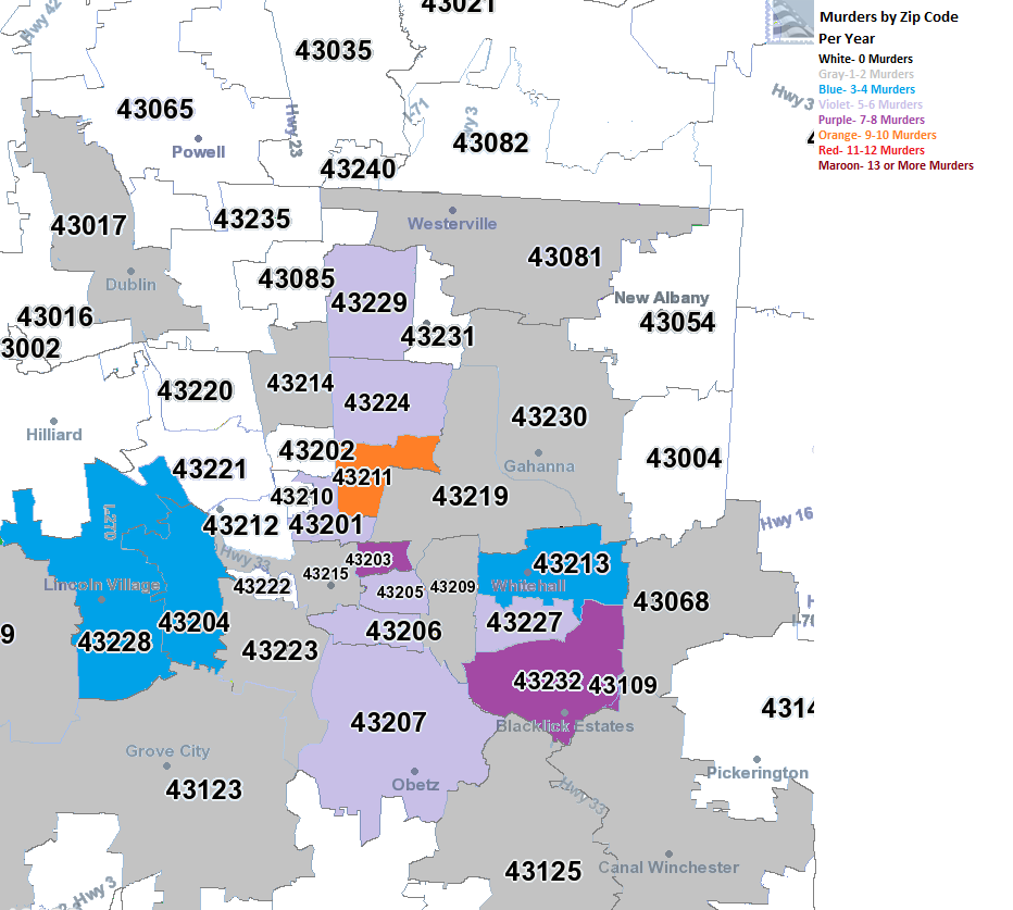
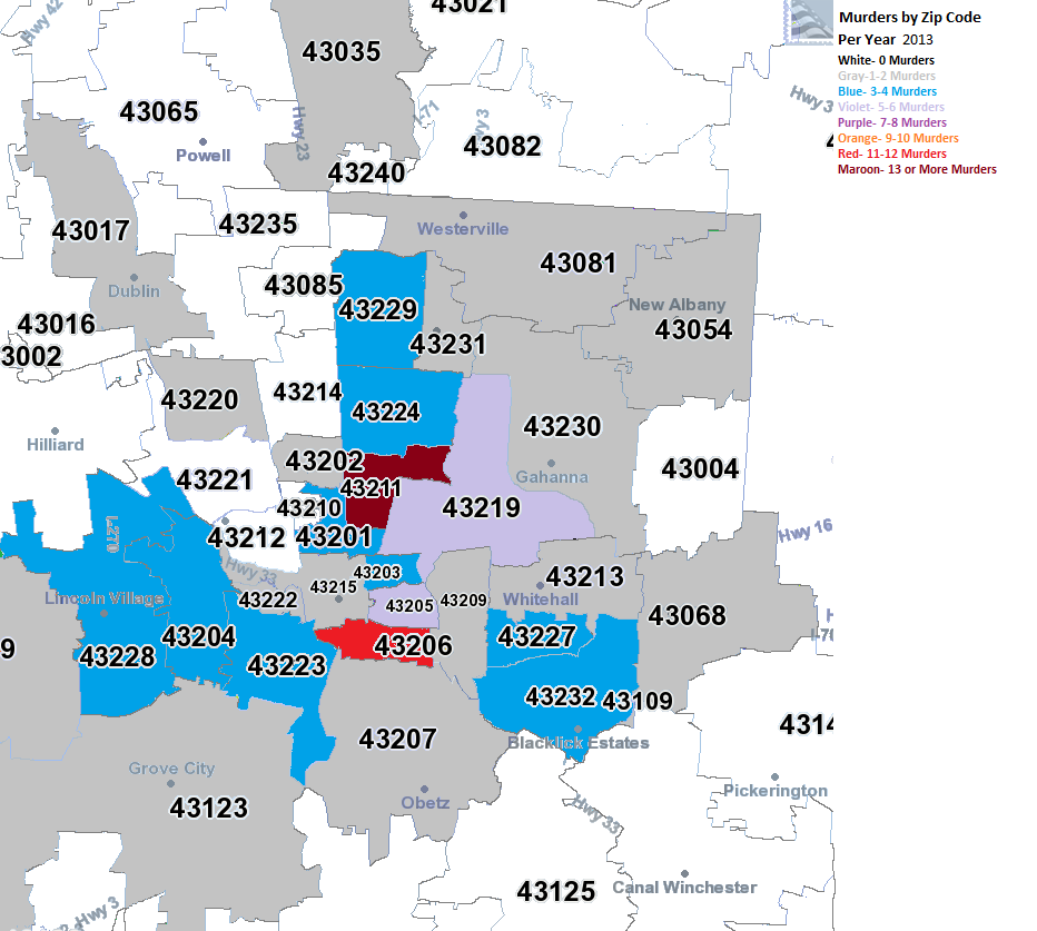
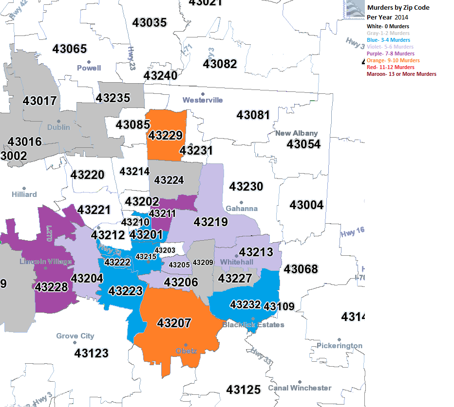
I have been wanting to do these maps for awhile now, as there have been several searches on the site for them and they weren’t available. It took a lot of work, but here are the maps for Columbus area murders by zip code 2008-2015.
2008
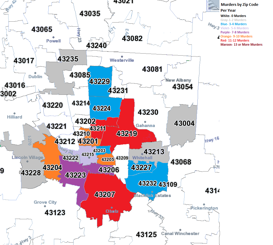
In 2008, almost all murders were contained within the I-270 boundaries. The East and South Sides were the worst areas.
2009
In 2009, there began to be a bit of diffusion on where murder was taking place. While parts of the urban core remained the worst areas, suburban areas also saw the occasional murder.
2010
The diffusion continued in 2010.
2011
And in 2011.
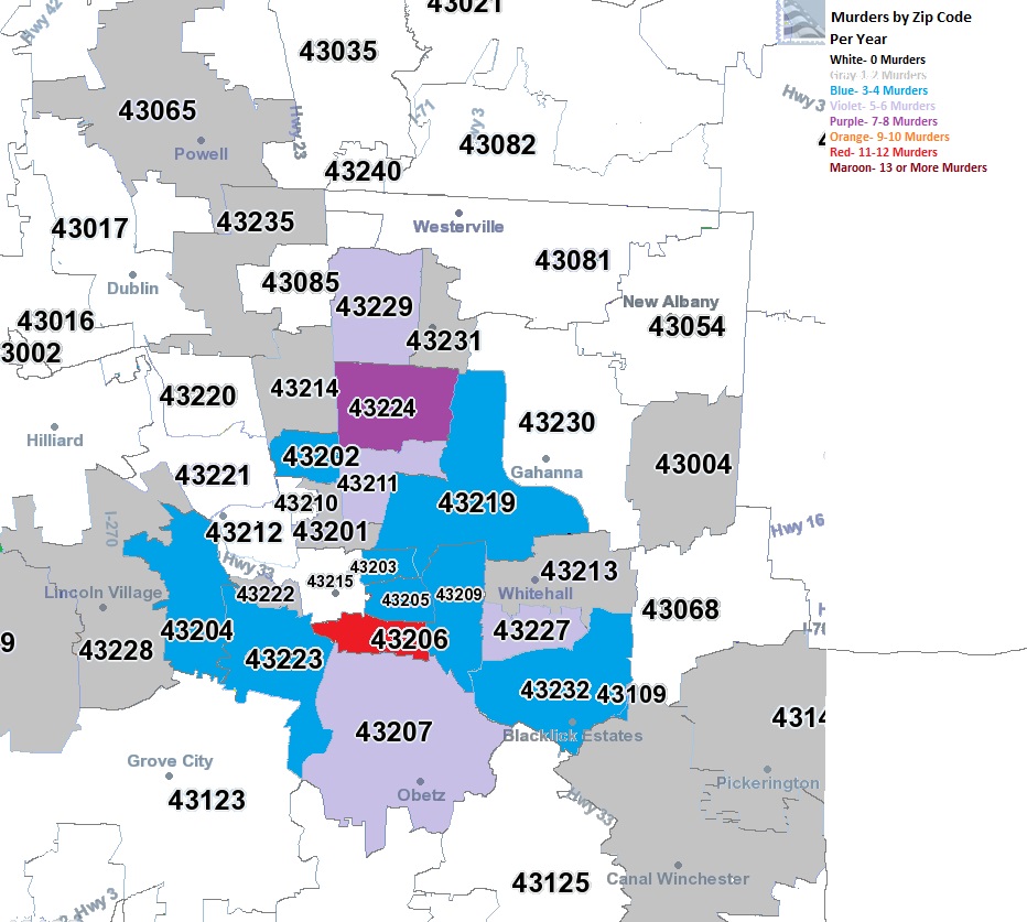
2012
2012 was the most diffuse of all the years, with no heavily concentrated areas, even in the urban core as much. Meanwhile, most of the suburban zip codes within Franklin County saw at least 1 murder.
2013
2014
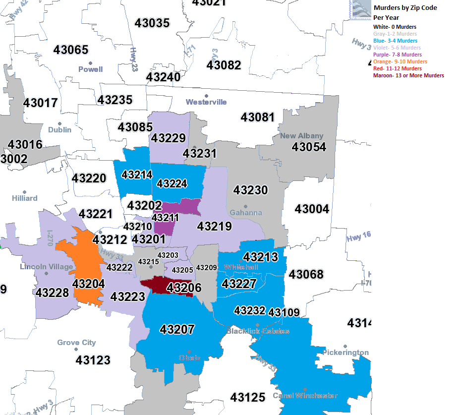
2015
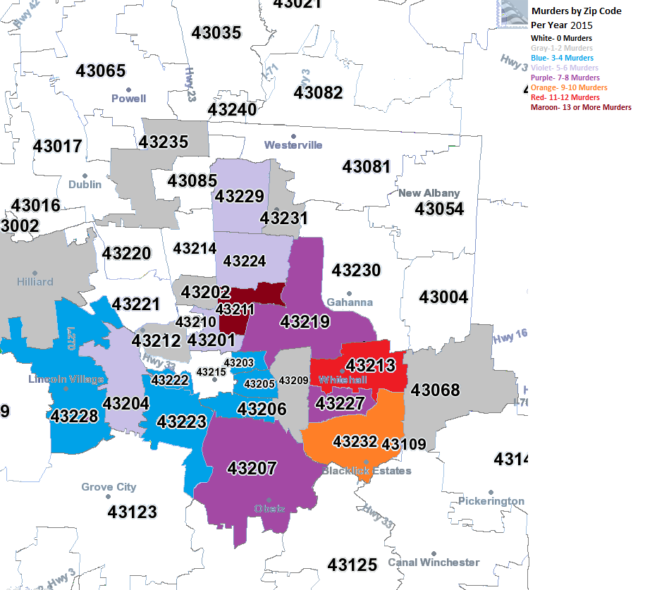
By 2015, most activity was on the eastern side of the city, particular South Linden and the Far East Side around Whitehall and Reynoldsburg, but all areas along the 270 area on the Far East Side had the highest levels of murder in the county. The central core generally stayed a lot lower, creating a much more prominent donut shape than what existed back in 2008.
This seems to indicate that as the central core gains in population and income, crime is also being pushed further out.
So first up to repost from the data loss will be one of the easiest. As mentioned the first time, I wanted to create a map that included the 10-county metro area highlighting every bit of existing, planned and under construction infrastructure involving biking and pedestrian activities. There are some existing maps that show this, but they are not regularly updated and they lack significant detail in what type of infrastructure exists.
Here is the link to the map: https://www.google.com/maps/d/edit?mid=zjN5g-xqXg7o.kmfXTQGVWudU&usp=sharing
The map is still very much a work in progress. I have neither finished the existing infrastructure level or the planned infrastructure level. I update it a bit more almost every day, so keep checking back!
Similar to other posts that show how Columbus has been changing, the link below from the site Urb-I has hundreds of before and after worldwide photos of streetscape changes. Columbus itself is not included, but perhaps that can be changed as the site allows anyone to submit images.