Missed opportunity are words that I would rather not use when it comes to urban development. And yet ever since the urban movement resurfaced in the last 10 years or so, I have been patiently waiting for Columbus to get with the program on building quality urban development. In far too many cases, however, those projects can’t be described as anything other than a missed opportunity, and now the phrase has become new buzzwords associated with Columbus development overall. While not every development project has been a disappointment in recent years, here is pretty much the entire list of examples of the city being forward-thinking, or at the very least, following established urban development principles:
1. The Scioto Greenway and Scioto Mile
This project, completed in 2015, removed the low-head dam south of the Main Street Bridge. This lowered the water level of the Scioto River through Downtown, allowing for the creation of more than 30 acres of new park space. Walking and biking paths, landscaping and public art was included in the project, which also improved water quality in the Scioto and allowed for a more natural flow.

Scioto River restoration.
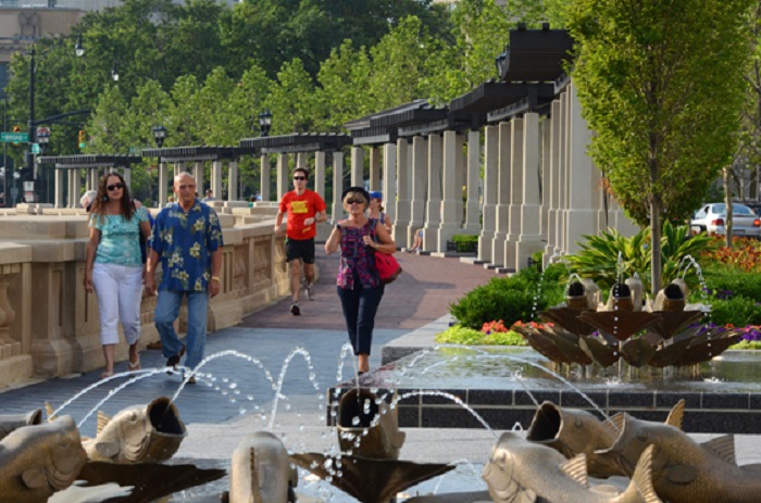
Scioto Mile
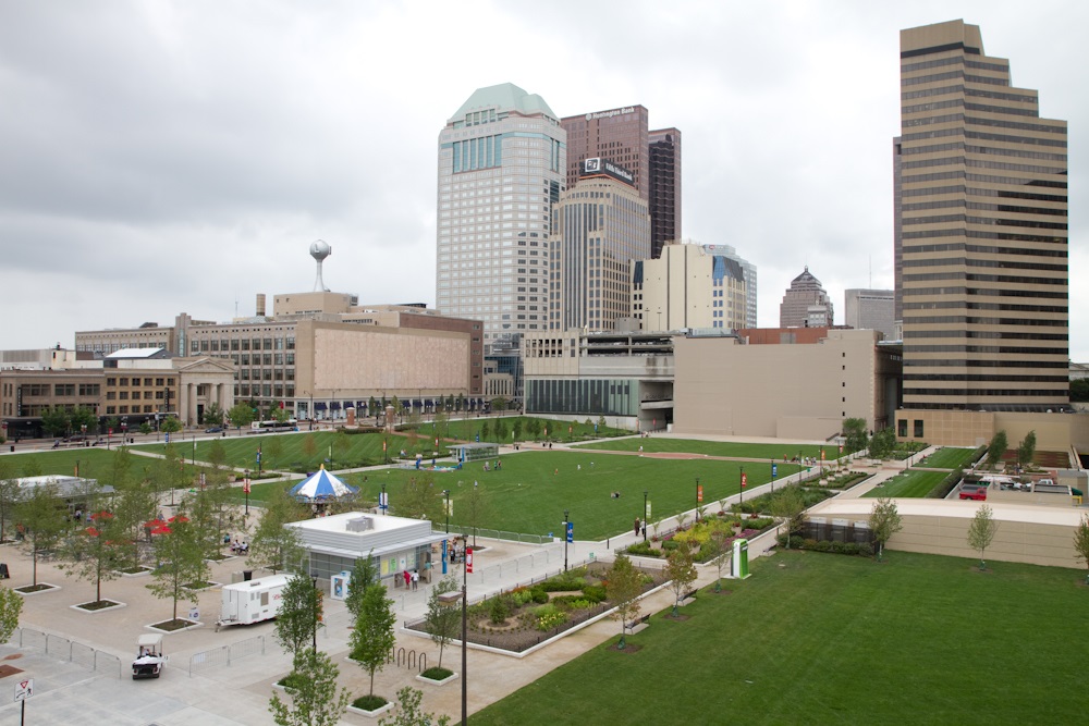
2. Getting rid of the City Center monstrosity for Columbus Commons park.
The 1989 City Center Mall, built in the typical suburban style that lacked any real street-level interaction, died a slow death due to competition. It was demolished in 2009 and Columbus Commons replaced it, complete with landscaping, restaurant space and a carousel. The park has been popular for warm-month events, and new development has sprung up around it.
Before
After
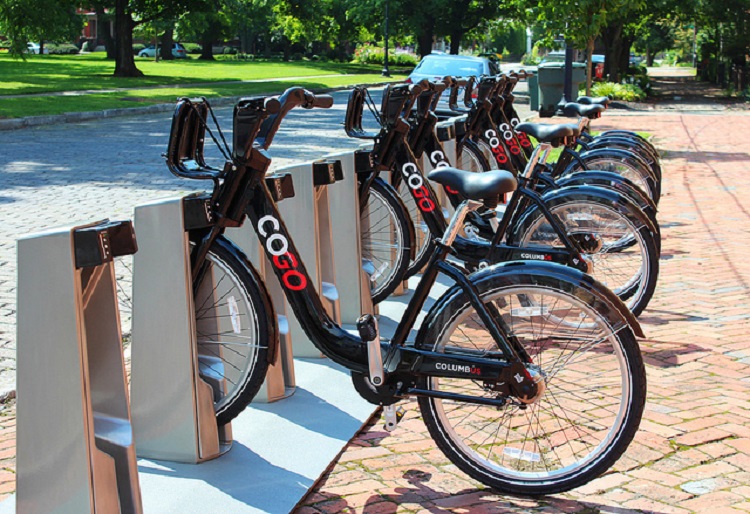
3. CoGo Bike Share.
What started as 30 stations with 300 bikes a few years ago has grown to more than 40 stations, with future expansions planned.
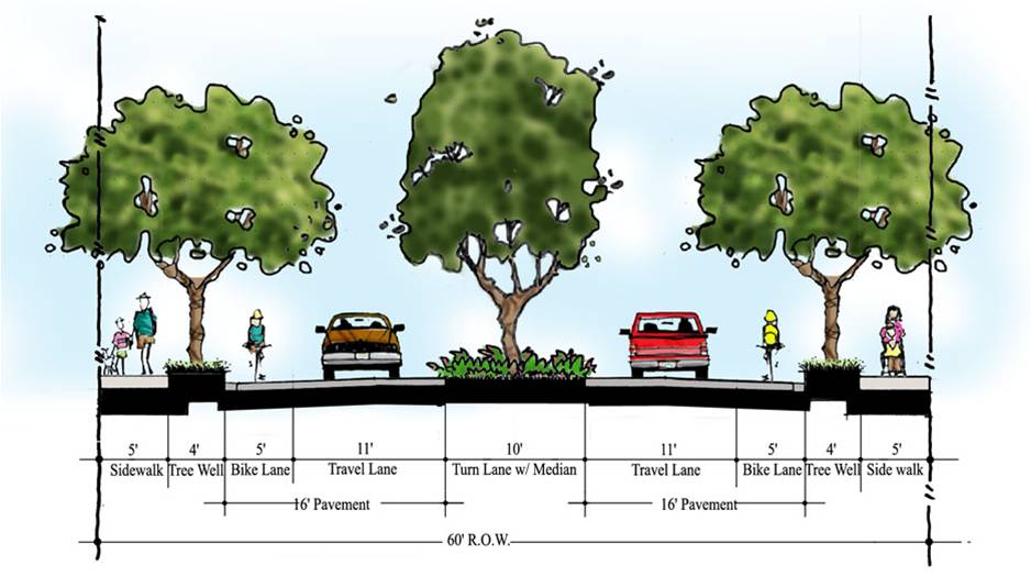
4. Adopting the Complete Streets Infrastructure Program
The concept of Complete Streets is the idea that public infrastructure should think about more than just cars. It allows for the principles that all roads should have pedestrian infrastructure, and where possible, multi use paths and bike lanes.
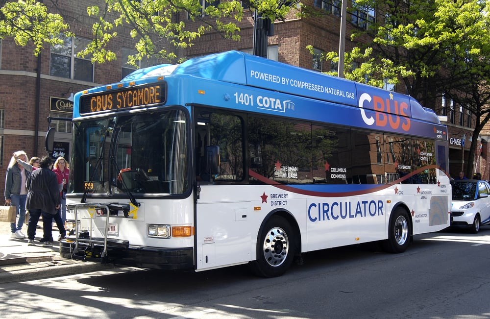
5. The C-Bus
The Downtown circulator bus has been very popular, particularly because it is free to all.
I literally couldn’t think of any others, but perhaps someone can help me out with other examples? In any case, this part will focus largely on Downtown, with the next installment focusing on other areas of the urban core.
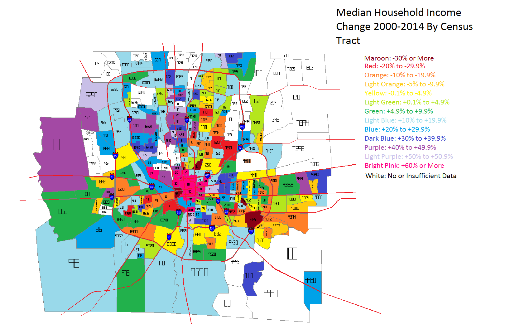
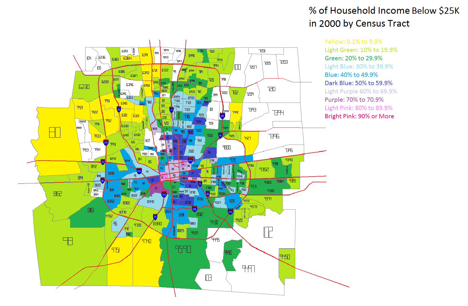
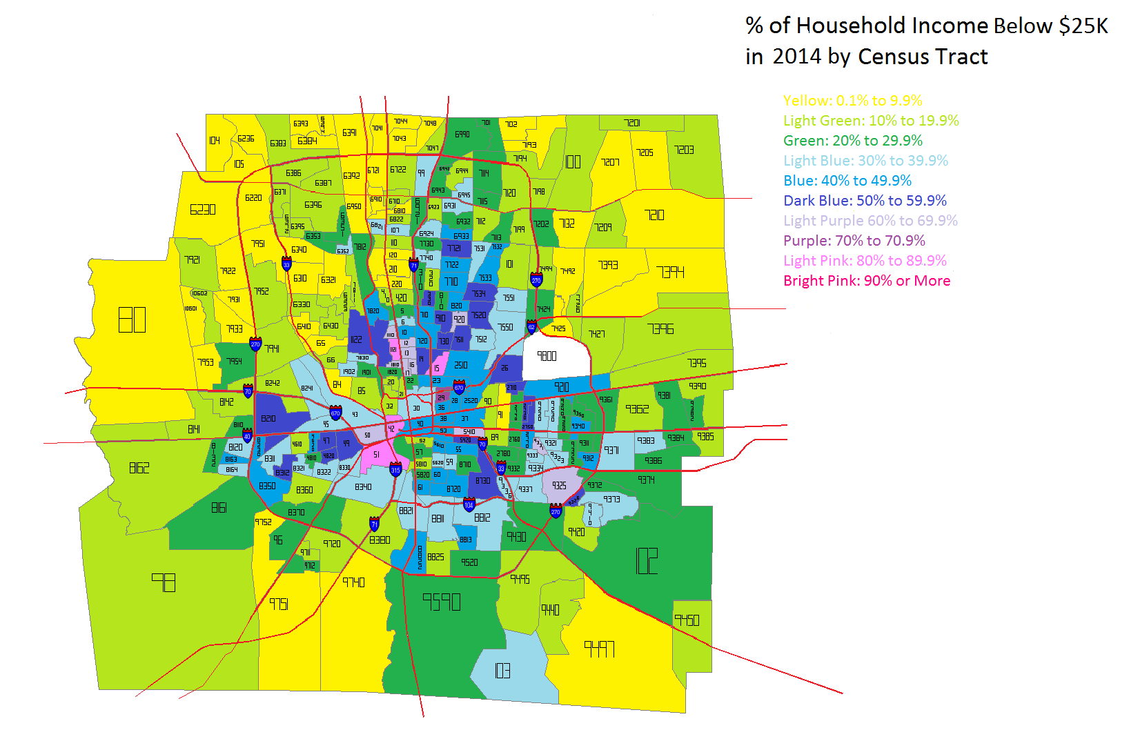
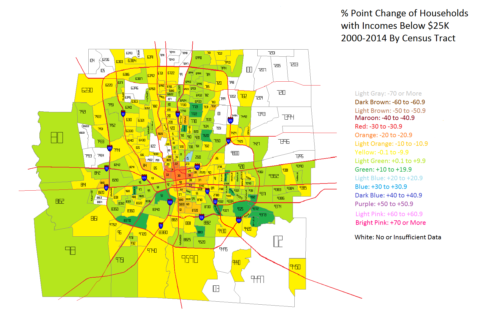
Back in 2002 when former mayor Mike Coleman helped initiate the first Downtown plan, it was built around the idea of a strong urban center, which Columbus hadn’t really had in decades, the Short North and German Village notwithstanding. His goal was to add 10,000 new residential units to Downtown by 2010. The city offered incentives like tax abatements to help make it happen. Unfortunately, the housing market in Columbus, like in just about every city, was severely impacted by the double recessions during the 2000s and Downtown ended up with less than 1/4th of the goal by 2010. While the economy was not Coleman’s fault and he was in fact fighting the good fight, the effort still ended up fairly underwhelming. Consider the very sobering facts about Downtown Columbus. In 2010, Downtown had 7,416 residents according to the Census report called “Distance Profiles for US Metropolitan Areas 2000 and 2010”. In the report, population profiles were given for each mile out from “City Hall”, or basically the center of each city’s downtown. Mile 0 measured the CBD, and Columbus’ 7,416 total was shockingly low for a city its size. In fact, of the 92 Midwestern metro areas of any size, Columbus’ downtown had the 15th lowest population. Out of major cities, it ranked dead last. The only bright bit of news was that it was just one of 22 Midwest downtowns that saw population growth between 2000 and 2010 (oh, and that the #15 worst ranking was actually an improvement from #8 worst in 2000), perhaps the only tangible result of the 2002 plan. I’ll get back to the population problem in a bit.
The lack of reaching 10,000 units during the 2000s was not the only casualty of the recession years. Coleman also revived the discussion about bringing rail to the city, but he did so in the form of streetcars, which seemed somewhat like a half-measure attempt. Ultimately it didn’t matter anyway. As soon as the economy crashed in 2007-2008, the plan was shelved without even getting on a ballot. Rail discussion has come and gone several times since then, but only in the context of multiple studies on potential routes and costs, but there have been zero serious discussions since 2007 about rail being something that is on its way to the city. Columbus remains the largest US city in the nation without passenger rail service of any kind, even as the economy has returned to normal and many other cities continue to expand or begin building systems of their own.
But rail is not the only transit misfire of recent years. Let’s talk about BRT. Dubbed the CMAX, a proposal to put Columbus’ first BRT (bus-rapid-transit) line on Cleveland Avenue was announced a few years back. The problem? It really isn’t BRT. BRT traditionally has dedicated lanes, fewer stops and bus stations that more closely resemble train platforms than the traditional bus shelter. Because of this, these buses typically run up to 50% faster along routes than a normal bus. With the CMAX, however, no dedicated lanes are planned whatsoever. Instead, the buses are supposed to get “signal priority” rather than separated lanes. This ensures that the bus will inevitably get stuck in traffic, and studies done on BRT systems overwhelmingly make the case that BRT in mixed traffic doesn’t significantly reduce route times or increase ridership. Technically, it isn’t even BRT. Oh, the stations will be fancier, as shown below, but fancy stations don’t actually make for a BRT system. Why transit leadership would make such a stupid mistake is beyond me, especially when there are already plenty of examples of better systems out there.
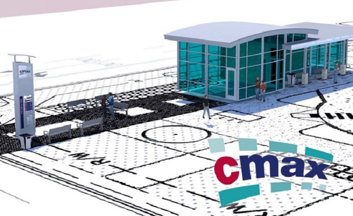
CMax station.
But wait, there’s more! Without rail, and with half-assed BRT that is still years away from being built on a single road, those wishing to use transit in Columbus have to rely on COTA and its bus system. Long using the outdated spoke system from Downtown, COTA finally decided it was time to redesign its system, which will include adding more express routes, extending hours and rearranging existing routes to better serve areas where people actually live and work. That’s the good news. The bad news is that it is still COTA will all its problems. You still need actual money to ride, as there is no rechargeable card, something cities across the country have used for years, and there is no live tracking system to show where buses are relative to bus stops. COTA actually paid a firm to design such a live tracking system, but it failed miserably and they were forced to go back to the drawing board. So far, there is no word on when or if a 2.0 version will arrive.
So let’s face it, transit sucks in Columbus. The city has long had a reputation as a car-first city, and it is hard to argue otherwise. This brings me back to Downtown and the urban core in general. Once upon a time, Downtown and adjacent neighborhoods were some of the most dense in Ohio. Population peaked by 1950 around 30,000 just in Downtown alone, but then followed several disastrous decades of “Urban Renewal”. I can’t say for a fact that UR affected Columbus more than most cities, but it is hard to argue with the results. Block after block after block of densely-built historic buildings were demolished for parking lots, most of which still exist to this very day. The population Downtown plummeted to barely 2,000 by 1980 before beginning its slow ascent again to the still pathetic 7,416 in 2010. This indiscriminate destruction was compounded by the highways that were deliberately plowed through urban neighborhoods, something which even Eisenhower, proponent of the national highway system, was appalled by. The Near East and Near South communities like German Village and Old Towne East were suddenly cut off from Downtown. While the historic German Village did better given that it had a dedicated group of proponents to revitalize the area, OTE and King-Lincoln saw their populations collapse. Thousands of historic homes not destroyed by the highways were left to rot, and many of them succumbed to the Urban Renewal wrecking ball eventually. The bottom line is that the urban core was hurt badly, and for a long, long time, no one understood the consequences of that.
By the mid-1980s, Downtown alone had over 65,000 parking spaces, but as I said above, very little population. It had become a place for office workers to abandon after 5pm on weekdays, and weekends were a ghost town. City leaders had long been discussing ways to bring life back to the core, but in a classic Columbus folly, thought the best way to do that was to build a suburban enclosed mall in the middle of Downtown. To do so, blocks of historic buildings that had managed to survive nearly 4 decades of destruction were demolished. When City Center and its monster Capital South Parking Garage were opened in 1989, it lacked the necessary characteristics that encourage pedestrian activity. People literally drove into the garage and went into the mall without ever stepping foot onto a sidewalk. Not surprisingly, Downtown retail not associated with the mall collapsed and the area ended up even more dead than before. Exactly 20 years later, in 2009, the mall itself came down after failing to compete with newer suburban malls. Some people mourned its loss, but not me. Unfortunately, the city-block sized parking garage remained. As mentioned above, City Center was replaced with a park, Columbus Commons.
The park plan received a LOT of negative feedback. Many were convinced that it would just become a place for the homeless to squat in or piss on new landscaping, or for criminals to lurk behind bushes waiting to strike. It was all pretty silly, and ultimately, none of that happened. The park, with the help of a robust schedule of yearlong activities planned by the city, became an almost instant success. A new stage on the north end allowed such events like Picnic with the Pops, from the Columbus Orchestra, to move Downtown from elsewhere. Also, even before the construction of the park, part of the new land was set aside for mixed-use construction. It was assumed then that it might take a decade to fill in the sections along High Street or the corner of 3rd and Rich. However, the new park being the success as it was, combined with the new Scioto Mile a few blocks away, made this area attractive to new development. All good so far, right? Here is where things took a turn towards “missed opportunity” in a big way.
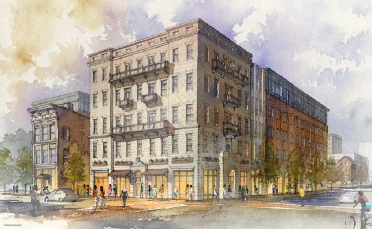
An Atlanta-based developer, Carter, and Moody Nolan proposed a 6-story project called HighPoint at Columbus Commons for the entire section of the park along High Street. The problem? High Street is arguably the city’s most prominent urban commercial corridor. The city had, not long before that, instituted recommended standards for High Street Downtown that called for minimum 10-stories. Worse, the design for HighPoint was terrible. The materials were cheap, and it was basically just a large box with tiny windows. The 300+ residential units (in 2 buildings) were a plus, as was the ground floor retail, but the scale of the project was simply too small for such a large site. The bad design just made it worse. Initial excitement over development coming to the Commons so soon after its construction faded pretty quickly with such a mediocre proposal. Unfortunately, the project received all the variances it needed and was built pretty much as proposed. It looked even worse in reality than it did in proposal form. It is now considered one of the worst projects built in the core in the last decade. Worse still, the retail sections have struggled to fill, and only very recently has there been any news on the spaces being rented.
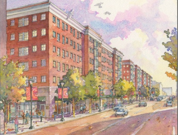
HighPoint as it was originally proposed.
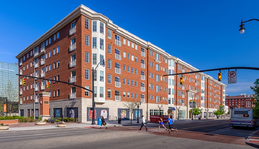
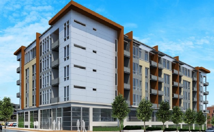
HighPoint completed.
HighPoint wouldn’t be Downtown’s only recent development missed opportunity. With such low Downtown population, one would think going for the most underwhelming result shouldn’t be the goal, or at least following recently adopted guidelines would be a priority, but that has proven to not be remotely true. While great developments like the Commons, Scioto Mile and the Scioto Greenways have activated RiverSouth construction, more often than not, the proposed projects have been vastly underwhelming for their Downtown locations. Before getting to the missed opportunities, let’s talk about the few RiverSouth projects that have bucked the trend.
At the northeast intersection of S. High and E. Main, a parking lot had existed since the late 1980s, when construction of the adjacent Capital South Garage was completed for City Center. The narrow lot had once had a proposal for a 4-5 story apartment project around 2003, but that never got very far. The 12-story, 250 High project was announced in 2013. The mixed-use project would contain 156 apartments, office space and ground floor retail. Completed in 2015, the project has been very successful with high demand for its office space in particular.
250High
Another decent project for the area is the LC at RiverSouth project at S. High and Town, which consists of an 8 and a 10-story mixed-use building with over 200 residential units and ground floor retail. Construction has been extremely slow on this project, but finally may be going vertical over the next few months.
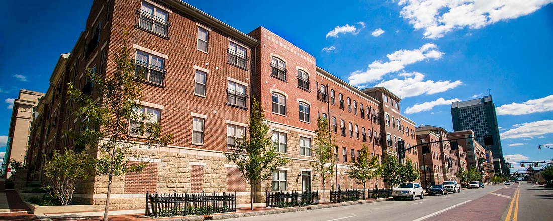
Finally, we have the Julian, a 90-unit renovation of a former factory building at S. Front and W. Main.
Before in 2009.
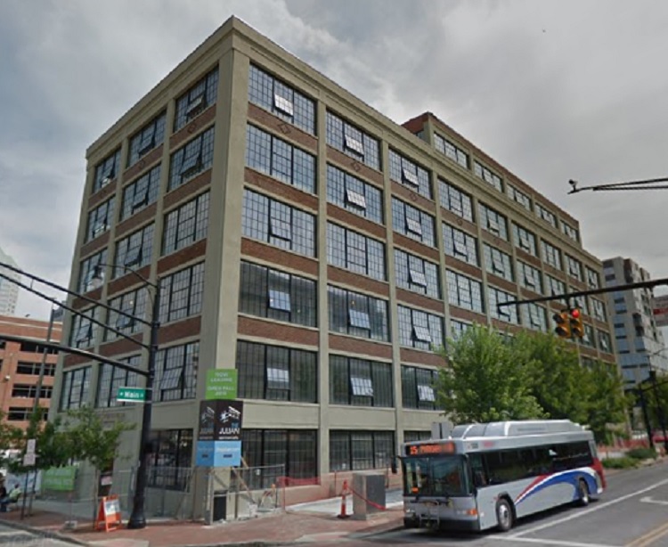
The completed Julian in 2015.
3 solid projects. Moving on to the problems though, there is a project in the RiverSouth that came about during the 2000s that is every bit the missed opportunity that later projects in the area would be- The Annex at RiverSouth. Lifestyle Communities, or LC as it is commonly known, took advantage of Coleman’s tax incentives to propose a condo project on two giant surface parking lots between W. Rich and W. Town along S. Front Street. These sites had been transitioning to parking since at least the 1950s and all buildings had been demolished by the 1980s. They remained this way through the mid-2000s, when LC, which had largely focused on building suburban apartment complexes previously, decided to enter the Downtown market with the Annex project. The two lots were pretty much some of the most prime real estate in all of Downtown, as they were just a block west of High and a block east of the river. A project of height could’ve taken advantage of some fantastic views of Downtown and the riverfront, as there were mostly low rise buildings between the site and the river itself, and the large sizes of the lots- the largest left west of High Street Downtown, were perfect for signature development. Instead, LC decided to bring suburbia into the city. It proposed a 4-story condominium development. There were no mixed-use elements, such as retail, associated with the project in any way. Yet again the Downtown Commission let the project fly through approvals with nary a change from the original proposal. To be fair, the design of the Annex is significantly better than HighPoint, but the scale was and is massively undersized for the location. Its lack of retail meant that anyone living in the complex had to go elsewhere to shop and eat. This would really be the first project that the Downtown Commission would ignore its own development guidelines to approve. HighPoint was next… and then there were a lot more.
LC somewhat redeemed itself a few years later with the proposal of the LC RiverSouth project mentioned above. Similar name, but a much different development from the Annex, so perhaps LC learned a few things in year years between them. Or maybe not, considering its most recent proposal for the northwest corner of W. Main and S. Front. Named The Matan, the proposal would include 117 apartments and retail. Unfortunately and once again, the 5-story proposal is far too small for its prime location.
Now, for some, the prospect of this project is a major positive, because it replaces a surface lot and adds population density and retail to a part of Downtown that needs it. It also has a bit better design and it restores a neighboring historic building instead of demolishing it. This is not a missed opportunity because of those factors, but because it does so in the most bare minimum of ways, much in the same way that HighPoint or the Annex did before it. Adding something where nothing currently exists is of course a positive, but it is also setting the bar as low as it can possibly go in terms of development. Consider the proposal for just across the street, at the southwest corner of W. Main and S. Front.
The 75-unit, 5-story apartment building, as yet unnamed, is even worse than the Matan. Besides also being far too small for the location, it also completely leaves ground floor retail out. Instead, the first 2 floors will be, what else… parking. So rather than building pedestrian level momentum on Front, which severely lacks it, the Downtown development commission is allowing projects to move through without encouraging even mixed-use elements. Why?
For being called RiverSouth, it seems developers don’t believe that anyone actually wants to see the river.
RiverSouth is hardly the only area seeing underwhelming projects Downtown. Take a look at some others.
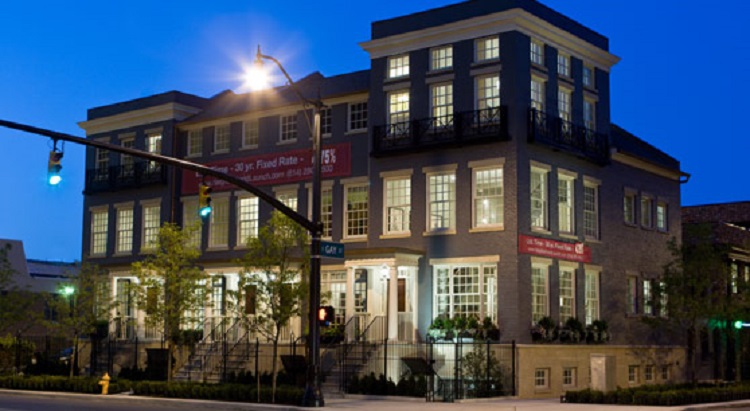
Northwest corner of Gay and N. High Street.
This 230-unit, 3-building project will be just 6 stories on some of the very last surface lots on High Street Downtown, once again in a corridor that adopted standards stresses a minimum of 10 stories. And while the design itself is not terrible, and there is retail, the design setbacks only enhance the fact that the project is far too small in scale for an entire block of High Street.
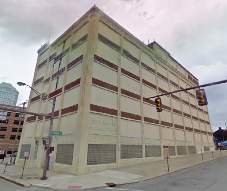
Southwest corner of Front and Long:
This 8-story city office building is, once again, underwhelming in scale and design. Its design actually looks very similar to the Franklin County Courthouse building constructed a few years ago. See below:
Very similar, right? Also, the project includes a new parking garage on the northwest corner of Long and Front. Front currently has more than half a dozen large parking garages already. Not a single one of them has any mixed-use elements, such as residential or office above, or retail on the ground floor. This new garage will not have it, either, creating one more dead zone when the city could’ve been more forward-thinking.
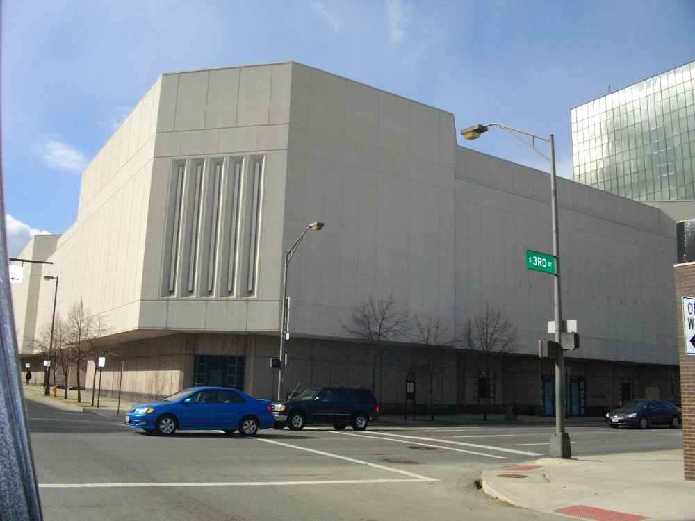
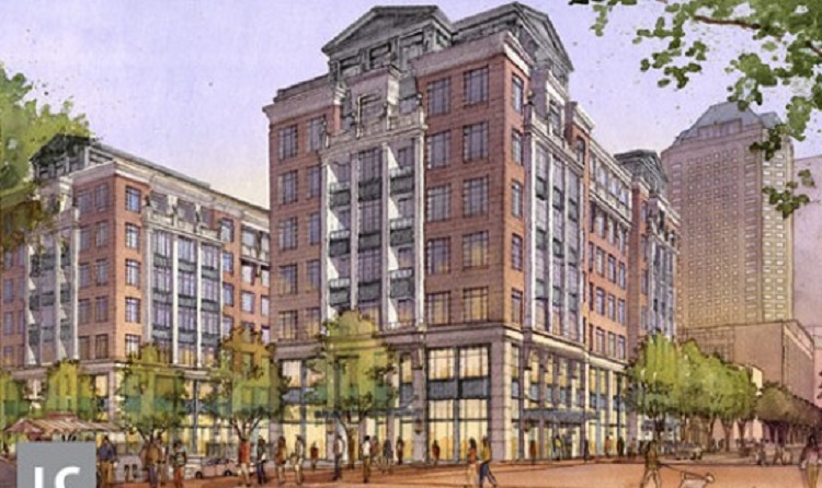
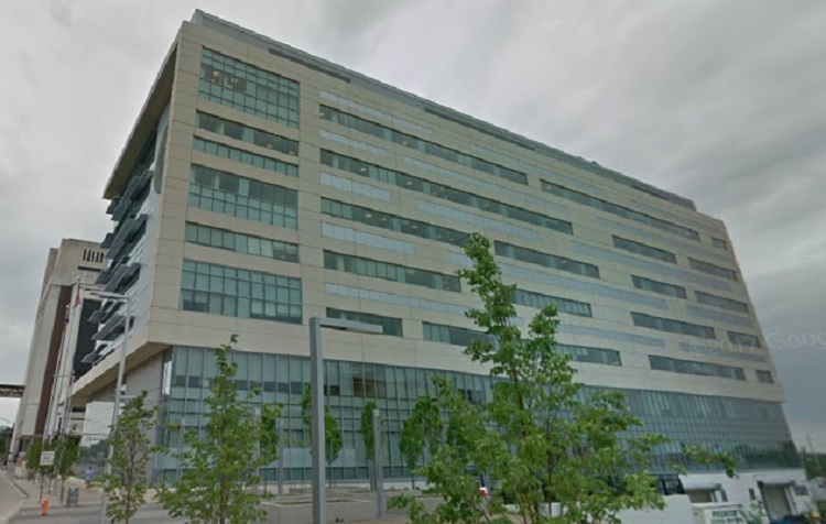
Northwest corner of S. 3rd and E. Rich:
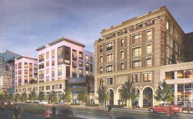
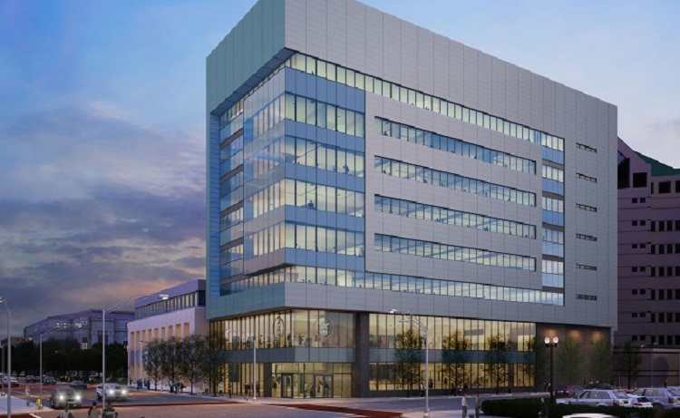
Original proposal.
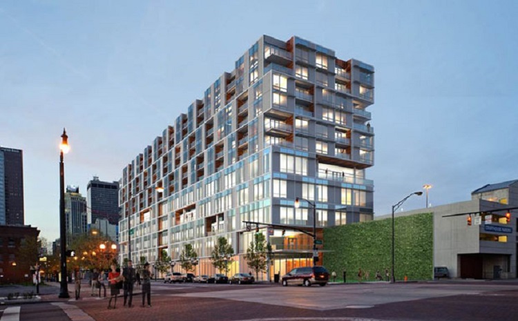
The southeast corner of Columbus Commons was originally proposed to be developed by something 20 stories or above. When the proposal for 17-story Two25 first came out, it was already a little disappointing. The news release, however, suggested the mixed-use project could go higher depending on demand. However, it was recently announced the Two25 would instead have its height cut by 5 full floors and would only be 12 stories. No real explanation was given, beyond the developer claiming that Columbus had not reached adequate $-per-square-foot returns for the larger project, despite extremely high demand for Class A office space and high 90s occupancy rates with residential. So basically, the developer didn’t buy into the idea that there was enough demand, despite every other mixed-use project, including 12-story 250 High, filling up rapidly.
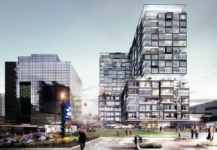
Northeast corner of E. Long and N. Fourth:
An as yet unnamed 10-story proposal is a missed opportunity for a few reasons. Originally, this was supposed to be 5 stories taller and for some reason, in what has become an all too familiar story, was reduced. Further, a good chunk of the site will be yet another parking garage for Downtown (there are now almost 30 garages and nearly 300 surface lots- think about that for a minute). The parking garage will not have retail on the ground floor, but rather office space for the developer. So instead of putting the offices on the 2nd floor of the garage and having retail/restaurant space on the ground floor to activate the street, this section of Fourth will remain a dead zone. Worse still, the garage will be the prominent look at the intersection, rather than the residential. Rather than address these flaws, the Downtown Commission caught the vapors and swooned in approval.
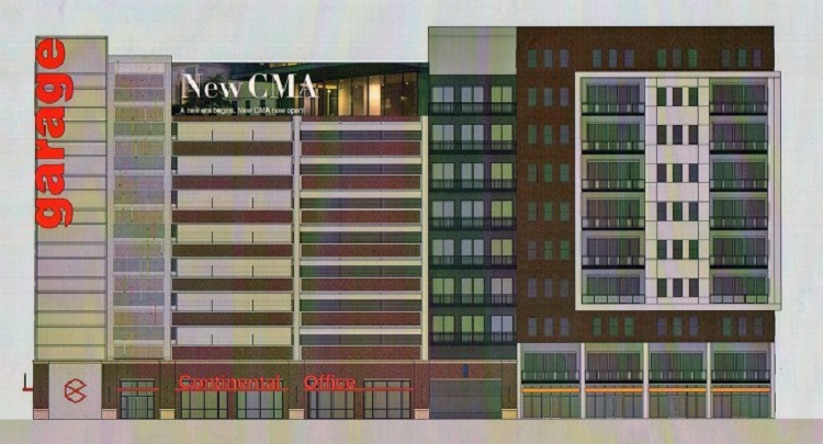
Basically all of Neighborhood Launch:
Okay, so I am going to get some flack for this, but hear me out. Overall, I do like this development. The quality of construction is there, design is good and it is replacing several surface lots and creating a much more vibrant area. However, there are some flaws that need to be mentioned. First of all, it is simply too small in scale, like many other developments Downtown. While there are a few 5-story buildings, most of it is 3 stories. The height/density is less of an issue, though, than the complete lack of mixed-use elements in a development that has several hundred units. Even in the 5-story buildings on E. Long, there is no retail. Part of creating an urban neighborhood is not just about getting people to live there, but also giving them amenities, and Neighborhood Launch lacks those amenities. There seems to be little to no regard for giving residents something to do. Even a corner café would be something, but just like in the Annex at RiverSouth, residents currently have to go elsewhere.
While in this post I have focused largely on Downtown, this is really just the tip of the iceberg in terms of what is going on around the rest of the city, and the situation may actually be worse elsewhere *coughClintonvillecough*. If Columbus wants to be a major, vibrant city, it has to act like one and not simply pay the concept lip service. Things like expanding transit should be a priority and development should not only match demand, but in order to reach the potential of what could be, it should be encouraged to push the envelope of what is possible rather than merely meeting the bare minimum of standards, or sometimes not even meeting them at all. Columbus should not be a city of missed opportunities, but rather one of exceeding expectations whenever possible. When its downtown is already one of the least populated of nearly 100 Midwest peers, it seems clear that going bare minimum is not going to get the job done. You can do better Columbus.