Today, the Census released new population figures for cities and incorporated places. I looked at all those places within the Columbus metro area and came up with the following stats on 2013 city population estimates.
So by the trends, it definitely appears that most suburbs have slowed, while Columbus and its inner suburbs increased. This seems like a pretty good indication of the ongoing urban movement to me.
The recent Census release of updated population numbers gives new figures on metro populations. In previous articles, I talked mostly about density, so this time, the data is being expanded a bit for a full 2013 metro area comparison.
Metro Area Population on July 1, 2012 and July 1, 2013 By Rank 2012————————————–—-2013 1. Pittsburgh: 2,360,989— 1. Pittsburgh: 2,360,867 2. Charlotte: 2,294,990—2. Charlotte: 2,335,358 3. Portland, OR: 2,289,038—3. Portland, OR: 2,314,554 4. San Antonio, TX: 2,234,494—4. San Antonio, TX: 2,277,550 5. Orlando: 2,223,456—5. Orlando: 2,267,846 6. Sacramento, CA: 2,193,927—6. Sacramento, CA: 2,215,770 7. Cincinnati: 2,129,309—7. Cincinnati: 2,137,406 8. Cleveland: 2,064,739—8. Cleveland: 2,064,725 9. Kansas City: 2,038,690—9. Kansas City: 2,054,473 10. Las Vegas: 1,997,659—10. Las Vegas: 2,027,868 11. Columbus: 1,944,937—11. Columbus: 1,967,066 12. Indianapolis: 1,929,207—12. Indianapolis: 1,953,961 13. San Jose, CA: 1,892,894—13. San Jose, CA: 1,919,641 14. Austin, TX: 1,835,110— 14. Austin, TX: 1,883,051 15. Nashville: 1,726,759—15. Nashville: 1,757,912 16. Virginia Beach, VA: 1,698,410—16. Virginia Beach, VA: 1,707,369 17. Providence, RI: 1,601,160—17. Providence, RI: 1,604,291 18. Milwaukee: 1,566,182—18. Milwaukee: 1,569,659
Total Metro Population Change, 2012-2013, By Rank 1. Austin: +47,941 2. Orlando: +44,390 3. San Antonio: +43,056 4. Charlotte: +40,368 5. Nashville: +31,153 6. Las Vegas: +30,209 7. San Jose: +26,747 8. Portland: +25,516 9. Indianapolis: +24,754 10. Columbus: +22,129 11. Sacramento: +21,843 12. Kansas City: +15,783 13. Virginia Beach: +8,959 14. Cincinnati: +8,097 15. Milwaukee: +3,477 16. Providence: +3,131 17. Cleveland: -14 18. Pittsburgh: -122
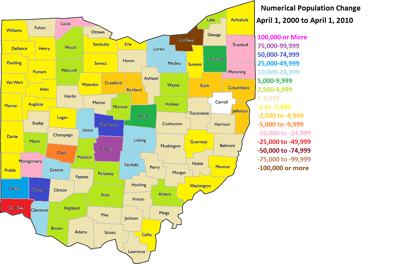
**Some of the changes in rates are due to boundary changes. For example, part of the growth rate for Columbus 2000-2010 was a retroactive population addition when boundaries were changed in 2013. The actual growth rate changed very little.
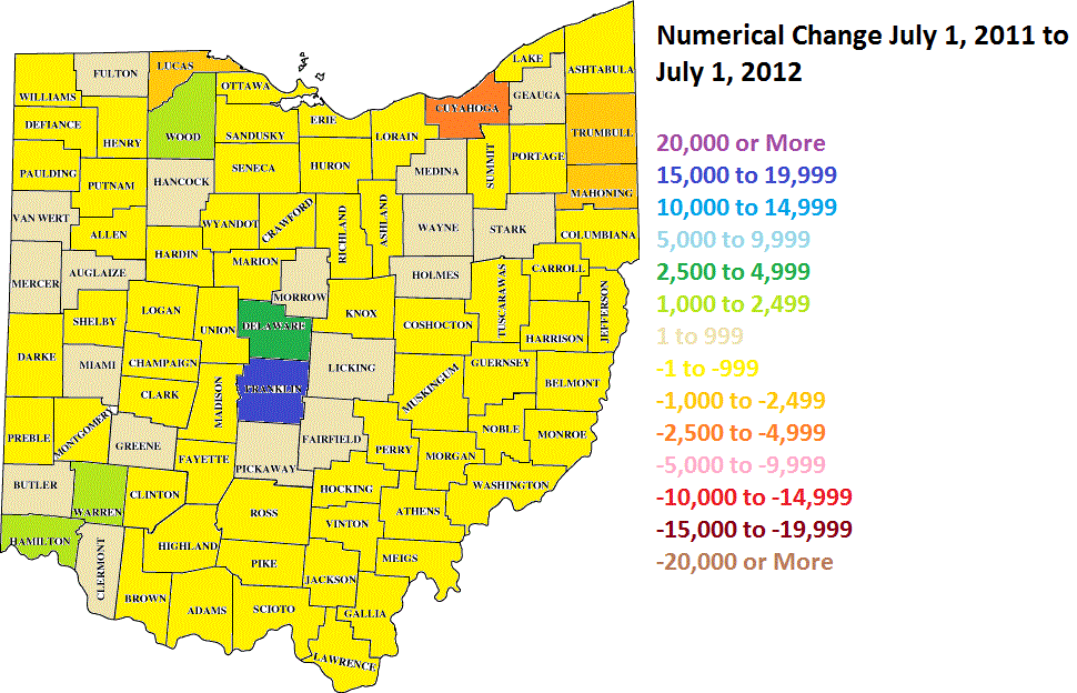
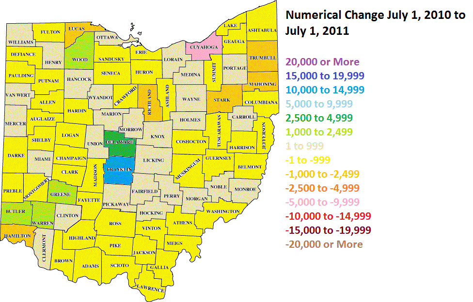
The US Census released the latest population estimates for metropolitan/micropolitan areas as well as counties for the year July 1, 2012 to July 1, 2013. Here is what they found for Columbus and Ohio metros.
Columbus leads the pack, and by a lot. Some interesting notes about these numbers is that half of the 8 major metros are growing. Also of significance is that Cleveland barely lost at all, which may indicate that the losses there are slowing down.
Now let’s take a look at where the population changes for these metros are coming from.
Natural growth is a vital part of the growth picture for any place. For Columbus, it is roughly 50% of it’s total annual growth. For places like Youngstown, with more deaths than births, it just contributes to overall decline.
The 2nd most important part of the growth rate, migration, is also pretty bad for most metros. Only Columbus is seeing a decent rate of growth, particularly domestically.
One final question is… how are these metro growth rates changing over time? That’s a bit harder to answer, as metro boundaries change so often that it’s more difficult to determine comparable rates decade to decade. However, this is what I came up with.