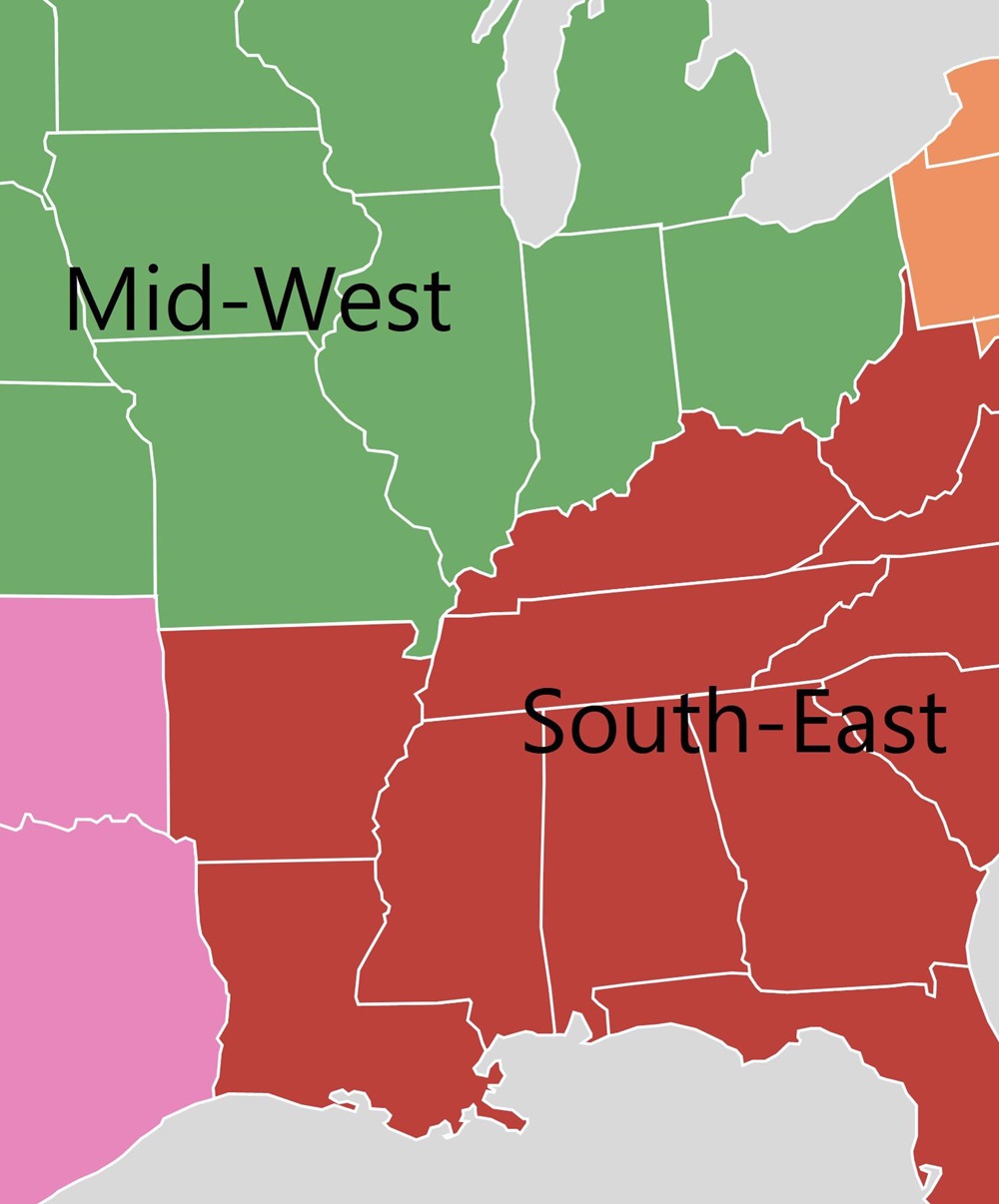
For years, if not decades, we’ve been hearing a familiar tale- that anyone and everyone is moving from the Midwest and Northeast to the South and West. This trend began during and after the collapse of Northern manufacturing, and as higher cost of living began to make the lower-cost South more attractive in particular. However, a lot of the South’s growth over the years- indeed a majority- never had anything to do with region-to-region migration. Instead, it was due largely to natural growth (births vs. deaths) and international migration, particularly from Central America. What received all the attention, though, was the belief that people were packing up and moving to the South from places like Ohio and other struggling Northern states. While that may have been true for a while, that is increasingly looking like it is no longer the case.
The Midwest, especially, has been derided as the region no one wants to live in. Despite its growing population approaching 66 million people, the common refrain was that its colder winters, flailing economies and questionable demographic future meant that it was simply a region being left behind by the booming Southern states.
Recently, the US Census released estimates for 2015-2016 geographic mobility, and they tell a very different story altogether. Regional domestic migration in 2016 may have actually bucked the trends.
First, let’s look at the total domestic migration moving to the Midwest from other regions. South to Midwest: +309,000 West to Midwest: +72,000 Northeast to Midwest: +61,000 Total to Midwest: +442,000
And then compare that to the total that the Midwest sends to other regions. Midwest to South: -254,000 Midwest to West: -224,000 Midwest to Northeast: -34,000 Total from Midwest: -512,000
Net difference by region. Midwest vs. South: +55,000 Midwest vs. West: -152,000 Midwest vs. Northeast: +27,000 Total Net: -70,000
So while the Midwest is seeing an overall net domestic migration loss, it is entirely to the Western states.
This could just be an off year, as almost all recent years showed losses to the South, but then again, maybe not. The South has been in a boom for several decades now, and in that time, the region still lags the other 3 in almost every quality of life metric used. All booms end eventually, and the South’s 2 biggest perceived advantages, low cost of living and business-friendly climate, have been gradually eroding over time. As Census surveys show, people don’t actually move for a change in weather, so it’s the economic factors that are going to make the biggest impacts long-term. The Midwest now has many cities and several states that are doing well economically, including Columbus, and perhaps they are becoming more attractive than they have in many years. Time will tell, but last year, the narrative of an unattractive Midwest vs. South was at least temporarily shelved.
I saw this postthe other day about changing neighborhood demographics in certain cities, particularly when it comes to racial segregation and gentrification. Surprisingly, of all the maps and posts I’ve done on demographics, I hadn’t thought to do one that showed Franklin County gentrification trends. Well, now I have.
A bit of an explanation is needed for the color coding: -For those categories marked “Steady”, the demographic listed has been the majority throughout the period, with little to no change of other demographics. -For those mixed categories of one decline and one rise, it means that the majority demographic has declined at least 5 percentage points, while a secondary demographic has risen at least 5 percentage points. -For the category of recent or steady integration, there are at least 2 demographics at 10% or more of the total population, as well as a 3rd demographic reaching at least 5% of the population.
A few things that stand out to me: The eastern half of the county is in much greater flux than the western half, and integration is respectable county-wide. These neighborhoods of demographic equilibrium are largely the result of increasing Hispanic and Asian populations, particularly on the Northeast and West Sides, as well as the Whitehall area. In the center core, almost all of the High Street corridor has remained Steady White, suggesting that other demographics have, so far, been unable to tap into the building boom along and adjacent to this corridor. One other thing I notice is that there are FAR more tracts with a growing black population than there are with a growing White population, suggesting that perhaps the idea of Whites moving into neighborhoods and displacing residents is not quite as big of an issue as some might believe.
Here are the integrated tracts by year, based the above criteria, and their racial breakdown.
Breakdown of # of Tracts by % of Hispanic Population 1990 95% or Higher: 0 90%-94.9%: 0 80%-89.9%: 0 70%-79.9%: 0 60%-69.9%: 0 50%-59.9%: 0 Total Majority Hispanic Tracts: 0 40%-49.9%: 0 30%-39.9%: 0 20%-29.9%: 0 10%-19.9%: 0 0.1%-9.9%: 278 0%: 5 2015 95% or Higher: 0 90%-94.9%: 0 80%-89.9%: 0 70%-79.9%: 0 60%-69.9%: 0 50%-59.9%: 0 Total Majority Hispanic Tracts: 0 40%-49.9%: 0 30%-39.9%: 1 20%-29.9%: 7 10%-19.9%: 33 0.1%-9.9%: 241 0%: 9
Integrated Tracts By Year 1990: 2 2015: 98
Most Integrated Tract by Year 1990 1122: White: 76.6% Black: 9.6% Asian: 11.2% Hispanic: 2.5% 2015 7721: White: 33.9% Black: 31.2% Asian: 26.8% Hispanic: 10.1%
All in all, the data shows that the county is much less racially stratified/segregated now than it was in 1990, and that it doesn’t appear that gentrification is really affecting many areas in terms of forcing out one racial group for another.
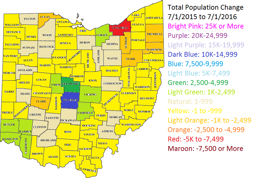
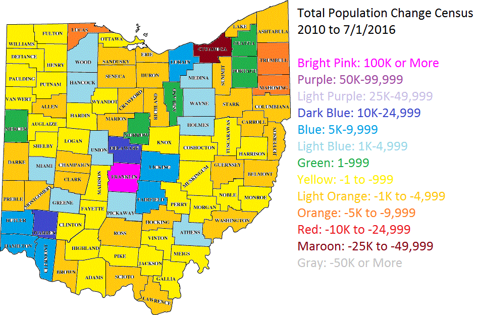
The 2016 population estimates came out this morning from the Census. Nationally, it seems that overall growth rates slowed down from where they were the year prior, and there were some surprising results in a few cases.
First, let’s take a look at the core counties for Columbus and its peer/Midwest counterparts nationally. The core city is in parenthesis. 2010—————————————————2015———————————2016 1. Cook (Chicago): 5,194,675————-1. Cook: 5,224,823————-1. Cook: 5,203,499 2. Clark (Las Vegas): 1,951,269———-2. Clark: 2,109,289————-2. Clark: 2,155,664 3. Wayne (Detroit): 1,820,584————-3. Santa Clara: 1,910,105—-3. Bexar: 1,928,680 4. Santa Clara (San Jose): 1,781,642—4. Bexar: 1,895,482—4. Santa Clara: 1,919,402 5. Bexar (San Antonio): 1,714,773——-5. Wayne: 1,757,062———5. Wayne: 1,749,366 6. Sacramento (Sac.): 1,418,788–6. Sacramento: 1,496,664–6. Sacramento: 1,414,460 7. Cuyahoga (Cleveland): 1,280,122—7. Orange: 1,284,864——–7. Orange: 1,314,367 8. Allegheny (Pittsburgh): 1,223,348—8. Cuyahoga: 1,255,025—-8. Franklin: 1,264,518 9. Franklin (Columbus): 1,163,414—–9. Franklin: 1,250,269—–9. Cuyahoga: 1,249,352 10. Hennepin (Minn.): 1,152,425—10. Allegheny: 1,229,298—-10. Hennepin: 1,232,483 11. Orange (Orlando): 1,145,951—11. Hennepin: 1,220,459—-11. Allegheny: 1,225,365 12. Travis (Austin): 1,024,266——12. Travis: 1,174,818——12. Travis: 1,199,323 13. Milwaukee (Mil): 947,735–13. Mecklenburg: 1,033,466–13. Mecklenburg: 1,054,835 14. Mecklenburg (Charl.): 919,628–14. Milwaukee: 956,314—14. Milwaukee: 951,448 15. Marion (Indianapolis): 903,393—15. Marion: 938,058———–15. Marion: 941,229 16. Hamilton (Cincinnati): 802,374—16. Hamilton: 807,748——–16. Hamilton: 809,099 17. Multnomah (Portland): 735,334–17. Multnomah: 789,125—17. Multnomah: 799,766 18. Jackson (Kansas City): 674,158–18. Jackson: 686,373——-18. Jackson: 691,801 19. Davidson (Nashville): 626,667—19. Davidson: 678,323——-19. Davidson: 684,410 20. Providence (Providence): 626,671–20. Kent: 636,095———20. Kent: 642,173 21. Kent (Grand Rapids): 602,622–21. Providence: 632,488—-21. Providence: 633,673 22. Summit (Akron): 541,781———22. Douglas: 549,168——–22. Douglas: 554,995 23. Montgomery (Dayton): 535,153–23. Summit: 541,316——–23. Summit: 540,300 24. Douglas (Omaha): 517,110–24. Montgomery: 531,567——24. Dane: 531,273 25. Sedgwick (Wichita): 498,365–25. Dane: 522,878———–25. Montgomery: 531,239 26. Dane (Madison): 488,073——-26. Sedgwick: 510,360——26. Sedgwick: 511,995 27. Lucas (Toledo): 441,815——–27. Polk: 466,688————–27. Polk: 474,045 28. Virginia Beach (VB): 437,994–28. Virginia Beach: 451,854–28. Vir. Beach: 452,602 29. Polk (Des Moines): 430,640—-29. Lucas: 433,496————-29. Lucas: 432,488 30. Allen (Fort Wayne): 355,359—30. Allen: 368,040————-30. Allen: 370,404 31. St. Louis (St. Louis): 319,294–31. St. Louis: 314,875———31. St. Louis: 311,404 32. Lancaster (Lincoln): 285,407—32. Lancaster: 305,705——-32. Lancaster: 309,637 33. Mahoning (Youngstown): 238,823–33. Mahoning: 231,767–33. Mahoning: 230,008
Franklin County moved up one spot to 8th most populated core county of the group.
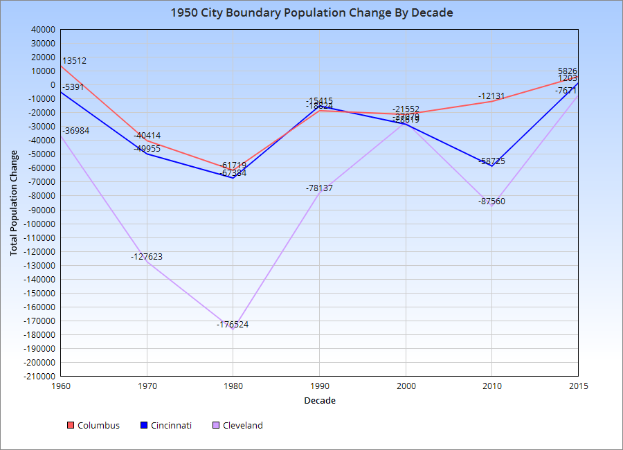
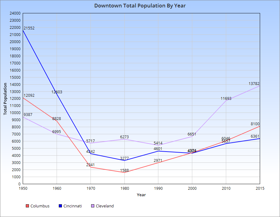
A little more than 4 years ago, I posted numbers on the recovery of Ohio downtowns, and what that might mean for the future. That post has proven to be one of the site’s most popular. I figured it was time to take a look at their continuing changes.
You can see by the chart for the 1950 Boundary population, the urban core of each city, that all 3-Cs suffered population losses post-1950. However, the rate of losses gradually declined, and 2 of the cities, Columbus and Cincinnati, appear to be growing in this boundary since at least 2010. Cleveland continues to lose.
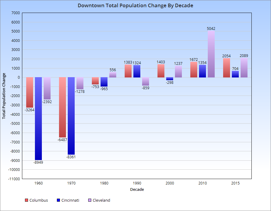
This is shown further by the chart below.
As far as the actual Downtowns of each, here are the population trends.
For the most part, population declines in the 3-Cs peaked around 1980, give or take a decade. Since then, all of them have seen increases, with Cleveland seeing the most rapid increase and Cincinnati the least. Columbus has seen steady, but increasingly rapid growth with each subsequent decade since 1980.
The recent housing market update January 2017 edition information comes from Columbus Realtors.
Note: LSD= Local School District, CSD= City School District. In both cases, school district boundaries differ from city boundaries.
Top 15 Most Expensive Locations By Median Sales Price in January 2017 1. New Albany: $535,000 2. New Albany Plain LSD: $397,450 3. German Village: $376,000 4. Powell: $354,950 5. Dublin: $343,600 6. Granville CSD: $330,000 7. Bexley: $325,000 8. Upper Arlington CSD: $319,500 9. Olentangy LSD: $315,000 10. Big Walnut LSD: $306,250 11. Dublin CSD: $271,500 12. Worthington: $270,000 13. Buckeye Valley LSD: $259,000 14. Sunbury: $253,000 15. Downtown: $243,750
Top 15 Least Expensive Locations by Median Sales Price in January 2017 1. Obetz: $80,100 2. Hamilton LSD: $80,100 3. Whitehall: $85,950 4. Newark CSD: $86,900 5. Lancaster CSD: $103,000 6. Jefferson LSD: $123,000 7. London CSD: $124,000 8. Groveport Madison LSD: $125,900 9. Reynoldsburg CSD: $125,950 10. Columbus CSD: $129,900 11. South-Western CSD: $131,000 12. Columbus: $140,026 13. Jonathan Alder LSD: $150,000 14. Minerva Park: $159,500 15. Grove City: $160,950
Overall Market Median Sales Price in January 2017: $160,368 Median Sales Price Change January 2016-January 2016: +$3,172
Top 15 Locations with the Highest Median Sales Price % Growth Between January 2016 and January 2017 1. Whitehall: +69.5% 2. Circleville CSD: +64.9% 3. Sunbury: +63.0% 4. Jefferson LSD: +53.5% 5. Big Walnut LSD: +44.1% 6. Canal Winchester CSD: +40.9% 7. Westerville: +29.8% 8. Westerville CSD: +27.3% 9. Powell: +25.4% 10. Pataskala: +24.0% 11. Olentangy LSD: +23.5% 12. Gahanna Jefferson CSD: +21.8% 13. Grandview Heights: +21.2% 14. Granville CSD: +20.0% 15. Pickerington: +17.7%
Top 15 Locations with the Lowest Median Sales Price % Growth Between January 2016 and January 2017 1. London CSD: -53.5% 2. Obetz: -38.3% 3. Hamilton LSD: -27.1% 4. Jonathan Alder LSD: -25.2% 5. Buckeye Valley LSD: -23.0% 6. Reynoldsburg CSD: -18.7% 7. Hilliard: -17.7% 8. Lancaster CSD: -17.6% 9. Grove City: -15.3% 10. Dublin CSD: -12.8% 11. Johnstown-Monroe LSD: -10.8% 12. Upper Arlington CSD: -8.5% 13. Newark CSD: -8.1% 14. Dublin: -7.1% 15. South-Western CSD: -6.4%
Overall Market Median Sales Price % Change January 2016-January 2017: +2.0%
Top 10 Locations with the Most New Listings in January 2017 1. Columbus: 829 2. Columbus CSD: 544 3. South-Western CSD: 136 4. Olentangy LSD: 122 5. Westerville CSD: 100 6. Hilliard CSD: 94 7. Dublin CSD: 89 8. Worthington CSD: 66 9. Dublin: 64 10. Pickerington LSD: 60
Top 10 Locations with the Fewest New Listings in January 2017 1. Valleyview: 0 2. Lithopolis: 1 3. Minerva Park: 2 4. Sunbury: 2 5. Obetz: 3 6. Johnstown Monroe LSD: 5 7. Jefferson LSD: 8 8. Jonathan Alder LSD: 8 9. German Village: 8 10. Hamilton LSD: 8 11. Northridge LSD: 9
Total New Listings in the Columbus Metro in January 2017: 2,002 Overall Metro New Listings % Change January 2016-January 2017: -1.9%
Top 10 Fastest-Selling Locations by # of Days Homes Remain on the Market Before Sale in January 2017 1. Obetz: 18 2. Sunbury: 21 3. Pataskala: 22 4. Jefferson LSD: 26 5. Gahanna: 28 6. Minerva Park: 28 7. Delaware CSD: 29 8. Bexley: 31 9. Hilliard CSD: 31 10. Pickerington: 31 11. Worthington CSD: 31
Top 10 Slowest-Selling Locations by # of Days Homes Remain on the Market Before Sale in January 2017 1. Dublin: 96 2. New Albany: 93 3. Dublin CSD: 82 4. Powell: 80 5. Granville CSD: 79 6. Olentangy LSD: 78 7. Downtown: 77 8. Grandview Heights: 76 9. New Albany Plain LSD: 68 10. Canal Winchester CSD: 67 11. New Albany CSD: 65 12. Upper Arlington CSD: 62 13. Circleville CSD: 61 14. Johnstown Monroe LSD: 61 15. Hamilton LSD: 60
# of Days For-Sale Homes Remain on the Market Before Sale Across the Metro Overall: 51.6 Change in # of Days Before Sale January 2016-January 2017: -22.0
Top 10 Locations with the Greatest % Decline of # of Days on the Market Before Sale January 2016-January2017 1. Obetz: -89.2% 2. Pataskala: -64.5% 3. Whitehall: -64.3% 4. Circleville CSD: -56.1% 5. Gahanna: -53.3% 6. Grove City: -49.2% 7. Delaware CSD: -44.2% 8. Bexley: -40.4% 9. Pickerington LSD: -39.7% 10. Worthington CSD: -38.0%
Top 10 Locations with the Lowest % Decline of # of Days on the Market Before Sale January 2016-January 2017 1. German Village: +161.1% 2. Worthington: +123.8% 3. Powell: +77.8% 4. Grandview Heights: +46.2% 5. Big Walnut LSD: +41.5% 6. Minerva Park: +40.0% 7. Jonathan Alder LSD: +37.8% 8. Canal Winchester CSD: +31.4% 9. Marysville CSD: +28.3% 10. Johnstown Monroe LSD: +27.1%
% Change for the # of Days Homes Remain on the Market Before Sale Across the Metro Overall: -29.9%