Housing Market Update January 2017


housing market update January 2017 Columbus, Ohio

The recent housing market update January 2017 edition information comes from Columbus Realtors.

Note: LSD= Local School District, CSD= City School District. In both cases, school district boundaries differ from city boundaries.

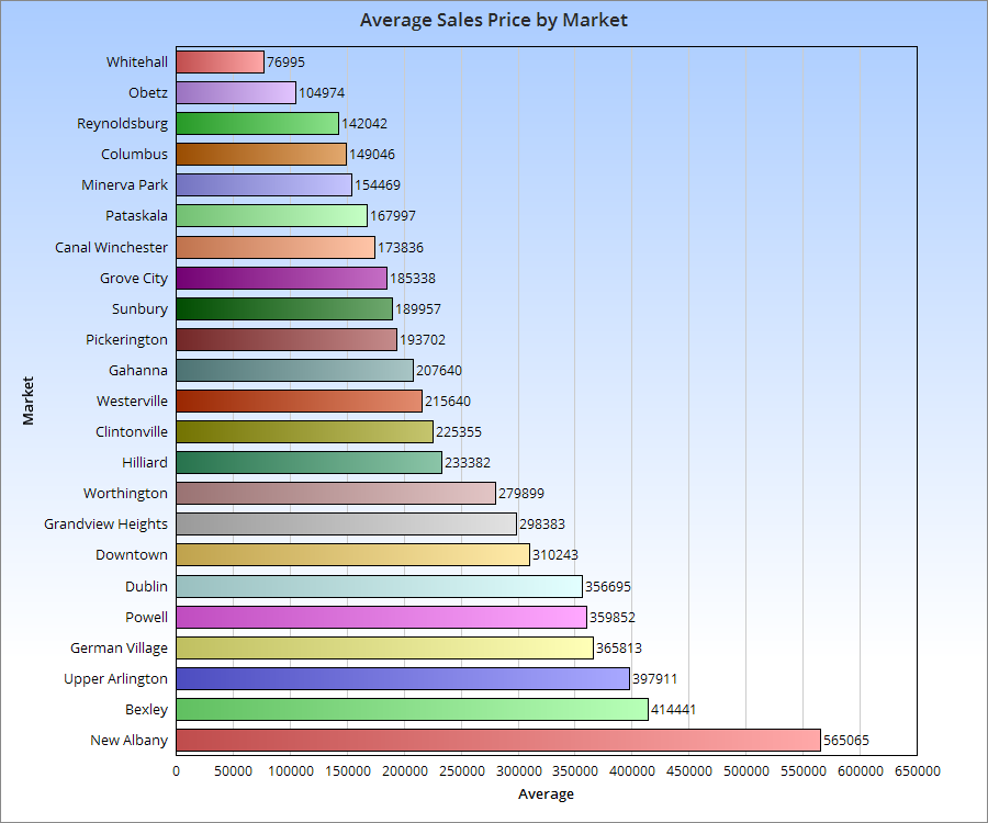
Top 15 Most Expensive Locations By Median Sales Price in January 2017
1. New Albany: $535,000
2. New Albany Plain LSD: $397,450
3. German Village: $376,000
4. Powell: $354,950
5. Dublin: $343,600
6. Granville CSD: $330,000
7. Bexley: $325,000
8. Upper Arlington CSD: $319,500
9. Olentangy LSD: $315,000
10. Big Walnut LSD: $306,250
11. Dublin CSD: $271,500
12. Worthington: $270,000
13. Buckeye Valley LSD: $259,000
14. Sunbury: $253,000
15. Downtown: $243,750

Top 15 Least Expensive Locations by Median Sales Price in January 2017
1. Obetz: $80,100
2. Hamilton LSD: $80,100
3. Whitehall: $85,950
4. Newark CSD: $86,900
5. Lancaster CSD: $103,000
6. Jefferson LSD: $123,000
7. London CSD: $124,000
8. Groveport Madison LSD: $125,900
9. Reynoldsburg CSD: $125,950
10. Columbus CSD: $129,900
11. South-Western CSD: $131,000
12. Columbus: $140,026
13. Jonathan Alder LSD: $150,000
14. Minerva Park: $159,500
15. Grove City: $160,950

Overall Market Median Sales Price in January 2017: $160,368
Median Sales Price Change January 2016-January 2016: +$3,172

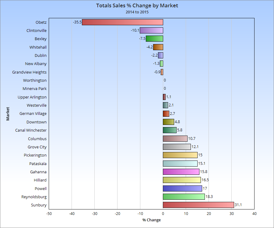
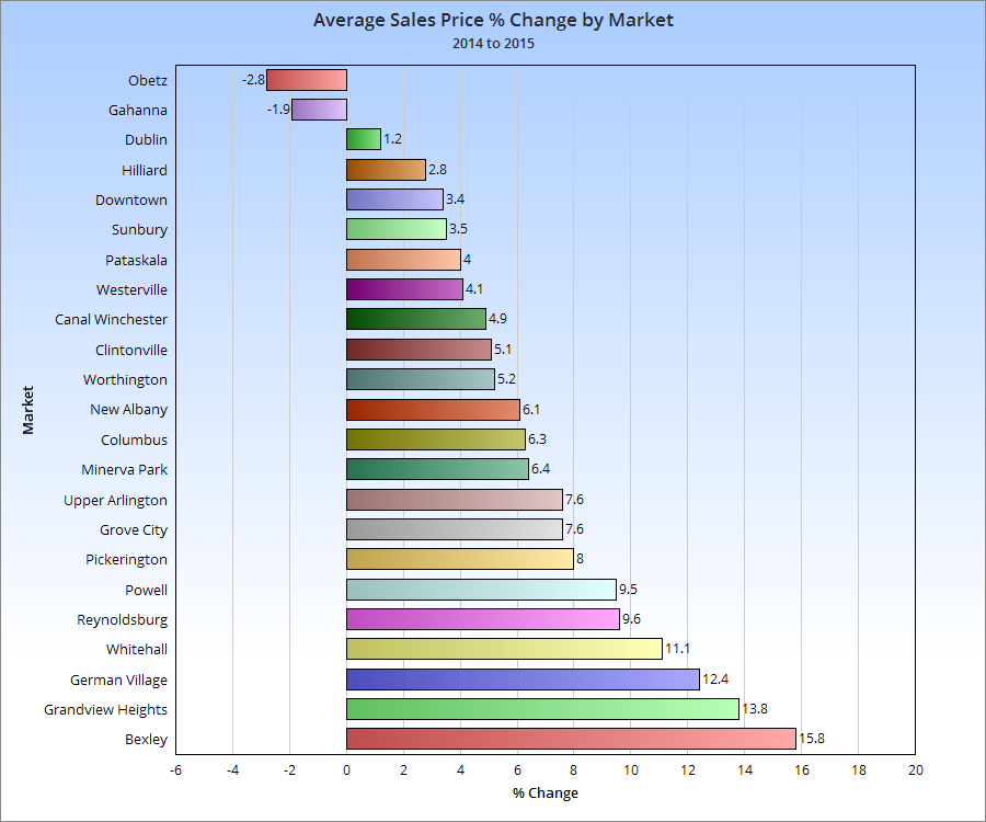
Top 15 Locations with the Highest Median Sales Price % Growth Between January 2016 and January 2017
1. Whitehall: +69.5%
2. Circleville CSD: +64.9%
3. Sunbury: +63.0%
4. Jefferson LSD: +53.5%
5. Big Walnut LSD: +44.1%
6. Canal Winchester CSD: +40.9%
7. Westerville: +29.8%
8. Westerville CSD: +27.3%
9. Powell: +25.4%
10. Pataskala: +24.0%
11. Olentangy LSD: +23.5%
12. Gahanna Jefferson CSD: +21.8%
13. Grandview Heights: +21.2%
14. Granville CSD: +20.0%
15. Pickerington: +17.7%

Top 15 Locations with the Lowest Median Sales Price % Growth Between January 2016 and January 2017
1. London CSD: -53.5%
2. Obetz: -38.3%
3. Hamilton LSD: -27.1%
4. Jonathan Alder LSD: -25.2%
5. Buckeye Valley LSD: -23.0%
6. Reynoldsburg CSD: -18.7%
7. Hilliard: -17.7%
8. Lancaster CSD: -17.6%
9. Grove City: -15.3%
10. Dublin CSD: -12.8%
11. Johnstown-Monroe LSD: -10.8%
12. Upper Arlington CSD: -8.5%
13. Newark CSD: -8.1%
14. Dublin: -7.1%
15. South-Western CSD: -6.4%

Overall Market Median Sales Price % Change January 2016-January 2017: +2.0%

Top 10 Locations with the Most New Listings in January 2017
1. Columbus: 829
2. Columbus CSD: 544
3. South-Western CSD: 136
4. Olentangy LSD: 122
5. Westerville CSD: 100
6. Hilliard CSD: 94
7. Dublin CSD: 89
8. Worthington CSD: 66
9. Dublin: 64
10. Pickerington LSD: 60

Top 10 Locations with the Fewest New Listings in January 2017
1. Valleyview: 0
2. Lithopolis: 1
3. Minerva Park: 2
4. Sunbury: 2
5. Obetz: 3
6. Johnstown Monroe LSD: 5
7. Jefferson LSD: 8
8. Jonathan Alder LSD: 8
9. German Village: 8
10. Hamilton LSD: 8
11. Northridge LSD: 9

Total New Listings in the Columbus Metro in January 2017: 2,002
Overall Metro New Listings % Change January 2016-January 2017: -1.9%

Top 10 Fastest-Selling Locations by # of Days Homes Remain on the Market Before Sale in January 2017
1. Obetz: 18
2. Sunbury: 21
3. Pataskala: 22
4. Jefferson LSD: 26
5. Gahanna: 28
6. Minerva Park: 28
7. Delaware CSD: 29
8. Bexley: 31
9. Hilliard CSD: 31
10. Pickerington: 31
11. Worthington CSD: 31

Top 10 Slowest-Selling Locations by # of Days Homes Remain on the Market Before Sale in January 2017
1. Dublin: 96
2. New Albany: 93
3. Dublin CSD: 82
4. Powell: 80
5. Granville CSD: 79
6. Olentangy LSD: 78
7. Downtown: 77
8. Grandview Heights: 76
9. New Albany Plain LSD: 68
10. Canal Winchester CSD: 67
11. New Albany CSD: 65
12. Upper Arlington CSD: 62
13. Circleville CSD: 61
14. Johnstown Monroe LSD: 61
15. Hamilton LSD: 60

# of Days For-Sale Homes Remain on the Market Before Sale Across the Metro Overall: 51.6
Change in # of Days Before Sale January 2016-January 2017: -22.0


Top 10 Locations with the Greatest % Decline of # of Days on the Market Before Sale January 2016-January2017
1. Obetz: -89.2%
2. Pataskala: -64.5%
3. Whitehall: -64.3%
4. Circleville CSD: -56.1%
5. Gahanna: -53.3%
6. Grove City: -49.2%
7. Delaware CSD: -44.2%
8. Bexley: -40.4%
9. Pickerington LSD: -39.7%
10. Worthington CSD: -38.0%

Top 10 Locations with the Lowest % Decline of # of Days on the Market Before Sale January 2016-January 2017
1. German Village: +161.1%
2. Worthington: +123.8%
3. Powell: +77.8%
4. Grandview Heights: +46.2%
5. Big Walnut LSD: +41.5%
6. Minerva Park: +40.0%
7. Jonathan Alder LSD: +37.8%
8. Canal Winchester CSD: +31.4%
9. Marysville CSD: +28.3%
10. Johnstown Monroe LSD: +27.1%

% Change for the # of Days Homes Remain on the Market Before Sale Across the Metro Overall: -29.9%


2015 Census Tract Population Density


2015 census tract population density

The US Census recently released 2015 census tract population density data, including census tract population density. I figured midway through the decade would be a good point to update where these stand because they give greater insight in smaller-scale population changes. I looked at all the census tracts in Franklin County and came up with the following map series.

First, the population in 2015.

Next, the population density of tracts in 2010, as reference.

And now 2015.

On the surface, it’s difficult to see the changes, but put side by side, you can tell there have been a lot of increases across the county. To make this more visible, I made the following maps.

You can see that some of the strongest density increases occurred around Downtown and the Short North, New Albany, parts of the Campus area, and Dublin.

The map above gives a straightforward look at where the density increased and decreased. As you can see, the increases FAR outweighed the decreases. Most of the latter were scattered except across the Far South Side and parts of the Whitehall area.

Here were the top 20 most dense census tracts in 2015.
1. 1810: 29,508.2 South Campus/Victorian Village
2. 1121: 25,287.9 Main Campus
3. 13: 21,961.4 Campus/Indianola Terrace
4. 1110: 18168.6 North Campus/Tuttle Park
5. 10: 17386.3 Campus/SoHud
6. 12: 16,981.9 Campus/Iuka Ravine
7. 20: 13,030.5 Short North/Victorian Village
8. 17: 12,872.3 Weinland Park
9. 6: 12,153.6 Old North Columbus
10. 21: 10,853.5 Short North/High Street
11. 8163: 10,255.3 Lincoln Village/Southwest Columbus
12: 4810: 9,557.4 South Central Hilltop
13. 47: 9,492.7 North Central Hilltop
14. 6352: 9,434.0 Northwest Columbus/Henderson Road
15. 57: 9,257.4 Brewery District/South German Village
16. 5: 9,177.9 Old North Columbus
17. 6933: 9,090.9 Forest Park East
18. 16: 8,980.5 Weinland Park
19. 4620: 8,928.6 North Central Hilltop
20. 1820: 8743.3 Victorian Village

It’s obvious that the High Street corridor is the most dense of the city, racking up most of the top 20.

Now here are the 20 tracts with the largest density increases 2010-2015.
1. 1121: 4,375.9
2. 6: 2,178.5
3. 21: 1,934.9
4. 22: 1,478.1
5. 40: 1,107.7 South Downtown
6. 1820: 1,044.1
7. 20: 921.7
8. 38: 904.3 Old Towne East
9. 5: 861.2
10. 210: 833.9 Clintonville
11. 32: 751.1 Arena District West/West Victorian Village
12. 730: 736.9
13. 7551: 656.0 Somerset/South Easton
14. 7951: 610.4 West Columbus
15. 6372: 574.6 Hayden Falls/Sawmill Road
16. 7209: 514 New Albany
17. 7395: 497.6 Blacklick/East Broad
18. 10: 492.8
19. 8230: 449.3 Westland
20. 710: 447.3 West-Central Linden

And finally, the top 20 largest declines 2010-2015.
1. 13: -2,964.3
2. 12: -1,625.1
3. 42: -1,620.8 Scioto Peninsula/East Franklinton
4. 920: -902.2 Northeast Linden
5. 17: -775.4
6. 50: -554.4 Franklinton
7. 61: -485.7 South High Street
8. 59: -441.9 Near South Side/Deshler Park
9. 4620: -380.4
10. 720: -380.2
11. 4610: -335.4
12. 820: -305.4 North Linden
13. 7721: -305.2 North Linden
14. 45: -258.1 North Hilltop
15. 60: -253.2 Vassor Village
16. 810: North Central Linden
17. 7532: -240.3 Morse Road/Easton
18. 2520: -240.1 Near East Side/King-Lincoln
19. 47: -206.6
20. 9333: -194.9 Linwood

So there you have it. The Census Tract Maps page gives demographic and population data for census tracts going back to 1930.


Census Tract Income 2010-2015

The US Census recently released demographic information for census tracts for 2015. Here are some quick maps for Franklin County for median household income.

First, median household income for both 2010 and 2015.
Census tract income

And the % change between 2010-2015.

As can be seen, a lot of the greatest improvements over the 5-year period were around Downtown, the Near East Side, North High, South High and around some of the higher-income suburbs like Upper Arlington and the New Albany area.

For more local and national population and demographic data, visit:
Demographics and Population
US Census


Top Housing Markets of 2015

The 2015 housing market was one of the strongest since before the recession, and 2016 looks to do even better. An ongoing problem, especially within the more urban markets, is a historically low inventory of available homes for sale. This has been a problem for several years now, as construction has failed to match demand.
Top housing markets of 2015 house sales

That lack of inventory really shows up in the yearly % change chart. Few urban markets have increased year over year, as they have a much more limited supply of housing, even as demand for urban housing has increased.

Let’s see how this impacted prices.

While urban markets were not necessarily the most expensive compared to suburban, more of them were generally towards the top half of price increases last year.


Franklin County Gentrification Trends 1990-2014


I saw this post the other day about changing neighborhood demographics in certain cities, particularly when it comes to racial segregation and gentrification. Surprisingly, of all the maps and posts I’ve done on demographics, I hadn’t thought to do one like this. Well, now I have, so here are Franklin County’s gentrification trends 1990-2014.
gentrification trends 1990-2014
A bit of an explanation is needed for the color coding:
-For those categories marked “Steady”, the demographic listed has been the majority throughout the period, with little to no change of other demographics.
-For those mixed categories of one decline and one rise, it means that the majority demographic has declined at least 5%, while a secondary demographic has risen at least 5%.
-For the category of recent or steady integration, there are at least 2 demographics at 10% or more of the total population, as well as a 3rd demographic reaching at least 5% of the population.

A few things that stand out to me is that the Steady White population dominates at least 50% of the map, while there are very few areas with Steady Black population. One would be tempted to suggest that gentrification is forcing the Black population out of neighborhoods, but this doesn’t seem to be true. In terms of significant changes, there are FAR more areas with Black population growth and White population decline than vice-versa, suggesting that “White Flight” may continue to be an issue. Also, a surprising number of areas have reached full integration, or have at least been maintaining it over the period of question. These neighborhoods of demographic equilibrium are largely the result of increasing Hispanic and Asian populations, particularly on the Northeast and West Sides, as well as the Whitehall area. In the center core, almost all of the High Street corridor has remained steady White, suggesting that other demographics have, so far, been unable to tap into the building boom along and adjacent to this corridor.

Here are the most integrated tracts by year, based the above criteria.
1990

1. #8720- South Side
2. #7820- Riverview-NW Side
3. #1122- West Campus
4. #1121- Campus
5. #29- King-Lincoln
Only 5 tracts counted as being integrated in 1990.