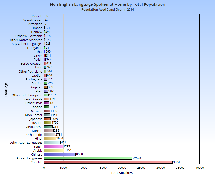
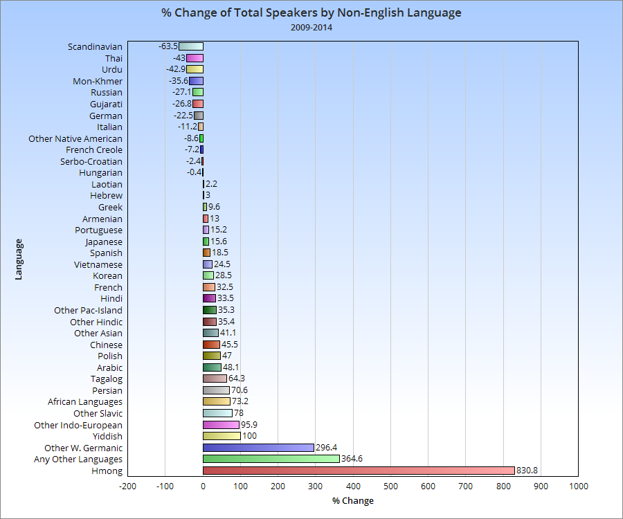
Just a quick little post about the non-English languages spoken in the city of Columbus and how they have changed between 2009 and 2014, by total number of speakers.
For the record, in 2014, 14.3% of the Columbus population spoke a language other than English at home, up from about 12% in 2009.
I saw this post the other day about changing neighborhood demographics in certain cities, particularly when it comes to racial segregation and gentrification. Surprisingly, of all the maps and posts I’ve done on demographics, I hadn’t thought to do one like this. Well, now I have, so here are Franklin County’s gentrification trends 1990-2014. A bit of an explanation is needed for the color coding: -For those categories marked “Steady”, the demographic listed has been the majority throughout the period, with little to no change of other demographics. -For those mixed categories of one decline and one rise, it means that the majority demographic has declined at least 5%, while a secondary demographic has risen at least 5%. -For the category of recent or steady integration, there are at least 2 demographics at 10% or more of the total population, as well as a 3rd demographic reaching at least 5% of the population.
A few things that stand out to me is that the Steady White population dominates at least 50% of the map, while there are very few areas with Steady Black population. One would be tempted to suggest that gentrification is forcing the Black population out of neighborhoods, but this doesn’t seem to be true. In terms of significant changes, there are FAR more areas with Black population growth and White population decline than vice-versa, suggesting that “White Flight” may continue to be an issue. Also, a surprising number of areas have reached full integration, or have at least been maintaining it over the period of question. These neighborhoods of demographic equilibrium are largely the result of increasing Hispanic and Asian populations, particularly on the Northeast and West Sides, as well as the Whitehall area. In the center core, almost all of the High Street corridor has remained steady White, suggesting that other demographics have, so far, been unable to tap into the building boom along and adjacent to this corridor.
Here are the most integrated tracts by year, based the above criteria. 1990 1. #8720- South Side 2. #7820- Riverview-NW Side 3. #1122- West Campus 4. #1121- Campus 5. #29- King-Lincoln Only 5 tracts counted as being integrated in 1990.
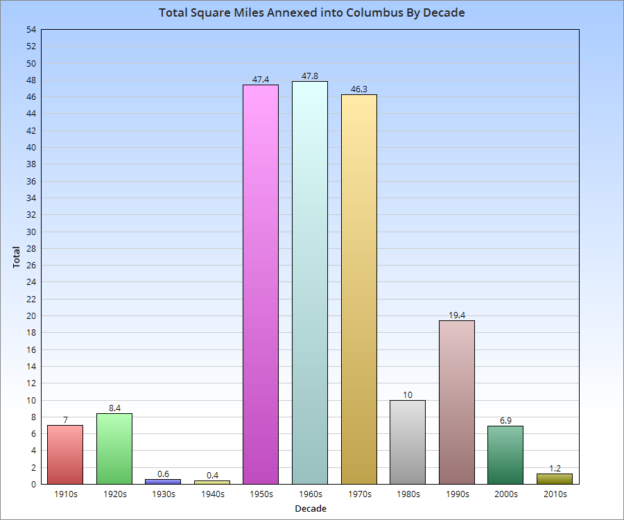
Ever wonder how Columbus got so big in area? Its city limits stretch into parts of other counties and include about a third of Franklin County. Today, it has a reputation for annexing its way to growth, but how true is this?
Well, 50 years ago, it was more or less true. Today, not so much. Aggressive annexation began in Columbus in 1953, when Mayor Maynard “Jack” Sensenbrenner began his policy of requiring annexation into the city if communities wanted city water service. Between 1953 and 1960, the area size of the city more than doubled, and that rate continued through the 1960s and 1970s, even after Sensenbrenner was no longer mayor. After 1980, annexation rates gradually began to decline. As the chart above shows, you can see the rapid rate of growth during the 1950s-1970s and the decline in more recent decades. Through the first 5 years of the 2010s, Columbus is on pace to add fewer than 3 square miles by 2020. Despite that fact, the city’s annual population growth since 2010 is exceeding the average annual growth of any decade during the mass annexation years. This strongly supports that the dynamic, and indeed, the story of Columbus’ growth is no longer about “fake” growth through the addition of existing land and population, but rather though the influx of new residents from outside of the city limits altogether. This is helping to gradually raise the city’s population density, which exceeded Cincinnati’s last year, as the chart below shows, along with a few other Columbus peers.
Millennials- those born roughly between 1981 and 2001- are big news these days. They are the largest generation ever in terms of total numbers (exceeding 76 million), and their choices are already having big impacts on everything from housing to the economy. I wanted to look at Columbus and its peers to see where it ranks in terms of attracting these young professionals.
For the comparison, I looked at metro areas of 1.5-2.5 million as well as major Midwest metros and then used their core cities to get the numbers. I used the age group of 25-34 specifically, as that is usually the number most often cited in the news.
Rank of Total Population Aged 25-34 2005_______________________2010___________________2014 1. Chicago: 463,236_______1. Chicago: 510,042_______1. Chicago: 525,381 2. San Antonio: 180,981_____2. San Antonio: 200,645____2. San Antonio: 226,711 3. Austin: 137,523_________3. Austin: 162,247_________3. Austin: 199,838 4. San Jose, CA: 133,144___4. Columbus: 147,584______4. Columbus: 170,759 5. Columbus: 131,641______5. San Jose, CA: 142,551___5. San Jose, CA: 153,690 6. Indianapolis: 114,532_____6. Indianapolis: 133,088____6. Charlotte, NC: 141,869 7. Detroit: 110,759_________7. Charlotte, NC: 127,539___7. Indianapolis: 140,491 8. Charlotte, NC: 100,025____8. Portland, OR: 113,210___8. Portland, OR: 116,109 9. Portland, OR: 90,023_____9. Milwaukee: 97,359______9. Milwaukee: 100,205 10. Las Vegas: 84,418______10. Detroit: 85,023________10. Minneapolis: 90,662 11. Milwaukee: 82,060______11. Minneapolis: 81,532____11. Las Vegas: 90,441 12. Sacramento, CA: 75,497___12. Las Vegas: 81,212____12. Detroit: 89,843 13. Minneapolis: 74,208___13. Sacramento, CA: 78,527__13. Sacramento, CA: 84,013 14. Kansas City, MO: 68,060__14. Kansas City: 73,872__14. Kansas City, MO: 79,262 15. Virginia Beach: 60,749__15. Virginia Beach: 67,614__15. Virginia Beach: 75,543 16. Omaha, NE: 56,248____16. Omaha, NE: 62,396_____16. Omaha, NE: 71,040 17. Wichita, KS: 52,426____17. St. Louis: 57,627_______17. Pittsburgh: 62,473 18. Cleveland: 50,558_____18. Wichita, KS: 56,737_____18. St. Louis: 61,718 19. St. Louis: 48,137______19. Cleveland: 54,428______19. Wichita, KS: 58,334 20. Cincinnati: 44,945_____20. Pittsburgh: 51,109______20. Cleveland: 56,134 21. Toledo: 43,134_______21. St. Paul, MN: 50,107_____21. St. Paul, MN: 54,464 22. Orlando: 40,846______22. Cincinnati: 49,067_______22. Orlando: 54,395 23. St. Paul, MN: 39,676__23. Orlando: 48,102________23. Cincinnati: 54,247 24. Lincoln, NE: 38,893___24. Madison, WI: 44,662_____24. Madison, WI: 44,835 25. Madison, WI: 38,826___25. Lincoln, NE: 42,034_____25. Toledo: 43,661 26. Pittsburgh: 38,744____26. Toledo: 41,580_________26. Lincoln, NE: 40,071 27. Grand Rapids: 35,287__27. Fort Wayne, IN: 35,193__27: Grand Rapids: 38,922 28. Des Moines: 32,640__28. Providence, RI: 31,044__28. Fort Wayne, IN: 37,741 29. Fort Wayne, IN: 31,738__29. Grand Rapids: 30,963__29. Des Moines: 33,857 30. Akron: 30,436_______30. Des Moines: 30,376_____30. Providence, RI: 31,902 31. Providence, RI: 29,307__31. Akron: 27,446________31. Akron: 28,207 32. Dayton: 18,591_______32. Dayton: 20,278________32. Dayton: 21,096 33. Youngstown: 8,505____33. Youngstown: 8,484_____33. Youngstown: 8,468
So Columbus ranks highly among total population in the 25-34 age group. But what about growth?
Total Growth Rank in 25-34 Population 2005-2014 1. Austin, TX: 62,315 2. Chicago: 62,145 3. San Antonio, TX: 45,730 4. Charlotte, NC: 41,844 5. Columbus: 39,118 6. Portland, OR: 26,086 7. Indianapolis: 25,959 8. Pittsburgh: 23,729 9. San Jose, CA: 20,546 10. Milwaukee, WI: 18,145 11. Minneapolis, MN: 16,454 12. Virginia Beach, VA: 14,794 13. St. Paul, MN: 14,788 14. Omaha, NE: 14,612 15. St. Louis, MO: 13,581 16. Orlando, FL: 13,549 17. Kansas City, MO: 11,202 18. Cincinnati: 9,302 19. Sacramento, CA: 8,516 20. Las Vegas, NV: 6,023 21. Madison, WI: 6,009 22. Fort Wayne, IN: 6,003 23. Wichita, KS: 5,908 24. Cleveland: 5,576 25. Grand Rapids, MI: 3,635 26. Providence, RI: 2,595 27. Dayton: 2,505 28. Des Moines, IA: 1,217 29. Lincoln, NE: 1,178 30. Toledo: 527 31. Youngstown: -37 32. Akron: -2,229 33. Detroit: -20,736
Again, Columbus ranks near the top during this period. What about more recently, since 2010?
Total Growth Rank of 25-34 Population 2010-2014 1. Austin: 37,591 2. San Antonio: 26,066 3. Columbus: 23,175 4. Chicago: 15,339 5. Charlotte: 14,330 6. Pittsburgh: 11,364 7. San Jose: 11,139 8. Las Vegas: 9,229 9. Minneapolis: 9,130 10. Omaha: 8,644 11. Grand Rapids: 7,959 12. Virginia Beach: 7,929 13. Indianapolis: 7,403 14. Orlando: 6,293 15. Sacramento: 5,486 16. Kansas City: 5,390 17. Cincinnati: 5,180 18. Detroit: 4,820 19. St. Paul: 4,357 20. St. Louis: 4,091 21. Des Moines: 3,481 22. Portland: 2,899 23. Milwaukee: 2,846 24. Fort Wayne: 2,548 25. Toledo: 2,081 26. Cleveland: 1,706 27. Wichita: 1,597 28. Providence: 858 29. Dayton: 818 30. Akron: 761 31. Madison: 173 32. Youngstown: -16 33. Lincoln: -1,963
So Columbus is doing even better since 2010 than it did in the earlier period and attracts significantly more Millennials in the 25-34 age group than cities often cited for this very metric.
Next, let’s look at percentage growth, as city size can affect this.
Total Percent Growth 2005-2014 in 25-34 Population 1. Pittsburgh: +61.25% 2. Austin: +45.31% 3. Charlotte: +41.83% 4. St. Paul: +37.27% 5. Orlando: +33.17% 6. Columbus: +29.72% 7. Portland: +28.98% 8. St. Louis: +28.21% 9. Omaha: +25.89% 10. San Antonio: +25.27% 11. Virginia Beach: +24.35% 12. Indianapolis: +22.67% 13. Minneapolis: +22.17% 14. Milwaukee: +22.11% 15. Cincinnati: +20.70% 16. Fort Wayne: +18.91% 17. Kansas City: +16.46% 18. Madison: +15.48% 19. San Jose: +15.43% 20. Dayton: +13.47% 21. Chicago: +13.42% 22. Sacramento: +11.28% 23. Wichita: +11.27% 24. Cleveland: +11.03% 25. Grand Rapids: +10.30% 26. Providence: +8.85% 27. Las Vegas: +7.13% 28. Des Moines: +3.73% 29. Lincoln: +3.03% 30. Toledo: +1.22% 31. Youngstown: -0.44% 32. Akron: -7.32% 33. Detroit: -18.75%
So Columbus again performs well in percentage growth, despite having one of the largest populations in the age group. It performs even better in the period since 2010, coming in at 3rd place.
Finally, now that we know the totals and the growth, what is the % of total city population that the 25-34 age group makes up?
25-34 % of Total City Population 2014 1. Minneapolis: 22.27% 2. Austin: 21.89% 3. Orlando: 20.73% 4. Pittsburgh: 20.45% 5. Columbus: 20.42% 6. Grand Rapids: 20.08% 7. St. Louis: 19.44% 8. Chicago: 19.30% 9. Portland: 18.74% 10. St. Paul: 18.30% 11. Madison: 18.25% 12. Cincinnati: 18.19% 13. Providence: 17.81% 14. Charlotte: 17.52% 15. Sacramento: 17.32% 16. Kansas City: 16.84% 17. Virginia Beach: 16.75% 18. Milwaukee: 16.71% 19. Indianapolis: 16.50% 20. Des Moines: 16.19% 21. Omaha: 15.91% 22. San Antonio: 15.78% 23. Toledo: 15.54% 24. San Jose: 15.13% 25. Wichita: 15.02% 26. Dayton: 14.96% 27. Fort Wayne: 14.74% 28. Las Vegas: 14.74% 29. Lincoln: 14.68% 30. Cleveland: 14.41% 31. Akron: 14.26% 32. Detroit: 13.21% 33. Youngstown: 13.02%
And here’s a simple % of population projection for just 4 years from now, 2018, provided the 25-34 population grows the same between 2014-2018 as it did 2010-2014. 1. Pittsburgh: 24.18% 2. Grand Rapids: 23.71% 3. Austin: 23.38% 4. Minneapolis: 23.27% 5. Columbus: 22.16% 6. Orlando: 21.34% 7. St. Louis: 20.82% 8. Cincinnati: 19.85% 9. Chicago: 19.70% 10. St. Paul: 19.05% 11. Providence: 18.20% 12. Portland: 18.14% 13. Virginia Beach: 18.1% 14. Sacramento: 17.84% 15. Charlotte: 17.67% 16. Kansas City: 17.64% 17. Des Moines: 17.50% 18. Madison: 17.40% 19. Milwaukee: 17.07% 20. Indianapolis: 16.85% 21. Omaha: 16.61% 22. Toledo: 16.59% 23. San Antonio: 16.52% 24. Fort Wayne: 15.61% 25. Las Vegas: 15.59% 26. Dayton: 15.27% 27. San Jose: 15.24% 28. Wichita: 15.23% 29. Cleveland: 15.08% 30. Akron: 14.73% 31. Detroit: 14.48% 32. Youngstown: 13.35% 33. Lincoln: 13.13%
Columbus has an existing large population of the 25-34 age demographic, and looks to be one of the strongest performers into the near future. Some would ask why that would be considering that Columbus transit is woefully lacking and has a reputation (very undeservedly, in my opinion) of being suburban- characteristics that Millennials supposedly almost universally reject. Perhaps the bottom line is that economics trump all other desires. Cost of living and employment tend to be higher up the list than rail lines, and Columbus has both a strong economy and relatively low COL. Whatever the case may be, Columbus seems to be doing something right. Continue this look at this population in Part 2.
Over the last few decades, much attention has been given to the fact that domestic migration by state has heavily favored the “Sun Belt”, states made up of the Southeast west to the West Coast. While Northern states weren’t all losing people, the region as a whole sent far more people to the Sun Belt than they retained. This helped fuel the respective Southern boom, and media story after media story over the years have made sweeping predictions of this growing powerhouse region, often centered around the idea that the boom had no foreseeable end. The irony with these predictions is that they ignored history. For more than 2 centuries, the North was where people moved. Its states and cities saw massive influxes of population. As recently as the decade of the 1950s, Ohio grew by nearly 2 million alone. Economic conditions in decline, job losses, particularly in the manufacturing industry, increases in the cost of living and other factors ended the boom and helped to bring about the rise of the South, so to speak. Since at least the 1960s, the story has been about the Sun Belt/West.
The Censusdoes state migration estimates every year, and there are some interesting things going on in the data that may indicate that the boom in the South is faltering while the North’s fortunes are not looking as grim as they once did.
First, what are the regions? South: Alabama, Arkansas, Florida, Georgia, Kentucky, Louisiana, Mississippi, North Carolina, Oklahoma, South Carolina, Tennessee, Texas, Virginia and West Virginia. North: Connecticut, Delaware, Washington D.C., Illinois, Indiana, Iowa, Kansas, Maine, Maryland, Massachusetts, Michigan, Minnesota, Missouri, Nebraska, New Hampshire, New Jersey, New York, North Dakota, Ohio, Pennsylvania, Rhode Island, South Dakota, Vermont and Wisconsin. West: Alaska, Arizona, California, Colorado, Hawaii, Idaho, Montana, Nevada, New Mexico, Oregon, Utah, Washington and Wyoming.
Let’s next look at the states by rank of domestic migration in 2005, the earliest available year for the state data, and compared it to 2012, the most recent year available. This period covers the period just before and just after the Great Recession.
So in 2005, the breakdown was as follows: 12 of 14 Southern states had positive domestic migration. The only 2 that did not, Louisiana and Mississippi, were heavily influenced in 2005 by Hurricane Katrina, which caused large numbers of displaced residents to leave the states entirely. 7 of 24 Northern states has positive domestic migration. The 7 states were mixed between the Midwest and the Northeast/Mid-Atlantic. Just one Great Lakes State had positive domestic migration in 2005. 9 of 13 Western states had positive domestic migration. Only California and a few Mountain West states had negative numbers.
The 2005 numbers show the overall domestic migration picture as it had been for at least the last few decades, if not much longer. The South and West were the dominant net gainers of domestic migration, while most of the North sent people to those regions.
In 2012, the breakdown was as follows: 11 of 14 Southern states had positive domestic migration. Even with Katrina-hit state Mississippi having net gains in 2012, the overall number of states with positive gains declined. 8 of 24 Northern states had positive domestic migration, a slight improvement over 2005. 8 of 13 Western states had positive domestic migration, a slight decline over 2005.
But the breakdowns don’t tell us the whole story. When trying to compare the two years, trends are very important, and the trends are far more revealing.
5 of 14 Southern states improved their domestic migration rates 2005-2012. 13 of 24 Northern states improved their domestic migration rates 2005-2012. 3 of 13 Western states improved their domestic migration rates 2005-2012.
Ohio had the 4th best improvement over the period, a huge change. But some might ask, is it really a change when the rates may still be positive or negative like they were before? Well, yes and no. 7 years is not that long, and we’re talking about decades-long patterns here. Those won’t change like flipping a switch. It will take time. The point is more that for many states that have faced negative numbers for a long time, there is positive momentum now that they did not have before. Another question some may ask, however, is if the recession during the period reduced mobility. In some cases, I’m sure that it did, but if so, that reduction seems to have been centered on the South. A reduction in mobility would only indicate that migration rates would reduce to levels around 0, neither particularly positive nor negative. That reduction would NOT necessarily support switches from positive to negative or increases in negative or positive rates that already exist. Meaning that reduced mobility would mean that positive would become less positive as fewer people moved in, and negative would become less negative as fewer people left. On a state and regional basis, there is a wide range of results that do not support that geographic mobility alone is the culprit, or even a primary factor.