2023 County and Metro Population Estimates


2023 county and metro population estimates

National county map for 2022-2023 population change.

I haven’t done an annual population estimates post since before the 2020 Census. This is because the pandemic- and political actions- screwed up counting quite a bit, and I haven’t felt confident in posting them. The 2023 county and metro population estimates have just been released., and since 3 years have gone by since the census, perhaps some of the kinks have been worked out. That said, the news isn’t all that great for Ohio and Columbus.

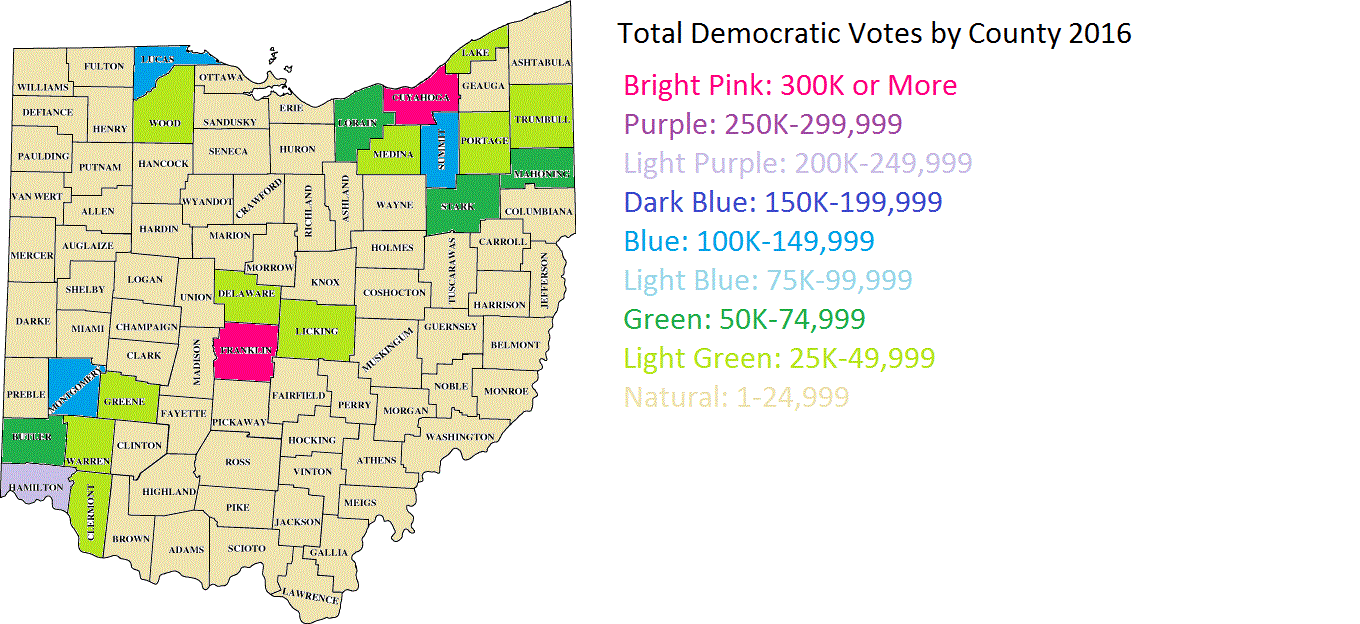
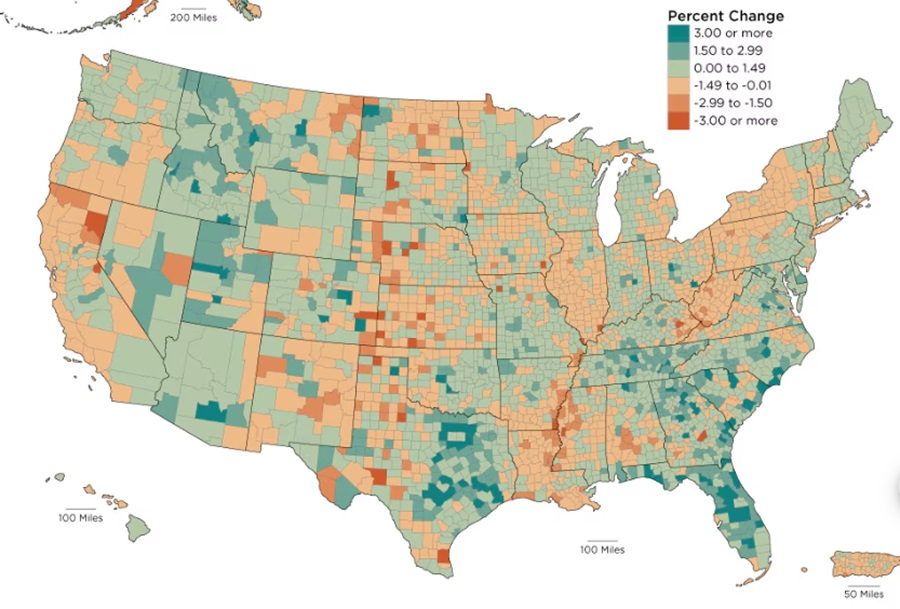
2020-2023 County Population Change

Prior to 2020, Franklin County was the fastest-growing county in the state by total growth. Since 2020, it’s fallen to 10th. While that may not seem that bad, only 30 of Ohio’s 88 counties have even seen growth since 2020. On the bright side, Franklin was the only major urban county in the state to see any growth at all. The majority of the 30 counties that saw growth in the state were metro suburban counties, including 8 of the 9 suburban counties within the Columbus Metro Area. Lingering effects of the pandemic are at least partially responsible for this shift, as some people sought to leave highly-populated areas, but wanted to otherwise remain close to core cities.
Another factor is likely the ongoing housing shortage. Housing just isn’t getting built in Franklin County like it was before, which is continuing to cause price increases, making the area less affordable than it used to be.
Additionally, extreme state politics may be driving some people away- or stopping them from moving locally altogether.

Still, the news isn’t all bad. The total Columbus metro population growth is gradually improving. From 2020-2021, the metro change was +7,986, 2021-2022 it was +14,560, and from 2022-2023, it was +18,205. Still a far cry from the pre-pandemic period when annual totals were 25K-30K. Hopefully, the upward trend continues through the rest of the decade.

Now that we know that overall population change, let’s take a closer look at the specific components of change since 2020.

Top 10 Counties by Natural Change 2020-2023
1. Franklin: +18,738
2. Hamilton: +4,233
3. Delaware: +2,072
4. Holmes: +1,309
5. Union: +662
6. Butler: +652
7. Warren: +650
8. Mercer: +543
9. Putnam: +86
10. Shelby: +67
Incidentally, only these 10 counties saw positive net natural change 2020-2023. That’s a terrible statistic for Ohio’s counties. Columbus’ 3 counties in the top 10 provided more natural change than all other 85 counties combined.

Top 10 Counties by Domestic Change 2020-2023
1. Delaware: +13,998
2. Warren: +7,424
3. Union: +6,011
4. Lorain: +5,969
5. Fairfield: +5,932
6. Licking: +4,592
7. Clermont: +3,117
8. Pickaway: +2,783
9. Miami: +2,433
10. Medina: +2,018
Again, Columbus metro counties- aside from Franklin- do relatively well here, with half of the top 10.

Top 10 Counties by International Migration Change 2020-2023
1. Franklin: +20,391
2. Cuyahoga: +8,557
3. Hamilton: +7,037
4. Butler: +3,551
5. Montgomery: +2,885
6. Summit: +2,593
7. Warren: +1,821
8. Delaware: +1,557
9. Lucas: +1,237
10. Greene: +839
Franklin again leads the pack and is generally doing better annually this decade than before the pandemic, the lone bright spot in the numbers.

Finally, here were the overall metro changes, both for 2022-2023 and 2020-2023.

2023 Total Metro Area Population
1. Cincinnati: 2,271,479
2. Columbus: 2,180,271
3. Cleveland: 2,158,932
4. Dayton: 814,363
5. Akron: 698,398
6. Toledo: 600,141
7. Youngstown: 425,969
8. Canton: 399,474
Columbus continues to leave Cleveland behind and close the gap with Cincinnati.

2022-2023 Metro Area Population Change
1. Columbus: +18,205
2. Cincinnati: +12,854
3. Dayton: +1,649
4. Akron: +887
5. Canton: +3
6. Toledo: -378
7. Youngstown: -679
8. Cleveland: -1,769

2020-2023 Metro Area Population Change
1. Columbus: +41,330
2. Cincinnati: +21,698
3. Dayton: +313
4. Canton: -2,106
5. Akron: -3,827
6. Youngstown: -4,707
7. Toledo: -6,100
8. Cleveland: -26,795

Cool Link- Issue 1 Results in Franklin County

Issue 1 Results

Issue 1 was a contentious, controversial proposal to make it harder for Ohioans to make changes to the state constitution. After a short campaign season, it would go on to defeat by just over 14 points- 57.01% to 42.99%. I provided a state county map with the results on the new Special Issues page. But what were the Issue 1 results in Franklin County and its precincts, specifically?

Today’s Cool Link provides the answer with a precinct map of the county. The map shows the results of Issue 1 for every single precinct, ward or city in Franklin County.

Based on the map, here were the overall margins for all the places in the county. Negative numbers are No wins, and positive numbers are Yes wins.
1. Bexley: -74.35
2. Grandview Heights: -71.19
3. Riverlea: -70.04
4. Marble Cliff: -69.02
5. Urbancrest: -64.16
6. Minerva Park: -63.1
7. Worthington: -61.94
8. Columbus: -61.8
9. Clinton Township: -58.32
10. Upper Arlington: -51.55
11. Sharon Township: -50.76
12. Mifflin Township: -46.54
13. Perry Township: -45.32
14. Whitehall: -43.97
15. Gahanna: -42.54
16. New Albany: -42.43
17. Hilliard: -41.09
18. Blendon Township: -39.79
19. Truro Township: -37.93
20. Reynoldsburg: -36.32
21. Jefferson Township: -36.29
22. Westerville: -36.0
23. Dublin: -35.71
24. Norwich Township: -27.9
25. Valleyview: -26.32
26. Canal Winchester: -18.14
27. Madison Township: -17.75
28. Groveport: -16.1
29. Obetz: -14.03
30. Grove City: -13.66
31. Prairie Township: -11.44
32. Plain Township: -9.12
33. Washington Township: -7.5
34. Franklin Township: -6.7
35. Brown Township: -2.58
36. Pleasant Township: +9.2
37. Jackson Township: +13.71
38. Hamilton Township: +15.04
As we can see, almost no part of the county voted Yes except for a few rural townships on the far south side. Not a single suburb voted yes, including in more conservative suburbs like Grove City and Canal Winchester. This suggests there was a lot of bipartisan opposition within the county.


Politics and Covid-19


Politics and Covid-19 Ohio

I largely avoid politics here because it’s a much more subjective topic that is far less data-focused in nature than what I try to provide here, so the most political I’ve gotten was to provide past election results and county voting trends with no political commentary. This post will attempt to maintain that line between data and opinion, but I understand that the topic of politics and Covid-19 is already a very controversial mix, and simply sticking to the data won’t necessarily be perceived as unbiased by all who read this. With that in mind, I can only say that this post is based on existing, straightforward data, and I have made no attempts to add any personal biases to the results one way or another.
With all that said, I was curious whether there was any correlation between voting patterns and Covid cases/deaths locally, specifically with Ohio’s 88 counties. There has been some suggestion in the media that Red- or Republican-voting places- have generally had worse outcomes than Blue- or Democratic-voting counties. So we will look at the following factors to see if that holds true locally:
1. Total Cases
2. Total Cases Per Capita
3. Total Deaths
4. Total Deaths Per Capita

But we first must establish what the Red vs. Blue counties are. Ohio doesn’t register voters by party affiliation, so instead, I used county voting results for the past 6 presidential elections, or since 2000. Based on the % of voters voting for either Republican or Democrat, I created 5 different levels of political bias.
Deep Blue: Counties where Democratic voters beat Republican voters by 25 points or more.
Light Blue: Counties where Democratic voters beat Republican voters by 5-24 points.
Neutral: Counties where Democratic/Republican voter advantage falls under 5 points.
Light Red: Counties where Republican voters beat Democratic voters by 5-24 points.
Deep Red: Counties where Republican voters beat Democratic voters by 25 points or more.
The point system is taken from the average of the past 6 elections, so keep in mind that some counties may be more Red or Blue currently than the average suggests.

So based on that criteria, which Ohio counties are Red vs. Blue vs. Neutral? Well, Ohio’s overwhelming rural counties are mostly in the Deep Red category (39 of 88), followed by Light Red (34 of 88), Neutral (7 of 88), Light Blue (7 of 88) and just 1 Deep Blue county in the state. The map below breaks the counties down and gives the average voting bias across the last 6 elections.

Now we need to take those established voting biases and compare them to how the counties performed during Covid-19.
Case Numbers Through 3/31/2022
Total All Red Counties: 1,230,285
Total All Neutral Counties: 498,375
Total All Blue Counties: 944,141
Average Total Cases by County Group
Deep Red Counties: 15,138.8
Light Red Counties: 18,819.8
Neutral Counties: 71,196.4
Light Blue Counties: 96,563.6
Deep Blue County: 268,196
On first glance, it would seem that Red counties did much better on average despite having more cases overall, but the problem is that those counties have much lower populations and literally cannot have the same average totals of more populated ones. That’s why we instead have to look at per-capita cases.
Total Cases Per 100K People
All Red Counties: 23.9
All Neutral Counties: 22.8
All Blue Counties: 21.9
Deep Red Only: 23.7
Light Red Only: 24.0
Neutral Only: 22.8
Light Blue Only: 22.0
Deep Blue Only: 21.7
With per-capita, the story is exactly the opposite, with Red counties having more cases by population. If you’re wondering why the Deep Red counties had a slightly lower per-capita rate than Light Red, the answer is Holmes County. Perhaps due to its heavy Amish population that tends to avoid modern medicine and technology- and largely keep to themselves in the process- reported per-capita cases there were the lowest in the state by far, and single-handedly lowered the entire Deep Red county grouping below Light Red counties. Regardless, the outcome was still the same- Red did worse.
Top 10 Highest Per-Capita Case Rate
1. Marion: 30.5
2. Lawrence, Scioto: 30.0
3. Pickaway: 29.9
4. Muskingum: 29.3
5. Jackson: 27.4
6. Fayette: 27.3
7. Guernsey: 26.9
8. Allen, Defiance, Pike: 26.8
9. Union: 26.4
10. Clark, Erie: 26.1
Top 10 Lowest Per-Capita Case Rate
1. Holmes: 11.6
2. Geauga: 17.1
3. Carroll: 19.5
4. Wayne: 20.0
5. Meigs: 20.1
6. Ashtabula: 20.3
7. Washington: 20.6
8. Summit: 20.7
9. Ottawa: 20.9
10. Trumbull: 21
Of course, one of the caveats with this data is that many, many cases went unreported, and those cases were more likely to be in rural areas with lower access to testing and medical facilities. There’s also the issue that Covid doesn’t always present with symptoms. So, it’s possible that the per-capita discrepancy was even larger.
Deaths, however, are more concrete. Not all of them have been counted either, obviously, but it’s a lot harder to hide a death than it is a symptomless case.
Total Deaths Through 3/31/2022
All Red Counties: 18,295
All Neutral Counties: 7,219
All Blue Counties: 12,523
Average Total Deaths by County Group
Deep Red: 227.6
Light Red: 277.0
Neutral: 1,031.3
Light Blue: 1,253.3
Deep Blue: 3,750.0
Again, on the surface, the average looks bad for Blue counties despite having the lower overall total, but the truth again rests with the per-capita figures.
Total Deaths Per Capita by County Group
Deep Red: 394.4
Light Red: 390.4
Neutral: 345.4
Light Blue: 328.6
Deep Blue: 304.0
On a per-capita basis, Blue counties lost 76 fewer people per 100K than did Red counties. That’s a lot of lives.

So what can be concluded from all this? The first is that the results in Ohio were not isolated. Across almost all states, Blue-leaning states had better outcomes per-capita than Red. Speculation as to why that is runs the gamut, from better overall local policies to differing views on science to even education levels and access to harmful media sources that disseminate misinformation. Whatever the case may be, the United States has lost more people than any other nation in the world, at now over 1 million. It is by far the worst pandemic and the worst natural disaster in American history. With so much bad news these days, we can only hope that something valuable has been learned in all this terrible mess.

2016 Election Results


I’m not going to get into any debate on the candidates themselves or what I personally thought/think of them. That’s not the point of this post, and frankly, there’s already plenty of opinions all over the internet on this. This post is about the 2016 election results for Ohio.

First, here is a map of total Democratic votes within Ohio’s counties.
2016 election results Democratic votes
As is typical, Democratic votes were most concentrated in counties with large cities.

Here are the metro areas that provided the most Democratic votes.
1. Cleveland: 561,368
2. Columbus: 450,146
3. Cincinnati: 339,159
4. Akron: 166,653
5. Dayton: 164,079
6. Toledo: 152,505
7. Youngstown: 100,395

And the top 10 counties with the most Democratic votes.
1. Cuyahoga: 398,271
2. Franklin: 351,198
3. Hamilton: 215,719
4. Summit: 134,256
5. Montgomery: 122,016
6. Lucas: 110,833
7. Stark: 68,146
8. Lorain: 66,949
9. Butler: 58,642
10. Mahoning: 57,381

Here is how Democratic votes changed by county between 2012 and 2016.
2016 election results Democratic vote change

As you can see, only a handful of counties saw Democratic votes increase in 2016 over 2012, Franklin County being one of them. Some of the biggest losses were in traditionally blue areas like Northeast Ohio.

And the map for total Republican votes.
2016 election results Republican votes

Republican votes by metro area.
1. Cincinnati: 440,375
2. Columbus: 429,930
3. Cleveland: 400,321
4. Dayton: 210,807
5. Akron: 151,997
6. Toledo: 134,558
7. Youngstown: 102,640

Top 10 counties for Republican votes.
1. Franklin: 199,331
2. Cuyahoga: 184,211
3. Hamilton: 173,665
4. Montgomery: 123,909
5. Summit: 112,026
6. Butler: 106,976
7. Stark: 98,388
8. Warren: 77,643
9. Lucas: 75,698
10. Clermont: 67,518

And here is the change of Republican votes in 2016 vs. 2012.
2016 election results Republican vote change

Most of Ohio’s counties saw increased Republican turnout, though again, Franklin County bucked the trend and actually saw declines.

Finally, a map of the net % change for each county and whether it trended more Republican or more Democratic vs. the net of the 2012 election.
2016 election results percentage difference

Almost all counties saw a net decrease of Democratic votes/increase in Republican votes. Only 3 counties of 88- Franklin, Delaware and Hamilton- trended more Democratic in 2016 over 2012. All the other 85 trended Republican.


2013 Ohio County Population Estimates


Along with the metro estimates, the latest 2013 Ohio county population estimates were released on Thursday by the US Census.

Here are the statewide county maps for recent estimate years as well as previous decades, just to show how growth patterns have been changing.
2013 Ohio county population estimates


Top 10 Largest Counties
1. Cuyahoga: 1,263,154
2. Franklin: 1,212,263
3. Hamilton: 804,520
4. Summit: 541,824
5. Montgomery: 535,846
6. Lucas: 436,393
7. Stark: 375,432
8. Butler: 371,272
9. Lorain: 302,827
10. Mahoning: 233,869

Top 10 Counties with the Largest Numerical Change 2012-2013
1. Franklin: +16,193
2. Delaware: +3,791
3. Hamilton: +2,004
4. Warren: +1,859
5. Fairfield: +1,358
6. Lorain: +1,230
7. Medina: +1,190
8. Clermont: +1,190
9. Summit: +718
10. Licking: +660