Columbus Domestic Migration Origins


Columbus domestic migration origins

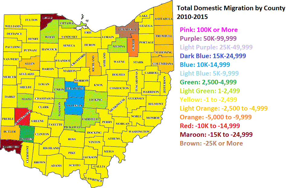
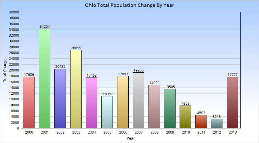
Most people seem to recognize that the Columbus domestic migration origins are often based in Ohio. Many rural counties and downtrodden cities are seeing residents move to Columbus and the greater metro for better economic and other opportunities. But how much of that domestic migration is actually from Ohio?


Top 30 Largest Net Domestic In-Migration Origins (Ohio Counties and States)

Numbers are based on estimates. Updated 1/24/2018 with 2011-2015 data.

2006-2010————————2009-2013—————————-2011-2015
1. Cuyahoga: 1602———-1. Cuyahoga: 1905————–1. Cuyahoga: 1842
2. Montgomery: 1020——-2. Michigan: 1425—————-2. Michigan: 1239
3. Michigan: 893————-3. Montgomery: 1123————3. Montgomery: 1088
4. Maryland: 745————-4. Summit: 744——————–4. Summit: 764
5. Lorain: 740—————–5. Lorain: 715———————-5. Lucas: 626
6. Virginia: 636—————6. Indiana: 694———————6. New Jersey: 608
7. Mahoning: 603————7. Lucas: 569———————–7. New York: 575
8. Stark: 584——————8. Maryland: 512——————-8. Medina: 572
9. Lucas: 554—————–9. Hamilton: 504——————–9. Stark: 484
10. Summit: 531————-10. Clermont: 466—————–10. Trumbull: 465
11. Highland: 499———–11. Stark: 466———————–11. Maryland: 464
12. New Jersey: 497——-12. Arizona: 463——————–12. Allen: 406
13. Hamilton: 483———–13. Alabama: 431——————-13. Washington (state): 399
14. New York: 419———-14. Trumbull: 401——————-14. Erie: 386
15. Allen: 384—————-15. Mahoning: 387——————15. Indiana: 386
16. Tennessee: 375——–16. Fayette: 354———————16. Massachusetts: 384
17. Logan: 328—————17. Washington (state): 353—–17. Pennsylvania: 371
18. Trumbull: 325————18. Coshocton: 346—————-18. Kentucky: 368
19. Coshocton: 310———19. Medina: 322——————–19. W. Virginia: 339
20. Jefferson: 290———–20. Allen: 302————————20. Lake: 316
21. Scioto: 259—————21. Erie: 290————————-21. Belmont: 314
22. Belmont: 254————22. Highland: 270——————-22. Wayne: 298
23. Huron: 245—————23. Puerto Rico: 265—————23. Fayette: 290
24. Darke: 217—————24. Adams: 260———————24. Mahoning: 289
25. Lake: 212—————-25. Warren: 260———————25. New Hampshire: 288
26. Tuscarawas: 202——-26. Massachusetts: 259———-26. Alaska: 282
27. Iowa: 200—————–27. Wayne: 259———————27. Alabama: 280
28. Shelby: 199————–28. Morgan: 255——————–28. Lorain: 277
29. Medina: 196————-29. Tuscarawas: 253————–29. Tuscarawas: 277
30. Massachusetts: 192—30. Ashtabula: 244—————–30. Geauga: 261

Top 30 Largest Net Domestic Out-Migration Destinations (Ohio counties and States)
2006-2010——————————-2009-2013—————————-2011-2015

1. Texas: -1371———————-1. Georgia: -1024—————-1. Florida: -1333
2. Knox: -942————————-2. Florida: -1013——————2. Missouri: -703
3. North Carolina: -782————3. Greene: -524——————-3. Georgia: -680
4. Georgia: -718———————4. Missouri: -516——————4. Athens: -607
5. Athens: -679———————-5. Colorado: -448—————–5. Knox: -506
6. Kentucky: -516——————-6. California: -436—————–6. Tennessee: -442
7. South Carolina: -499———–7. South Carolina: -431———-7. Colorado: -435
8. California: -364——————-8. Knox: -418———————-8. California: -391
9. Florida: -360———————-9. North Carolina: -417———-9. Greene: -388
10. Wood: -351———————10. Wisconsin: -395————–10. South Carolina: -362
11. Richland: -344——————11. Athens: -336——————11. Marion: -329
12. Greene: -239——————–12. Minnesota: -308————-12. Hamilton: -312
13. West Virginia: -236————13. Utah: -290———————13. Logan: -306
14. Missouri: -219——————-14. Richland: -266—————14. Utah: -300
15. Crawford: -209——————15. Portage: -265—————–15. Wood: -282
16. Hardin: -179———————16. Kentucky: -257—————16. Scioto: -249
17. Noble: -177———————-17. Logan: -242——————-17. Seneca: -183
18. Muskingum: -175—————18. Pennsylvania: -242———18. Champaign: -174
19. Butler: -173———————-19. Tennessee: -200————19. Oregon: -158
20. Holmes: -163——————–20. Oregon: -187—————-20. New Mexico: -157
21. Marion: -138———————21. Wood: -166——————21. Meigs: -150
22. Portage: -134——————-22. Sandusky: -157————–22. Mississippi: -146
23. Ottawa: -131——————–23. Mississippi: -151————-23. Portage: -142
24. Sandusky: -124—————-24. Jefferson: -127—————24. Idaho: -137
25. Oregon: -120——————-25. Kansas: -98——————-25. Minnesota: -125
26. Indiana: -116——————-26. Delaware (state): -88——-26. North Dakota: -112
27. Idaho: -115———————27. Idaho: -74———————-27. Wisconsin: -111
28. Utah: -103———————- 28. Crawford: -73—————–28. Darke: -103
29. Fayette: -93———————29. Hardin: -68——————–29. Texas: -95
30. Kansas: -90———————30. Seneca: -66——————-30. Hardin: -87

Top 25 Largest Positive Swings Between 2006-2010 and 2011-2015
1. Texas: +1276
2. North Carolina: +982
3. Kentucky: +884
4. West Virginia: +575
5. Indiana: +502
6. Washington (state): +466
7. Knox: +436
8. Richland: +406
9. Butler: +395
10. Fayette: +383
11. Medina: +376
12. Alaska: +364
13. Michigan: +346
14. Alabama: +298
15. Clinton: +282
16. Erie: +263
17. New Hampshire: +261
18. Lawrence: +241
19. Cuyahoga: +240
20. Summit: +233
21. Wayne: +226
22. Crawford: +221
23. Muskingum: +211
24. Clermont: +198
25. Nevada: +197

Top 25 Largest Negative Swings Between 2006-2010 and 2011-2015
1. Florida: -973
2. Tennessee: -817
3. Hamilton: -795
4. Logan: -634
5. Colorado: -598
6. Scioto: -508
7. Highland: -491
8. Missouri: -484
9. Lorain: -463
10. Virginia: -437
11. Darke: -320
12. Mahoning: -314
13. Champaign: -310
14. Jefferson: -301
15. Maryland: -281
16. New Mexico: -261
17. Minnesota: -249
19. Coshocton: -233
20. Washington (county): -208
21. Ashland: -202
22. Utah: -197
23. Marion: -191
24. Seneca: -181
25. Iowa: -158

Total Counts By Period
Positive Ohio Counties

2006-2010: 53
2009-2013: 57
2011-2015: 50

Positive States, including DC and Puerto Rico
2006-2010: 21
2009-2013: 24
2011-2015: 28

Total Net In-Migration
Ohio

2006-2010: +8,008
2009-2013: +11,366
2011-2015: +7,895

Outside Ohio
2006-2010: -1,158
2009-2013: -466
2011-2015: +1,598

Ohio and Outside Ohio
2006-2010: +6,850
2009-2013: +10,900
2011-2015: +9,493

All these figures show that the Columbus metrohas net positive domestic migration. While the majority of that comes from within the state, Columbus’ previously negative net total from outside the state has more recently become positive as well. For a long time, Columbus’ relative success was not well-known outside of the state, but perhaps word is finally getting out.

2015 County Population Estimates Report


The US Census has released its population estimates for both counties and metros for the year ending July 1, 2015. Here is a detailed look at Ohio’s counties in this 2015 county population estimates report.

Ohio’s Top 25 Largest Counties
2010……………………………….2014………………………………..2015

1. Cuyahoga: 1,280,109….1. Cuyahoga: 1,263,796……1. Cuyahoga: 1,255,921
2. Franklin: 1,163,545……..2. Franklin: 1,234,126………2. Franklin: 1,251,722
3. Hamilton: 802,270……….3. Hamilton: 806,332……….3. Hamilton: 807,598
4. Summit: 541,671………..4. Summit: 542,600………….4. Summit: 541,968
5. Montgomery: 536,216….5. Montgomery: 532,515…..5. Montgomery: 532,258
6. Lucas: 441,575…………..6. Lucas: 434,615…………….6. Lucas: 433,689
7. Stark: 375,461…………….7. Stark: 375,638…………….7. Butler: 376,353
8. Butler: 369,064…………..8. Butler: 373,948…………….8. Stark: 375,165
9. Lorain: 301,471…………..9. Lorain: 304,187……………9. Lorain:305,147
10. Mahoning: 238,398……10. Mahoning: 233,398…….10. Mahoning: 231,900
11. Lake: 230,004…………..11. Lake: 229,220……………11. Lake: 229,245
12. Warren: 213,524………..12. Warren: 221,816………..12. Warren: 224,469
13. Trumbull: 209,854………13. Trumbull: 205,255……..13. Trumbull: 203,751
14. Clermont: 197,795……..14. Clermont: 201,375……..14. Clermont: 201,973
15. Delaware: 175,146……..15. Delaware: 189,237…….15. Delaware: 193,0134
16. Medina: 172,542………..16. Medina: 175,963………..16. Medina: 176,395
17. Licking: 166,480…………17. Licking: 169,407………..17. Licking: 170,570
18. Greene: 161,608………..18. Greene: 164,660………..18. Greene: 164,427
19. Portage: 161,448……….19. Portage: 162,235………..19. Porage: 162,275
20. Fairfield: 146,385……….20. Fairfield: 150,432………..20. Fairfield: 151,408
21. Clark: 148,246…………..21. Clark: 136,482……………21. Clark: 135,959
22. Wood: 125,940………….22. Wood: 129,575…………..22. Wood: 129,730
23. Richland: 124,173……..23. Richland: 121,914……….23. Richland: 121,707
24. Wayne: 114,439………..24. Wayne: 115,572………….24. Wayne: 116,063
25. Columbiana: 107,863…25. Columbiana: 105,597…..25. Columbiana: 104,806

From the numbers above, Columbus’ Franklin County was just below Cuyahoga last year. It is likely that, given each county’s growth rates, Franklin has now passed up Cuyahoga to become Ohio’s most populated county.

Top 25 Total Growth Counties 2010-2015
1. Franklin: +88,177
2. Delaware: +18,824
3. Warren: +11,601
4. Butler: +8,223
5. Fairfield: +5,256
6. Hamilton: +5,224
7. Clermont: +4,610
8. Wood: +4,242
9. Licking: +4,090
10. Medina: +4,062
11. Lorain: +3,791
12. Greene: +2,858
13. Union: +2,010
14. Miami: +1,718
15. Wayne: +1,549
16. Holmes: +1,543
17. Pickaway: +1,300
18. Athens: +1,113
19. Portage: +854
20. Hancock: +791
21. Geauga: +692
22. Madison: +664
23. Tuscarawas: +334
24. Morrow: +247
25. Muskingum: +216
2015 county population estimates report

Components of County Population Change

Top 25 Counties for Natural Growth (Births vs. Deaths) 2010-2015
1. Franklin: +50,736
2. Hamilton: +17,256
3. Butler: +7,785
4. Cuyahoga: +7,409
5. Lucas: +7,053
6. Delaware: +6,260
7. Montgomery: +5,007
8. Warren: +4,688
9. Clermont: +3,987
10. Summit: +3,194
11. Fairfield: +2,676
12. Lorain: +2,630
13. Holmes: +2,613
14. Wayne: +2,554
15. Licking: +2,482
16. Greene: +2,309
17. Medina: +2,040
18. Wood: +1,824
19. Union: +1,475
20. Hancock: +1,196
21. Allen: +1,115
22. Shelby: +1,038
23. Miami: +902
24. Putnam: +849
25. Huron: +815

Franklin County’s natural growth rate destroys every other county in the state. It gains almost 7x that of Cuyahoga County, despite Cuyahoga having a larger population during this period, and nearly 3x that of Hamilton County.

Top 25 Counties for Domestic Migration 2010-2015
1. Franklin: +11,715
2. Delaware: +10,532
3. Warren: +4,496
4. Fairfield: +1,691
5. Licking: +1,249
6. Medina: +1,234
7. Wood: +1,120
8. Pickaway: +711
9. Miami: +475
10. Union: +249
11. Madison: +246
12. Ottawa: +5
13. Clermont: -39
14. Morrow: -159
15. Morgan: -162
16. Monroe: -167
17. Washington: -177
18. Harrison: -198
19. Belmont: -221
20. Geauga: -320
21. Vinton: -361
22. Meigs: -401
23. Noble: -421
24. Van Wert: -431
25. Perry: -464

Again, Franklin County leads the pack, with Columbus metro counties performing the best statewide, as shown in the map below.

Top 25 Counties for International Migration 2010-2015
1. Franklin: +26,977
2. Cuyahoga: +16,926
3. Hamilton: +9,016
4. Montgomery: +5,380
5. Summit: +5,307
6. Butler: +4,066
7. Greene: +2,400
8. Lorain: +2,303
9. Warren: +2,198
10. Lucas: +2,194
11. Portage: +1,991
12. Delaware: +1,610
13. Athens: +1,586
14. Mahoning: +1,383
15. Wood: +1,026
16. Stark: +881
17. Lake: +729
18. Fairfield: +658
19. Clermont: +612
20. Medina: +578
21. Tuscarawas: +468
22. Wayne: +408
23. Licking: +404
24. Allen: +375
25. Miami: +359

Most Ohio counties saw increases in international migration, but once again, none came close to Franklin County’s total.

So there you have it, the updated numbers for Ohio’s counties.


Domestic Migration by State Report


domestic migration by state

Over the last few decades, much attention has been given to the fact that domestic migration by state has heavily favored the “Sun Belt”, states made up of the Southeast west to the West Coast. While Northern states weren’t all losing people, the region as a whole sent far more people to the Sun Belt than they retained. This helped fuel the respective Southern boom, and media story after media story over the years have made sweeping predictions of this growing powerhouse region, often centered around the idea that the boom had no foreseeable end. The irony with these predictions is that they ignored history. For more than 2 centuries, the North was where people moved. Its states and cities saw massive influxes of population. As recently as the decade of the 1950s, Ohio grew by nearly 2 million alone. Economic conditions in decline, job losses, particularly in the manufacturing industry, increases in the cost of living and other factors ended the boom and helped to bring about the rise of the South, so to speak. Since at least the 1960s, the story has been about the Sun Belt/West.

The Censusdoes state migration estimates every year, and there are some interesting things going on in the data that may indicate that the boom in the South is faltering while the North’s fortunes are not looking as grim as they once did.

First, what are the regions?
South: Alabama, Arkansas, Florida, Georgia, Kentucky, Louisiana, Mississippi, North Carolina, Oklahoma, South Carolina, Tennessee, Texas, Virginia and West Virginia.
North: Connecticut, Delaware, Washington D.C., Illinois, Indiana, Iowa, Kansas, Maine, Maryland, Massachusetts, Michigan, Minnesota, Missouri, Nebraska, New Hampshire, New Jersey, New York, North Dakota, Ohio, Pennsylvania, Rhode Island, South Dakota, Vermont and Wisconsin.
West: Alaska, Arizona, California, Colorado, Hawaii, Idaho, Montana, Nevada, New Mexico, Oregon, Utah, Washington and Wyoming.

Let’s next look at the states by rank of domestic migration in 2005, the earliest available year for the state data, and compared it to 2012, the most recent year available. This period covers the period just before and just after the Great Recession.

Domestic Migration Rank, 2005 vs. 2012, by Total
2005___________________________________2012

1. Florida: +188,035_________________________1. Florida: +108,823
2. Arizona: +131,501_________________________2. Texas: +105,565
3. Texas: +124,522__________________________3. Colorado: +43,530
4. Georgia: +88,250________________________4. Washington: +37,187
5. North Carolina: +51,575___________________5. North Carolina: +34,846
6. Tennessee: +43,901______________________6. South Carolina: +34,149
7. Oregon: +43,360_________________________7. Nevada: +25,835
8. Washington: +38,093_____________________8. Arizona: +25,615
9. South Carolina: +32,312___________________9. Georgia: +25,204
10. Arkansas: +30,765______________________10. Missouri: +20,176
11. Nevada: +26,839________________________11. North Dakota: +14,254
12. Idaho: +20,308_________________________12. Tennessee: +13,255
13. Colorado: +16,963______________________13. Virginia: +12,110
14. Oklahoma: +16,372_____________________14. Arkansas: +11,981
15. Alabama: +14,501______________________15. Oregon: +10,742
16. New Mexico: +13,714___________________16. New Hampshire: +10,711
17. Delaware: +12,561______________________17. Delaware: +10,610
18. Virginia: +11,121________________________18. Kentucky: +8,899
19. Kentucky: +7,451______________________19. Mississippi: +6,569
20. Missouri: +6,338______________________20. Oklahoma: +6,402
21. Iowa: +5,406__________________________21. Utah: +5,717
22. Montana: +4,185______________________22. Vermont: +4,375
23. Pennsylvania: +2,868__________________23. South Dakota: +3,578
24. Maine: +2,447_________________________24. Montana: +3,410
25. Hawaii: +2,388________________________25. Idaho: +3,400
26. West Virginia: +998____________________26. Wisconsin: +1,468
27. New Hampshire: +497__________________27. Iowa: +275
28. South Dakota: +360____________________28. Ohio: -105
29. Wyoming: -366________________________29. West Virginia: -300
30. Minnesota: -1,154______________________30. Wyoming: -639
31. Kansas: -2,244_________________________31. Maryland: -2,821
32. North Dakota: -2,553___________________32. Rhode Island: -2,948
33. Wisconsin: -2,756______________________33. Louisiana: -4,741
34. Vermont: -3,580_______________________34. Kansas: -4,850
35. Nebraska: -5,128_______________________35. Nebraska: -5,174
36. Utah: -5,639___________________________36. Hawaii: -6,364
37. Connecticut: -6,536____________________37. Connecticut: -6,712
38. Mississippi: -7,120_____________________38. Washington D.C.: -7,470
39. Indiana: -9,222_________________________39. New Mexico: -9,228
40. Maryland: -9,718_______________________40. Alabama: -9,431
41. Washington D.C.: -12,872________________41. Indiana: -10,460
42. Rhode Island: -15,037___________________42. Maine: -11,025
43. New Jersey: -22,051____________________43. Minnesota: -14,904
44. Alaska: -23,567________________________44. Massachusetts: -15,579
45. Ohio: -40,841__________________________45. Pennsylvania: -21,656
46. Massachusetts: -52,726________________46. Michigan: -41,761
47. Michigan: -53,852______________________47. Alaska: -49,250
48. Illinois: -55,932________________________48. Illinois: -68,356
49. Louisiana: -99,684_____________________49. California: -73,345
50. New York: -239,848____________________50. New Jersey: -89,666
51. California: -266,243_____________________51. New York: -135,149

So in 2005, the breakdown was as follows:
12 of 14 Southern states had positive domestic migration. The only 2 that did not, Louisiana and Mississippi, were heavily influenced in 2005 by Hurricane Katrina, which caused large numbers of displaced residents to leave the states entirely.
7 of 24 Northern states has positive domestic migration. The 7 states were mixed between the Midwest and the Northeast/Mid-Atlantic. Just one Great Lakes State had positive domestic migration in 2005.
9 of 13 Western states had positive domestic migration. Only California and a few Mountain West states had negative numbers.

The 2005 numbers show the overall domestic migration picture as it had been for at least the last few decades, if not much longer. The South and West were the dominant net gainers of domestic migration, while most of the North sent people to those regions.

In 2012, the breakdown was as follows:
11 of 14 Southern states had positive domestic migration. Even with Katrina-hit state Mississippi having net gains in 2012, the overall number of states with positive gains declined.
8 of 24 Northern states had positive domestic migration, a slight improvement over 2005.
8 of 13 Western states had positive domestic migration, a slight decline over 2005.

But the breakdowns don’t tell us the whole story. When trying to compare the two years, trends are very important, and the trends are far more revealing.

Total Change 2005-2012 By Rank
1. California: +192,898
2. New York: +104,699
3. Louisiana: +94,943
4. Ohio: +40,736
5. Massachusetts: +37,147
6. Colorado: +26,567
7. North Dakota: +16,807
8. Missouri: +13,838
9. Mississippi: +13,689
10. Michigan: +12,091
11. Rhode Island: +12,089
12. Utah: +11,356
13. New Hampshire: +10,214
14. Vermont: +7,955
15. Maryland: +6,897
16.Washington, D.C.: +5,402
17. Wisconsin: +4,224
18. South Dakota: +3,218
19. South Carolina: +1,837
20. Kentucky: +1,448
21. Virginia: +989
22. Nebraska: -46
23. Connecticut: -176
24. Wyoming: -273
25. Montana: -775
26. Washington: -906
27. Nevada: -1,004
28. Indiana: -1,238
29. West Virginia: -1,298
30. Delaware: -1,951
31. Kansas: -2,606
32. Iowa: -5,131
33. Hawaii: -8,752
34. Oklahoma: -9,970
35. Illinois: -12,424
36. Maine: -13,472
37. Minnesota: -13,750
38. North Carolina: -16,729
39. Idaho: -16,908
40. Arkansas: -18,784
41. Texas: -18,957
42. New Mexico: -22,942
43. Alabama: -23,932
44. Pennsylvania: -24,524
45. Alaska: -25,683
46. Tennessee: -30,646
47. Oregon: -32,618
48. Georgia: -63,046
49. New Jersey: -67,615
50. Florida: -79,212
51. Arizona: -105,886

5 of 14 Southern states improved their domestic migration rates 2005-2012.
13 of 24 Northern states improved their domestic migration rates 2005-2012.
3 of 13 Western states improved their domestic migration rates 2005-2012.

Ohio had the 4th best improvement over the period, a huge change. But some might ask, is it really a change when the rates may still be positive or negative like they were before? Well, yes and no. 7 years is not that long, and we’re talking about decades-long patterns here. Those won’t change like flipping a switch. It will take time. The point is more that for many states that have faced negative numbers for a long time, there is positive momentum now that they did not have before. Another question some may ask, however, is if the recession during the period reduced mobility. In some cases, I’m sure that it did, but if so, that reduction seems to have been centered on the South. A reduction in mobility would only indicate that migration rates would reduce to levels around 0, neither particularly positive nor negative. That reduction would NOT necessarily support switches from positive to negative or increases in negative or positive rates that already exist. Meaning that reduced mobility would mean that positive would become less positive as fewer people moved in, and negative would become less negative as fewer people left. On a state and regional basis, there is a wide range of results that do not support that geographic mobility alone is the culprit, or even a primary factor.


Ohio’s Improving Growth Outlook


Back in November, I wrote about Ohio’s improving growth outlook. In that post, I examined domestic out-migration and domestic in-migration 2005-2012, and discovered that the net change had been improving. The state was losing fewer people over time domestically, and the difference had declined to under 2,000 people by 2012, a HUGE improvement from the start of the period.

Recently, the US Census released 2013 state population estimates, along with components of population change for the July 1st, 2012-July 1st, 2013 period. More positive news was to be found in those estimates.

First, Ohio’s population increased to 11,570,808, representing an annual increase of 17,777. While the increase is not particularly great, especially in comparison to states nationally, there are some positive nuggets with that number. The state held on to its position as the 7th most populous state, and the increase was the highest since pre-recession. The state moved up 18 spots in the total annual growth rankings 2012-2013 vs. 2011-2012. This was the best increase of all 50 states. It was also the best growth for the state since 2007.

Did the state bottom out in 2012? Perhaps, but way too early to tell. Still, a very good improvement that halted a general decline.

The components of change are also interesting.

The migration patterns show a few things. First, 2013 had the 2nd highest rate since 2000 of in-international migration. It was also one of the best years (since 1996) for domestic in-migration.

The question is, can Ohio keep improving or is this just a temporary blip? Time will tell.


Ohio Domestic Migration 2005-2012


Ohio has been growing fairly slowly for several decades now. In fact, if it was not for Columbus’ population growth and international migration, the state would’ve been losing population in recent years. But is the picture really that bad? Are things changing? I decided to find out.

The first chart above shows the total population that moved to Ohio from all other 49 states plus Puerto Rico and DC by year. The drop during the recession is pretty obvious, as mobility greatly decreased during that time. 2012 had the 2nd highest total of the period, only slightly behind 2006.

What the out-migration chart shows is that the total is gradually going down, meaning fewer people, on average, are leaving Ohio each year. So what is the overall difference of in vs. out migration to Ohio?

As the chart shows, the trend has been improving over time, and 2012 barely registered a loss at all. Will the state begin seeing positive domestic in-migration in the very near future? Based on this chart, the answer seems to be yes. A lot can still happen, but it does appear that Ohio is finally shaking off its long-term population issues.