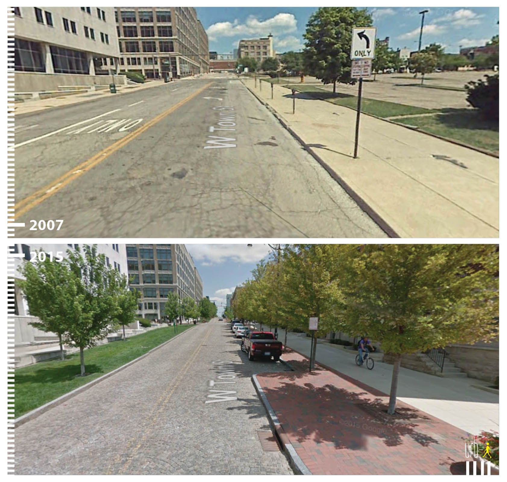
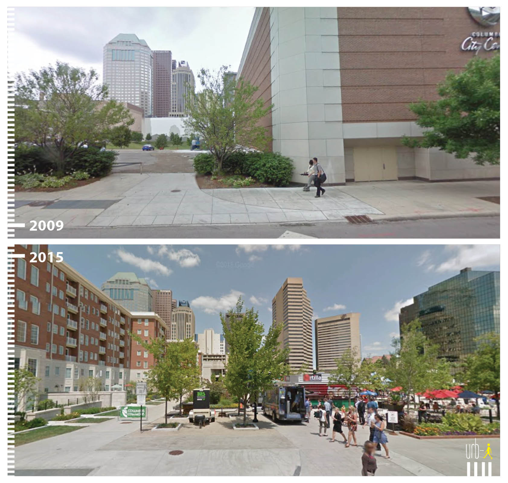
I saw this site mentioned on the CityLab site awhile back and thought it was a very cool idea. The site highlights how cities are transforming public spaces and making car-centric areas much more pedestrian, bike and transit friendly. Since I found the site, I have been lucky enough to become a regular contributor working to help make the site even better. The great thing is that anyone can send in before and after photos from their own cities of public space transformations. Take a look: http://www.urb-i.com/ The site covers cities across the world.
Columbus has several examples that I have added, but the photos are not yet updated on the site’s map. Until they are, here is a sneak peek:
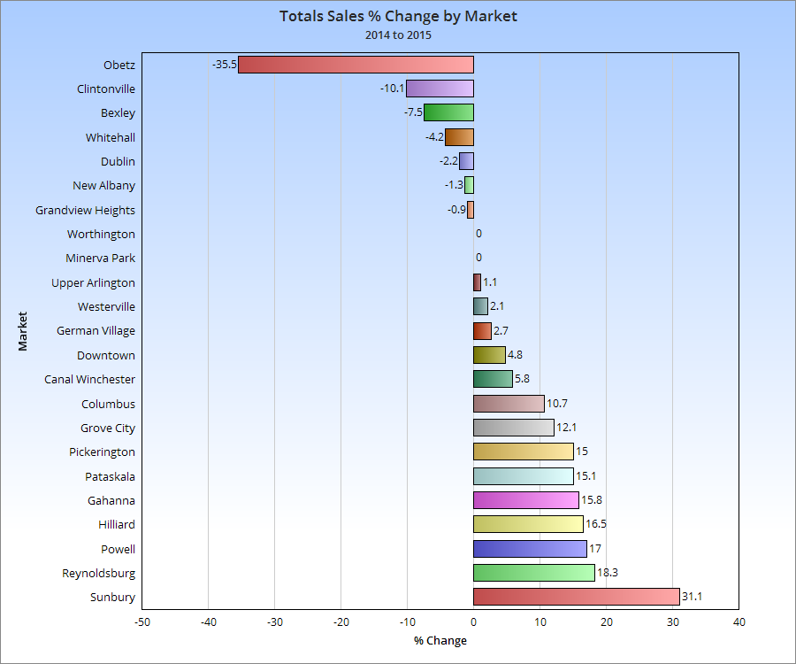
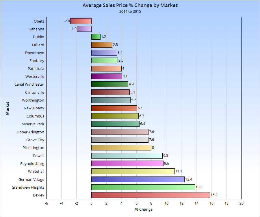
The 2015 housing market was one of the strongest since before the recession, and 2016 looks to do even better. An ongoing problem, especially within the more urban markets, is a historically low inventory of available homes for sale. This has been a problem for several years now, as construction has failed to match demand.
That lack of inventory really shows up in the yearly % change chart. Few urban markets have increased year over year, as they have a much more limited supply of housing, even as demand for urban housing has increased.
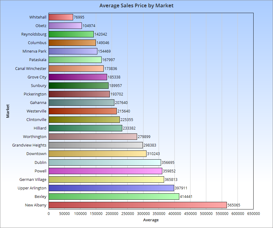
Let’s see how this impacted prices.
While urban markets were not necessarily the most expensive compared to suburban, more of them were generally towards the top half of price increases last year.
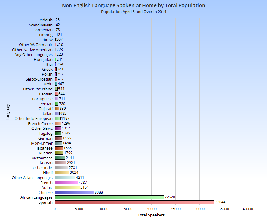
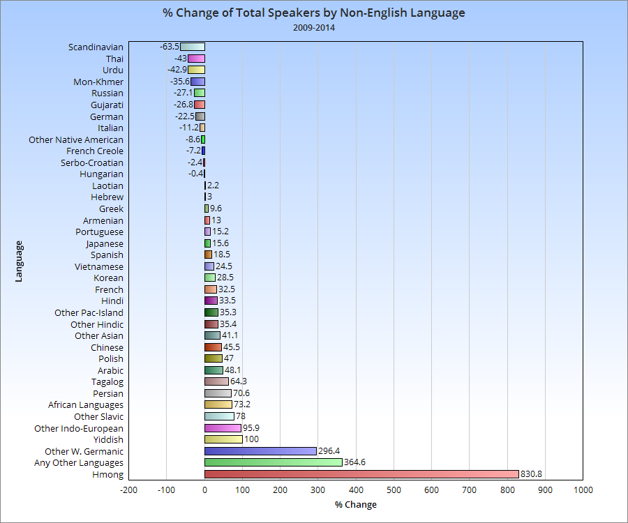
Just a quick little post about the non-English languages spoken in the city of Columbus and how they have changed between 2009 and 2014, by total number of speakers.
For the record, in 2014, 14.3% of the Columbus population spoke a language other than English at home, up from about 12% in 2009.
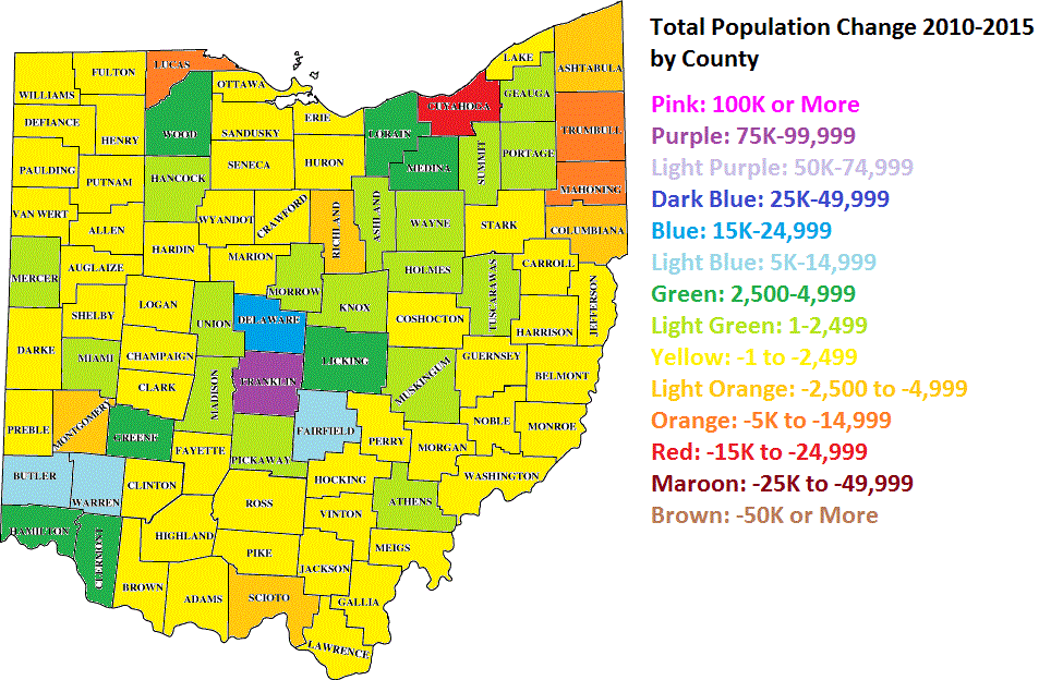
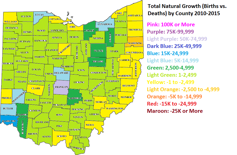
The US Census has released its population estimates for both counties and metros for the year ending July 1, 2015. Here is a detailed look at Ohio’s counties in this 2015 county population estimates report.
From the numbers above, Columbus’ Franklin County was just below Cuyahoga last year. It is likely that, given each county’s growth rates, Franklin has now passed up Cuyahoga to become Ohio’s most populated county.
Franklin County’s natural growth rate destroys every other county in the state. It gains almost 7x that of Cuyahoga County, despite Cuyahoga having a larger population during this period, and nearly 3x that of Hamilton County.
I saw this post the other day about changing neighborhood demographics in certain cities, particularly when it comes to racial segregation and gentrification. Surprisingly, of all the maps and posts I’ve done on demographics, I hadn’t thought to do one like this. Well, now I have, so here are Franklin County’s gentrification trends 1990-2014. A bit of an explanation is needed for the color coding: -For those categories marked “Steady”, the demographic listed has been the majority throughout the period, with little to no change of other demographics. -For those mixed categories of one decline and one rise, it means that the majority demographic has declined at least 5%, while a secondary demographic has risen at least 5%. -For the category of recent or steady integration, there are at least 2 demographics at 10% or more of the total population, as well as a 3rd demographic reaching at least 5% of the population.
A few things that stand out to me is that the Steady White population dominates at least 50% of the map, while there are very few areas with Steady Black population. One would be tempted to suggest that gentrification is forcing the Black population out of neighborhoods, but this doesn’t seem to be true. In terms of significant changes, there are FAR more areas with Black population growth and White population decline than vice-versa, suggesting that “White Flight” may continue to be an issue. Also, a surprising number of areas have reached full integration, or have at least been maintaining it over the period of question. These neighborhoods of demographic equilibrium are largely the result of increasing Hispanic and Asian populations, particularly on the Northeast and West Sides, as well as the Whitehall area. In the center core, almost all of the High Street corridor has remained steady White, suggesting that other demographics have, so far, been unable to tap into the building boom along and adjacent to this corridor.
Here are the most integrated tracts by year, based the above criteria. 1990 1. #8720- South Side 2. #7820- Riverview-NW Side 3. #1122- West Campus 4. #1121- Campus 5. #29- King-Lincoln Only 5 tracts counted as being integrated in 1990.