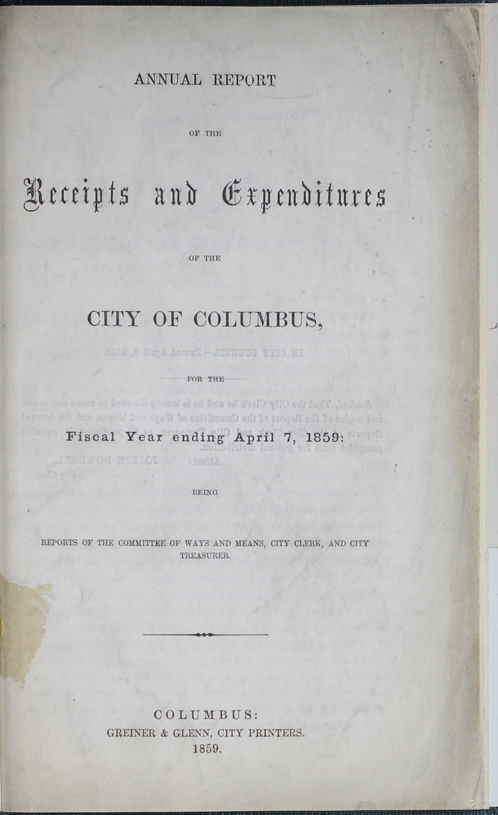
159 years ago, Columbus released its first (as far as I could find) annual report detailing all sorts of information on the state of the city. These reports were issued well into the 1980s, and while the first included mostly dry financial information such as tax receipts and expenditures, as the years passed, they would grow to include everything from annexation numbers to weather statistics and crime data. I will occasionally write about some of the more interesting highlights of these historic documents on the city’s past.
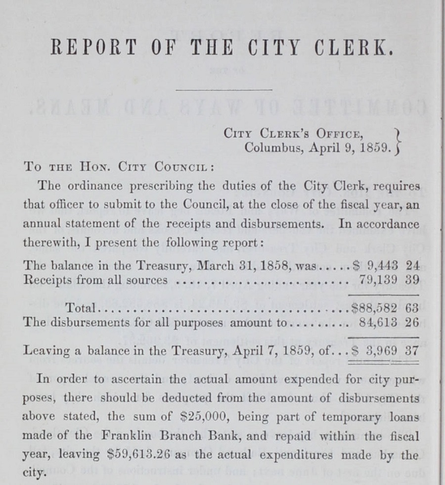
Let’s look at some highlights from the report. First up, Columbus’ finances. Certainly much has changed in the city’s expenditures, with a budget that now exceeds $1 billion a year.
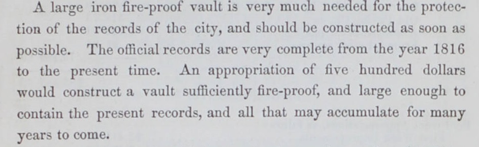
Next up is a plea from then City Clerk Joseph Dowdall about the need to protect the city’s records. Dowdall would be the City Clerk through 1861. He would show up in the Columbus records through the early 1880s, when in 1880 he gained a permit to build a 2-story brick addition to a home.
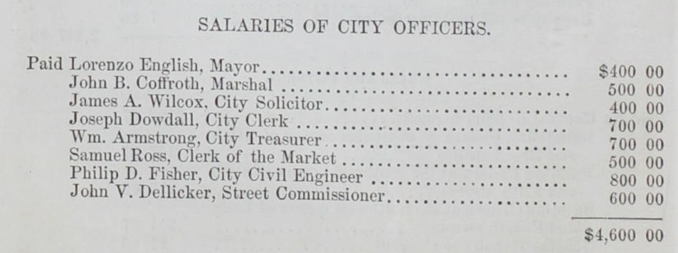
City leaders were paid a *little* less per year than they are now. Interesting that the mayor earned the lowest amount of all. Even with inflation over the years, the $400 salary would only have been about $11,300 in 2017. Clearly public service back then was not a lucrative proposition.
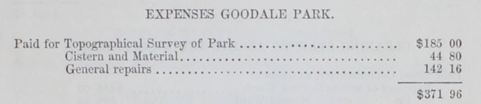
Only 7 years after the land was donated to the city, Goodale Park was still being surveyed.
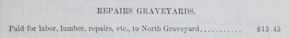
The now infamous North Graveyard received a few repairs that year. North Graveyard was once on the northern fringes of Downtown, where North Market would eventually rise. Sometime after the graveyard was “moved” in 1872, its original location was all but forgotten. In the early 2000s, utility work at North Market made a grisly discovery not so dissimilar to the Poltergeist movie- bodies. It seems that in the hasty movement of the cemetery, through outright intent, neglect or lost records, many bodies had simply never been moved at all. There has long been the belief that many more remains are still in the ground under the area. The upcoming Market Tower project has a good chance of finding at least some of them.
So there you have it, an early look into Columbus’ financial history.
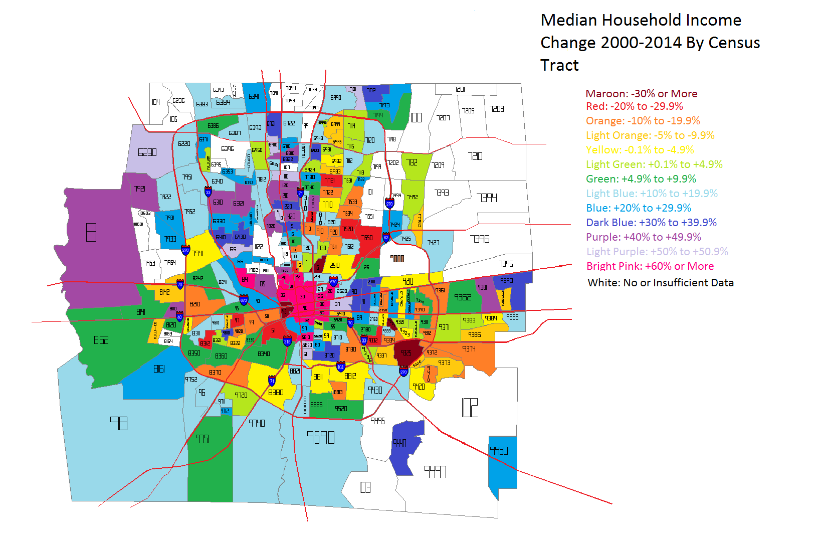
The US Census recently released demographic information for census tracts for 2015. Here are some quick maps for Franklin County for median household income.
First, median household income for both 2010 and 2015.
And the % change between 2010-2015.
As can be seen, a lot of the greatest improvements over the 5-year period were around Downtown, the Near East Side, North High, South High and around some of the higher-income suburbs like Upper Arlington and the New Albany area.
What the numbers suggest is that Columbus was performing at a middle-mediocre level in the first half of the 2001-2015 period, and has generally been performing significantly better in the latter half. In Ohio, Columbus is poised to become Ohio’s largest metro economy over the next few years.
Over the years, there have been endless claims about how the Columbus economy is dominated by jobs related to state government and OSU. These claims are usually made from other Ohioans complaining that Columbus has an unfair advantage and is mooching public dollars from the rest of the state to prop up the economy.
Let’s first address two points made: 1. That the number of government jobs is far above what they are in all other major Ohio cities, and 2. That overall, government jobs are becoming a larger slice of the metro economy.
The first claim is easy to look into. The Bureau of Labor Statistics, or BLS, produces numbers every single month on job industry numbers by metro area. The most recent numbers are from June 2016. Here are the total government jobs for Ohio’s largest cities. Columbus: 162,600 Cleveland: 138,800 Cincinnati: 124,200 Dayton: 62,300 Toledo: 44,800 Akron: 40,600
So as to the first claim, that the total of government jobs in Columbus is higher than the other cities, that is true. As the state capital, this is no surprise. However, how dependent on government jobs is Columbus really versus those other cities? To find out, you have to divide government jobs by all total jobs within the metro. In June 2016, here was the percentage of the total.
Interestingly enough, Columbus is not the top government-dependent city. That spot goes to Dayton.
Now onto the 2nd claim- that Columbus is increasingly reliant on those government jobs. Let’s look at the % of total jobs that government jobs made up going back to 1990. The figures are for June of each year given.
So it does not appear that Columbus has become more or less dependent on government jobs over the last 26 years. Indeed, if there is any pattern at all, it appears that during economic downturns, the number of government jobs increase, and during periods of stability/recovery, government jobs decline. The early 1990s and late 2000s had high levels of governments jobs, both periods of recession. In June 2016, nearly 85% of the local economy was not government-related, not statistically much different than other Ohio cities.
Finally, let’s look at how total government jobs have changed since the beginning of this decade, 2010, by Ohio city. The figures are for June 2010 and June 2016.
So that brings us to the actual makeup of the Columbus metro economy. What are the industries that most people work for? What are the industries that have the greatest % of the total jobs? Let’s compare June 1990 and June 2016.
1990 Trade/Transportation/Utilities: 20.51% Government: 17.97% Manufacturing: 13.49% Professional and Business Services: 11.46% Health and Education: 9.41% Leisure and Hospitality: 8.63% Financial Activities: 8.26% Mining/Logging/Construction: 4.30% Other Services: 3.46% Information: 2.51%
2016 Trade/Transportation/Utilities: 18.37% Professional and Business Services: 17.11% Government: 15.30% Health and Education: 14.43% Leisure and Hospitality: 10.89% Financial Activities: 7.63% Manufacturing: 6.84% Other Services: 4.10% Mining/Logging/Construction: 3.75% Information: 1.57%
If anything, Columbus’ economy is actually more diverse in 2016 than it was in 1990, not less.
Economic segregation is basically where people living in the same city are segregated in terms of financial characteristics, such as housing prices or income. This is considered negative as the more economically segregated an area is, the harder it is for people, especially in lower income brackets, to move up financially. My report on economic segregation in Columbus focuses on household income within census tracts in Franklin County and where those household incomes are changing the most.
First of all, let’s look at the household income levels around the county, both in 2000 and 2014. In 2000, the median household income for the county was highest in the Upper Arlington and Grandview, Dublin, Bexley, Hilliard and the New Albany area. Downtown and adjacent areas had the lowest, as well as the general urban core and East Side.
By 2014, household income remained the highest in the same areas it was in 2000, but there were major improvements in many parts of the urban core, especially around Downtown, the Near East Side, Near South, Clintonville and the Short North. To illustrate this change better, take a look at the next map.
Unfortunately, because not all of 2014’s census tracts existed in 2000, I don’t have data for the entire county for comparison. But the trend is very clear. The areas that saw the biggest improvements in median household incomes were in the dead center of the county- Downtown, Near South and East Sides, as well as the Short North and Grandview. Only parts of Hilliard, Clintonville and Worthington really saw anything remotely as close. This indicates, at least to me, that the beating heart of revitalization and growth in the county is along the High Street corridor.
So now that we’ve established what the incomes look like across the county, let’s break it down further into income level brackets. This will help determine where economic segregation is a problem and where it isn’t.
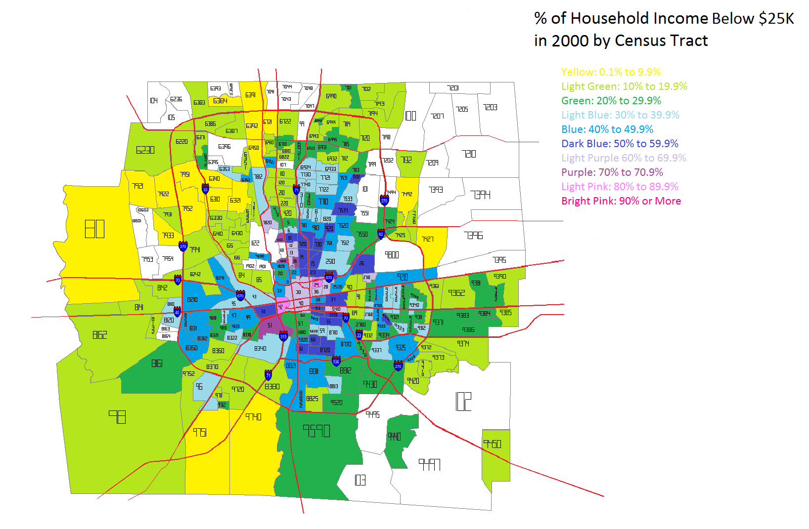
The lowest household income I looked at was Below $25K a year. In 2000, this income level was most heavily concentrated in the Downtown area and adjacent neighborhoods. The Near East Side, as well as Linden down through the east side of I-71 had the county’s highest % of households that earned this level of income. Hilltop and the West Broad Corridor were also fairly high.
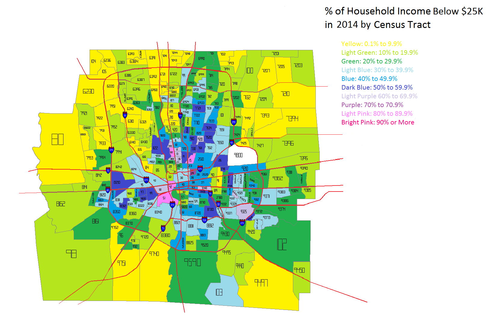
By 2014, the lowest household income level looked largely the same. However, there were also some noticeable difference. Downtown, the Near East Side, the Near South Side and parts of the North High Corridor saw obvious declines in this population, while it seemed to spread further east outside of 270 into suburban areas.
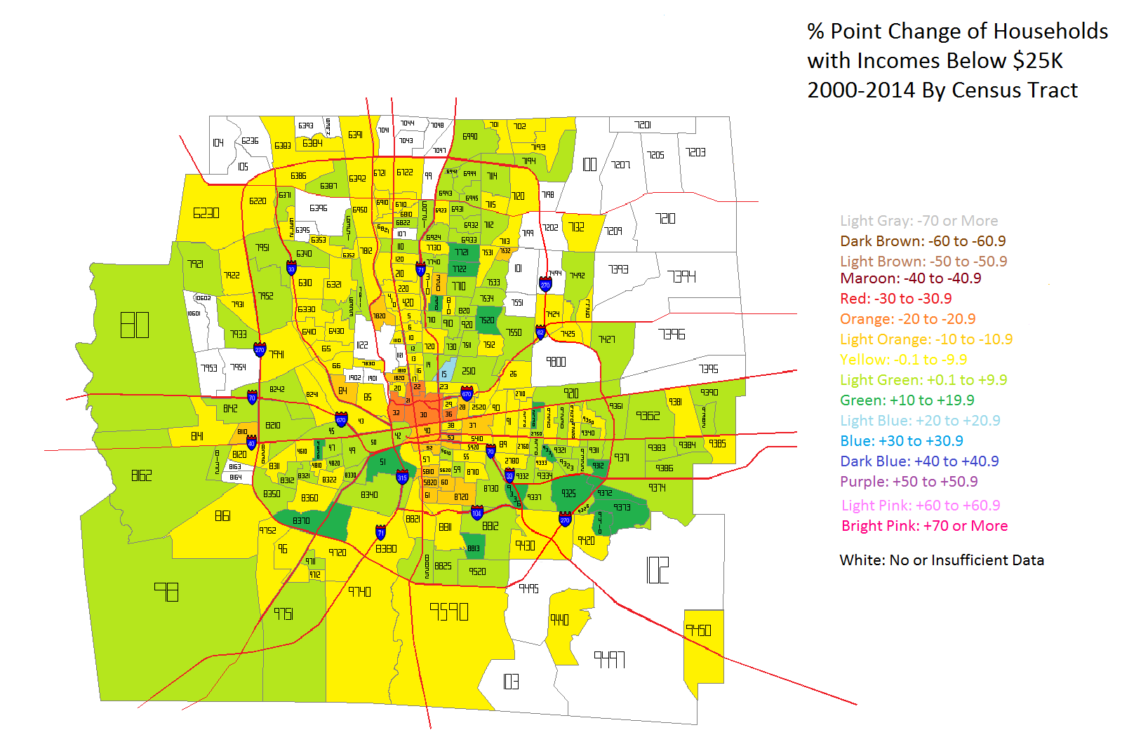
In the map above, we can see how Below $25K household incomes had changed in the tracts between 2000 and 2014 by % point change. Ironically, the urban core, especially along High and Broad streets saw the most consistent declines in this population while areas around and outside of 270 saw the most consistent increases. The good news is that more tracts saw declines than increases, but the map does indicate that poverty is perhaps moving further out from the core.
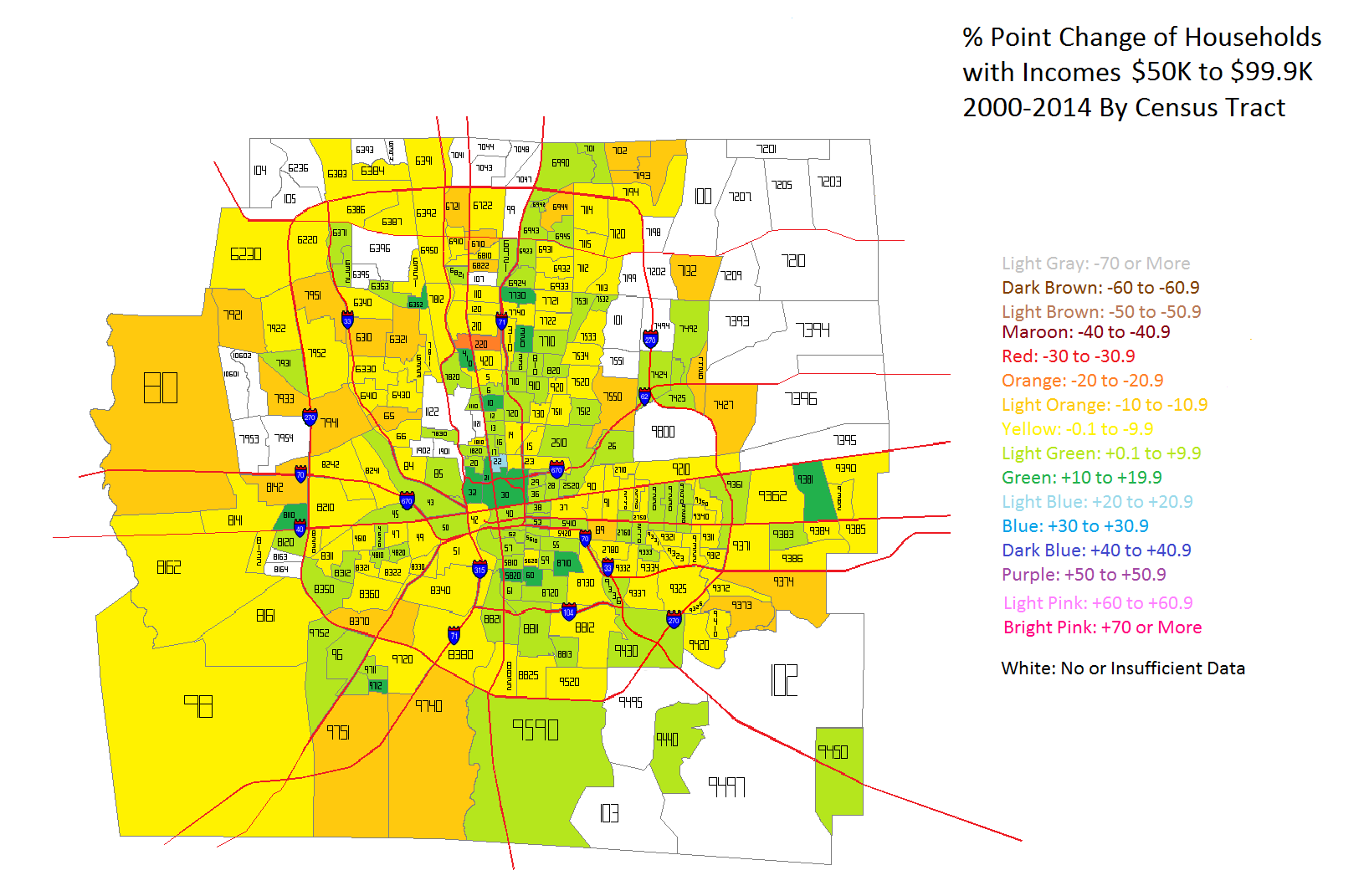
Next up is the household income level change that would be considered closest to middle class- $50K-$99K.
The urban core areas clearly saw the most consistent increases in middle class household income levels, while the outer suburbs almost universally declined in this metric. One explanation for this is that the lowest incomes in the core moved up into the middle class, while in the suburbs, middle class incomes moved into the upper class incomes. That would explain both the rise in the core, but the decline in the suburbs. But to prove if this is true or not, we have to look at the highest income levels- those of $100K and above.
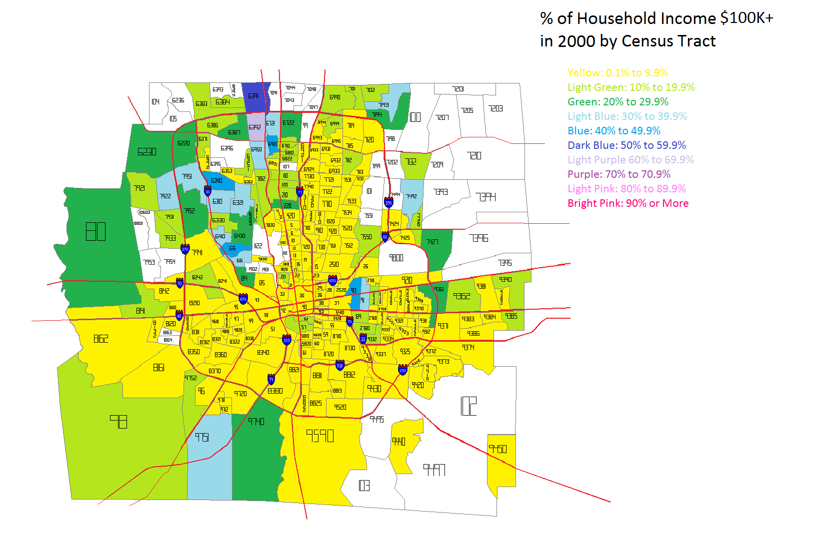
In 2000 the highest incomes were almost entirely outside of 270 except for Bexley and the Northwest Side communities like Dublin and Upper Arlington. It is likely that the New Albany area also had high incomes, but again, those tracts didn’t exist in 2000, so it is difficult to give that information.
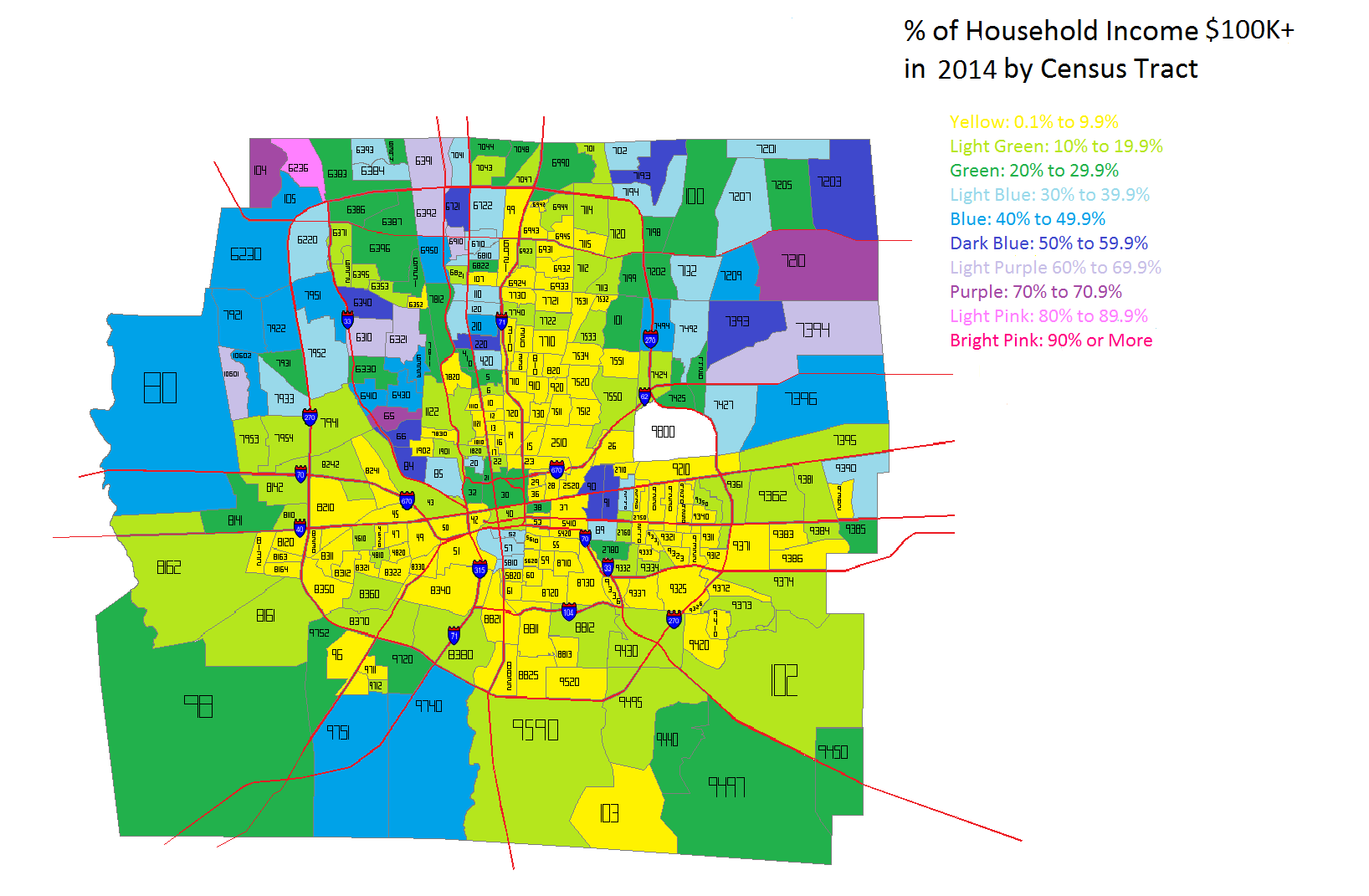
By 2014, while the Northern areas of Franklin County continued to have the highest incomes in general, gains were made in many parts of the county, including several within the urban core area.
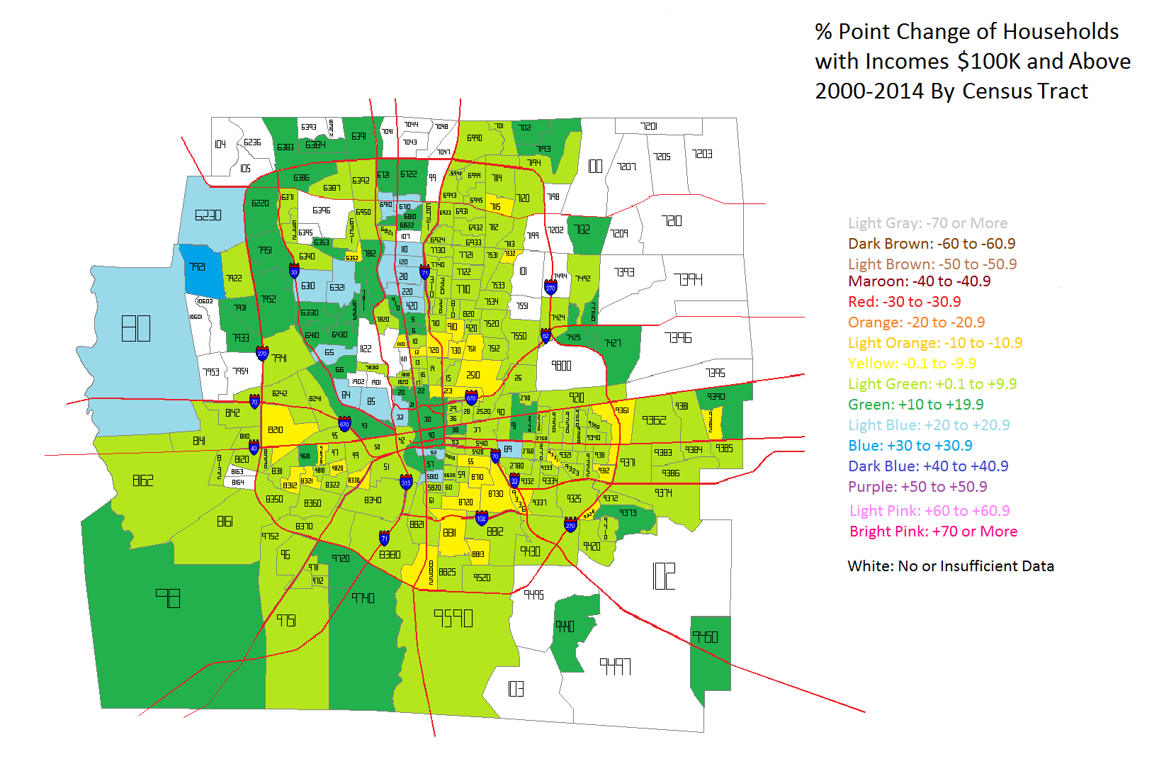
Between 2000 and 2014, there was almost universal growth of $100K+ incomes in Franklin County, with only small areas seeing declines. The Northwest communities, as well as areas in and around Downtown seemed to do the best.
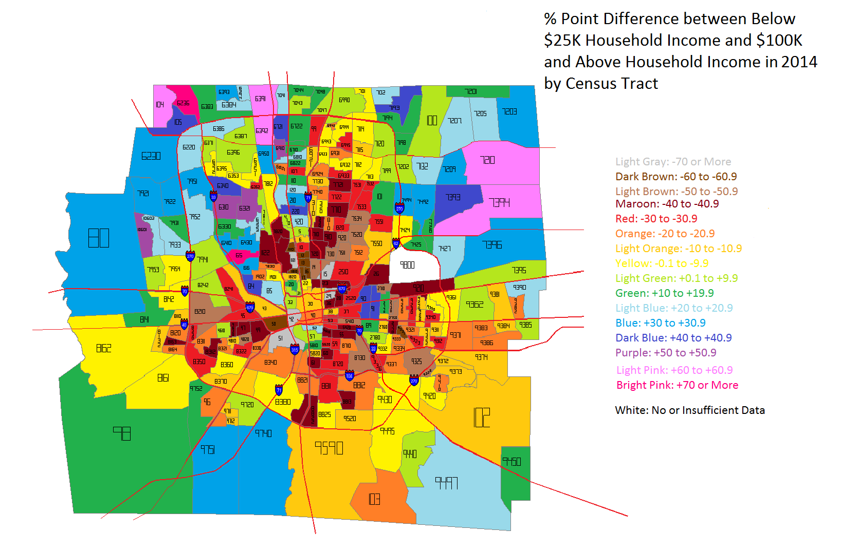
Okay, so incomes levels are clearly improving in most of the county, but especially in urban core areas. But what is the difference between the highest and lowest incomes within each census tract? To find out, I took the % of households in each tract earning less than $25K a year vs. the % of households earning $100K or more. The % point difference between these two groups is a good indication of how much economic segregation exists. The closer this number is to 0, the more economically integrated a tract is. Negative numbers indicate that Below $25K household incomes outweigh those making $100K or more, while positive numbers are the reverse.
The 2000 map shows that Below $25K household incomes dominate inside I-270, particularly around Downtown and the East Side. Many tracts contain at least 40 % points more $25K incomes than $100K incomes. This shows that poverty was deeply concentrated around the center of the county. Suburban areas were more dominated by the reverse, where middle and upper class households were concentrated.
In 2014, the severely concentrated levels of the lowest incomes have eased in most locations. There are fewer tracts of 40+ point differences, especially around Downtown and the general High Street Corridor. Only the Campus area, for obvious reasons, and parts of Linden, largely remain unchanged.
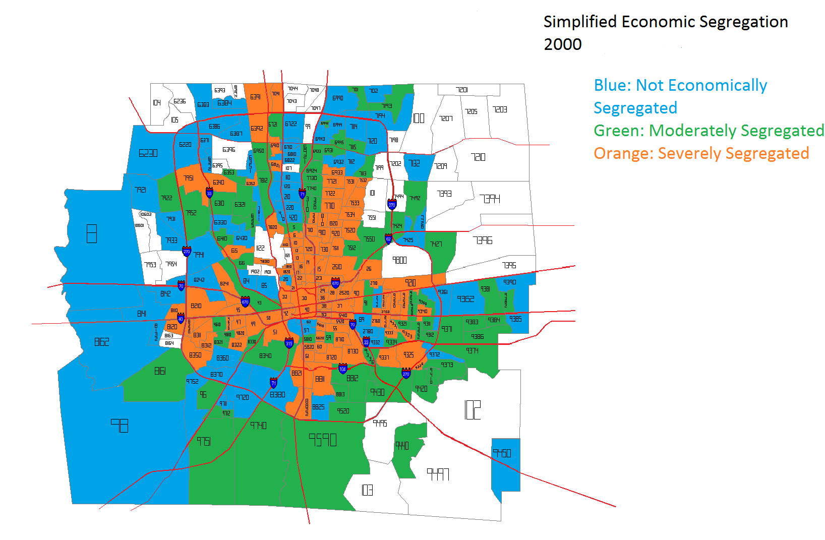
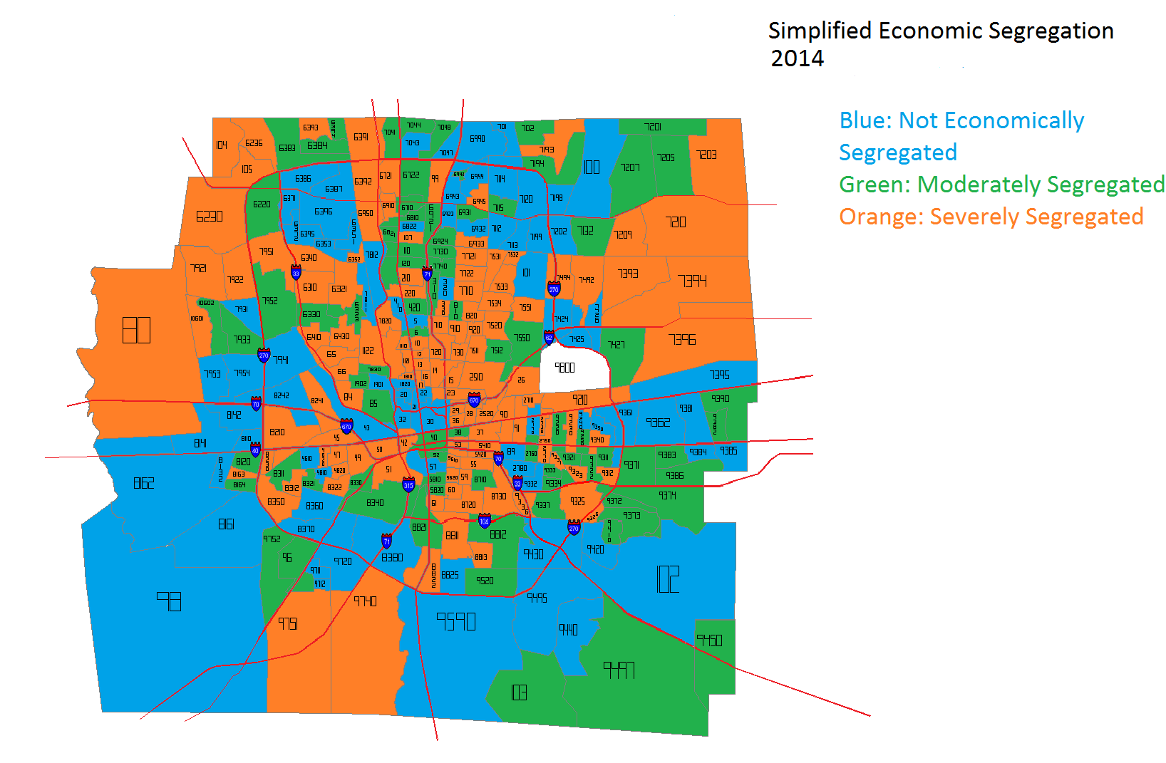
So what does all this ultimately mean about economic segregation in Frankly County? To get a simplified sense of that picture, considering the final set of maps.
In the coloring, the blue tracts are tracts that have income point differences that are between -15 and +15. These are the tracts that are most economically integrated. Green tracts are those with differences of +/- 15 to 29 points, while orange represent those with +/- 30 points or more. Orange tracts are the most economically segregated. In 2000, most of the orange tracts were within I-270. In fact, they very closely represent the most urban part of Columbus- the 1950 city boundary. They are amazingly similar. Meanwhile, almost all the outer suburbs in 2000 were well integrated.
Fast forward to 2014 and the picture becomes significantly more convoluted. Being in the urban core vs. the suburbs does not automatically guarantee economic integration. Many suburbs are now as severely segregated as some of the urban core is, while parts of the urban core are as integrated as some suburbs.
Overall, it appears that Franklin County has improved its economic integration in the last decade or so, but there is still more than can be done. Economic incentives for providing more mixed-income housing and bringing more jobs to urban areas would likely help achieve a more integrated city and county.