I haven’t done a Before and After installment for a while. This time around, I chose to not focus on any single neighborhood.
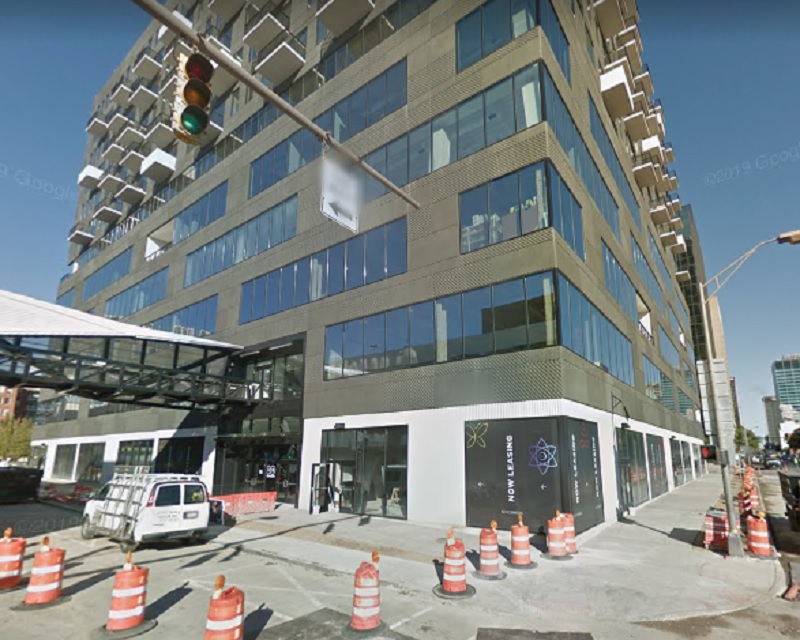
First up is a photo of the construction of the Columbus Interurban Terminal, looking northwest from 3rd. The photo was taken on October 5, 1911, about 3 months before the building opened. The interurban system was relatively short-lived in the city, and the terminal closed after only 26 years in 1938. The building survived as a grocery store through the mid-1960s before the building was demolished in 1967 as part of the construction of the Greyhound Bus Terminal across the street. The actual location of the building was not on the Greyhound site, but was used as an overflow parking lot. It remained a parking lot until the mid-1980s, when it became part of the City Centre Mall site. Today, plans are for the site to become the location for the 12-story, 80 on the Commons mixed-use project.
October, 1911.
Here is the same place in October, 2018.
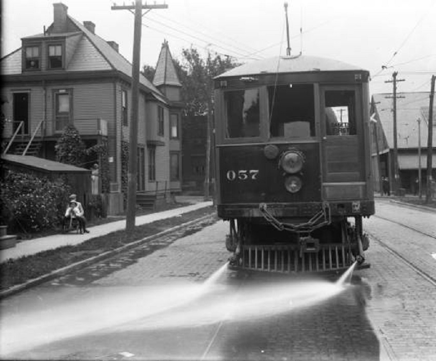
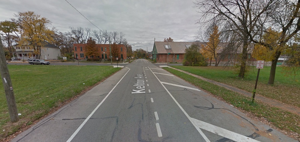
The second historic photo is of the #57 streetcar on Kelton Avenue just south of the Oak Street intersection. The photo, which looks north, was taken on June 30, 1915 and includes 3 separate visible buildings as well. The house on the left actually survived until 1977, when it and the rest of the east half of the block was demolished. The building visible on the right is the surviving streetcar barn. Today, it is in bad shape, and while many would like to see it renovated and saved, time seems to be running out. The other surviving building, barely visible in the 1915 photo, is the tenement building on the northwest corner of Oak and Kelton. And in 2015:
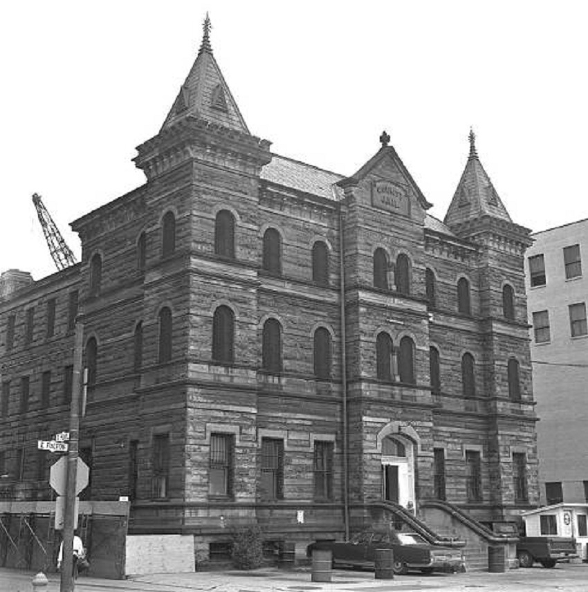
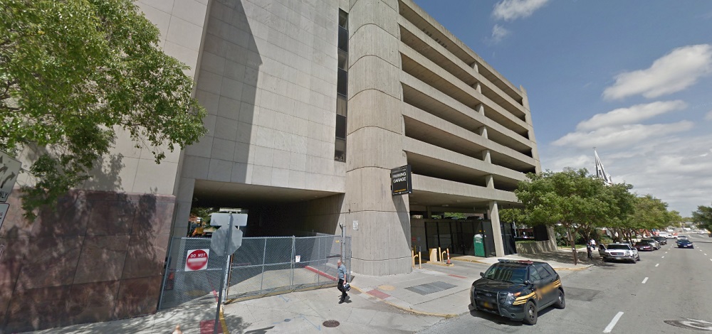
Third in this list is a photo of the demolition of the old Franklin County Jail, once located at 36 E. Fulton Street in Downtown. Built in 1889, the structure survived until the fall of 1971, when the building, which by then had become outdated for its intended purpose, was torn down to make way for- what else- a parking garage. The parking garage remains to the present day. Columbus leaders at the time should’ve been flogged for such short-sighted thinking, something that was repeated over and over and over again during that era. Today, such a very cool, unique building would’ve made an excellent candidate for mixed-use conversion. And in August, 2016:
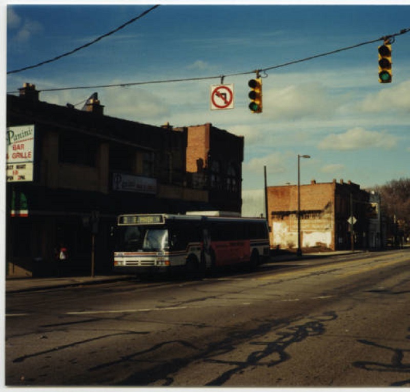
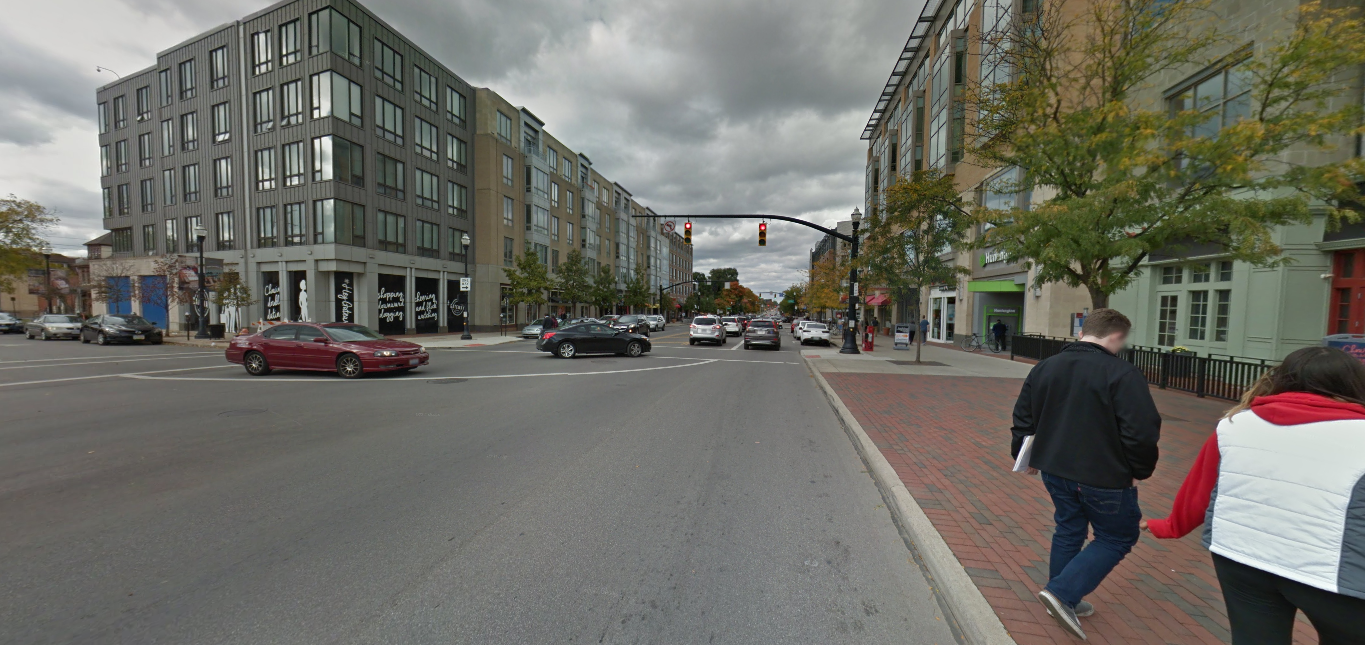
Finally, this next photo isn’t really historic. It was taken a mere 15 years ago in February, 2002, looking northwest from the corner of N. High Street and 10th Avenue. At the time, this area had been made up of low-rise historic buildings that had long held bars for OSU students. All these buildings in the photo, and many more, were demolished not long after the photo was taken in order to make room for the South Campus Gateway, now more or less just called the Gateway. Similar large-scale demolitions are taking place to the north and south as the entirety of the High Street corridor around Campus is transformed. Whether that is good or bad depends on who you ask. What can be agreed upon, however, is that the corridor will be almost unrecognizable in the end. And in October, 2016:
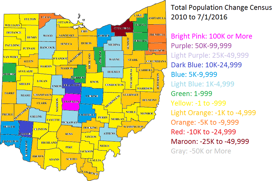
The 2016 population estimates came out this morning from the Census. Nationally, it seems that overall growth rates slowed down from where they were the year prior, and there were some surprising results in a few cases.
First, let’s take a look at the core counties for Columbus and its peer/Midwest counterparts nationally. The core city is in parenthesis. 2010—————————————————2015———————————2016 1. Cook (Chicago): 5,194,675————-1. Cook: 5,224,823————-1. Cook: 5,203,499 2. Clark (Las Vegas): 1,951,269———-2. Clark: 2,109,289————-2. Clark: 2,155,664 3. Wayne (Detroit): 1,820,584————-3. Santa Clara: 1,910,105—-3. Bexar: 1,928,680 4. Santa Clara (San Jose): 1,781,642—4. Bexar: 1,895,482—4. Santa Clara: 1,919,402 5. Bexar (San Antonio): 1,714,773——-5. Wayne: 1,757,062———5. Wayne: 1,749,366 6. Sacramento (Sac.): 1,418,788–6. Sacramento: 1,496,664–6. Sacramento: 1,414,460 7. Cuyahoga (Cleveland): 1,280,122—7. Orange: 1,284,864——–7. Orange: 1,314,367 8. Allegheny (Pittsburgh): 1,223,348—8. Cuyahoga: 1,255,025—-8. Franklin: 1,264,518 9. Franklin (Columbus): 1,163,414—–9. Franklin: 1,250,269—–9. Cuyahoga: 1,249,352 10. Hennepin (Minn.): 1,152,425—10. Allegheny: 1,229,298—-10. Hennepin: 1,232,483 11. Orange (Orlando): 1,145,951—11. Hennepin: 1,220,459—-11. Allegheny: 1,225,365 12. Travis (Austin): 1,024,266——12. Travis: 1,174,818——12. Travis: 1,199,323 13. Milwaukee (Mil): 947,735–13. Mecklenburg: 1,033,466–13. Mecklenburg: 1,054,835 14. Mecklenburg (Charl.): 919,628–14. Milwaukee: 956,314—14. Milwaukee: 951,448 15. Marion (Indianapolis): 903,393—15. Marion: 938,058———–15. Marion: 941,229 16. Hamilton (Cincinnati): 802,374—16. Hamilton: 807,748——–16. Hamilton: 809,099 17. Multnomah (Portland): 735,334–17. Multnomah: 789,125—17. Multnomah: 799,766 18. Jackson (Kansas City): 674,158–18. Jackson: 686,373——-18. Jackson: 691,801 19. Davidson (Nashville): 626,667—19. Davidson: 678,323——-19. Davidson: 684,410 20. Providence (Providence): 626,671–20. Kent: 636,095———20. Kent: 642,173 21. Kent (Grand Rapids): 602,622–21. Providence: 632,488—-21. Providence: 633,673 22. Summit (Akron): 541,781———22. Douglas: 549,168——–22. Douglas: 554,995 23. Montgomery (Dayton): 535,153–23. Summit: 541,316——–23. Summit: 540,300 24. Douglas (Omaha): 517,110–24. Montgomery: 531,567——24. Dane: 531,273 25. Sedgwick (Wichita): 498,365–25. Dane: 522,878———–25. Montgomery: 531,239 26. Dane (Madison): 488,073——-26. Sedgwick: 510,360——26. Sedgwick: 511,995 27. Lucas (Toledo): 441,815——–27. Polk: 466,688————–27. Polk: 474,045 28. Virginia Beach (VB): 437,994–28. Virginia Beach: 451,854–28. Vir. Beach: 452,602 29. Polk (Des Moines): 430,640—-29. Lucas: 433,496————-29. Lucas: 432,488 30. Allen (Fort Wayne): 355,359—30. Allen: 368,040————-30. Allen: 370,404 31. St. Louis (St. Louis): 319,294–31. St. Louis: 314,875———31. St. Louis: 311,404 32. Lancaster (Lincoln): 285,407—32. Lancaster: 305,705——-32. Lancaster: 309,637 33. Mahoning (Youngstown): 238,823–33. Mahoning: 231,767–33. Mahoning: 230,008
Franklin County moved up one spot to 8th most populated core county of the group.
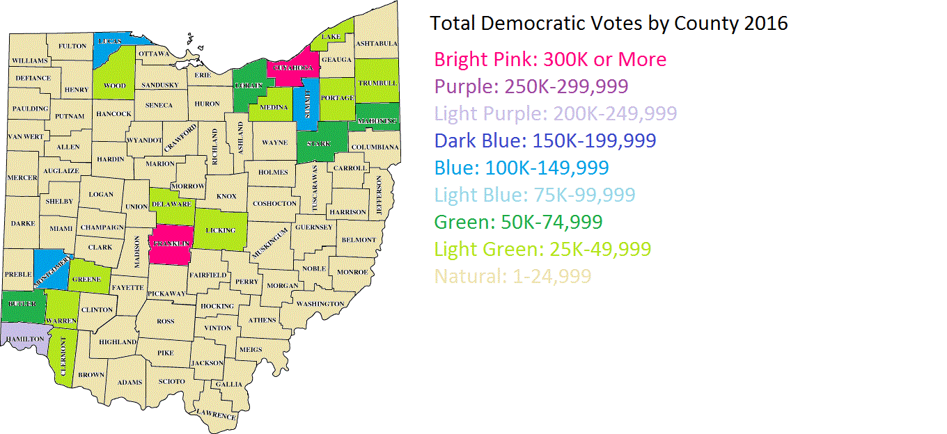
I’m not going to get into any debate on the candidates themselves or what I personally thought/think of them. That’s not the point of this post, and frankly, there’s already plenty of opinions all over the internet on this. This post is about the 2016 election results for Ohio.
First, here is a map of total Democratic votes within Ohio’s counties. As is typical, Democratic votes were most concentrated in counties with large cities.
Here are the metro areas that provided the most Democratic votes. 1. Cleveland: 561,368 2. Columbus: 450,146 3. Cincinnati: 339,159 4. Akron: 166,653 5. Dayton: 164,079 6. Toledo: 152,505 7. Youngstown: 100,395
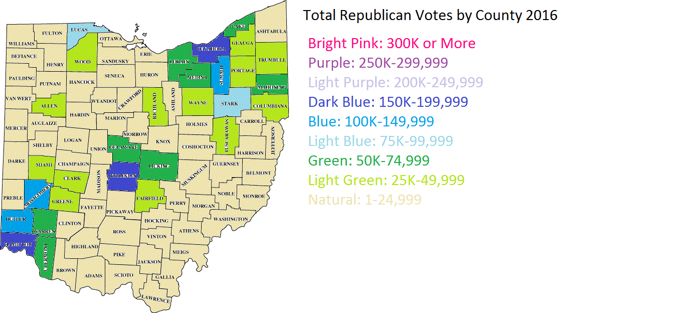
And the top 10 counties with the most Democratic votes. 1. Cuyahoga: 398,271 2. Franklin: 351,198 3. Hamilton: 215,719 4. Summit: 134,256 5. Montgomery: 122,016 6. Lucas: 110,833 7. Stark: 68,146 8. Lorain: 66,949 9. Butler: 58,642 10. Mahoning: 57,381
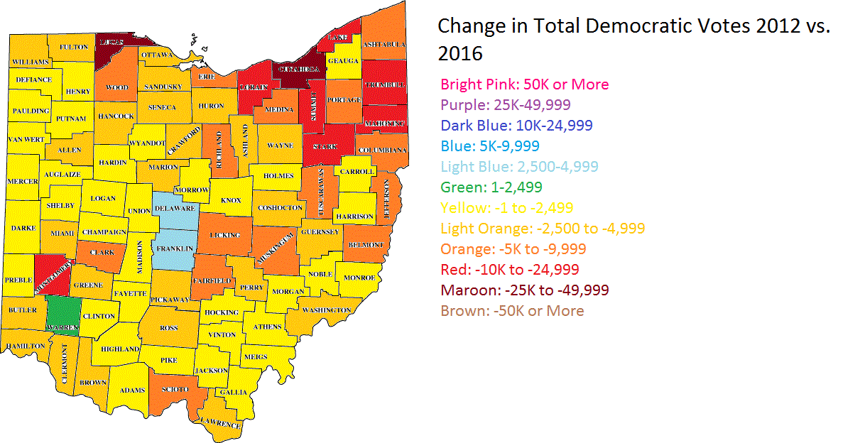
Here is how Democratic votes changed by county between 2012 and 2016.
As you can see, only a handful of counties saw Democratic votes increase in 2016 over 2012, Franklin County being one of them. Some of the biggest losses were in traditionally blue areas like Northeast Ohio.
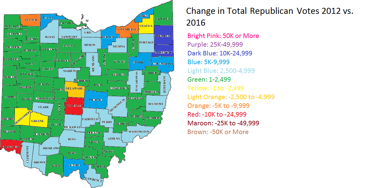
And here is the change of Republican votes in 2016 vs. 2012.
Most of Ohio’s counties saw increased Republican turnout, though again, Franklin County bucked the trend and actually saw declines.
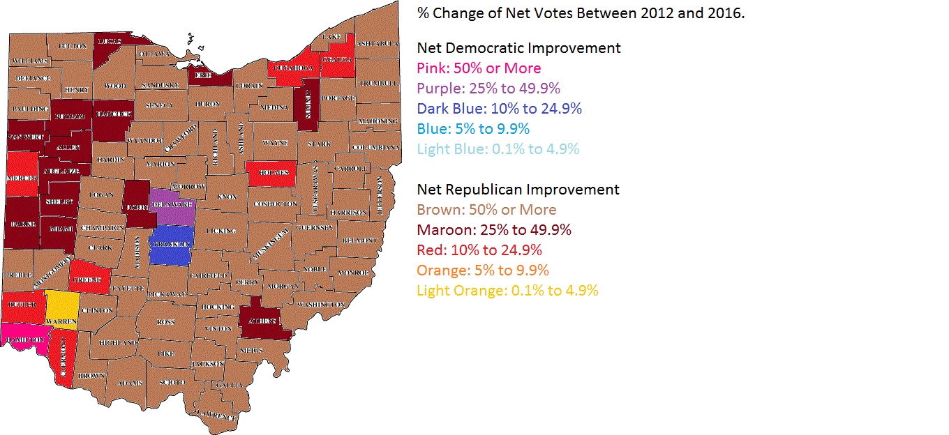
Finally, a map of the net % change for each county and whether it trended more Republican or more Democratic vs. the net of the 2012 election.
Almost all counties saw a net decrease of Democratic votes/increase in Republican votes. Only 3 counties of 88- Franklin, Delaware and Hamilton- trended more Democratic in 2016 over 2012. All the other 85 trended Republican.
Over the years, there have been endless claims about how the Columbus economy is dominated by jobs related to state government and OSU. These claims are usually made from other Ohioans complaining that Columbus has an unfair advantage and is mooching public dollars from the rest of the state to prop up the economy.
Let’s first address two points made: 1. That the number of government jobs is far above what they are in all other major Ohio cities, and 2. That overall, government jobs are becoming a larger slice of the metro economy.
The first claim is easy to look into. The Bureau of Labor Statistics, or BLS, produces numbers every single month on job industry numbers by metro area. The most recent numbers are from June 2016. Here are the total government jobs for Ohio’s largest cities. Columbus: 162,600 Cleveland: 138,800 Cincinnati: 124,200 Dayton: 62,300 Toledo: 44,800 Akron: 40,600
So as to the first claim, that the total of government jobs in Columbus is higher than the other cities, that is true. As the state capital, this is no surprise. However, how dependent on government jobs is Columbus really versus those other cities? To find out, you have to divide government jobs by all total jobs within the metro. In June 2016, here was the percentage of the total.
Interestingly enough, Columbus is not the top government-dependent city. That spot goes to Dayton.
Now onto the 2nd claim- that Columbus is increasingly reliant on those government jobs. Let’s look at the % of total jobs that government jobs made up going back to 1990. The figures are for June of each year given.
So it does not appear that Columbus has become more or less dependent on government jobs over the last 26 years. Indeed, if there is any pattern at all, it appears that during economic downturns, the number of government jobs increase, and during periods of stability/recovery, government jobs decline. The early 1990s and late 2000s had high levels of governments jobs, both periods of recession. In June 2016, nearly 85% of the local economy was not government-related, not statistically much different than other Ohio cities.
Finally, let’s look at how total government jobs have changed since the beginning of this decade, 2010, by Ohio city. The figures are for June 2010 and June 2016.
So that brings us to the actual makeup of the Columbus metro economy. What are the industries that most people work for? What are the industries that have the greatest % of the total jobs? Let’s compare June 1990 and June 2016.
1990 Trade/Transportation/Utilities: 20.51% Government: 17.97% Manufacturing: 13.49% Professional and Business Services: 11.46% Health and Education: 9.41% Leisure and Hospitality: 8.63% Financial Activities: 8.26% Mining/Logging/Construction: 4.30% Other Services: 3.46% Information: 2.51%
2016 Trade/Transportation/Utilities: 18.37% Professional and Business Services: 17.11% Government: 15.30% Health and Education: 14.43% Leisure and Hospitality: 10.89% Financial Activities: 7.63% Manufacturing: 6.84% Other Services: 4.10% Mining/Logging/Construction: 3.75% Information: 1.57%
If anything, Columbus’ economy is actually more diverse in 2016 than it was in 1990, not less.