For a good portion of the US, the winter of 2013-2014 was one of the worst, if not the worst, in recent memory. Cold and snow hit early in the season and didn’t let up until the first half of March. Now that April is behind us (the last month that snow typically might fall during a season), we can take a look back at the Winter 2013-2014 Review.
A Look Back at Snowfall For many in Central Ohio, winter provided its first taste on October 23rd, when a cold front briefly changed rain to a wet snow that coated car tops. This was merely a prelude to what would come.
2013-14 Winter Snowfall vs. Normal
November Notable Snow Events November 11-12th, 2013: This was the first real accumulating snowfall of the season, dropping a general 1″-2″ across the area. The highest total in Franklin County was 2″ reported just southeast of Clintonville. A map of the event can be found here.
November 26th-27th, 2013: The months 2nd and larger event occurred towards the end of the month, and dropped 1″-4″ across the county, with the higher totals on the east side of Columbus. A map of the event can be found here. The November total of 4.7″, while not anywhere near record breaking, was a top 20 snowiest, coming in at #14. November 2013 was also the snowiest Columbus had seen since 1972, when 6.3″ fell.
December Notable Snow Events December 6th, 2013: This was the first major event of the season. A low pressure center brought rain to the area on the 5th. As temperatures cooled, rain gradually changed to freezing rain and then heavy snow, dropping 3″-6″ across the area. A map of this event can be found here.
December 10th, 2013: The second event of the month was a persistent band of snow that set up alon I-71. The cold air produced high ratios, dropping 1″-3″. http://www.erh.noaa.gov/iln/events/20131210/
December 14th, 2013: Rain changed to snow along and north of I-71. http://www.erh.noaa.gov/iln/events/20131214/ December’s 12.7″ total was 2 1/2x normal, and the first 10 days of the month were the snowiest on record. It also made the month the 8th snowiest December on record. Further, it was the 2nd consecutive above average December and the 5th since 2007 to be so.
January Notable Snow Events January 2nd, 2014: The new year started off as snowy as the previous ended, when a low pressure brought occasionally heavy snow and 3″-5″ across the city. http://www.erh.noaa.gov/iln/events/20140102/
January 25th-26th, 2014: The months’ signature event, a strong storm brough a mixed bag of precipitation, including heavy snow to parts of the city. As the storm passed, additional snow squalls developed into the 26th and brought occasional whiteout conditions. Columbus’ official 2-day total was 8.3″. A map of the event can be found here, though it only lists totals for the 25th:
All told, the 17.7″ of snow for the month was the 16th snowiest on record, and the 8.3″ snow event tied for the 10th largest January event since records began.
February Notable Snow Events February 4th-5th, 2014: A low pressure brought heavy snow and mixed precipitation to the area, and proved to be winter’s largest snow event with 6″-10″ across the city. The 10.6″ at Columbus was the largest storm of the winter, tied as the 3rd largest February snowstorm, and provided the 7th largest daily February snowfall. http://www.erh.noaa.gov/iln/events/20140205/
February 14th-15th, 2014: Valentines Day brought a storm that skimmed the area with 2″-4″, with much higher totals to the south. http://www.erh.noaa.gov/iln/events/20140215/ February’s 15.9″ of snow was the 6th snowiest on record.
March did not break any records or have any large events, but it was more or less a capping month to a winter that kept snowing.
April saw just one snow event, on the 15th, when half an inch to 1″ fell, ending the snowfall season.
So ultimately, 2013-2014’s 56.4″ of snow ranks it as the 3rd snowiest winter since records began in 1878. It was also the #1 snowiest meteorological winter (December-February) on record. The graph below shows the top 10 snowiest winters. Notice that 4 of the 10 have occurred since 2002, with 3 since 2007. Are we possibly entering a snowier period? That remains to be seen.
The recent Census release of updated population numbers gives new figures on metro populations. In previous articles, I talked mostly about density, so this time, the data is being expanded a bit for a full 2013 metro area comparison.
Metro Area Population on July 1, 2012 and July 1, 2013 By Rank 2012————————————–—-2013 1. Pittsburgh: 2,360,989— 1. Pittsburgh: 2,360,867 2. Charlotte: 2,294,990—2. Charlotte: 2,335,358 3. Portland, OR: 2,289,038—3. Portland, OR: 2,314,554 4. San Antonio, TX: 2,234,494—4. San Antonio, TX: 2,277,550 5. Orlando: 2,223,456—5. Orlando: 2,267,846 6. Sacramento, CA: 2,193,927—6. Sacramento, CA: 2,215,770 7. Cincinnati: 2,129,309—7. Cincinnati: 2,137,406 8. Cleveland: 2,064,739—8. Cleveland: 2,064,725 9. Kansas City: 2,038,690—9. Kansas City: 2,054,473 10. Las Vegas: 1,997,659—10. Las Vegas: 2,027,868 11. Columbus: 1,944,937—11. Columbus: 1,967,066 12. Indianapolis: 1,929,207—12. Indianapolis: 1,953,961 13. San Jose, CA: 1,892,894—13. San Jose, CA: 1,919,641 14. Austin, TX: 1,835,110— 14. Austin, TX: 1,883,051 15. Nashville: 1,726,759—15. Nashville: 1,757,912 16. Virginia Beach, VA: 1,698,410—16. Virginia Beach, VA: 1,707,369 17. Providence, RI: 1,601,160—17. Providence, RI: 1,604,291 18. Milwaukee: 1,566,182—18. Milwaukee: 1,569,659
Total Metro Population Change, 2012-2013, By Rank 1. Austin: +47,941 2. Orlando: +44,390 3. San Antonio: +43,056 4. Charlotte: +40,368 5. Nashville: +31,153 6. Las Vegas: +30,209 7. San Jose: +26,747 8. Portland: +25,516 9. Indianapolis: +24,754 10. Columbus: +22,129 11. Sacramento: +21,843 12. Kansas City: +15,783 13. Virginia Beach: +8,959 14. Cincinnati: +8,097 15. Milwaukee: +3,477 16. Providence: +3,131 17. Cleveland: -14 18. Pittsburgh: -122
**Some of the changes in rates are due to boundary changes. For example, part of the growth rate for Columbus 2000-2010 was a retroactive population addition when boundaries were changed in 2013. The actual growth rate changed very little.
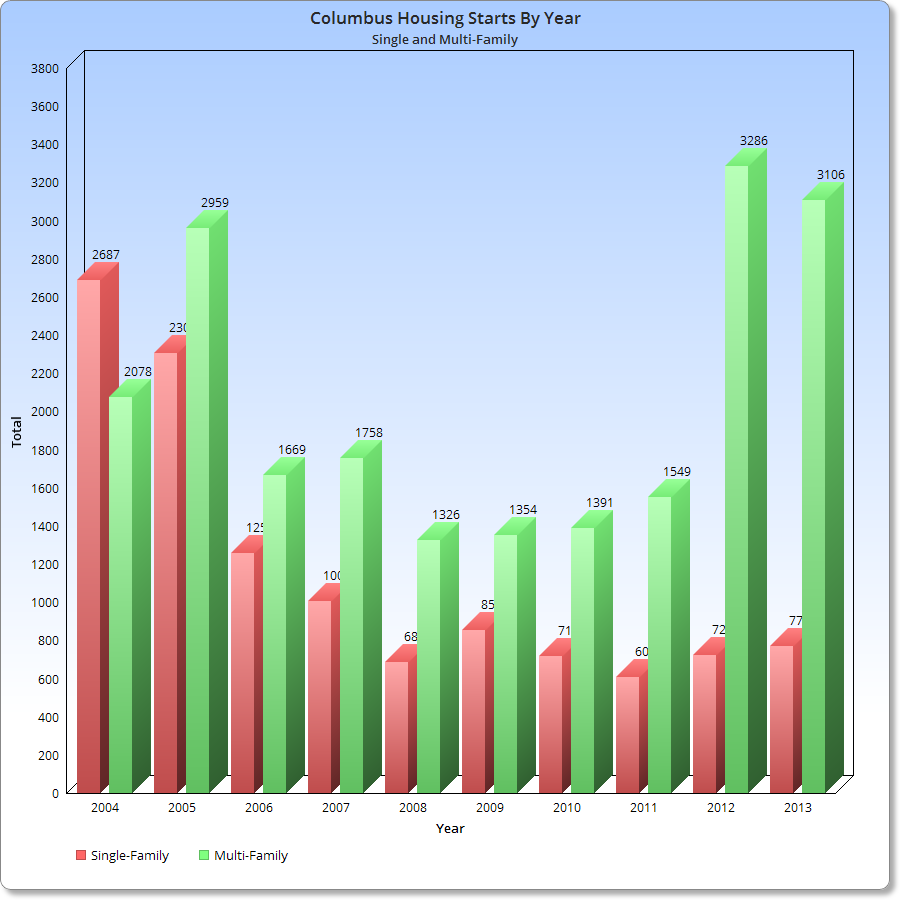
We’ve been hearing a lot the last few years about how residential construction has largely turned toward the rental variety, and no more so than in the urban areas. I have tried to document the level of activity in the city in my development page, but it doesn’t quite show what’s going on in the city overall. I did a little research and found some surprising realities that fully support the rental boom. The residential construction trends of Columbus have changed significantly in recent years.
Here is a graph of annual housing construction permits from 2004-2013 broken down by multi-family and single-family types. The chart above is based on the # of units, not the number of overall projects.
So what do the numbers say? Well, it raises some interesting questions. First, was the amount of single-family home construction on the decline before 2004 given the downward trend from that year through 2005? And was multi-family construction on the rise during the same period? Did the recession merely interrupt a trend that began more than a decade ago and resurfaced strongly in recent years? It’s hard to say for sure as I don’t have information before 2004, but regardless, it is clear that multi-family construction is the preferred residential preference right now by builders. Single-family home construction, however, has remained steady and well below its previous peak of the last decade.
This continued low level of single-family construction has likely contributed to the fact that area sales in that market have been down for several months now due to a lack of inventory. Prices, however, have risen.
Unfortunately, I have been unable to update this site for about a month, but I am back now and have quite a bit to add. First, I have the numbers for the local Housing Market Update February 2014. Due to changes in the way the numbers were gotten, January’s were not available. I still do them for 21 major areas of Franklin County, however, and here they are. As always, the data is from Columbus Realtors.