Tract Demographic Changes Mapped


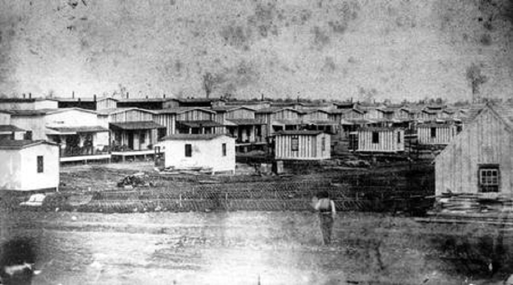
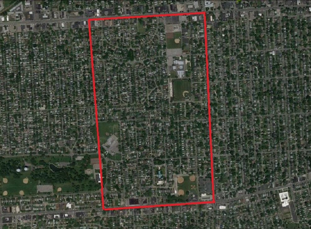
One of the most interesting things about the last census- at least to me- was the data on what demographic groups were moving where in Columbus. The following series of maps show the central core of Columbus and how the 4 major racial/ethnic groups have been changing in the area, both in 2000 and 2010.

While I can’t directly post images, the best way to look at the following map series is to open the 2000 and 2010 versions and do a side by side comparison.

White Demographic
2000

http://www.washingtonpost.com/wp-srv/special/nation/census/2010/?custommap=1,0,1,0,40.00535,-83.0034,11
In the 2000 map above, you could almost count the number of urban tracts with a growing White population on one hand. Even as far out as the I-270 corridor, there was a distinct lack of tracts where this group was growing. The vast majority of the growth in this demographic was in the far suburbs.
2010
http://www.washingtonpost.com/wp-srv/special/nation/census/2010/?custommap=1,0,2,0,40.00535,-83.0034,11
By 2010, there had been some interesting changes. First, the ring of strong suburban growth seems to have lessened some, or at the very least, spread out more. Meanwhile, the tracts that were losing the White demographic pushed further out as well into some of these suburban areas. In the city’s urban core, the White population has clearly also been on the rise. While there were just a few positive tracts in 2000, just about every tract between Merion Village and Clintonville was growing in White population by 2010, as well as strong growth in the Near East Side, the Easton area and Downtown. Even a few tracts in the southern portions of Linden saw increases.

The question is, how will the map look in 2020? If the trends continue, the urban core should continue to expand its growth in this demographic. Sort of a reverse donut hole growth pattern.

Black Demographic
2000

http://www.washingtonpost.com/wp-srv/special/nation/census/2010/?custommap=1,1,1,0,40.00535,-83.0034,11
In 2000, much of the urban core of Columbus was losing the Black demographic. While not nearly as stark as the 2000 map for Whites, the suburbs were once again the easy winner for this demographic’s best growth.
2010
http://www.washingtonpost.com/wp-srv/special/nation/census/2010/?custommap=1,1,2,0,40.00535,-83.0034,11
The 2010 map does show improvement, with more urban tracts gaining. The area of losses are almost exclusively concentrated on the Near East Side and Southeast Side. These same areas have historically been largely African American neighborhoods, so it may just be a case of majority population shift.

Asian Demographic
2000

http://www.washingtonpost.com/wp-srv/special/nation/census/2010/?custommap=1,3,1,0,40.00535,-83.0034,11
In 2000, Asian growth was fairly widespread, even in the urban core. There were weak spots, but not nearly as bad as the ones above.
2010
http://www.washingtonpost.com/wp-srv/special/nation/census/2010/?custommap=1,3,2,0,40.00535,-83.0034,11
By 2010, though, there were some big changes. Out of the 4 demographic groups looked at, Asians were the only group which looks to have left the urban core more in the 2000s than they did in the 1990s. While other groups are increasing their presence in the city, Asians are doing just the opposite. There are still strong pockets of growth, and it’s still not as bad as Whites, but clearly there is a different dynamic to their moving patterns than with the other 3.

Hispanic Demographic
2000

http://www.washingtonpost.com/wp-srv/special/nation/census/2010/?custommap=1,2,1,0,40.00535,-83.0034,11
Hispanics had the best overall growth map in 2000, with widespread, strong growth across most areas of the city. The inner West Side did the worst and the suburbs did the best, but overall it’s not bad.
2010
http://www.washingtonpost.com/wp-srv/special/nation/census/2010/?custommap=1,2,2,0,40.00535,-83.0034,11
2010 showed an even stronger growth by Hispanics across the city. There were only about 15 tracts total between Downtown and the suburbs that did not see growth in this demographic, out of more than 200.

It seems clear from these maps that the urban areas of Columbus are starting to become more attractive, or at least were the previous decade. Recent years have only seemed to strengthen this trend.

To see census tract data for Columbus going back to 1930, visit here: Census Tract Maps


Columbus History Camp Chase


Columbus history Camp Chase Columbus, Ohio
Not long after the firing on Fort Sumter, South Carolina on April 12, 1861, the act that would begin the Civil War, President Lincoln called on the North to supply tens of thousands of volunteers to fight. Ohio stepped up, and eventually would have nearly 320,000 soldiers, the 3rd highest total in the North. However, it would have the highest % of enlisted men of any state in the North. And of course, the state would supply some of the war’s most famous generals, including Grant, Sherman, Sheridan and the infamous George Armstrong Custer, who would die along with all of his men at the Battle of Little Big Horn in 1876.

After Lincoln’s call to arms, Camp Jackson was established in Columbus for training and organization of these new recruits. I haven’t been able to find exactly where this was in Columbus, but it proved too small to handle the tasks it was supposed to, so the following month Camp Chase was commissioned, and on June 21, 1861 it was officially dedicated. Named after then Secretary of the Treasury Salman P. Chase, the borders of the camp were W. Broad Street, Westgate Avenue, Hague Avenue and Sullivant Avenue, so it encompassed a fairly large chunk of what would later become the Hilltop and eventually the Westgate neighborhood.
Columbus history Camp Chase barracks Columbus, Ohio
Over the next 4 years as the war raged on, over 150,000 Union soldiers came through Camp Chase, but so did 25,000 Confederate prisoners of war, with a peak of 9,423 of them held on the grounds by 1865. Conditions for them, of course, were not particularly great, nor was medical care. Food and clothing rations were too few, and there were so many POWs that overcrowding was a constant problem. Over the years, well over 2,000 of them died from disease, malnutrition, wounds or for attempts at escape. On the southern border near the intersection of Hague and Sullivant, a cemetery was established in 1863 for the detained Confederates who did not survive their imprisonment. By the time Camp Chase closed in July of 1865, 2,260 Confederates had been buried there.

Columbus history Camp Chase cemetery Columbus, Ohio

A large rock within the cemetery marking the graves.


Today, the cemetery is all that remains visible of the camp. After the war, the buildings were gradually dismantled until little trace remained of the land’s former use. Still, the site remained largely empty of development until the first decades of the 20th century when the Westgate residential neighborhood was constructed. The only other visible signs besides the cemetery today can be seen by aerial pictures. While Hilltop is a dense, residential area with hardly an empty lot to be found, the land within the former boundaries of the camp contain several school lots containing ball diamonds. When the Westgate neighborhood was built, the schools took advantage of the empty land for this purpose. Besides Westgate Park, which exists just outside of the former boundaries, there are very few other empty parcels of land in Hilltop.
Columbus history Camp Chase boundary Columbus, Ohio

The approximate location of Camp Chase between West Broad Street and Sullivant in Hilltop.

The History Links takes a look back at all sorts of other history for the Columbus area.


Cool Link Columbus Job Density


The Brookings Institute recently released a study on job density, or basically where jobs are most heavily concentrated within metro areas.

Here is how Columbus job density compared to other Ohio metros.

Total Jobs Located within 3 Miles of the Central Business District (Downtown) in 2010, Most to Least
1. Columbus: 157,193
2. Cincinnati: 151,956
3. Cleveland: 127,846
4. Dayton: 75,481
5. Akron: 66,247
6. Toledo: 59,552
7. Youngstown: 54,368

% of Total Metro Jobs Located within 3 Miles of the Central Business District (Downtown) in 2010, Highest to Lowest
1. Youngstown: 27.3%
2. Akron: 24.9%
3. Dayton: 24.5%
4. Toledo: 23.8%
5. Columbus: 21.2%
6. Cincinnati: 17.7%
7. Cleveland: 15.4%

So Columbus has the highest total number of jobs within 3 miles of the CBD, but is in the bottom half for % of total metro jobs in that area.

Jobs Change from 2000-2010 for all Jobs Located within 3 Miles of the CBD, Best to Worst
1. Toledo: -15,412
2. Akron: -16,700
3. Youngstown: -17,307
4. Columbus: -30,338
5. Cincinnati: -31,717
6. Dayton: -32,420
7. Cleveland: -54,134

% Jobs Change from 2000-2010 for all Jobs Located within 3 Miles of the CBD, Best to Worst
1. Cincinnati: -1.9%
2. Cleveland: -2.1%
3. Akron: -2.5%
4. Columbus: -2.5%
5. Toledo: -2.5%
6. Youngstown: -2.9%
7. Dayton: -3.9%

At first glance, this may seem like horrible news, and while it’s not necessarily good, almost all metros lost jobs in this area, even high growth cities like Charlotte, Atlanta, Dallas, etc. This has a lot to do with the suburbanization of the nation over the last several decades, including during most of the 2000s. Jobs left the central core to spread out into the suburban areas people were moving to.

Total Jobs Located Between 3 and 10 Miles from the CBD in 2010, Highest to Lowest
1. Columbus: 321,508
2. Cleveland: 317,128
3. Cincinnati: 252,789
4. Dayton: 164,453
5. Toledo: 137,339
6. Akron: 117,986
7. Youngstown: 89,711

% of Total Metro Jobs Located Between 3 and 10 Miles from the CBD in 2010, Highest to Lowest
1. Toledo: 54.8%
2. Dayton: 53.4%
3. Youngstown: 45.1%
4. Akron: 44.3%
5. Columbus: 43.4%
6. Cleveland: 38.1%
7. Cincinnati: 29.5%

% Jobs Change 2000-2010 for all Jobs Located Between 3 and 10 Miles from the CBD, Best to Worst
1. Dayton: +1.5%
2. Youngstown: +1.1%
3. Akron: +0.7%
4. Toledo: -0.1%
5. Cincinnati: -1.4%
6. Cleveland: -1.4%
7. Columbus: -2.4%

The positive % changes even while the area lost jobs has to do with how many the share of total metro jobs. While the area may have lost jobs, its share of the entire metro grew as other areas shrank faster.

Finally, the far suburbs…

Total Jobs Located between 10 and 35 Miles from the CBD in 2010, Highest to Lowest
1. Cincinnati: 452,895
2. Cleveland: 386,727
3. Columbus: 262,003
4. Akron: 82,260
5. Dayton: 67,838
6. Youngstown: 54,709
7. Toledo: 53,736

% of Total Metro Jobs Located Between 10 and 35 Miles from the CBD in 2010, Highest to Lowest
1. Cincinnati: 52.8%
2. Cleveland: 46.5%
3. Columbus: 35.4%
4. Akron: 30.9%
5. Youngstown: 27.5%
6. Dayton: 22.0%
7. Toledo: 21.4%

% Jobs Change 2000-2010 for all Jobs Located Between 10 and 35 Miles from the CBD, Best to Worst
1. Columbus: +5.0%
2. Cleveland: +3.5%
3. Cincinnati: +3.3%
4. Dayton: +2.5%
5. Toledo: +2.5%
6. Akron: +1.7%
7. Youngstown: +1.7%

So what do all these numbers show? Well, the larger the metro, the more spread out it seems to be as far as where jobs are located. Smaller metros like Akron and Dayton are more compact. Columbus is the most compact of the 3-Cs and has the most total jobs, by far, within 10 miles of its core of any metro, but not by %. None of the metros saw real jobs growth within 10 miles of their cores, which is to be expected. However, in recent years, urban development has exploded, and companies seem to be shifting jobs closer to the center. It remains to be seen if these are long term trends or just a blip.


Columbus and Segregation 1970 and 2010


Columbus and segregation history

A cool interactive map has come out showing how cities/metros have changed over time in terms of segregated census tracts. http://www.theatlanticcities.com/politics/2013/04/new-interactive-graphic-charts-integration-268-cities/5336/ Here are the results for Ohio’s metros.

The number is based on the dissimilarity index, with 0 being the most racially integrated and 100 being the most racially segregated. They are for the entire metro area’s census tracts.

Most to Least Segregated Metros in 1970
1. Cleveland: 88.3
2. Dayton: 86.5
3. Toledo: 84.3
4. Cincinnati: 80.8
5. Columbus: 79.2
6. Youngstown: 77.2
7. Akron: 76.8
8. Canton: 74.4

So in 1970, it’s pretty clear that all of the metros were very segregated, with Cleveland, surprisingly, being the most segregated of the bunch.

Most to Least Segregated Metros in 2010
1. Cleveland: 72.1
2. Cincinnati: 66.4
3. Youngstown: 64.9
4. Dayton: 62.9
5. Toledo: 62.7
6. Columbus: 59.2
7. Akron: 57.3
8. Canton: 53.0

Fast forward 40 years and they’ve all become less segregated. Cleveland is still the worst and Canton is still the best. Every other metro has shifted positions. Columbus dropped a spot.

Change from 1970-2010, Best to Worst
1. Dayton: -23.6
2. Toledo: -21.6
3. Canton: -21.4
4. Columbus: -20.0
5. Akron: -19.5
6. Cleveland: -16.2
7. Cincinnati: -14.4
8. Youngstown: -12.3

Dayton has seen the biggest improvement, Youngstown the least.


April 2013 Project Updates for Downtown


These monthly updates do not include all ongoing projects, but just updates on the most significant or those that have recently made news. To see the full list, check out the Columbus Development page.

Downtown
1. The ongoing Neighborhood Launch expansion continues The current expansion includes a pair of 5-story buildings along E. Long Street at N. 5th. The two buildings will contain about 260 new apartments. The foundations are mostly complete and the buildings are now going vertical. The former Faith Mission at 315 E. Long will be renovated and converted into an event and meeting space for new residents of the project.
2. Construction continues on the High Point residential project at Columbus Commons. Just over 300 apartments as well as ground floor retail and a handful of park-side restaurants will be included once complete. Work is well underway on the 2nd story of these twin 6-story buildings.
3. An application for architectural review has been submitted to the downtown commission for Discovery Commons, a 5-story residential project at E. Spring and Neilston that will include 102 apartments and 70 underground parking spaces. This project has been floating around for over a year, so the recent submission suggests this may finally start to move forward.
4. The historic corner building at 101 S. High Street was recently announced to be renovated into mixed-use. The 4-story building will have Heartland Bank take over the bottom floor with the top 3 floors being residential. No word on how many units it would be, but the renovation is expected to start later this year.
5. The Hills Market at 96 Grant Avenue finally opened a few weeks ago after long construction delays put off the original opening date by almost 4 months.
6. The Atlas building will finally begin its renovation and conversion to 186 apartments and ground-floor retail later this spring. Historic preservation credits were issued for the building at 8 E. Long Street earlier this year.
7. Renovation and expansion of the old Police HQ building at N. Ludlow and W. Gay is nearing completion. The building will allow consolidation of local offices from other buildings. The fate of the vacated buildings nearby remains unannounced.
8. The LeVeque Tower’s renovation and conversion to mixed-use continues. A hotel, offices and several dozen residential units are in the works once complete later in the year.
9. The Columbus Metropolitan Library Main Branch at S. Grant and E. Town Streets recently announced purchase and expansion plans for the adjacent old Deaf School. Construction should begin sometime this year.

Detailed lists of present, past and future Columbus development are included on the Development page.