I hear all the time how Columbus is extremely suburban (low density) in its development. But where does it actually rank with its peers? One metric is looking at exurbia, the far outer suburban areas that are largely made up of sprawl. How does exurbia in the Columbus metro compare to other places?
I looked at metros of similar size to Columbus (1.5-2.5 million).
Metro Population Living in Exurbia, 2000 1. Nashville, TN: 23.1% 2. Austin, TX: 21.8% 3. Charlotte, NC: 16.7% 4. Orlando, FL: 14.7% 5. San Antonio, TX: 12.6% 6. Indianapolis, IN: 10.5% 7. Kansas City, KS: 9.0% 8. Cincinnati: 6.7% 9. Virginia Beach: 6.0% 10. Portland, OR: 5.8% 11. Columbus: 4.9% 12. Sacramento, CA: 4.1% 13. Las Vegas, NV: 3.1% 14. Providence, RI: 2.9% 15. Milwaukee, WI: 2.8% 16. San Jose, CA: 1.1% 17. Cleveland: 1.0% 18. Pittsburgh, PA: 0.8%
Metro Population Living in Exurbia, 2010 1. Austin, TX: 32.3% 2. Nashville, TN: 27.9% 3. Charlotte, NC: 22.7% 4. Orlando, FL: 21.7% 5. San Antonio, TX: 20.3% 6. Indianapolis: 15.8% 7. Kansas City, KS: 14.4% 8. Las Vegas, NV: 10.6% 9. Cincinnati: 8.8% 10. Columbus: 7.7% 11. Sacramento, CA: 7.7% 12. Virginia Beach, VA: 7.4% 13. Portland, OR: 6.7% 14. Milwaukee, WI: 3.3% 15. Providence, RI: 3.2% 16. Cleveland: 1.7% 17. Pittsburgh, PA: 1.1% 18. San Jose, CA: 1.1%
Metro Population Living in Exurbia Total % Change 2000-2010 1. Las Vegas, NV: +389.9% 2. Sacramento, CA: +123.5% 3. Austin, TX: +103.8% 4. San Antonio, TX: +101.6% 5. Orlando, FL: +92.0% 6. Charlotte, NC: +82.5% 7. Columbus: +78.4% 8. Kansas City, KS: +75.6% 9. Indianapolis, IN: +72.9% 10. Cleveland: +58.3% 11. Nashville, TN: +46.4% 12. Cincinnati: +38.7% 13. Portland, OR: +33.5% 14. Virginia Beach, VA: +31.2% 15. Pittsburgh, PA: +28.0% 16. Milwaukee, WI: +20.8% 17. Providence, RI: +10.3% 18. San Jose, CA: +9.0%
So what these numbers show is that Columbus is actually in the bottom half of exurban population vs. its 17 peers, but is in the top half of growth in that population. As can be imagined, a large part of this growth came before the recession.
Metro Exurban Population Growth 2000-2007 1. Las Vegas, NV: +285.2% 2. Sacramento, CA: +104.2% 3. Orlando, FL: +78.3% 4. Austin, TX: +74.2% 5. Columbus: +62.0% 6. Charlotte, NC: +58.4% 7. San Antonio, TX: +56.2% 8. Kansas City, KS: +55.4% 9. Indianapolis, IN: +46.4% 10. Nashville, TN: +30.6% 11. Portland, OR: +29.1% 12. Cleveland: +27.0% 13. Cincinnati: +26.2% 14. Virginia Beach, VA: +25.7% 15. Pittsburgh, PA: +16.5% 16. Milwaukee, WI: +13.3% 17. Providence, RI: +10.9% 18. San Jose, CA: +5.9%
Metro Exurban Population Growth 2007-2010 1. San Antonio, TX: +29.1% 2. Las Vegas, NV: +27.2% 3. Cleveland: +24.7% 4. Indianapolis, IN: +18.0% 5. Austin, TX: +17.0% 6. Charlotte, NC: +15.3% 7. Kansas City, KS: +13.7% 8. Nashville, TN: +12.1% 9. Columbus: +10.1% 10. Cincinnati: +9.9% 11. Pittsburgh, PA: +9.8% 12. Sacramento, CA: +9.5% 13. Orlando, FL: +7.7% 14. Milwaukee, WI: +6.7% 15. Virginia Beach, VA: +4.3% 16. Portland, OR: +3.3% 17. San Jose, CA: +2.9% 18. Providence, RI: -0.6%
Average Annual Rate Change Between 2000-2007 and 2007-2010 1. Cleveland: +117.1% 2. Pittsburgh, PA: +45.5% 3. San Antonio, TX: +34.8% 4. San Jose, CA: +25.0% 5. Milwaukee, WI: +22.2% 6. Indianapolis, IN: +1.8% 7. Nashville, TN: +0.0% 8. Cincinnati: -5.9% 9. Charlotte, NC: -29.4% 10. Kansas City, KS: -32.3% 11. Austin, TX: -34.1% 12. Columbus: -53.5% 13. Virginia Beach, VA: -57.6% 14. Las Vegas, NV: -60.8% 15. Portland, OR: -70.3% 16. Orlando, FL: -70.9% 17. Sacramento, CA: -71.0% 18. Providence, RI: -113.3%
So there you have it. Columbus is definitely not anywhere near the sprawl king it’s often made out to be, even within its own peer group. Outside of it, there are dozens of metros with far more.
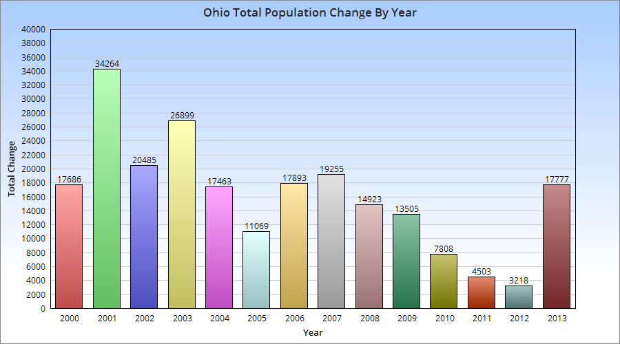
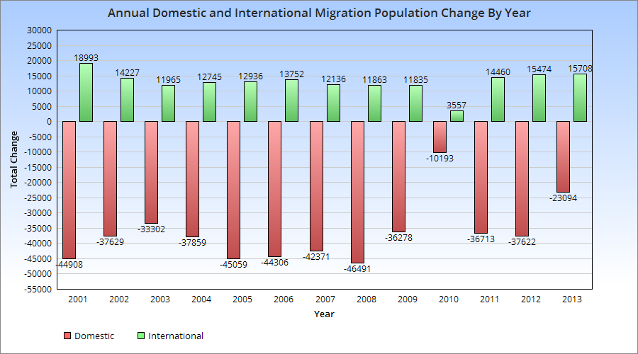
Back in November, I wrote about Ohio’s improving growth outlook. In that post, I examined domestic out-migration and domestic in-migration 2005-2012, and discovered that the net change had been improving. The state was losing fewer people over time domestically, and the difference had declined to under 2,000 people by 2012, a HUGE improvement from the start of the period.
Recently, the US Census released 2013 state population estimates, along with components of population change for the July 1st, 2012-July 1st, 2013 period. More positive news was to be found in those estimates.
First, Ohio’s population increased to 11,570,808, representing an annual increase of 17,777. While the increase is not particularly great, especially in comparison to states nationally, there are some positive nuggets with that number. The state held on to its position as the 7th most populous state, and the increase was the highest since pre-recession. The state moved up 18 spots in the total annual growth rankings 2012-2013 vs. 2011-2012. This was the best increase of all 50 states. It was also the best growth for the state since 2007. Did the state bottom out in 2012? Perhaps, but way too early to tell. Still, a very good improvement that halted a general decline.
The components of change are also interesting.
The migration patterns show a few things. First, 2013 had the 2nd highest rate since 2000 of in-international migration. It was also one of the best years (since 1996) for domestic in-migration.
The question is, can Ohio keep improving or is this just a temporary blip? Time will tell.
There’s been some discussion over the last few years about how driving habits are changing nationally. I’ve seen at least a few reports suggesting that overall driving is actually on the decline and has been for some time. This even while the population of the US continues to rise. A http://uspirg.org/sites/pirg/files/reports/US_Transp_trans_scrn.pdf”>new report has come out detailing the changing habits of cities, including the changing Columbus transit scene.
Percent Change in Per-Capita Vehicle Miles Traveled from 2006-2011 Columbus: -5.7% Dayton: -0.2% Akron: +1.2% Cleveland: +5.1% Youngstown: +5.4% Cincinnati: N/A Toledo: N/A
Columbus saw the largest drop in vehicle miles traveled, indicating that people there are driving less. Northeast Ohio all saw increases, which goes against the national trend. Toledo and Cincinnati did not have comparable numbers.
Percent Change in Per-Capita Passenger Miles Traveled on Mass Transit 2005-2010 Columbus: +1.6% Dayton: -0.6% Akron: -2.8% Youngstown: -8.3% Toledo: -28.8% Cleveland: -34.2% Cincinnati: -34.8%
Columbus was the only city to see an increase in its mass transit miles. Cleveland, Cincinnati saw drops of more than 1/3rd.
Change in the Proportion of Workers who Commuted by Car, 2000-2011 Dayton: -1.5% Columbus: -1.2% Toledo: -1.0% Youngstown: -1.0% Akron: -0.8% Cleveland: -0.4% Cincinnati: -0.2%
All 7 saw declines.
Change in the Proportion of Workers who Biked to Work, 2000-2011 Columbus: +0.3% Akron: +0.1% Cleveland: +0.1% Dayton: +0.1% Toledo: +0.1% Cincinnati: +0% Youngstown: +0%
Columbus saw the largest increase of all 7, although the actual changes are all small. No city measured in the US saw a change of more than +1.7%. The majority of cities were less than 0.3%.
Change in the Proportion of Workers Who Worked From Home, 2000-2011 Columbus: +1.4% Cincinnati: +0.9% Dayton: +0.8% Cleveland: +0.6% Toledo: +0.6% Youngstown: +0.6% Akron: +0.5%
Columbus again leads, though all cities saw increases.
Total Per-Capita Vehicle Miles Traveled in 2006 Cleveland: 8,285 Youngstown: 8,806 Akron: 9,379 Columbus: 9,956 Dayton: 10,084 Cincinnati: N/A Toledo: N/A
Total Per-Capita Vehicle Miles Traveled in 2011 Cleveland: 8,705 Youngstown: 9,284 Columbus: 9,385 Akron: 9,490 Dayton: 10,068 Cincinnati: N/A Toledo: N/A
Total Per-Capita Mass-Transit Miles Traveled in 2005 Cleveland: 172.0 Cincinnati: 110.0 Dayton: 64.7 Columbus: 52.6 Toledo: 51.6 Akron: 42.9 Youngstown: 17.3
Total Per-Capita Mass-Transit Miles Traveled in 2010 Cleveland: 113.0 Cincinnati: 71.8 Dayton: 64.1 Columbus: 53.4 Akron: 41.7 Toledo: 36.7 Youngstown: 15.9
% of Workers who Traveled by Car, 2011 Cleveland: 89.2% Columbus: 89.8% Cincinnati: 90.6% Dayton: 91.4% Akron: 92.5% Toledo: 93.1% Youngstown: 94.4%
National Rank (of 100 cities) in the % Change for those who Biked to Work, 2000-2011 Columbus: 15th Dayton: 37th Cleveland: 38th Akron: 39th Toledo: 49th Cincinnati: 74th Youngstown: 81st
% Change of Households with No Vehicle, 2006-2011 Akron: +2.2% Dayton: +1.0% Cleveland: +0.9% Columbus: +0.9% Cincinnati: -0.3% Toledo: -0.4% Youngstown: N/A
So what does all this data tell us? Well, for the most part, all Ohio cities are seeing car use decline in some way or another. Columbus performs strongly in car use declines and increases in at-home workers and increases in bike commuting. Mass-transit was where it performed the weakest, where it’s middle of the pack. Yet even there, it saw increases in its use.