The Census just came out with 2015 demographic numbers for all places with at least 65,000 people. Given that half the decade is over, it’s a good point to look at where Columbus stands relative to its national/Midwest peers in a foreign-born comparison. A few days ago, I gave numbers for GDP. In the next few posts, I will look at the people that make up the populations of these places.
First up, let’s take a look at foreign-born populations. I have looked at this topic some in the past, but I have never done a full-scale comparison for this topic.
Total Foreign-Born Population Rank by City 2000, 2010 and 2015 2000—————————————-2010———————————-2015 1. Chicago, IL: 628,903———–1. Chicago: 557,674—————1. Chicago: 573,463 2. San Jose, CA: 329,750——–2. San Jose: 366,194————-2. San Jose: 401,493 3. San Antonio, TX: 133,675—-3. San Antonio: 192,741———-3. San Antonio: 208,046 4. Austin, TX: 109,006————4. Austin: 148,431——————4. Austin: 181,686 5. Las Vegas, NV: 90,656——-5. Las Vegas: 130,503————-5. Charlotte: 128,897 6. Sacramento, CA: 82,616—–6. Chalotte: 106,047—————6. Las Vegas: 127,609 7. Portland, OR: 68,976———7. Sacramento: 96,105————-7. Sacramento: 112,579 8. Charlotte, NC: 59,849——–8. Columbus: 86,663—————-8. Columbus: 101,129 9. Minneapolis, MN: 55,475—–9. Portland: 83,026—————–9. Nashville: 88,193 10. Columbus: 47,713———–10. Indianapolis: 74,407———–10. Portland: 86,041 11. Milwaukee, WI: 46,122—–11. Nashville: 73,327—————11. Indianapolis: 72,456 12. Detroit, MI: 45,541———–12. Minneapolis: 57,846———–12. Minneapolis: 70,769 13. Providence, RI: 43,947—–13. Milwaukee: 57,222————-13. Milwaukee: 58,321 14. Nashville, TN: 38,936——-14. Providence: 52,926————14. Providence: 53,532 15. Indianapolis, IN: 36,067—-15. Orlando: 43,747—————-15. Orlando: 50,558 16. Virginia Beach, VA: 28,276–16. Virginia Beach: 40,756—–16. Omaha: 48,263 17. Orlando, FL: 26,741———17. Omaha: 39,288—————–17. Detroit: 39,861 18. Omaha, NE: 25,687———18. Kansas City: 35,532———18. Virginia Beach: 38,360 19. Kansas City, MO: 25,632—19. Detroit: 34,307—————-19. Kansas City: 37,787 20. Cleveland: 21,372————20. St. Louis: 23,011————–20. Pittsburgh: 28,187 21. Grand Rapids, MI: 20,814–21. Pittsburgh: 18,698————21. St. Louis: 21,802 22. St Louis, MO: 19,542——-22. Cleveland: 17,739————-22. Grand Rapids: 19,176 23. Pittsburgh, PA: 18,874—–23. Grand Rapids: 16,615——–23. Cleveland: 18,830 24. Cincinnati: 12,461———–24. Cincinnati: 16,531————-24. Cincinnati: 16,896 25. Toledo: 9,475—————–25. Toledo: 11,559—————–25. Akron: 10,024 26. Akron: 6,911——————26. Akron: 8,524——————–26. Toledo: 9,257 27. Dayton: 3,245—————-27. Dayton: 5,102——————-27. Dayton: 7,381 28. Youngstown: 1,605———28. Youngstown: 3,695————28. Youngstown: 1,058
Here’s the 2000-2015 total change.
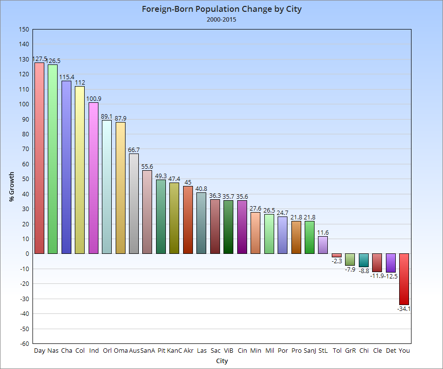
And the 2000-2015 change by %.
So Columbus has an above average total and growth compared to its peers nationally.
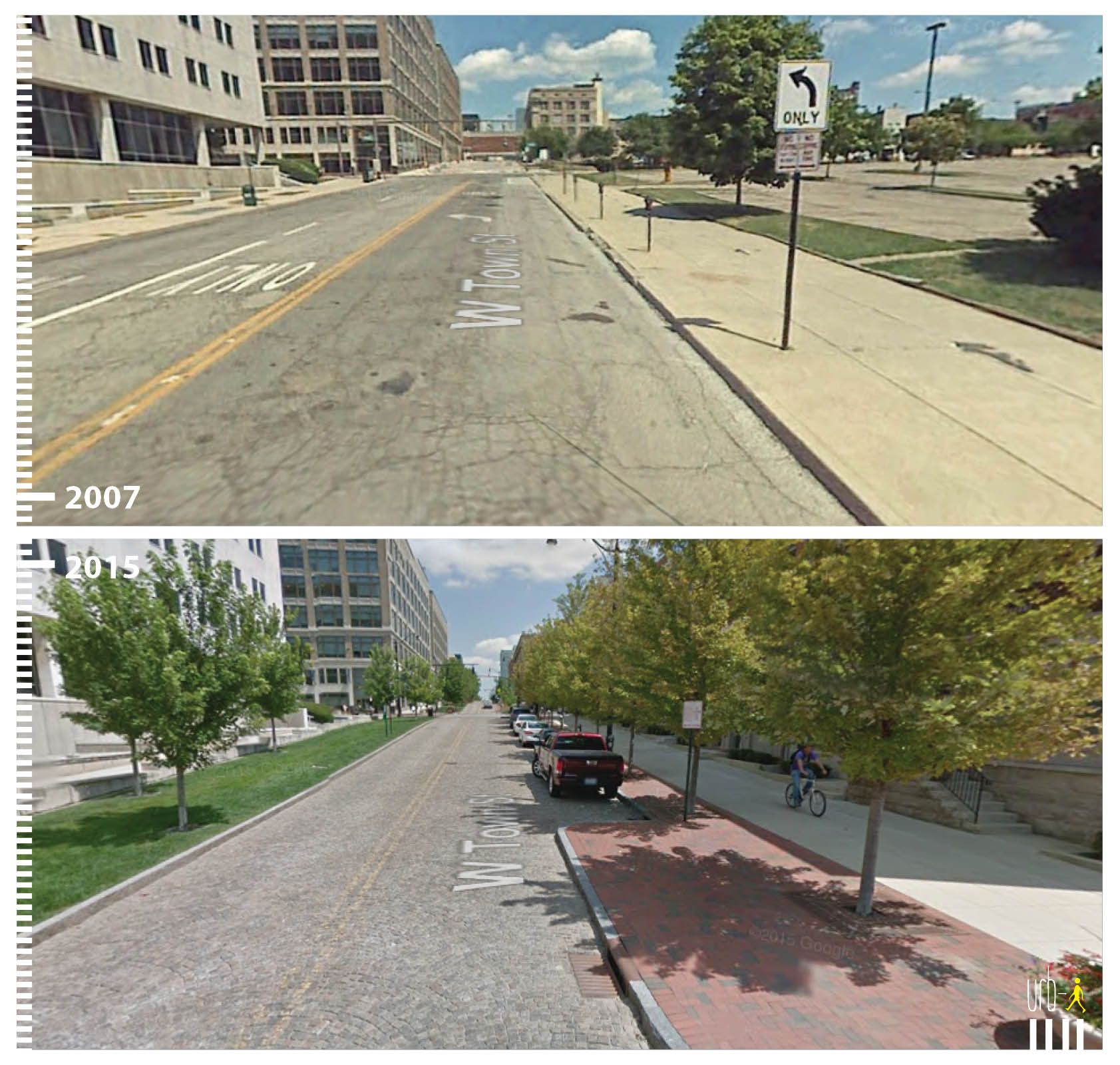
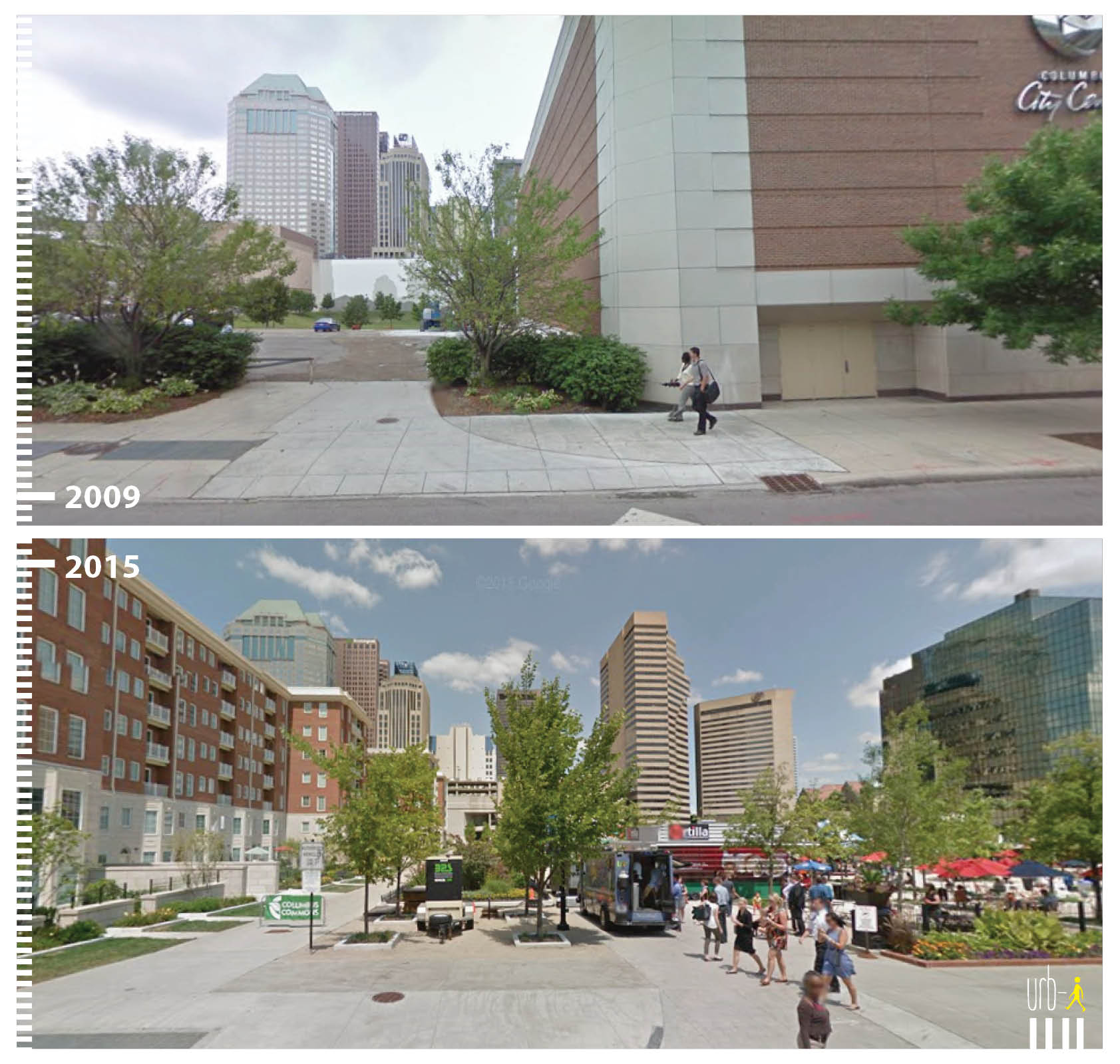
I saw this site mentioned on the CityLab site awhile back and thought it was a very cool idea. The site highlights how cities are transforming public spaces and making car-centric areas much more pedestrian, bike and transit friendly. Since I found the site, I have been lucky enough to become a regular contributor working to help make the site even better. The great thing is that anyone can send in before and after photos from their own cities of public space transformations. Take a look: http://www.urb-i.com/ The site covers cities across the world.
Columbus has several examples that I have added, but the photos are not yet updated on the site’s map. Until they are, here is a sneak peek:
The 2015 housing market was one of the strongest since before the recession, and 2016 looks to do even better. An ongoing problem, especially within the more urban markets, is a historically low inventory of available homes for sale. This has been a problem for several years now, as construction has failed to match demand.
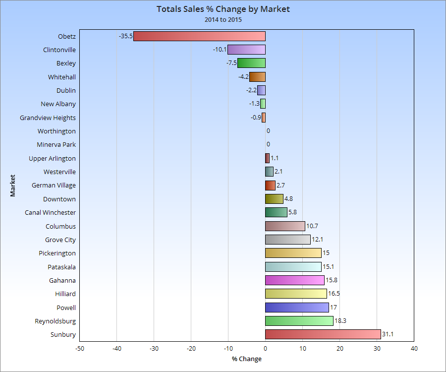
That lack of inventory really shows up in the yearly % change chart. Few urban markets have increased year over year, as they have a much more limited supply of housing, even as demand for urban housing has increased.
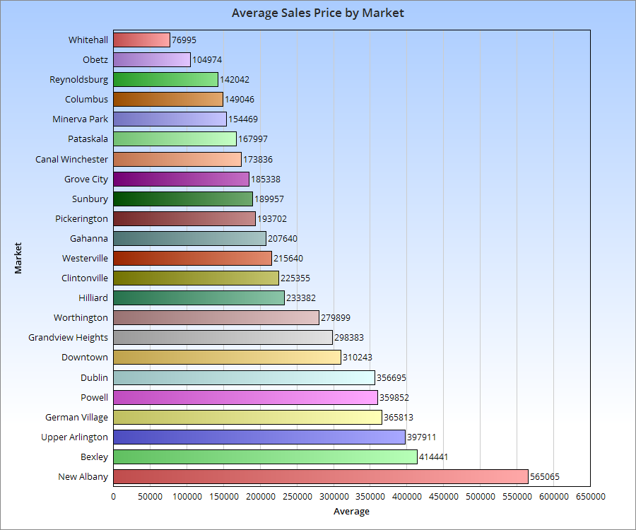
Let’s see how this impacted prices.
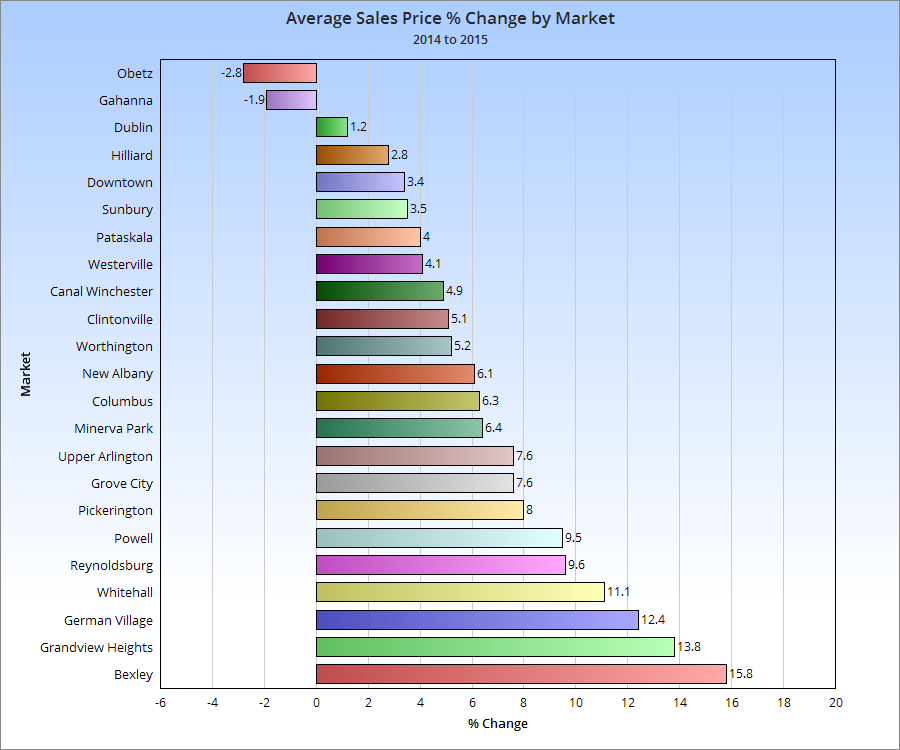
While urban markets were not necessarily the most expensive compared to suburban, more of them were generally towards the top half of price increases last year.
This summer has been wet… very wet. Rain has fallen on far more days than not, and cloud cover has hung thick and heavy in what are historically much sunnier months. To top it all off, temperatures have been somewhat below normal.
How wet has the Summer of Rain 2015 been up through today? Meteorological summer runs June 1st-August 31st, and today makes the midpoint of that period, so I thought it would be a good time to check in and answer that question.
Here are the top 10 wettest summers through yesterday. 1. 1958: 12.54″ 2. 2008: 11.68″ 3. 1990: 10.93″ 4. 2015: 10.66″ 5. 1949: 10.40″ 6. 1973: 10.23″ 7. 1917: 10.06″ 8. 1928: 10.02″ 9. 1937: 9.75″ 10. 1969: 9.38″
So 2015 is running the 4th wettest. It looks to be dry the next few days before more thunderstorms and rain return, so 2015′s position may end up rising.
What are the wettest full summers of all time? A few of the above years went on to be in the top 10, but not all. 1. 1958: 22.02″ 2. 1979: 20.92″ 3. 1995: 19.85″ 4. 2003: 19.39″ 5. 1969: 19.09″ 6. 1915: 18.92″ 7. 1992: 18.44″ 8. 1973: 17.81″ 9. 1989: 17.45″ 10. 1949: 16.54″
Summer 2015 needs about 6″ more to reach into the top 10 wettest summers, which at the current pace is more than possible.