Economic Segregation in Columbus


Economic segregation is basically where people living in the same city are segregated in terms of financial characteristics, such as housing prices or income. This is considered negative as the more economically segregated an area is, the harder it is for people, especially in lower income brackets, to move up financially. My report on economic segregation in Columbus focuses on household income within census tracts in Franklin County and where those household incomes are changing the most.

First of all, let’s look at the household income levels around the county, both in 2000 and 2014.
Economic segregation
In 2000, the median household income for the county was highest in the Upper Arlington and Grandview, Dublin, Bexley, Hilliard and the New Albany area. Downtown and adjacent areas had the lowest, as well as the general urban core and East Side.


By 2014, household income remained the highest in the same areas it was in 2000, but there were major improvements in many parts of the urban core, especially around Downtown, the Near East Side, Near South, Clintonville and the Short North. To illustrate this change better, take a look at the next map.


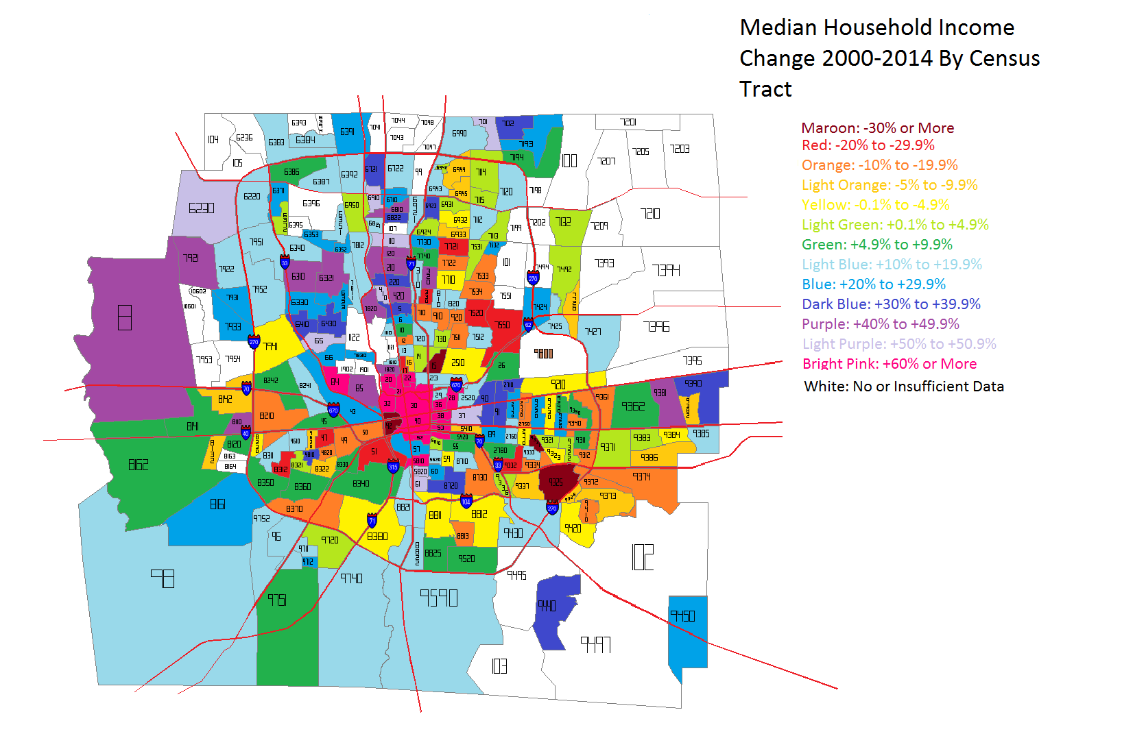
Unfortunately, because not all of 2014’s census tracts existed in 2000, I don’t have data for the entire county for comparison. But the trend is very clear. The areas that saw the biggest improvements in median household incomes were in the dead center of the county- Downtown, Near South and East Sides, as well as the Short North and Grandview. Only parts of Hilliard, Clintonville and Worthington really saw anything remotely as close. This indicates, at least to me, that the beating heart of revitalization and growth in the county is along the High Street corridor.

So now that we’ve established what the incomes look like across the county, let’s break it down further into income level brackets. This will help determine where economic segregation is a problem and where it isn’t.


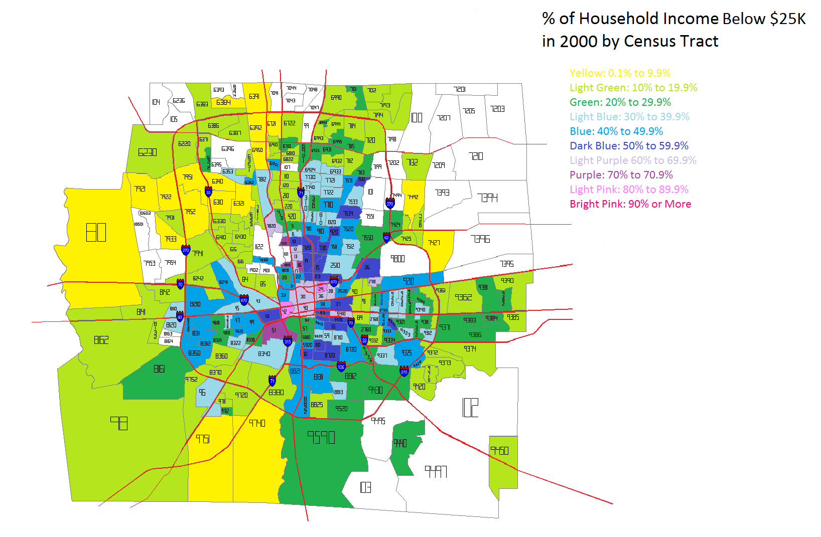
The lowest household income I looked at was Below $25K a year. In 2000, this income level was most heavily concentrated in the Downtown area and adjacent neighborhoods. The Near East Side, as well as Linden down through the east side of I-71 had the county’s highest % of households that earned this level of income. Hilltop and the West Broad Corridor were also fairly high.


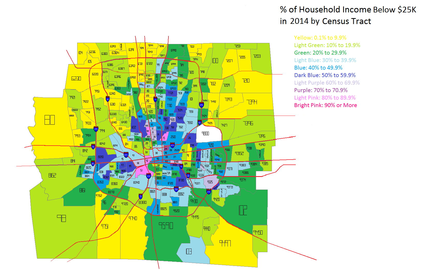
By 2014, the lowest household income level looked largely the same. However, there were also some noticeable difference. Downtown, the Near East Side, the Near South Side and parts of the North High Corridor saw obvious declines in this population, while it seemed to spread further east outside of 270 into suburban areas.


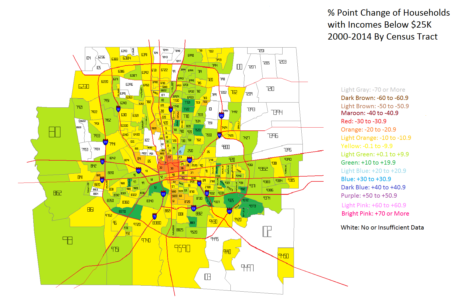
In the map above, we can see how Below $25K household incomes had changed in the tracts between 2000 and 2014 by % point change. Ironically, the urban core, especially along High and Broad streets saw the most consistent declines in this population while areas around and outside of 270 saw the most consistent increases. The good news is that more tracts saw declines than increases, but the map does indicate that poverty is perhaps moving further out from the core.

Next up is the household income level change that would be considered closest to middle class- $50K-$99K.


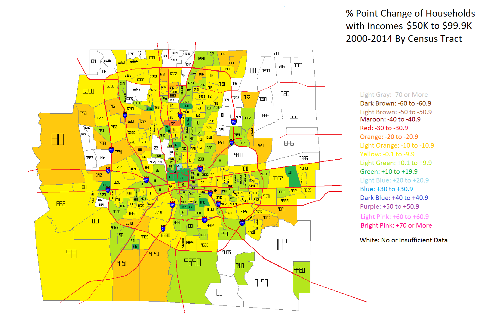
The urban core areas clearly saw the most consistent increases in middle class household income levels, while the outer suburbs almost universally declined in this metric. One explanation for this is that the lowest incomes in the core moved up into the middle class, while in the suburbs, middle class incomes moved into the upper class incomes. That would explain both the rise in the core, but the decline in the suburbs. But to prove if this is true or not, we have to look at the highest income levels- those of $100K and above.


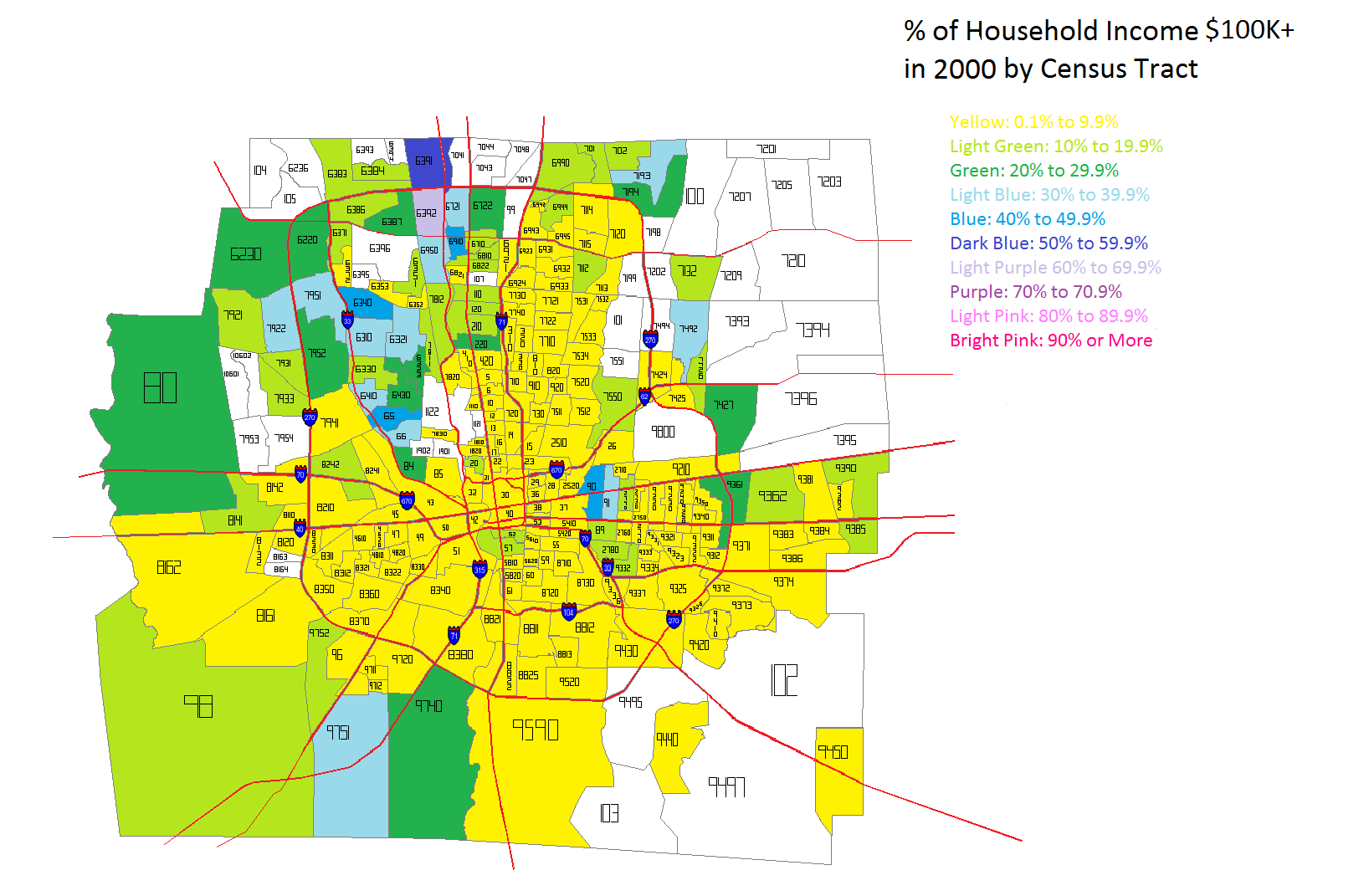
In 2000 the highest incomes were almost entirely outside of 270 except for Bexley and the Northwest Side communities like Dublin and Upper Arlington. It is likely that the New Albany area also had high incomes, but again, those tracts didn’t exist in 2000, so it is difficult to give that information.


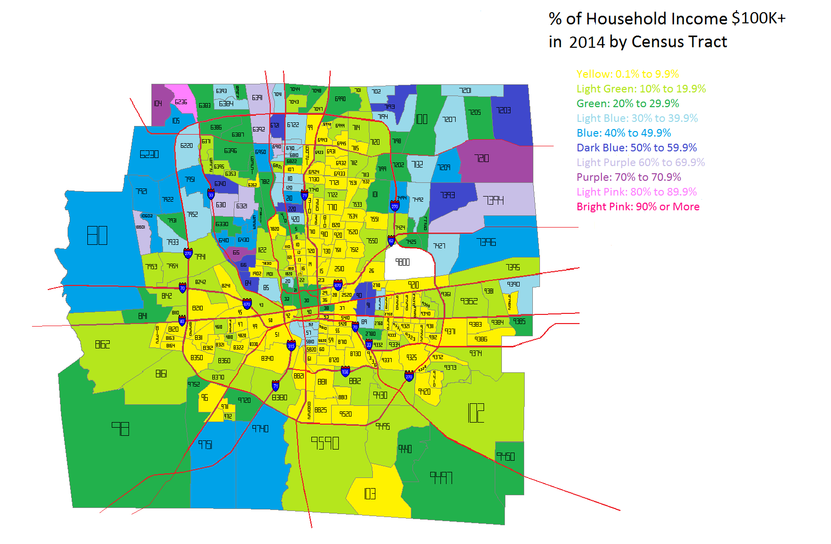
By 2014, while the Northern areas of Franklin County continued to have the highest incomes in general, gains were made in many parts of the county, including several within the urban core area.


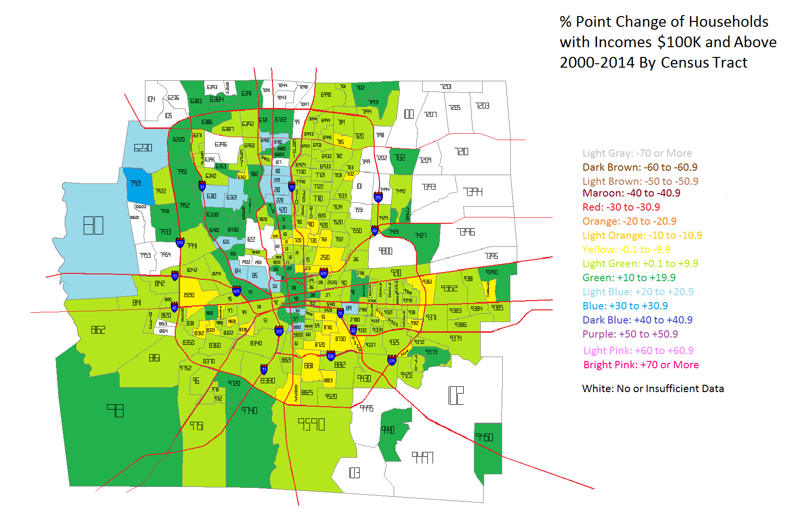
Between 2000 and 2014, there was almost universal growth of $100K+ incomes in Franklin County, with only small areas seeing declines. The Northwest communities, as well as areas in and around Downtown seemed to do the best.

Okay, so incomes levels are clearly improving in most of the county, but especially in urban core areas. But what is the difference between the highest and lowest incomes within each census tract? To find out, I took the % of households in each tract earning less than $25K a year vs. the % of households earning $100K or more. The % point difference between these two groups is a good indication of how much economic segregation exists. The closer this number is to 0, the more economically integrated a tract is. Negative numbers indicate that Below $25K household incomes outweigh those making $100K or more, while positive numbers are the reverse.


The 2000 map shows that Below $25K household incomes dominate inside I-270, particularly around Downtown and the East Side. Many tracts contain at least 40 % points more $25K incomes than $100K incomes. This shows that poverty was deeply concentrated around the center of the county. Suburban areas were more dominated by the reverse, where middle and upper class households were concentrated.


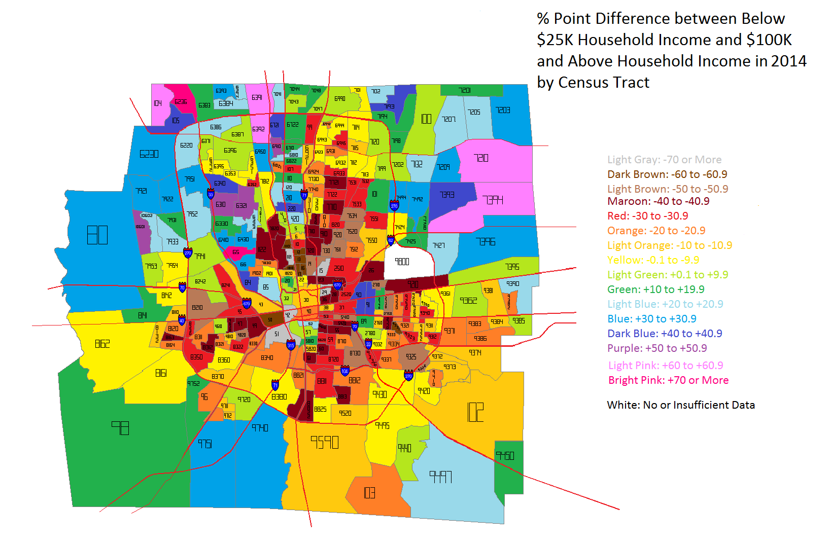
In 2014, the severely concentrated levels of the lowest incomes have eased in most locations. There are fewer tracts of 40+ point differences, especially around Downtown and the general High Street Corridor. Only the Campus area, for obvious reasons, and parts of Linden, largely remain unchanged.

So what does all this ultimately mean about economic segregation in Frankly County? To get a simplified sense of that picture, considering the final set of maps.


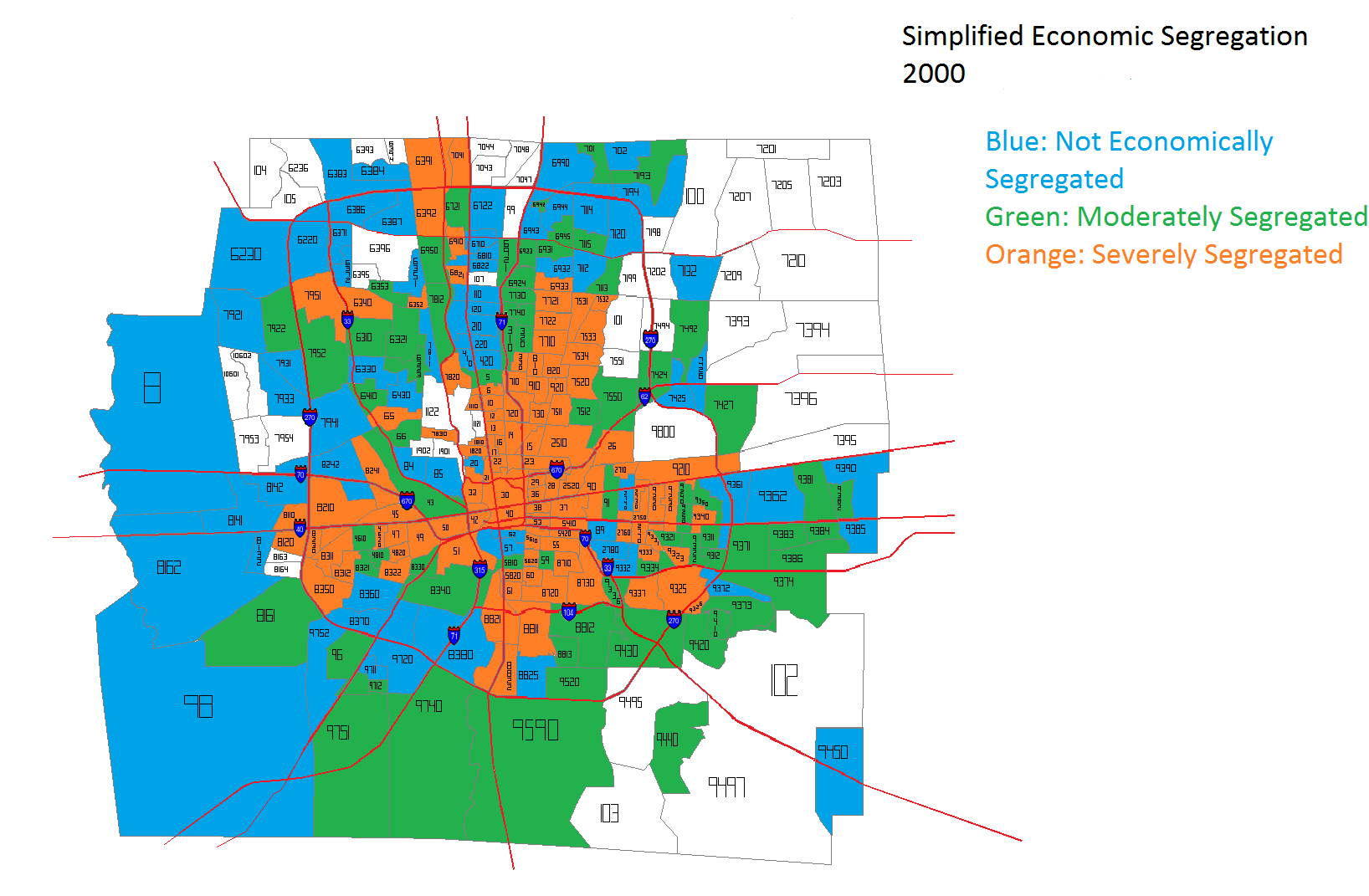
In the coloring, the blue tracts are tracts that have income point differences that are between -15 and +15. These are the tracts that are most economically integrated. Green tracts are those with differences of +/- 15 to 29 points, while orange represent those with +/- 30 points or more. Orange tracts are the most economically segregated. In 2000, most of the orange tracts were within I-270. In fact, they very closely represent the most urban part of Columbus- the 1950 city boundary. They are amazingly similar. Meanwhile, almost all the outer suburbs in 2000 were well integrated.


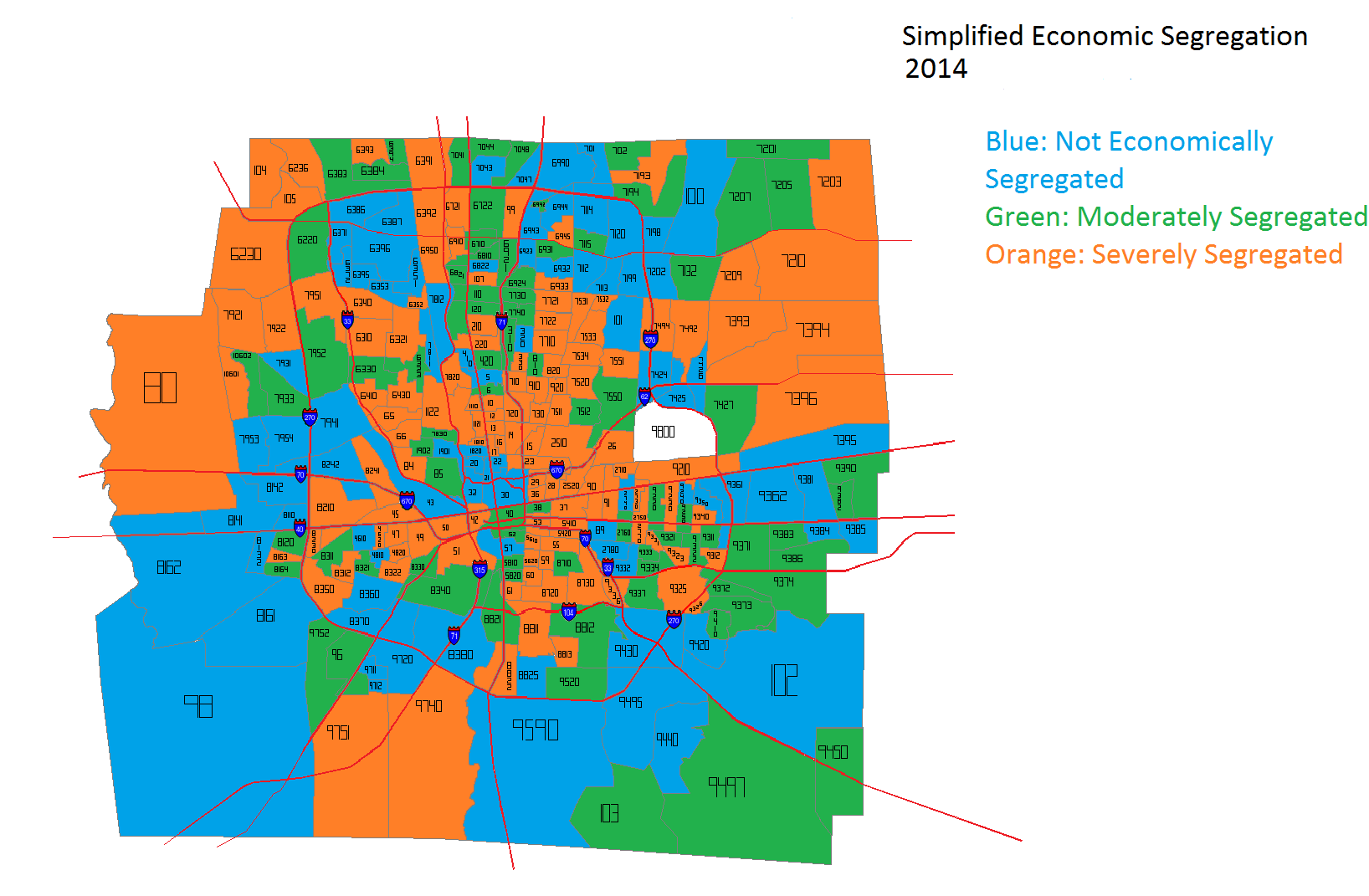
Fast forward to 2014 and the picture becomes significantly more convoluted. Being in the urban core vs. the suburbs does not automatically guarantee economic integration. Many suburbs are now as severely segregated as some of the urban core is, while parts of the urban core are as integrated as some suburbs.

Overall, it appears that Franklin County has improved its economic integration in the last decade or so, but there is still more than can be done. Economic incentives for providing more mixed-income housing and bringing more jobs to urban areas would likely help achieve a more integrated city and county.


A Glimpse at 1960s Preservation Efforts


In my research into finding photos and information on historic buildings in Columbus, I have come across some interesting documents related to why some buildings were demolished and how 1960s preservation efforts were often failtures. Take the Alfred E. Kelley House, which once stood at 282 E. Broad Street. Built over the course of about a year between 1837-1838, the house was a classic Greek Revival. Over the many years of its existence, the house functioned in multiple capacities, including as a school. During those other uses, the architecture was drastically altered, and by 1960, the year the house was proposed to be demolished to build the Christopher Inn, the historic nature had been “severely damaged”. Still, the house had survived 122 years by then, and a history-minded group of people got together to try and save it with the intent of restoration and operating a period museum.

1960s preservation efforts Alfred Kelley house

Photo taken in 1898.

The library in the Kelley House, circa 1900.

An elaborately decorated hallway in the Kelley House circa 1900.

The gutted house in 1958.

In early January 1962, the efforts to save the house during the previous year were detailed by one Dixie Sayre Miller, chairman of the Kelley House Committee, which had been formed on March 24th, 1961. The goal of the committee was as follows:

“Considering the time element and the importance of Kelley to the State**, the committee decided to ask the legislature for money for which to move the house intact. We, later, would seek private money with which to restore it.”

The Committee had some powerful allies at the time. State Rep. Chris McNamara and John Vorys, former delegate to the UN, were both in leadership roles. Given this, even during a time when preservation efforts took a clear backseat to development, the Committee did meet with some initial success. The Kelley House legislative subcommittee was able to pass an appropriations bill in July 1961 for the amount of $95,000. The governor vetoed the bill, calling the appropriation “frivolous”. In August, a member of the Committee, Lee Skilken, had the idea to solicit local contractors to volunteer in taking down the house in order for it to be moved. When the idea was presented to the property owners on September 5th, it was rejected because it could not be guaranteed that the property would be clear in time for construction to begin. Instead, the owners wanted a paid contractor to do the work so that the timeline could be met. The land had to be cleared by October 15th, 1961, and the Committee had to have the money to pay the contractor by September 15th.

Here is where the story becomes a bit shady and political. On September 6th, members of the committee went to the Governor for advice on how to proceed. He recommended that they go to the Emergency Board, which would be able to issue a grant towards the project. The Governor promised he would “not object, would not fight it and would not make a political issue of it”.
On September 15th, the money deadline, the Committee had raised only $11,000 towards the $35,000 cost of the paid contractor. However, the following day, they caught a break. Another contractor came forward offering to take down the house for just $20,000 and would begin immediately. Further, even though the Committee did not have the full $20,000, the contractor trusted that the Committee would have raised the amount by the time the work was completed. I’m not sure if such deals would ever occur in today’s environment, but they still happened 53 years ago.
Only 2 days after the contractor began to take down the house, the Emergency Board awarded a $20,000 grant to the Committee and the house was fully dismantled before the deadline of October 15th. Stonework and foundations of the house were moved to a holding site at Franklin Park, while interior detailing was stored “in a city building”, all waiting for funding to be assembled and restored at a new site. This new site was listed as being in Wolfe Park on “East Broad at Nelson Road”.


So, why isn’t the Alfred E. Kelley house at Wolfe Park today? Two things happened after October 15th. First, the Governor lied. On the very day that the Committee was supposed to pay the contractor, they received a call stating that the Governor had deemed the Emergency Board grant unconstitutional and was withholding the money, despite being his recommendation that the Committee seek the grant from it in the first place. This also after a promise that he would not interfere or stand in the way. The Committee considered legal action, but decided a costly court process was not “advisable”.

Without the $20,000, the Committee was only able to pay the contractor $6,000, who then threatened legal action for the full amount. Since the Committee had neglected to be incorporated, each member was personally responsible for a share of what was owed. By December 1961, the Committee had become incorporated and had managed to pay an additional $2,000, but still owed the majority of the contract.

That concluded the events through January 1962. After that time, there are mysteries that remain unknown (at least as far as I can tell). First, what happened to the Committee? Did it end up raising the amount to pay off the contractor or did they end up in court? Why had the Governor decided to prevent the Committee from getting the grant? Did he have a political axe to grind with members of the Committee? Finally, and far more importantly, what happened to the Kelley House? The materials were in storage in early 1962, but the house was never rebuilt. Were they destroyed? Did the contractor take possession of them if the Committee was unable to pay? Are they still sitting in some warehouse somewhere covered in half a century’s worth of dust? We may never know, though I suspect that someone out there has the answers.

An ironic article in 1961.

**Kelley helped save the state from bankruptcy during the Panic of 1837 by offering up his house, possessions and business interests as collateral.

Edit 7/18/2014:
I guess research pays off, and now, at least some of the mystery is solved, as contacts through readers led me to part of the answer. As mentioned above, part of the house’s remains, particularly the stone and brick portions, were stored at Franklin Park after the demolition in 1961. Five years later in 1966, these were moved to the Ohio Exposition Center at the Ohio State Fairgrounds. By then, the plans no longer called for putting the house back together and restoring it. Instead, the stone materials were planned to be incorporated into a new Ohio Historical Center in the late 1960s, presumably the one that now sits adjacent to the fairgrounds today. But that plan also fell through for unknown reasons. The stone materials were eventually gifted to the Western Reserve Historic Society in Cleveland. Some of the stone was used in the restoration of the Hale Farm, but much of it now sits tossed around outside in the elements, slowly being worn away. This still leaves many questions unanswered, such as where the interior portions of the house ended up and why none of the material was ever reused in Columbus despite preservation interests eventually securing the funds to do so.

A fireplace at the Hale Farm rebuilt with Kelley House stones.

Kelley House stones in the elements at Hale Farm near Cleveland.


Disastrous Decision for the Columbus Convention Center


I’m not a complainer… or at the very least, I don’t prefer to be. That said, there are simply times where negativity makes perfectly logical sense, and where it can serve a real purpose for true positive change. That is arguably the case now, with the a very poor decision about the Columbus Convention Center. I’ve not posted too much on my personal views regarding development, but recent events have prompted me to give some of them on this particular project.

Back in March, it was revealed that the Greater Columbus Convention Center leadership had asked the local development community to come up with ideas for a potential expansion project for the convention center itself. The building was designed by famed 1980s and early 1990s architect Peter Eisenman (who also did the Wexner Center for the Arts), and began construction in 1989 and completed in 1990. Originally, the building included 1.4 million square feet of space, with a large parking lot occupying the southeast corner of the Goodale/N. High Street intersection.
Columbus convention center

In 1999, an expansion pushed the structure north nearly to Goodale, but left enough space for a small plaza there.

So even after the initial construction of the original building, there were obvious problems with the design, not least of which was the pastel color scheme better suited for Miami Beach. The building simply didn’t have any street-level presence. Beyond a few entrances, the convention center’s design essentially created a block-long wall along High Street. There was no ground floor retail, no restaurants and no pedestrian interaction whatsoever. Back in 1989, this was just fine and dandy, because no one really cared about that and hadn’t since the days before WWII. Cities had become showplaces and for big buildings and massive surface parking lots that didn’t actually bring anyone to live there. There was no reason to walk on the streets of the city, and architects certainly didn’t think it was necessary to build for that purpose. The suburbs were the real future, blah blah blah. Everyone knows that story.

Since 1999, the neighborhood around the convention center has been rocketing upward in popularity. The nearby Arena District continued to grow and add development, and the Short North continued to rapidly revitalize and is now the city’s hottest neighborhood. For the past few years, there has been a push to attract more business to Columbus via the center and to highlight all the nearby amenities. To that end, the 12-story, 500+ room Hilton was completed across the street in 2012. The $140 million structure was built with public dollars, as a private developer did not step forward when the idea was put forth. The project was somewhat speculative, as the demand for hotel space in the city was not particularly high enough to warrant the construction (a good reason why private development hadn’t shown up), but because the city understood that hotel space was part of the key to attract bigger and better convention events, the hotel went up and Hilton came in to run the space.

The gamble seemed to be paying off, and in January, the Columbus Dispatch came out with an article about the hotel’s success. In the article, there was even the mention of adding even more hotel space, possibly up to 1,000 additional rooms, at some point in the near future.

So when the convention center authority announced it was searching for ideas for a new expansion project, that reality seemed to be taking place. In late March, there was this bit of news. Four separate proposals had been submitted by private developers on ideas to develop the north end of the convention center, along with the surface parking lot north of Goodale behind the 670 retail cap. The most prominent idea came from Wagenbrenner, with a pair of 15-story, mixed-use towers that would’ve included more than 100 residential units, hotel and event space, and ground-floor retail along High Street, an element the original building severely lacked.

Columbus convention center Wagenbrenner proposal

Wagenbrenner Development’s proposal.

Columbus convention center Wagenbrenner proposal rendering 2

Wagenbrenner Development’s proposal, looking southeast from High and Goodale.

Another proposal from Kaufman was far more modern, but still retained mixed-use elements.

Columbus convention center Kaufman proposal

The Kaufman proposal, looking east on Goodale.

In Wagenbrenner’s case, a hotel chain had already stepped forward interested in running the hotel aspect of the project, and there seemed little doubt that one of the proposals would move forward, based on quotes from the convention center authority and their stated goal for a “big idea” sort of project moving forward. The selection of the design would be announced in a few month’s time.

So what was the result of all that? On June 12th, 2014, an article in the Dispatch came out detailing a renovation and expansion project for the convention center.
The problem was that the article did not mention any mixed-use project whatsoever. Instead, it called for a general total-building renovation and a small 30,000 sf expansion and entranceway into the plaza space at the southeast corner of High and Goodale. Additionally, an 800-space parking garage would be built in the surface lot behind the 670 cap.

Wait, what?? When the article initially came out, there was confusion by many in the development-following community on just what was going on. Part of the confusion stemmed from the fact that the convention center authority had already announced a renovation project just 2 weeks prior to the release of the information on the mixed-use expansion project. That announcement had mentioned only a $30 million renovation, not the much larger one announced on June 12th. There had also been mention previously of the garage project, back in late 2013. In that discussion, the garage was being looked at to get ground-floor retail, especially closer to High, to take advantage of the neighborhood’s high walkability and retail success.

So at first, it was assumed that the garage and renovation project was a separate issue from the larger proposed expansion, but the article on June 12th specifically mentioned the very same land that the proposed mixed-use towers would’ve used. The following day, on June 13th, the Dispatch came out with a second article about the $125 million renovation/expansion project, and in it near the bottom, was this damning paragraph:

Jennison said the expansion of the convention center rules out earlier ideas of adding shops and residences to the north end of the facility, including the possibility of more hotel space. The authority’s board sought proposals for such a project earlier this year before ultimately ruling them out.

Suddenly, the 2-tower project had been swept under the rug and abandoned. Worse, it had been abandoned in favor of new carpets/fresh paint, a glorified 2-story entrance on Goodale, and a 1970s parking garage with no retail at all.

Columbus convention center parking garage

The parking garage proposal on Goodale behind the 670 retail cap, part of the convention authority’s new plan.

To say that there was some disbelief that such a decision had been made is putting it mildly. Across development forums, and even on the Dispatch articles themselves, the negative reaction was swift and universal. How and why had such a promising proposal for the convention center turned into the height of mediocrity? And why had potential fully private or a private/public funded project turned into a 100% publicly funded fiasco? The answer, it seems, is likely staring us in the face: The Hilton Hotel. Though it hasn’t been confirmed either way, there is an element of suspicion against the Hilton for obvious reasons. The Hilton is publicly financed and was publicly built. To have a private company build a competing hotel may have taken away business, and the convention authority was not interested in allowing competition for a public enterprise. There are precious few other logical reasons why the convention authority would actively seek private investment only to toss those proposals out a few months later in favor of a project that had no competing elements to it.

Worse still, the convention authority knows it’s a terrible plan in comparison. On June 15th, yet another article on the project appeared in the Columbus Dispatch.

In it, the idea is pushed forth that the renovation plan will be transformative, and will keep Columbus competitive for convention business. The problem is that it’s neither transformative nor competitive. Granted, the convention center is in need of renovations, as much of the interior is dated. But to spend $125 million on that renovation, combined with a laughably bad expansion/garage rather than actually going with, at the very least, a partially privately-funded project that would’ve actually improved Columbus’ competitiveness along with adding much needed pedestrian access and excitement to the intersection in question… well, it’s insanity. And the 3rd article only suggests that the convention authority is well aware of the overwhelmingly negative reaction to their plan and are attempting to justify it as much as possible. Only there can be no real justification. Bad decisions remain bad decisions. Whether this one was made to prevent competition or is simply an example of being out of touch with a stated goal, the convention center authority has made one of the worst decisions in Columbus development history… and that was after the city allowed Union Station to be demolished. Shame on them.


Housing Impact of Immigration


Housing impact of immigration

The Impact of Immigration on the Housing Market

For this link, you can zoom to county level and see the housing impact of immigration. Basically, the more immigration, the greater the impact.

An Examination of Franklin County Voting History


**Added data for the 2016 election.

With the presidential election just a few months ago, I thought it might be interesting to look at how Franklin County has voted over time. I went back to the presidential election of 1976 as that is the earliest I could find individual county totals.

First, let’s look at the total number of votes that were for the Democratic candidates vs the total number of votes for the Republican candidate.
An examination of Franklin County voting history
As the graph above shows, the number of Democratic votes has gradually been rising, and first surpassed Republican votes in the 1996 election. Meanwhile, Republican votes have more or less held steady, seeing no appreciable gains or declines over the course of the period of record.

What about votes as a %? For this, I was able to go back a bit further in the records.

This graph shows a very similar story, only a bit more stark, with Republicans clearly losing its share of the vote over the period with Democrats gaining.

Not only are the voting habits of the county changing, but Franklin County’s share of the statewide vote is also growing. In the graph below, Franklin County is compared to Cincinnati’s Hamilton County and Cleveland’s Cuyahoga County showing the % share of total statewide votes for each. Franklin County’s has been steadily rising over time, while both other counties have lost some share over the period.

And it is also becoming a bigger player in the statewide % of Democratic votes.

If these trends continue, Columbus’ Franklin County may end up passing Cuyahoga County not only as the most “Blue” county in the state, but the most influential county as well.