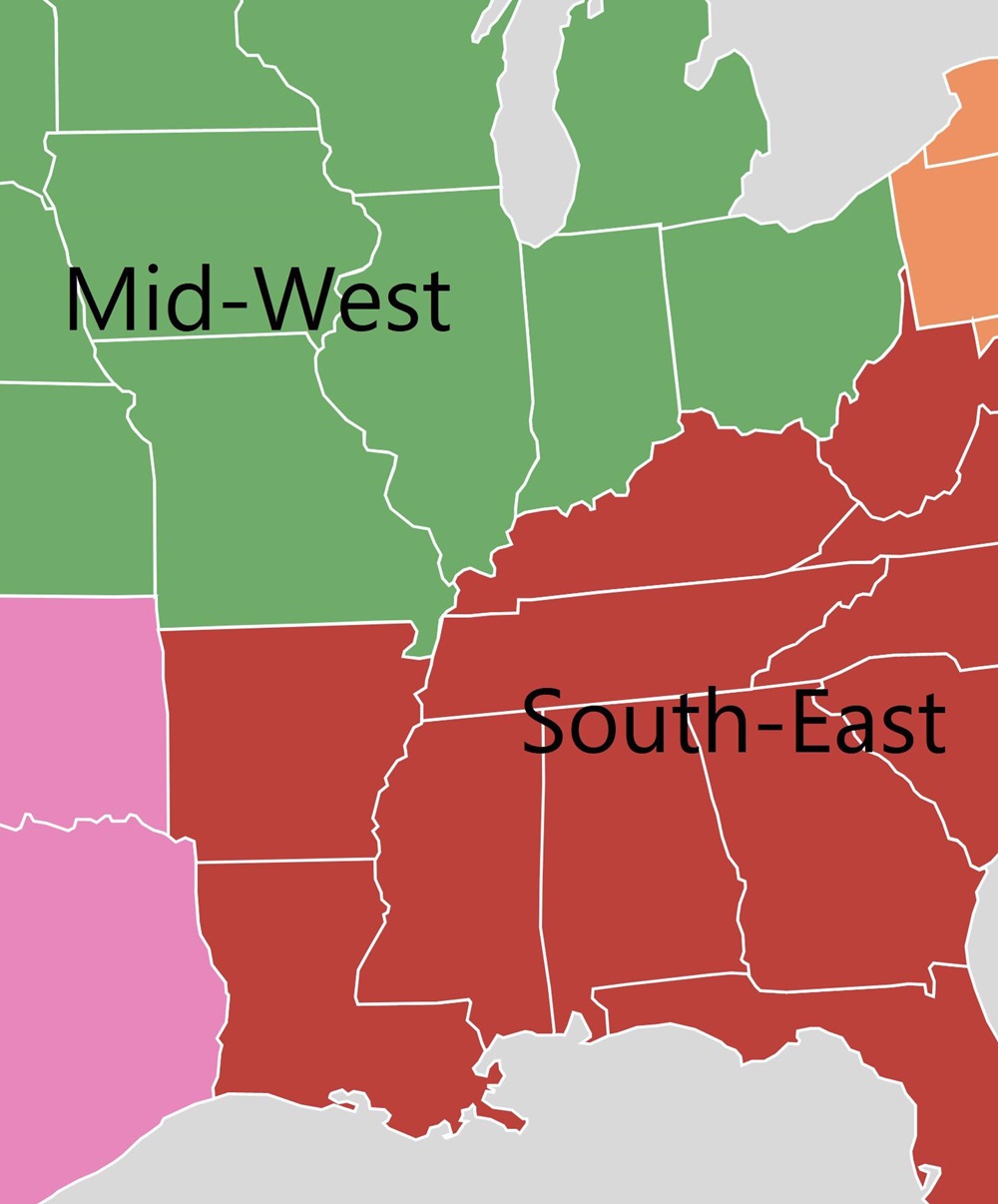
For years, if not decades, we’ve been hearing a familiar tale- that anyone and everyone is moving from the Midwest and Northeast to the South and West. This trend began during and after the collapse of Northern manufacturing, and as higher cost of living began to make the lower-cost South more attractive in particular. However, a lot of the South’s growth over the years- indeed a majority- never had anything to do with region-to-region migration. Instead, it was due largely to natural growth (births vs. deaths) and international migration, particularly from Central America. What received all the attention, though, was the belief that people were packing up and moving to the South from places like Ohio and other struggling Northern states. While that may have been true for a while, that is increasingly looking like it is no longer the case.
The Midwest, especially, has been derided as the region no one wants to live in. Despite its growing population approaching 66 million people, the common refrain was that its colder winters, flailing economies and questionable demographic future meant that it was simply a region being left behind by the booming Southern states.
Recently, the US Census released estimates for 2015-2016 geographic mobility, and they tell a very different story altogether. Regional domestic migration in 2016 may have actually bucked the trends.
First, let’s look at the total domestic migration moving to the Midwest from other regions. South to Midwest: +309,000 West to Midwest: +72,000 Northeast to Midwest: +61,000 Total to Midwest: +442,000
And then compare that to the total that the Midwest sends to other regions. Midwest to South: -254,000 Midwest to West: -224,000 Midwest to Northeast: -34,000 Total from Midwest: -512,000
Net difference by region. Midwest vs. South: +55,000 Midwest vs. West: -152,000 Midwest vs. Northeast: +27,000 Total Net: -70,000
So while the Midwest is seeing an overall net domestic migration loss, it is entirely to the Western states.
This could just be an off year, as almost all recent years showed losses to the South, but then again, maybe not. The South has been in a boom for several decades now, and in that time, the region still lags the other 3 in almost every quality of life metric used. All booms end eventually, and the South’s 2 biggest perceived advantages, low cost of living and business-friendly climate, have been gradually eroding over time. As Census surveys show, people don’t actually move for a change in weather, so it’s the economic factors that are going to make the biggest impacts long-term. The Midwest now has many cities and several states that are doing well economically, including Columbus, and perhaps they are becoming more attractive than they have in many years. Time will tell, but last year, the narrative of an unattractive Midwest vs. South was at least temporarily shelved.
The 2016 population estimates came out this morning from the Census. Nationally, it seems that overall growth rates slowed down from where they were the year prior, and there were some surprising results in a few cases.
First, let’s take a look at the core counties for Columbus and its peer/Midwest counterparts nationally. The core city is in parenthesis. 2010—————————————————2015———————————2016 1. Cook (Chicago): 5,194,675————-1. Cook: 5,224,823————-1. Cook: 5,203,499 2. Clark (Las Vegas): 1,951,269———-2. Clark: 2,109,289————-2. Clark: 2,155,664 3. Wayne (Detroit): 1,820,584————-3. Santa Clara: 1,910,105—-3. Bexar: 1,928,680 4. Santa Clara (San Jose): 1,781,642—4. Bexar: 1,895,482—4. Santa Clara: 1,919,402 5. Bexar (San Antonio): 1,714,773——-5. Wayne: 1,757,062———5. Wayne: 1,749,366 6. Sacramento (Sac.): 1,418,788–6. Sacramento: 1,496,664–6. Sacramento: 1,414,460 7. Cuyahoga (Cleveland): 1,280,122—7. Orange: 1,284,864——–7. Orange: 1,314,367 8. Allegheny (Pittsburgh): 1,223,348—8. Cuyahoga: 1,255,025—-8. Franklin: 1,264,518 9. Franklin (Columbus): 1,163,414—–9. Franklin: 1,250,269—–9. Cuyahoga: 1,249,352 10. Hennepin (Minn.): 1,152,425—10. Allegheny: 1,229,298—-10. Hennepin: 1,232,483 11. Orange (Orlando): 1,145,951—11. Hennepin: 1,220,459—-11. Allegheny: 1,225,365 12. Travis (Austin): 1,024,266——12. Travis: 1,174,818——12. Travis: 1,199,323 13. Milwaukee (Mil): 947,735–13. Mecklenburg: 1,033,466–13. Mecklenburg: 1,054,835 14. Mecklenburg (Charl.): 919,628–14. Milwaukee: 956,314—14. Milwaukee: 951,448 15. Marion (Indianapolis): 903,393—15. Marion: 938,058———–15. Marion: 941,229 16. Hamilton (Cincinnati): 802,374—16. Hamilton: 807,748——–16. Hamilton: 809,099 17. Multnomah (Portland): 735,334–17. Multnomah: 789,125—17. Multnomah: 799,766 18. Jackson (Kansas City): 674,158–18. Jackson: 686,373——-18. Jackson: 691,801 19. Davidson (Nashville): 626,667—19. Davidson: 678,323——-19. Davidson: 684,410 20. Providence (Providence): 626,671–20. Kent: 636,095———20. Kent: 642,173 21. Kent (Grand Rapids): 602,622–21. Providence: 632,488—-21. Providence: 633,673 22. Summit (Akron): 541,781———22. Douglas: 549,168——–22. Douglas: 554,995 23. Montgomery (Dayton): 535,153–23. Summit: 541,316——–23. Summit: 540,300 24. Douglas (Omaha): 517,110–24. Montgomery: 531,567——24. Dane: 531,273 25. Sedgwick (Wichita): 498,365–25. Dane: 522,878———–25. Montgomery: 531,239 26. Dane (Madison): 488,073——-26. Sedgwick: 510,360——26. Sedgwick: 511,995 27. Lucas (Toledo): 441,815——–27. Polk: 466,688————–27. Polk: 474,045 28. Virginia Beach (VB): 437,994–28. Virginia Beach: 451,854–28. Vir. Beach: 452,602 29. Polk (Des Moines): 430,640—-29. Lucas: 433,496————-29. Lucas: 432,488 30. Allen (Fort Wayne): 355,359—30. Allen: 368,040————-30. Allen: 370,404 31. St. Louis (St. Louis): 319,294–31. St. Louis: 314,875———31. St. Louis: 311,404 32. Lancaster (Lincoln): 285,407—32. Lancaster: 305,705——-32. Lancaster: 309,637 33. Mahoning (Youngstown): 238,823–33. Mahoning: 231,767–33. Mahoning: 230,008
Franklin County moved up one spot to 8th most populated core county of the group.
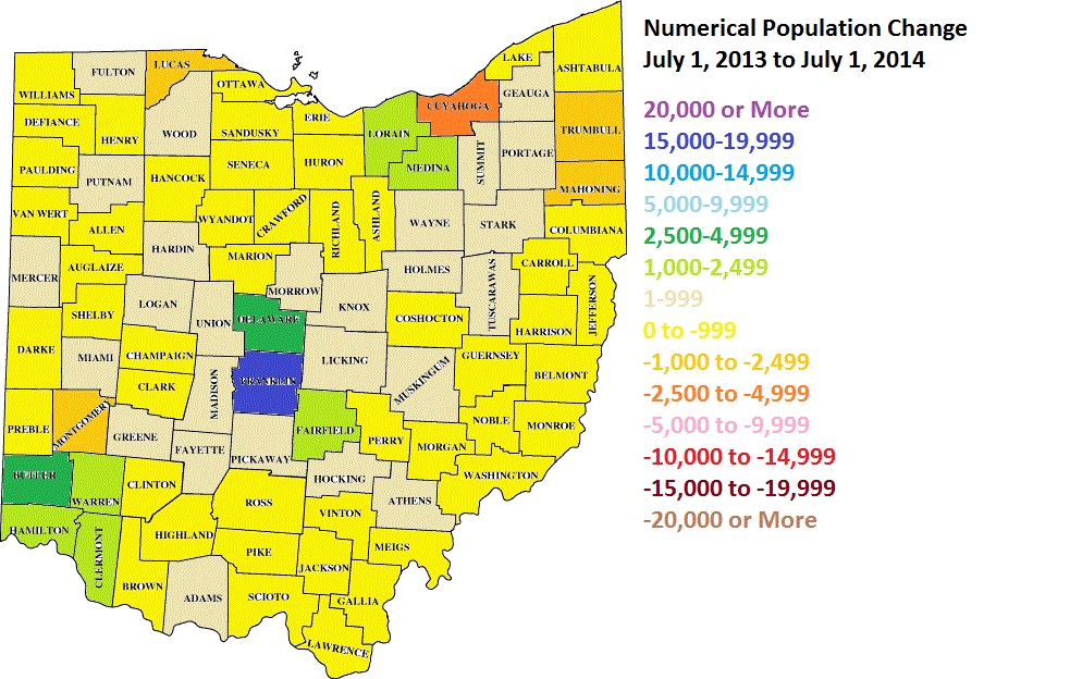
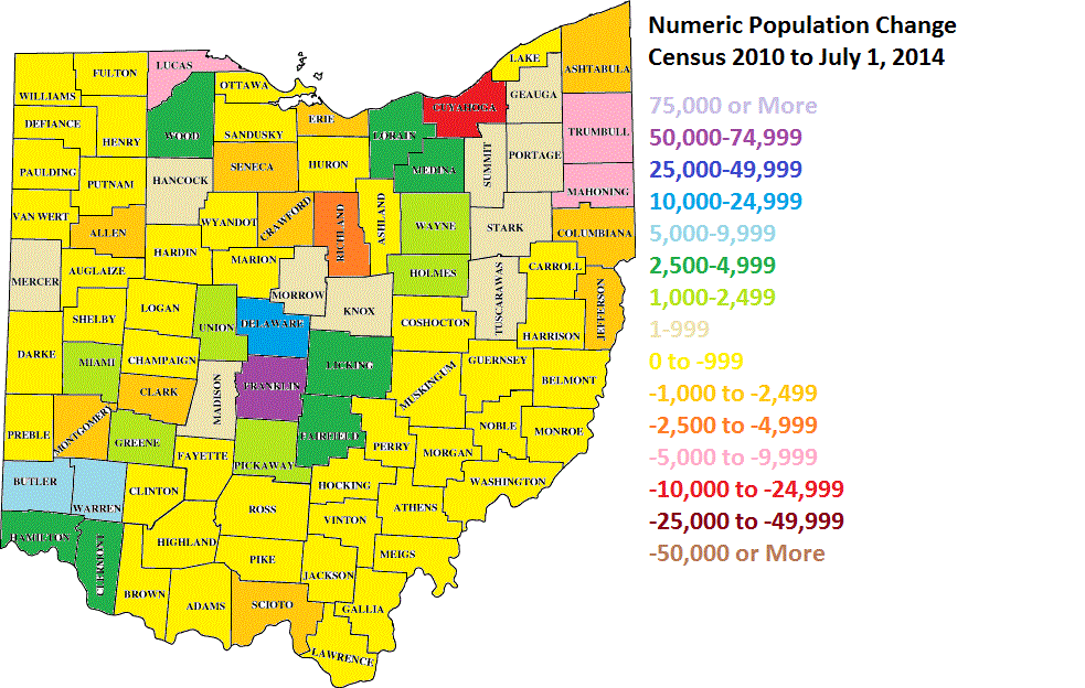
New 2014 county population estimates were released Thursday by the Census. Franklin County had its 2nd highest growth year since 1970 and within a few years of passing Cuyahoga County to become the most populated in Ohio.
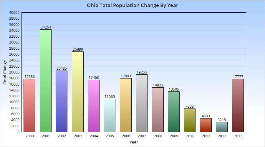
Back in November, I wrote about Ohio’s improving growth outlook. In that post, I examined domestic out-migration and domestic in-migration 2005-2012, and discovered that the net change had been improving. The state was losing fewer people over time domestically, and the difference had declined to under 2,000 people by 2012, a HUGE improvement from the start of the period.
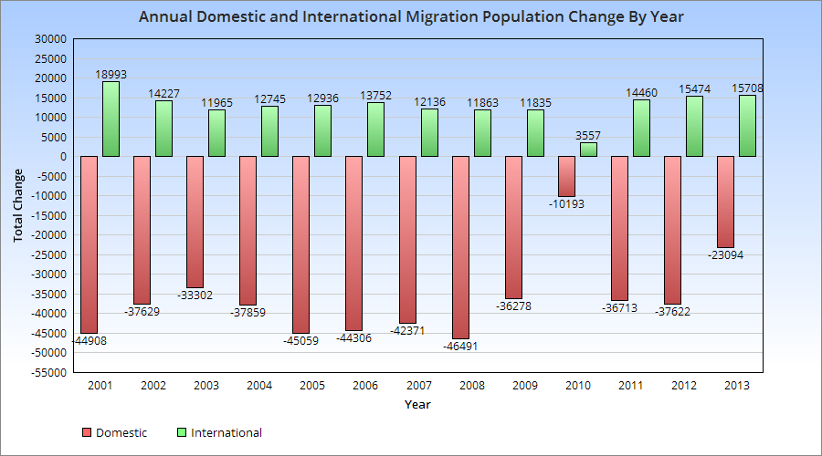
Recently, the US Census released 2013 state population estimates, along with components of population change for the July 1st, 2012-July 1st, 2013 period. More positive news was to be found in those estimates.
First, Ohio’s population increased to 11,570,808, representing an annual increase of 17,777. While the increase is not particularly great, especially in comparison to states nationally, there are some positive nuggets with that number. The state held on to its position as the 7th most populous state, and the increase was the highest since pre-recession. The state moved up 18 spots in the total annual growth rankings 2012-2013 vs. 2011-2012. This was the best increase of all 50 states. It was also the best growth for the state since 2007. Did the state bottom out in 2012? Perhaps, but way too early to tell. Still, a very good improvement that halted a general decline.
The components of change are also interesting.
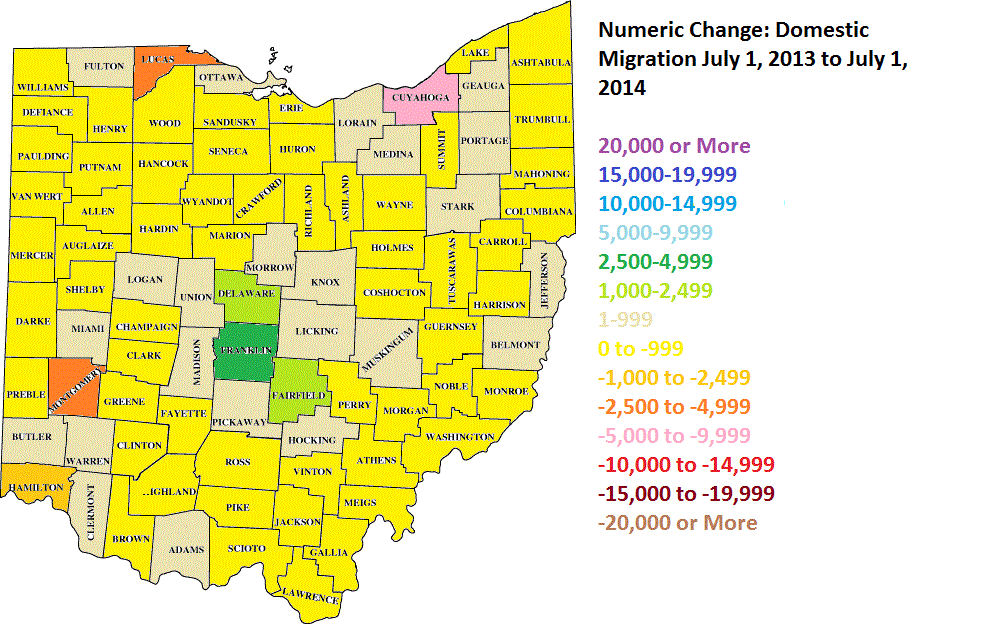
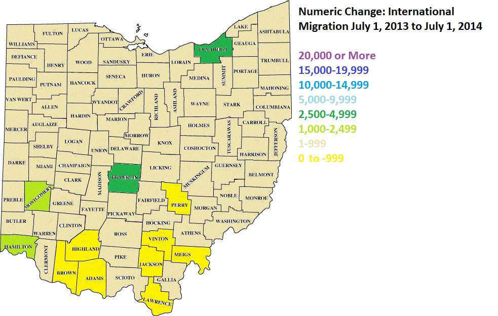
The migration patterns show a few things. First, 2013 had the 2nd highest rate since 2000 of in-international migration. It was also one of the best years (since 1996) for domestic in-migration.
The question is, can Ohio keep improving or is this just a temporary blip? Time will tell.