The US Census recently released 2015 census tract population density data, including census tract population density. I figured midway through the decade would be a good point to update where these stand because they give greater insight in smaller-scale population changes. I looked at all the census tracts in Franklin County and came up with the following map series.
First, the population in 2015.
Next, the population density of tracts in 2010, as reference.
And now 2015.
On the surface, it’s difficult to see the changes, but put side by side, you can tell there have been a lot of increases across the county. To make this more visible, I made the following maps.
You can see that some of the strongest density increases occurred around Downtown and the Short North, New Albany, parts of the Campus area, and Dublin.
The map above gives a straightforward look at where the density increased and decreased. As you can see, the increases FAR outweighed the decreases. Most of the latter were scattered except across the Far South Side and parts of the Whitehall area.
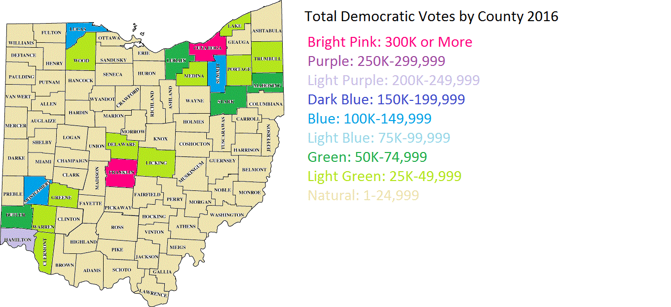
Here were the top 20 most dense census tracts in 2015.
1. 1810: 29,508.2 South Campus/Victorian Village
2. 1121: 25,287.9 Main Campus
3. 13: 21,961.4 Campus/Indianola Terrace
4. 1110: 18168.6 North Campus/Tuttle Park
5. 10: 17386.3 Campus/SoHud
6. 12: 16,981.9 Campus/Iuka Ravine
7. 20: 13,030.5 Short North/Victorian Village
8. 17: 12,872.3 Weinland Park
9. 6: 12,153.6 Old North Columbus
10. 21: 10,853.5 Short North/High Street
11. 8163: 10,255.3 Lincoln Village/Southwest Columbus
12: 4810: 9,557.4 South Central Hilltop
13. 47: 9,492.7 North Central Hilltop
14. 6352: 9,434.0 Northwest Columbus/Henderson Road
15. 57: 9,257.4 Brewery District/South German Village
16. 5: 9,177.9 Old North Columbus
17. 6933: 9,090.9 Forest Park East
18. 16: 8,980.5 Weinland Park
19. 4620: 8,928.6 North Central Hilltop
20. 1820: 8743.3 Victorian Village
It’s obvious that the High Street corridor is the most dense of the city, racking up most of the top 20.
Now here are the 20 tracts with the largest density increases 2010-2015.
1. 1121: 4,375.9
2. 6: 2,178.5
3. 21: 1,934.9
4. 22: 1,478.1
5. 40: 1,107.7 South Downtown
6. 1820: 1,044.1
7. 20: 921.7
8. 38: 904.3 Old Towne East
9. 5: 861.2
10. 210: 833.9 Clintonville
11. 32: 751.1 Arena District West/West Victorian Village
12. 730: 736.9
13. 7551: 656.0 Somerset/South Easton
14. 7951: 610.4 West Columbus
15. 6372: 574.6 Hayden Falls/Sawmill Road
16. 7209: 514 New Albany
17. 7395: 497.6 Blacklick/East Broad
18. 10: 492.8
19. 8230: 449.3 Westland
20. 710: 447.3 West-Central Linden
And finally, the top 20 largest declines 2010-2015.
1. 13: -2,964.3
2. 12: -1,625.1
3. 42: -1,620.8 Scioto Peninsula/East Franklinton
4. 920: -902.2 Northeast Linden
5. 17: -775.4
6. 50: -554.4 Franklinton
7. 61: -485.7 South High Street
8. 59: -441.9 Near South Side/Deshler Park
9. 4620: -380.4
10. 720: -380.2
11. 4610: -335.4
12. 820: -305.4 North Linden
13. 7721: -305.2 North Linden
14. 45: -258.1 North Hilltop
15. 60: -253.2 Vassor Village
16. 810: North Central Linden
17. 7532: -240.3 Morse Road/Easton
18. 2520: -240.1 Near East Side/King-Lincoln
19. 47: -206.6
20. 9333: -194.9 Linwood
So there you have it. The Census Tract Maps page gives demographic and population data for census tracts going back to 1930.