
Ohio has been growing fairly slowly for several decades now. In fact, if it was not for Columbus’ population growth and international migration, the state would’ve been losing population in recent years. But is the picture really that bad? Are things changing? I decided to find out.
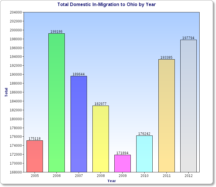
The first chart above shows the total population that moved to Ohio from all other 49 states plus Puerto Rico and DC by year. The drop during the recession is pretty obvious, as mobility greatly decreased during that time. 2012 had the 2nd highest total of the period, only slightly behind 2006.
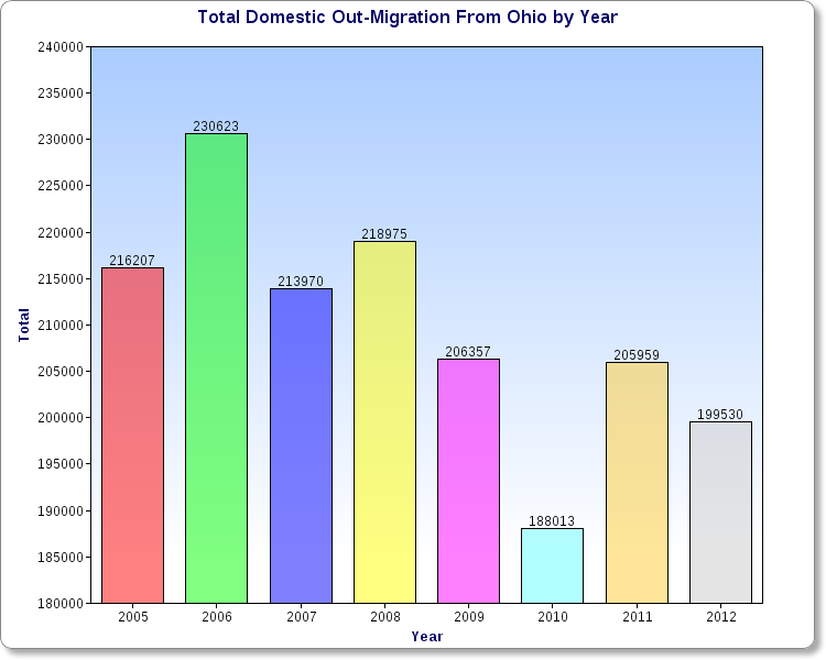
What the out-migration chart shows is that the total is gradually going down, meaning fewer people, on average, are leaving Ohio each year. So what is the overall difference of in vs. out migration to Ohio?
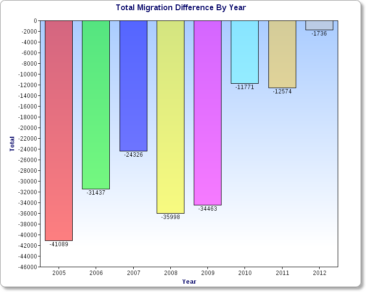
As the chart shows, the trend has been improving over time, and 2012 barely registered a loss at all. Will the state begin seeing positive domestic in-migration in the very near future? Based on this chart, the answer seems to be yes. A lot can still happen, but it does appear that Ohio is finally shaking off its long-term population issues.